SoundWhiz SymphoniQ Hybrid Over-Ear Bluetooth Headphones review

There are a lot of different styles of Bluetooth headphones on the market today. On-the-ear, over-the-ear, and in-ear are the most common. Personally, I own a pair of on-the-ear Sports headphones that I use when I go to the gym or walk my dog. I even have a pair of earbuds that I only use when cutting my grass. One thing I don’t own is a pair of high-quality headphones that I can use solely for the purpose of relaxing and just listening to music. The Soundwhiz SymphoniQ Bluetooth headphones are exactly that and I was fortunate enough to get my hands on a pair to review for the Gadgeteer.

In the Box

  • SymphoniQ Bluetooth Headphones
  • Hard Shell carrying case
  • Micro USB charging cable
  • Audio cable
  • 3mm to 5mm jack converter

Technical Specs

  • Bluetooth Version: 4.1 with APT-X
  • Noise Cancellation: CVC6
  • Pairing: Normal or NFC
  • Play Time: Up to 20Hrs
  • Talk Time: Up to 18Hrs
  • Standby: Up to 6000Hrs
  • Speaker: 40mm Dynamic Driver
  • Frequency: 10Hz – 20KHz

The first thing that appealed to me about these headphones was their striking design.

The clean Arctic white with black accents and just a touch of chrome gives them a real modern, edgy appearance. The SymphoniQ has build quality you can FEEL. The earcups are made of metal with soft leather covered memory foam ear cushions.

No cheap plastic here.

The adjustable headband is strong & flexible and has just enough spring to hug your ears for a stable fit without being over tight. I found them to be a little tight in the beginning but after wearing them for a few days they broke in nicely.

SoundWhiz even includes a nice executive looking hard-shell carrying case.

The headphones come with a built-in 480 mAh rechargeable battery. Charging the SymphoniQ is done using a Micro USB charging cable plugged into any standard USB port such as a phone adaptor or PC. SoundWhiz recommends charging the headset for 3 hours prior to first use. Once charged the headphones have an impressive 20 hours of playback time and up to 600 hours of standby time.

Pairing the headphones with your favorite Bluetooth device is easy.

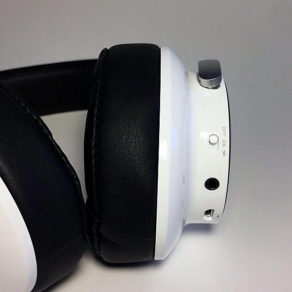
Simple slide the on/off switch (located on the right ear cup) to the Bluetooth icon and hold for 2 seconds. The LED indicator light (located on the side of the right ear cup) will flash red and blue. Open your devices Bluetooth setting and select ‘SoundWhiz SymphoniQ’. Once connected the blue LED indicator light will flash twice every 4 seconds.

There is even friendly voice prompts that will tell you when the headphones are powered on or off, pairing, connected or disconnected.

The SymphoniQ also automatically connect to the last paired device when you turn them on. To reconnect with a paired device in standby mode, short press the Multi-Function button to find paired devices in range.

If you have an Android device you can connect using NFC. Make sure your Android devices NFC is enabled and hold it next to the headphones Multi-Function-Button. The connection should occur automatically within a few seconds. 

The SymphoniQ also has Dual-Pairing which allows you to connect two Bluetooth devices simultaneously. If the headphones battery is low, or if you prefer a wired connection you can use the provided audio cable.

SoundWhiz even throws in a 5mm jack converter so you can plug into a stereo system, amp, or musical instrument.

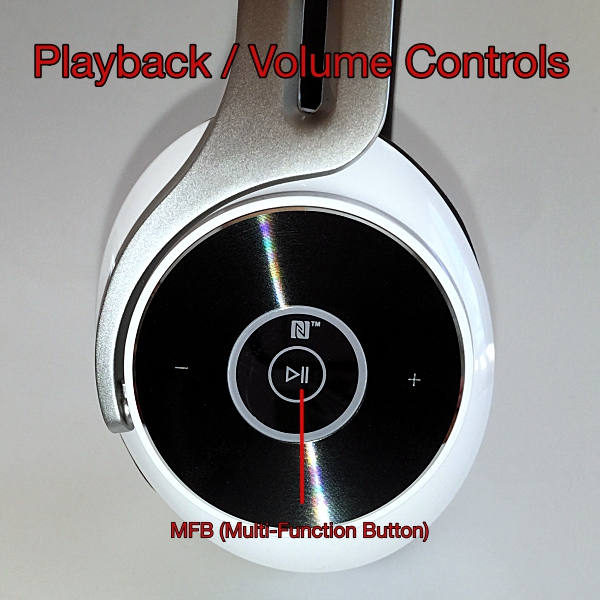
 The headphones controls are located on the side of the right ear cup. During music playback, you can control volume, play and pause music, and next or previous track.

The large disc design of the controls makes them easy to use; no more fumbling for buttons.

Playing and pausing music is done using the headphones MFB (Multi-Function Button). A short press of the MFB will play and pause music playback. A short press of the (+) and (-) icons will raise and lower volume respectively. To play next track press and hold the (+) icon, do the same to the (-) icon to play previous track. 
 A built-in HD mic with CVC6 noise cancellation allows for crystal clear phone calls even when you’re somewhere with a lot of ambient noise. To answer an incoming call short press the MFB, another short press will end the call.  A short double press of the MFB will automatically redial the last number. You can even manage 2 simultaneous calls using just your headset.

The SymphoniQ headphones feature an innovative hybrid semi-open back ear cup design.

To be honest, before I reviewed the SymphoniQ headphones I had no idea what an open back headphone was. What I learned is that there are generally two types of over-the-ear headphones, closed-back, and open-back.

Closed-back headphones are what most of us are familiar with. They basically isolate you from the outside world. It’s just you and your music. Open-back headphones usually have a grill on the back of the ear cups allowing music to escape outward. Doing this provides a significantly larger soundstage, it’s like listening to music in a room as opposed to it being beamed into your head. 

On the SymphoniQ instead of a grill SoundWhiz designed the ear cups so that sound could escape outwards and the face plates are more acoustically transparent and not hermetically sealed, therefore, allowing sound to escape out.

This would explain why these headphones sounded so different to me when I first put them on. Indeed the music sounded more spacious and detailed. Definitely, a different listening experience then what I was used to. 

These headphones produce a really rich sound, with a deep resonant bass and crystal clear mids and highs. Even though the bass really pumps it doesn’t bleed over to other parts of the music, it’s still controlled and detailed.

Vocals remain clean and the treble is clear and bright, so things like snares and high-hats pop out very nicely. All and all these headphones work wonderfully for listening to any kind of audio genre. From classical and rock to hip-hop and rap the SymphoniQ headphones handles them all beautifully.

I even use them to listen to my TV’s audio and they do a great job with both movies and sports.

Because these headphones are semi-open back you still get pretty good noise isolation. There is some sound bleed but overall they do a good job of keeping out most ambient noise.

The SoundWhiz Symphonic Bluetooth Headphones are the perfect combination of style, comfort, and sound. Priced at $74.99 these headphones SHOULD be at the top of every Holiday shopping list this Christmas.

Source: This sample was provided by SoundWhiz. Please visit their site for more info and Amazon to order.


Product Information

Price: $74.99
Manufacturer: SoundWhiz
Retailer: Amazon
Pros:
  • Stylish
  • Comfortable
  • Great sound quality

Filed in categories: Reviews

Tagged:

SoundWhiz SymphoniQ Hybrid Over-Ear Bluetooth Headphones review originally appeared on The Gadgeteer on November 15, 2017 at 4:04 pm.

Note: If you are subscribed to this feed through FeedBurner, please switch to our native feed URL http://the-gadgeteer.com/feed/ in order to ensure continuous delivery.

Action Method Notebooks review

Originally designed for creative professionals, the Action Method is a note-taking system that focuses on identifying the action steps you need to keep your projects moving forward. Behance, the creators of the Action Method, have also developed a full line of beautiful notebook products designed specifically to work with their system. For this review, we’re taking a look at both the Action Method and their fancy notebooks. How does it all work together? Let’s review! 

How does the Action Method work?

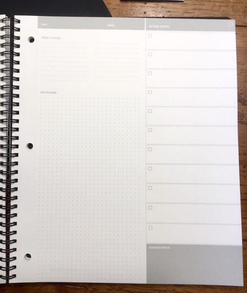
The Action Method is a template for your note taking, breaking the page into four distinct zones to keep your notes organized as you go.

The “prep/focus” area is for pre-work setup including preparation activities and important focus areas for the upcoming session.

The “notations” area is for capturing your running notes, ideas, and sketches during the session.

The “action steps” area is for capturing important tasks and activities to be completed after the session and includes checkbox areas to indicate when they are completed.

The “backburner” section to capture lower-priority items for future follow-up.

It’s a wonderfully simple and intuitive system. They key is the Action Steps action, which allows you to clearly identify and prioritize your critical next steps when your note taking session is completed.

Beautiful, functional notebooks

Featuring top-quality materials and beautifully minimalist design, the Action Method Notebooks are lovely to work with. They also integrate some clever features that promote their overall usability. I’ve got two different types of Action Method Notebooks for my review.

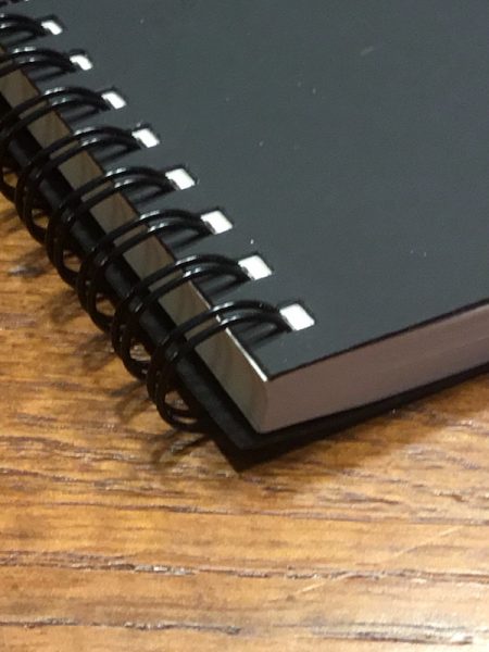
The Reduced Action Notebook variant I’m testing is designed with all the features of the Action Method system, but without the branding or color integration found in other products in the lineup. The cover material is a thick, semi-rigid material with a suede-like texture. The interior paper is a soft white 80-pound vellum that has a subtle texture and excellent hand feel. Bound with black double-spiral binding, each page also has two sets of perforations: separate the pages at the first perforation for loose pages, or at the second perforation to use the pre-drilled holes to add your notes to a three-ring binder.

On the Reduced Action Notebook, you’ll find each page is printed on the front face with the Action Method four-zone template in a neutral grey. The notation area features a dot-grid pattern to facilitate writing and drawing, and this pattern is also printed on the back of each page if you need more room for your observations and musings. In other notebooks in the product line, the action steps area is highlighted in solid blocks of bold color to stand out from the rest of the page. The Reduced Action Notebook uses the same layout but presents the action steps in simple framed boxes.

If you’re a designer, the Dot Grid book may be more to your liking. It’s the same style notebook, but the Action Method template is replaced with the dot grid pattern covering the front and back of all pages. This leaves the whole page open for sketching layouts with the grid pattern as a background guide. The Reduced Dot Grid Notebook I am testing also foregoes the external branding for simple, all-black cover. 

Speaking of which… the Action Method Notebook series sports a variety of notebook products to fit your needs. My notebooks are each 8.5” by 10.5”, but different sizes are available as well as hard-bound Moleskine-style journal books, loose notepads, and notepads that just feature the action step format (which you could pair with your Dot Grid notebook for a complete note-taking solution). You can check out all the variations on the Action Method web site.

Let’s take some notes!

You can take your notes on any old piece of paper, but there’s something special about incorporating beautifully crafted notebooks into your daily work life. When you combine that with a simple & elegant system for organizing yourself, the result is a wonderfully useful set of work tools.

If you are a fan of high-end notebooks, you’ll love the Action Method products. The material quality is on par with competitive products like Rhodia or Moleskine. The covers are durable, classy, and hold up well with continuous handling. The thick interior pages have beautiful texture with a great hand feel. The minimalist & elegant styling looks great when you pull it out of your bag for that big meeting. As a day-to-day notebook, they just feel good (and look good) to use.

The pages themselves are great for note taking. The soft white color is easy on the eyes, reducing eye strain. They also absorb inks wonderfully, reducing the smudges and smears that you sometimes get on cheaper papers. There’s no bleeding through to the back of the page. The grey printed templates and grid patterns are dark enough to read well but light enough that they don’t conflict with handmade scribbles (I tested blue and black inks for this). I tend to crawl all over the place when I take notes on a blank page, but I also don’t like the formality of ruled pages that makes me feel like I need to stay within the lines. The dot grid patterning for your note taking areas is a great solution. It’s excellent for sketching out designs, but also provides helpful guides to make your handwritten notes easier to read later.

I was pleasantly surprised by how intuitive & simple the Action Method is as a note taking system. I’ve tried a variety of note taking methods to organize myself (most recently the Bullet Method) and found that many systems put too much complexity into the task of sorting and organizing things for my tastes. I just don’t like to think that much. The Action Method, by breaking down your notes down into four simple categories, allows you to focus on your thoughts and not the process. It’s wonderfully liberating, especially for those of us who are creative types.

I typically oversee 10-15 different project work streams at a given time covering a broad range of creative, strategic and technical categories. I’m also moving constantly between projects as I interact with my different work teams. This can create a nightmare for keeping myself organized. The nice thing about the action method is that I can focus my thoughts and actions around specific work streams by dedicating a page to each project in my notebook. With easy reference to the action steps, I can quickly sort myself out and prioritize my next steps with a quick scan of the individual project pages. It’s really useful for keeping me focused.

When it comes to deep dive meetings (such as creative brainstorming activities or group workshops), the Action Method format really facilitates the output of those sessions. When there’s a lot of information flying about the room, you can quickly lose yourself in a sea of notes. With the Action Method, I can make sure that I pull the key action elements out of the content stream on-the-fly, with a clear set of post-meeting priorities to focus on.

Since I started this evaluation, I have had several people around the office ask me about my notebooks after seeing me use them in meetings. I’ve had numerous compliments on the simple format, the organization of to-do items, and the quality of the products. It speaks well to the attractiveness & effectiveness of the Action Method Notebooks… these aren’t the kind of thing that usually gets attention!

Considerations and caveats

Notebooks and note-taking systems are a deeply personal experience. We all have our own preferences and working styles. That being the case, the Action Method Notebooks may (or may not) be right for you.

Price is the first and most obvious consideration. I really enjoy the quality and feel of high-end notebooks, but they’re not for everyone. While Behance offers most of their products on their website for under $20, their shipping costs are rather high. The two notebooks I am testing cost $16 each, for example, but $10.25 for USPS priority shipping (the cheapest option available) brings the net cost up to $22 each. It looks like the price comes down the more you buy, but this is kind of a bummer. There are many alternative low-cost options out there is price point is a concern.

I’m a big fan of the Action Method, but it may be overly simplistic for some. It’s great for organizing the notes from a meeting or work session. If you’re accustomed to taking ongoing detailed notes throughout your day, however, you may get frustrated with this as a running note taking system. Detail-oriented project managers may also want more options for organizing your notes, subdividing action steps, etc.

I should point out that the covers are not coated in any way so the material will pick up scratches & soak up liquids. They do protect the interiors very well but expect some scars and marks along the way.

Conclusions and pricing

Maybe I’m old school, but I just can’t quit paper notes. And as a creative professional, I appreciate products that put an emphasis on style, elegance, and efficiency. If you’re looking for a new solution to organize your note taking that works intuitively and looks/feel great, I’d highly recommend the giving the Action Method Notebooks a try.

Behance offers a full range of products and accessories on their site that range from $5 to $20 including different style wire-bound notebooks, bound journals, pocket-sized books, pad styles, and more (see my notes above about shipping costs). Check them out at the Action Method web site.

Source: The sample for this review was provided by Behance. For more info visit their site and Amazon to order.


Product Information

Price: $5.00 and up
Manufacturer: Behance
Retailer: Amazon
Pros:
  • Beautifully crafted, high quality notebooks
  • Minimalist upscale design
  • Simple, intuitive note taking method
  • Nice range of accessories and add-ons to customize your note taking
Cons:
  • Can get expensive, especially with shipping
  • Cover material picks up smudges and scars

Filed in categories: Reviews

Tagged:

Action Method Notebooks review originally appeared on The Gadgeteer on November 15, 2017 at 11:07 am.

Note: If you are subscribed to this feed through FeedBurner, please switch to our native feed URL http://the-gadgeteer.com/feed/ in order to ensure continuous delivery.
Lioe Phantom S420 scissors review

When Lioe design reached out to see if I would like to review the Lioe Titan business card holder they asked if I would also be interested in reviewing the Phantom S420 scissors.  I told Julie I’d be happy to check them out. Many of the items reviewed on The Gadgeteer are evaluated to describe and demonstrate their technical or tactical features. These scissors were primarily designed to enhance the aesthetic of everyday scissors, but also to cut. We’ll demonstrate the various ways to show off these scissors but also evaluate how they cut. Read on to see what I think!

Unboxing

The Phantom S420 scissors come in a slipcase covered black box appropriate for gift giving.

Below the slipcover is a black box emblazoned with the Lioe (pronounced Lee-Oh) logo.

Inside the scissors and display stand are fit into a precision cut foam insert. The box also includes an instruction card on how to use the display stand and a warning card that brings attention to the fact that these scissors are a sharpened cutting tool recommended for adult use only. The card includes language that waives Lioe’s liability for injuries due to improper use. Apparently, these scissors were used to cut a check to the Lioe Design attorney.

Display

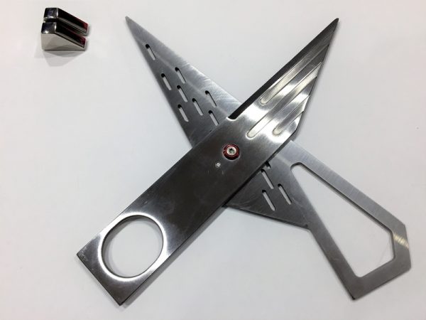
Scissors used for routine secretarial work still spend most of the time in storage.  The idea behind these scissors was to get them out of a desk drawer or pencil cup and display them as a unique piece of functional art.  The feature image at the start of this review and the images below demonstrate how the shapes, surface finishes, colors, and textures evoke artistic elements of industrial design that transcend functionality and have come to be appreciated as objets d’art. The flutes on the image above and voids on the image below remind me of the flutes and vents on a set of disc brake rotors of a world-class racing car, or the sides of a Reading Streamliner.  The thumb and finger holes look like the voids cut out of steel beams. The red bushing on the central screw looks like a ruby jewel used in watchmaking. All these elements give the phantom scissors an appearance of something other than scissors.

The scissors are meant to be displayed. They come with a highly polished stainless steel display stand. The scissors slide into a groove and the stand widens the base enough for the scissors to stand upright on their side.The scissorss may be displayed as shown on the feature image or the image above, but may also be displayed by positioning the stand according to the images below. These positions give the display potential energy and adds a sense of strength. The scissors appear ‘stronger’ because they must support their own weight.

The two configurations above are probably the easiest way to display the scissors. Getting the scissors to sit in the stand at the end of the handle requires the stand be in a particular location versus it being positioned anywhere along the handle as in above. The configurations below require two-hands to hold the stand up on edge and also place the handle steel into the notch.

Use

The Phantom scissors have an artistic compromise that makes them a little bit different to use than the typical pair of scissors. The edges of the blades are positioned behind the knuckles of the thumb and fingers when holding the scissors and the edges do not pivot directly opposite the screw.  Because of this design (or even in spite of it) the cutting seems a bit more difficult to control than compared to using a standard scissors from OfficeMax. The tension can be adjusted by the central screw, but it is a Torx T8 style bolt.

Although the design is somewhat ambidextrous in that the thumb and finger holes are not contoured, the design of the scissors is actually left-handed, with the thumb blade on top of the finger blade when the thumb is positioned on the left. This means that right-handed users will tend to force the blades apart when closing. The area where the screw is located is very large so perhaps this effect will be minimized. My impression of this phenomenon is poor because I’m a lefty who has used right handed scissors all my life. Even if the alignment of the blades is unaffected by the asymmetric mechanics of the left and fight hands, right-handed individuals will need to cut across their body to see the  paper being cut because the finger blade will obscure the view if the scissors are held out strait.

Performance

Since I don’t have access to one of these I needed to come up with my own performance evaluation. The first test was to cut precisely across the lines of a piece of paper. The results below are from the Phantom 420.

The results below are from the OfficeMax scissors pictured above. I think that the OfficeMax scissors were easier to use. The results may appear to be the same but I had to concentrate a lot more to complete the cuts with the Phantom.

The next test was seeing how many sheets of paper the scissors could cut through and how those cuts looked. The paper below demonstrates the cutting performance through the indicated number of sheets. In reality, I just foled the paper upon itself and cut across the bundle. The sheet below was cut by the Phantom 420.

This sheet was cut by the OfficeMax scissors. There is barely a difference. The OfficeMax scissors were more comfortable because the handle is padded, but overall the results of the cuts look very similar. Both scissors had difficulty with the 32 sheet count.

Conclusion

These scissors are fantastic to look at and I can admire them all day, but when it come time to use them I miss my generic (right-handed) OfficeMax scissors.  Also, in keeping with the maxim “good art isn’t cheap, cheap art isn’t good” the Phantom scissors cost $65; quite a bit more than the $5.99 OfficeMax pair. Maybe if I keep using them I’ll learn to like them more, but for now I feel like they are like a great looking pop music act with only an average voice. Perhaps with some refinements they will be more appreciated, but for now they don’t make the cut.

Source: The sample for this review was provided by Lioe. Please visit their site for more info and you can order one from Amazon.


Product Information

Price: $65
Manufacturer: Lioe
Retailer: Amazon
Requirements:
  • Light Duty Office Use – Paper or Card Stock Only
Pros:
  • style
  • left handed design for left handed people
Cons:
  • price
  • performance
  • left handed design for right handed people
  • unpadded finger/thumb hole

Filed in categories: Reviews

Tagged: ,

Lioe Phantom S420 scissors review originally appeared on The Gadgeteer on November 14, 2017 at 2:00 pm.

Note: If you are subscribed to this feed through FeedBurner, please switch to our native feed URL http://the-gadgeteer.com/feed/ in order to ensure continuous delivery.

FABRIQ Chorus Portable Smart Speaker with Amazon Alexa review

Give me a speaker, a Bluetooth or wifi connection, throw in a dollop of Amazon Alexa’s brains and witty personality and top that off with a pinch of Spotify or Amazon Music and it looks like a recipe for sheer gadget bliss.  The great thing about this recipe is that all the ingredients are accessible through the Fabriq Chorus Smart Speaker. Let’s have a look-see. 

In the Box (See pic below)

1 Chorus speaker
1 Charging dock
1 Cable for charging with USB to wall adapter

Set up

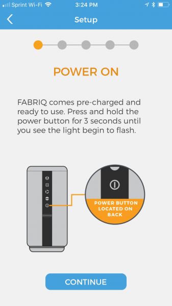
The set up was pretty simple for both wifi and Bluetooth. After you plug in the unit (it does come precharged, but why not charge it more?) and download the app from either the Apple Store or Google Play, you’ll go through the setup process which is guided by the Fabriq app.

One thing to keep in mind is that you need to make sure you are connecting to the same network that your phone is connected to.  I know that seems painfully obvious, but you could run into problems if you have two networks in your home like I do.

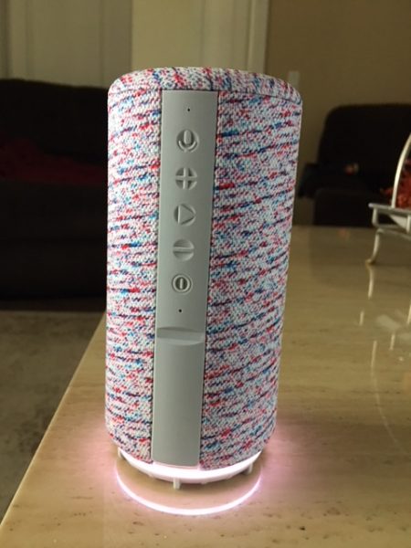
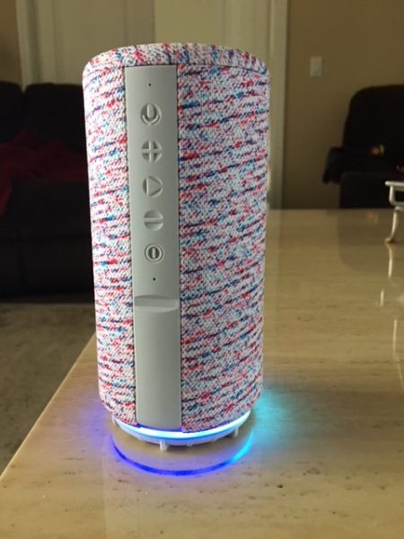
After the device is powered on, the ring around the bottom lights up like the pic below and blinks white and plays a little tune. This white light lets you know it’s either connected to wifi, or it’s ready to be connected (the device is pictured here off the charging dock). After the initial setup, whenever it is turned on, it will still blink, but after a couple of seconds, it says, “connected” so you know you are ready to rock.

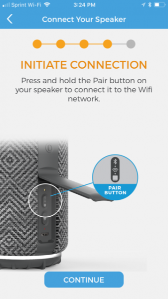
The next step is locating the “pair” button that is hidden under the secret plastic door on the back of the device (see photo below). This is the button you will use to connect to Bluetooth or a wifi connection. If your phone is connected to a wifi network, the speaker will try and connect to it, so if you want to use Bluetooth, you need to turn off the wifi connection on your phone and press the pair button again. Note: If you use the speaker with a Bluetooth connection and you arrive home again and wish to use it on the wifi network, you must repair the device using the app. Don’t worry, it’s a very quick process, but it’s good to know.  I didn’t realize this and I just kept pressing the pair button over and over and it wouldn’t pair.  It tells you to see the app for help though (here’s your sign!), and when you do, the app walks you through connection again.

After pairing, you can begin to explore the wonderfulness of the speaker. I haven’t personally tried, but the directions say that you can pair up to 10 Fabriq speakers and use them together, or control them individually….that would be some pretty cool surround sound.

A great thing about this speaker, in my opinion, is once you set it up to use on wifi, you don’t have to keep referring to the app to control it. The lighted ring around the bottom can tell you what you need to know and there are volume control buttons on the back.  I already discussed the white light, the blue light (above pic) is when you’ve enabled the Bluetooth setting…go figure! There is a red light also and that is what tells you the battery is about to die. This happens typically after about 5-6 hours after being off the charger, depending on what the speaker is being used for. I feel like my face is in my phone enough and being able to use this speaker easily, by just speaking to it and observing what color the rings are has been great!

What can it do?

If you already have an Amazon Alexa app on your phone, you simply need to connect Fabriq to the account. If you don’t have it, you need to get it in order to use the Amazon Alexa functions.  Once you do that, you can say the wake word, “Alexa” and then any command that you would tell your Amazon Echo.  The one problem that I have found with this device is that she doesn’t “hear” as well as my Echo, and I find myself having to raise my voice, or my other devices in other rooms will pick up my command first. In order to combat this, I changed the wake word on my Echo to “Amazon” and my Echo Dot is now called “Echo”.  The Fabriq speaker gets to have the name “Alexa” because I went into the Alexa app and the option to change the wake word was not available…but it’s okay with me because I think she looks more like an Alexa anyway. So now, just like with my children, I end up saying all of their names before I get to the one I want. It’s pretty comical actually…Alexa, Echo…. Amazon!

The above pic allows you see how the unit sets on the charger and what the connectors look like on the bottom. It doesn’t have to click, lock, or be set down in any certain way in order to charge or to be removed from the dock.

The sound quality of this little speaker is actually comparable to the Amazon Echo, and much better sounding than the Dot. I was hoping to add this speaker to my group I named “Everywhere” so that I could have my Amazon Music play from all three devices simultaneously instead of just the two, however, that option is not available.  So, if you want to connect this speaker to others to play together for a multi-room effect, you’ll just have to get more Fabriq speakers!

Final Thoughts

I’ve been pretty impressed by this speaker and it’s sound quality, it’s portability and frankly, I think its got a pretty cool look.  I have enjoyed being able to take it to the tennis court for some motivational hype music while my daughter and I hit the ball around and to the beach for some relaxing music as we sunbathe.  I found the setup to be simple, and once I renamed my other Alexa devices, there was harmony in the house once again, and everyone was able to “listen” without interrupting each other.  I don’t think that this Fabriq Smart Speaker hears as well as the Amazon Echo speakers, but that is a pretty high bar because Echo speakers hear it all! Lastly, it looks as if Elsa the cat has accepted the Fabriq speaker into our home….and that is not something you see every day!

Source: The sample for this review was provided by Fabriq. Please visit www.thefabriq.com for more information and go to Amazon to order.


Product Information

Price: $99.99
Manufacturer: Fabriq
Retailer: Amazon
Requirements:
  • A smartphone
  • An electrical outlet or USB port for charging
  • The Amazon Alexa app (or you won't be able to use those features)
  • Wifi or Bluetooth connection
Pros:
  • Portable, can be used away from wifi connection with Bluetooth
  • Can be used to control smart home features and most other skills that Alexa uses
  • Has great sound quality
  • Can pair up to 10 Fabriq speakers
  • After pairing, heavy App usage is not needed
Cons:
  • Charge only lasts 5-6 hours
  • Doesn't "hear" quite as well as the Amazon Echo products
  • Does not pair with other Echo Speakers to play Amazon Music simultaneously

Filed in categories: Reviews

Tagged: ,

FABRIQ Chorus Portable Smart Speaker with Amazon Alexa review originally appeared on The Gadgeteer on November 14, 2017 at 11:00 am.

Note: If you are subscribed to this feed through FeedBurner, please switch to our native feed URL http://the-gadgeteer.com/feed/ in order to ensure continuous delivery.

Anki Cozmo robot review


Let me state up front that the Anki Cozmo robot is a difficult review to write. It’s not because I don’t like it (frankly, negative reviews are easy to write); it’s because I really like this robot and it does so many things—most of them silly—that I’m having a hard time deciding what to leave in and what to delete. So, let me start off the review by saying, “If you want the coolest holiday gift for 2017, this is it.”

Well, that was easy. Now for the hard part …

When I first saw Cozmo online in a series of hilarious Anki videos, I was reminded of Pixar’s Wall-E. Cozmo loosely resembles Wall-E with his various noises and pseudo-language as he expresses joy—or quite the opposite. I don’t know whether Cozmo is a he, she or it, so I will use “he” since Cozmo is a boy’s name and calling him an it robs him of his personality.

Cozmo is a small, intelligent robot that will win you over with his ability to learn and his desire to beat you in every game he plays with you. He learns and gets more competitive as you interact with him. He is self-centered, petulant, moody and lovable—much like a cat.

Cozmo knows some games and will perform some tricks right out of the box, but as you spend time with him, other games and tricks are opened up. When you play with Cozmo each day, you’re awarded play tokens. Acquire three and you can unlock what Anki calls Bonus Boxes where you can redeem rewards—sparks, games, and tricks. Sparks are like points that are used to start a game or trick with Cozmo. Different games require different amounts of Sparks. Cozmo can also earn Sparks by winning games. Sometimes Cozmo chooses a game to play and sometimes it’s up to you. Either way, he’s constantly reminding you he wants to play.

Note: I made some videos, but they don’t do justice to everything Cozmo can do. There are countless Cosmo videos on YouTube that do a better job. Plus the quality is lacking—I had to use my iPad to shoot video because the Anki app will not work in the background on a smartphone, so multitasking is not possible.

Cozmo gets bored easily and can cause mischief. He always wants to pounce on your finger, play a song or go exploring. He’s even recognized our pet dogs! Speaking of recognition, when you first unbox Cozmo, you go through this facial recognition by typing your name and letting Cozmo scan your face. A built-in camera performs the scan and then Cozmo clearly pronounces your name. Anki assures us that no personal info ever goes out and that everything is stored in Cozmo himself and not shared with anyone. Note: Should you decide, Cozmo can be easily and completely erased.

Sometimes you can play tricks on Cozmo. Either putting him upside down or rearing him up on his back wheels will upset him. He will do everything he can to right himself up. Many times, his head, lift (arms) and tread (wheels) need recalibration. This is easily done in the free iOS or Android app that must be downloaded for Cozmo to work. This app controls everything Cozmo. It tells you what he’s thinking, how to set up a game or trick, and even keeps count of the sparks left in your “bank.”

The app also lets you know then Cozmo’s battery is getting low or when he needs to be fed. It also keeps track of the three cubes which are Cozmo’s toys. These blocks have specific icons for identification. The cubes have colors that turn on and off depending on how they’re used. A blue cube means that Cozmo sees it, but a green glowing cube means that Cozmo will interact with it. Which blocks become blue or green seems to be completely random. The cubes can display many different colors during game time.

Starting Cozmo up is a multi-step affair. First, you have to place him in his base regardless of whether he’s charged or not. Then he needs to be connected to a smartphone via his own WiFi network. Once that’s done, he wakes up and rolls off the base. Usually, Cozmo needs tuning up and feeding before any activities can take place. Feeding Cozmo involves shaking a blue glowing cube until it remains bright and then letting him find it and ‘drink’ from it. Sometimes, he even gets the hiccups. Of course, it’s all for show since it has nothing to do with a charged or empty battery. But hey, it’s a pet, ya’ know?
Tuning up requires scanning Cozmo and then following instructions given by the app to “fix” him by aligning his tread wheels, calibrating his lift and adjusting his head. I not sure how necessary this procedure is, but it’s fun to do as the app asks.

Once you have Cozmo set up, you’ll want him to recognize you. If you’ve already performed facial scanning, he will see you and say your name. Sometimes, you may have to re-introduce yourself after you power him up. I told Cozmo my name was “Billy Bob” because my name is actually William Robert and it sounds better than just “Bill”.

After you play a few games and spend time with Cozmo, you collect sparks that are used as tokens to play more games. As days go by, more sparks are added and conversely, with these sparks, more games are added. Be careful though, Cozmo does not like to be ignored and will throw a fit if you don’t pay enough attention to him. He also expresses displeasure when he wants to play a game and you say no or you say yes and then beat him. However, it’s fun to watch Cozmo randomly play games and performing tricks to amuse himself (and us in the process).

There are more advanced activities for Cozmo in the Discover section of the app.

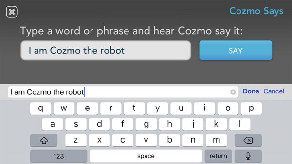
My favorite Cozmo activity is Explore Mode. This utilizes the built-in camera (what Cozmo “sees”). You see what he sees on your smartphone screen. You can then control Cozmo by moving, turning and manipulating his arms and head. Plus he will recognize a cube, human or even a pet and will greet you (or your pet) by pressing the Greet button on the screen. Cozmo can be made too either lift or roll a cube. Plus, you can drive him around using his camera as an eye. It allows you to see your surroundings from Cozmo’s viewpoint. More than once in this mode, he recognized me and said my name. I also had fun terrorizing my 75 lb dog with Cozmo driving around on the floor and seeing it from Cozmo’s point of view. My poor dog didn’t know what to make of him, so he walked away. If he had attacked Cozmo, this review may have ended quickly! You can also type anything into the app and Cozmo will say it.
Another mode for the adventurous is what the app calls Code Lab. This allows you to instruct Cozmo in different tasks by piecing together code blocks to make a program. It’s rudimentary, but it works flawlessly. Even though I don’t have a coding bone in my body, I could program simple tasks for Cozmo. I can envision kids gaining an interest in coding with this simple and intuitive game just to make Cozmo do what they want. Note: There is also a Cozmo Software Development Kit (SDK) for hard-core coders.

When you turn off the app, Cozmo lets out a disappointed sigh (or two or three) and begins snoring quite loudly. After a bit, he shuts down completely and must be re-awakened using the app’s Connect button. He then looks around and will call out your name when he recognizes you.

Cozmo is one of those intelligent toys that rewards the kid in all of us. As we spend more time with him, he becomes even more entertaining and opens up more games. I have yet to discover everything Cozmo has to offer despite the time I’ve spent with him. And isn’t that one of the joys of any toy—discovering new things about it even after hours of playtime?

Cozmo is not an inexpensive toy, but considering all he does and the hours of fun he promises in addition to learning as you play, what more can you ask for?

The Anki Cozmo robot sells for $179.99 US and is available from Amazon. I received the graphite colored Collector’s Edition, which costs the same as the white regular edition.

Source: The sample for this review was provided by Anki. Please visit their site for more information and Amazon to order one.


Product Information

Price: $179.99 US
Manufacturer: Anki
Retailer: Amazon
Pros:
  • Endless, creative fun
  • Cozmo learns and adapts and gets smarter
  • Cozmo learns who you are
  • Cooler looking Collector's Edition same price as regular Cozmo
  • Allows coding
Cons:
  • Expensive

Filed in categories: Reviews

Tagged: , ,

Anki Cozmo robot review originally appeared on The Gadgeteer on November 13, 2017 at 12:39 pm.

Note: If you are subscribed to this feed through FeedBurner, please switch to our native feed URL http://the-gadgeteer.com/feed/ in order to ensure continuous delivery.