Flexispot all in one Deskcise Pro desk bike review

Did you succumb to the recent trend and buy a standing desk or are you still slouching in a chair behind your computer all day? I had a standing desk for a short time but just couldn’t learn to love it, so I gave it away and went back to slouching behind my computer all day at work and then going home and doing the same.

When the folks at Flexispot contacted me to see if I would be interested in giving their all in one Deskcise Pro desk bike a try, I was curious and said yes.

What is it?

The Flexispot all in one Deskcise Pro desk bike is a small low impact exercise bike with a built-in platform for a laptop that has been designed for people between 5’1″ and 6’2″

Product specs

Desktop size: 19.6″ x 22.8″
Bike size: 36″ x 22.8″ x 43.3″- 49″
Height adjustable seat range: 30.7″ – 38.1″
8 level magnetic tension resistance
Weight capacity: 300 lbs

Design and features
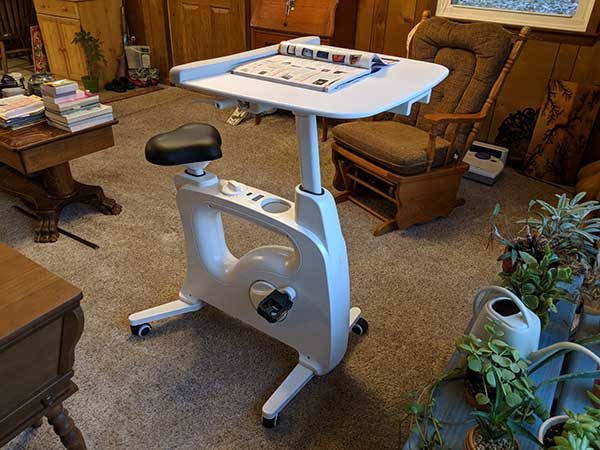
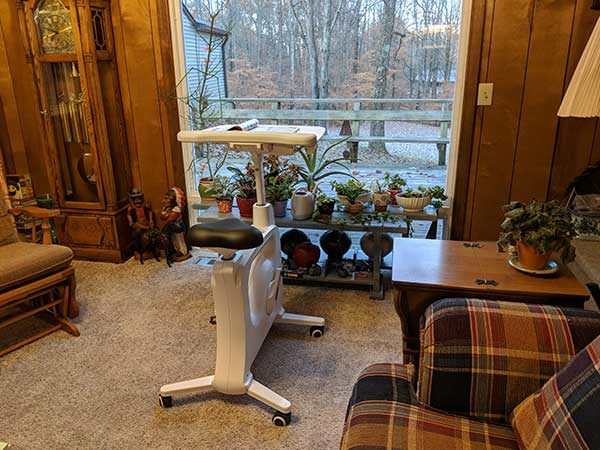
The Flexispot is made of white plastic and metal and is compact enough to fit in even small homes. It arrives assembled except for attaching the desktop which requires no tools to attach.
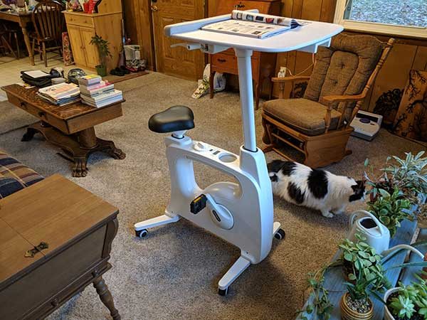
As mentioned in the product specs, the Flexispot is designed for people between 5’1″ and 6’2″. I am 5’6″, so I had no trouble adjusting the height of the desktop to accommodate me.
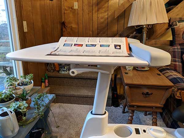
To adjust the height level of the desktop, you just press the lever on the side of the desk and lift upwards or press downwards till the height is where you like it. Then you let go of the lever to lock the placement.

A lever on the opposite side of the desktop allows you to slide the desktop forwards or backward to bring the platform closer or farther away from you. You can even pull the desktop back as far as it will go and then stand behind the seat to use the Flexispot as a standing desk.
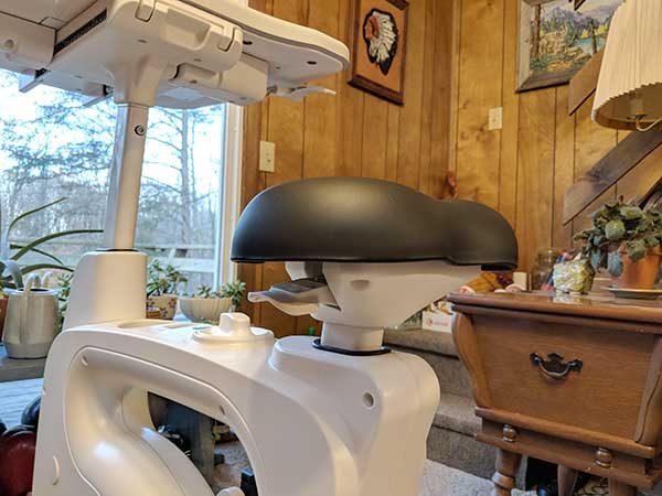
You can do the same with the padded seat to raise and lower it.
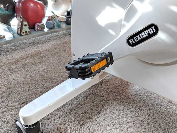
The Flexispot has hard rubber pedals that work well when you are wearing shoes. FYI, I find it a little amusing that the pedals have reflectors on them considering you won’t be riding this “vehicle” on the roads.
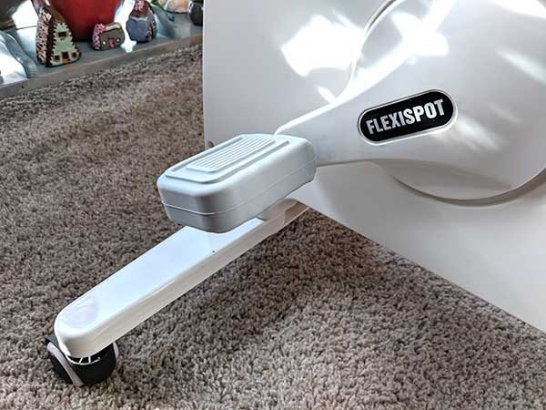
If you want to ride the Flexispot without shoes, soft rubber covers are included to make riding more comfortable.

You’ll also notice that the Flexispot has caster wheels. This makes it easy to move the desk bike where ever you want to place it. The wheels also lock in place when you’re on the bike so that it won’t move while you’re getting your exercise.
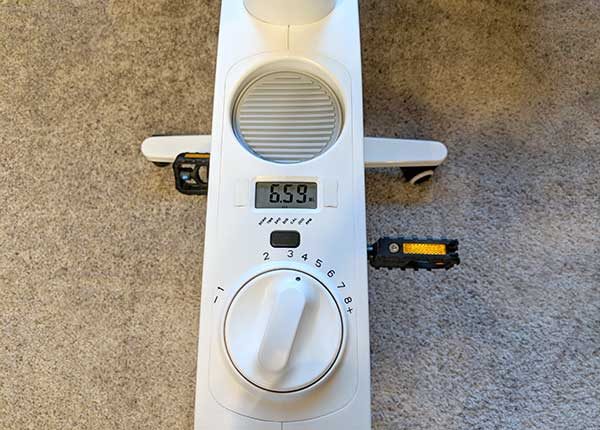
The all in one Deskcise Pro has a large knob that you use to adjust the magnetic tension resistance. There are 8 adjustable settings to choose from so you set things up to be easy or challenging.
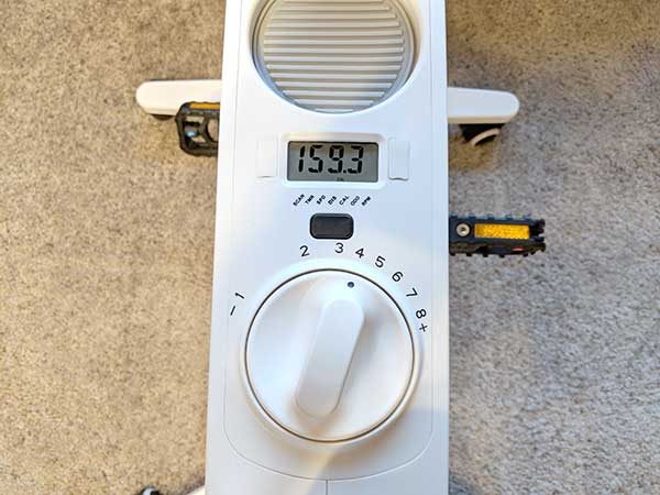
An LCD display above the knob will show workout time, pedal revolutions, distance, calories burned and speed. A button below the display is used to cycle through each of the readouts.

There’s even a built-in cup holder so you can stay hydrated during your bike desk sessions.
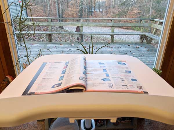
The desk platform is large enough for magazines, books, tablets, and laptops, and has a padded wrist rest for comfort.

Let’s go for a spin!

When I first jumped on the Flexispot, I thought that pumping my legs while trying to do work on my computer or reading a magazine would be really distracting. It was a little distracting at first, but after a few minutes, I forgot all about the fact that I was riding a “bike” and zoned out on what I was doing with my eyes and brain.


Before I knew it, 20 minutes passed by and I’d “traveled” a couple miles. I was surprised and felt good about myself because I was actually moving parts of my body that are usually sitting still while I surf and read. Getting a little extra movement without really trying is pretty cool.

The Flexispot seat is padded and pretty comfortable, but I did notice my rear end getting a little sore after using the bike for an extended time. I don’t have a lot of padding back there, so I have comfort problems with most bicycle seats but thought I should still mention it.

I like that the Flexispot comes 99% assembled and that it’s easy to adjust and use. There’s no thick manual to read. You just get on and ride.

I also like that the desk bike is small and that it doesn’t make a lot of noise while you’re pedaling it to bother other people in the room.

One thing that I’d like to see added to a future version is a tilt feature added to the desktop platform to make it easier to read or watch videos on a tablet without needing a separate stand.

Positives

  • Comes assembled
  • Small and compact
  • Doesn’t make much noise

Negatives

  • Expensive
  • Desk platform doesn’t tilt

Price: $499.99
Where to buy: Amazon

Final thoughts

We all know that it’s not good for our health to sit for hours at a time. Finding easy ways to add movement while still doing the activities that we like and need to do on a daily basis can be a challenge but the Flexispot all in one Deskcise Pro makes it easy and fun to go from sitting to low impact exercising with minimal effort.

Source: The sample for this review was provided by Flexispot. Please visit their site for more info.


Gear4 Oxford iPhone case with D3O protection review

A good cover is the first thing people usually buy after getting a new phone. If you’re someone who works, studies, or plays in an environment that includes the possibility of falling great distances, getting smacked by something unforgiving, or otherwise compromising the wholeness of a large slab of glass, you’ve probably found that you’re in need of a protective cover, not just a decorative one. In answer to this need, manufacturers and materials scientists have been hard at work developing better solutions: cases that can be thin and light, yet protect a device from a high fall, or a huge impact, without being 2 inches thick all around. The folks at Gear4 have solved the mystery with an advanced material from D3O. Let’s take a closer look.

Note: Photos may be tapped or clicked for a larger image.

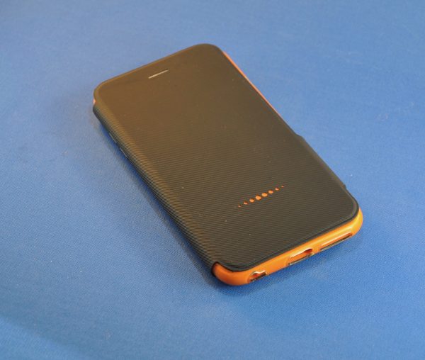
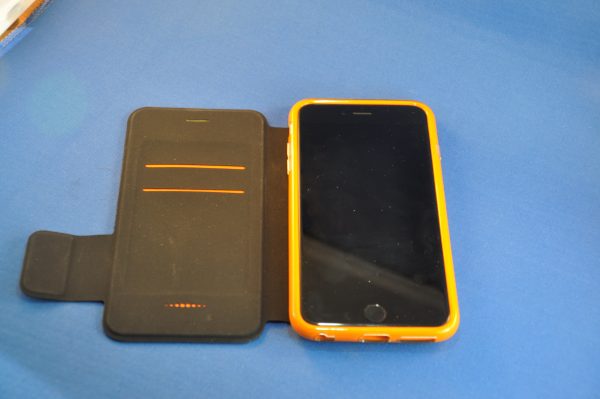
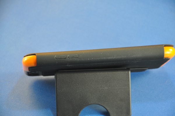
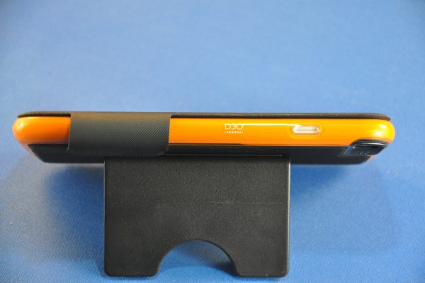
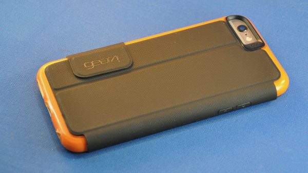
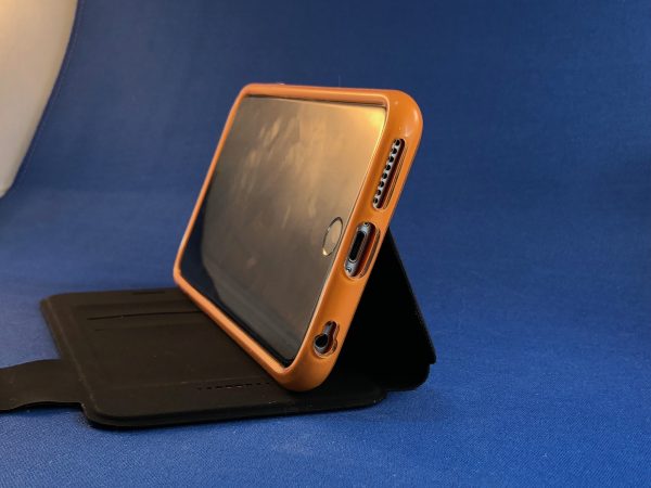
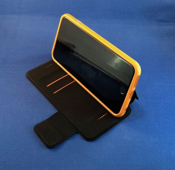
I was sent one for a “regular” sized iPhone (7), and a Plus-sized iPhone (6/6s Plus). Overall, the two cases look similar: there is a black outer skin front and back, with two slots for cards in the inside front cover. A formed bumper is bonded to the rear skin. There are ports for all the needed touch-places: camera, ring silencer, speakers, AUX port and charging port. While roomy, the Lightning port may not be accessible from a dock or even some cables. The camera ports, however, are quite roomy and slant away from the inner cutout, to let in just that smallest bit more light.The Sleep/wake and volume control buttons are covered by domed actuators. I had no trouble pressing the actual buttons with them, and I don’t think they pressed in on the buttons while in the case. The last port is one that’s not usually added to a valet case: the receiver speaker. The only other case I’ve used that had this was the Moshi SenseCover in 2015. There is a pierced foil piece covering the front, and the cutout perfectly allows sound to transfer to the outside while the cover is closed.

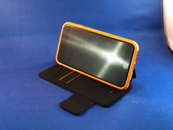
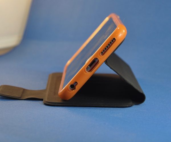
One hidden superpower of this case is that it is designed to be a stand where you can watch or create videos. If you’re trying to keep up with your team’s games while at your desk, this will enable those streaming presentations to be at the perfect angle.

At first glance, the case looks only slightly better than the thin silicon slip-on case that protected my original iPhone. Being a wallet case, it does have the addition of a cover, which comes in two different styles: a clip-closing one and a flap-closing one. The clip latch is centered on the case cover and clicks into the side of the soft liner on the rear piece. The flap is a magnetic-locked strap of the cover material that flaps all the way around the edge and secures to the rear of the case. But the bumper that surrounds the phone is quite a fantastic product. This is one of those energy-absorbing materials. It is flexible until it is struck by a certain amount of force. As soon as this happens, the molecules in the material shout “Shield Wall!” and interlock together for protection. (Sorry, I’ve been bingeing on The Last Kingdom on Netflix. The shield wall is a Medieval defense ploy where shields are made to interlock or overlap and can become a shell for the whole army, like a turtle. Riot police still use this tactic today. They just don’t shout the command like Uhtred does.) Here’s how Gear4 describes it on their site:

D3O® materials in their raw state flow freely when moved slowly, but on shock, lock together to absorb and disperse energy, before instantly returning to their flexible state. This reaction is counter intuitive. The greater the force of the impact, the more the molecules lock together and the greater the protection.

In early development media for this type material, a researcher released a video where he made a roll of the gel, wrapped it around his finger and then smacked his finger with a hammer. Hard. He slid out his finger and moved it to show there was no damage. (I sold a lot of cases with that video!) I’ve seen it used in whole iPad cases where testers would toss the cased device out a window onto concrete. It is amazing how well this works.

Placing your phone into this type of protective bumper, while allowing you access and being light, soft, and providing a grip-able surface is near perfect. Adding the feature of a stand for media or FaceTime, as well as the cover and wallet makes for a Trifecta.

Working at the Apple Store, I saw many folks whose iPhones had “committed suicide” by falling from a counter onto tile, concrete, or asphalt. Universally, the owner would say “but I put on a case to protect it!” Until the iPhone, I never worried about a case for my mobile phone. When I first unwrapped that smooth, full-screen beauty, however, I knew I’d just be sick if it got scratched up. Usually, I’d just get a silicone overwrap, which gave a bit of grip and some protection. After that original phone unclipped from my belt holder and smacked to the pavement on the corner, I realized what many folks have found since: a basic case can help with small tumbles, but most are not going to protect your device from a real drop. For that you’re going to need a more protective case and, traditionally, these are bulky.

Gear4 have a variety of case styles and colors for an array of current and just-past-current smartphones. The Oxford model is the wallet design I was sent, but they have many other styles, from the clear polycarbonate Soho with D3O edges to the heavily armored Battersea.  Any of them will give you more protection than the slim piece of plastic or silicone you’ve probably got on your device currently. Grab them while they are on sale for the holidays!

Positives:

  • Thin but strong edge protection
  • Wallet flap allows talking without opening wallet
  • Stand is adjustable for use as a videophone.

Negatives:

  • Some docks, cables, or third-party devices may not work with case installed

Price: $20 – $89.99 depending on design and device. As shown, $49.99
Where to buy: Gear4.com

Source: The sample for this review was provided by Gear4. Please visit for more info.

Dodocool DA106 Hi-Fi Music Player review

“It was the best of times, it was the worst of times.” This quote from Charles Dickens’ Tale of Two Cities pretty much sums up my thoughts on the Dodocool DA106 digital audio player (DAP). Please bear with me as I explain my happiness—and sadness—over this player.

What is it?

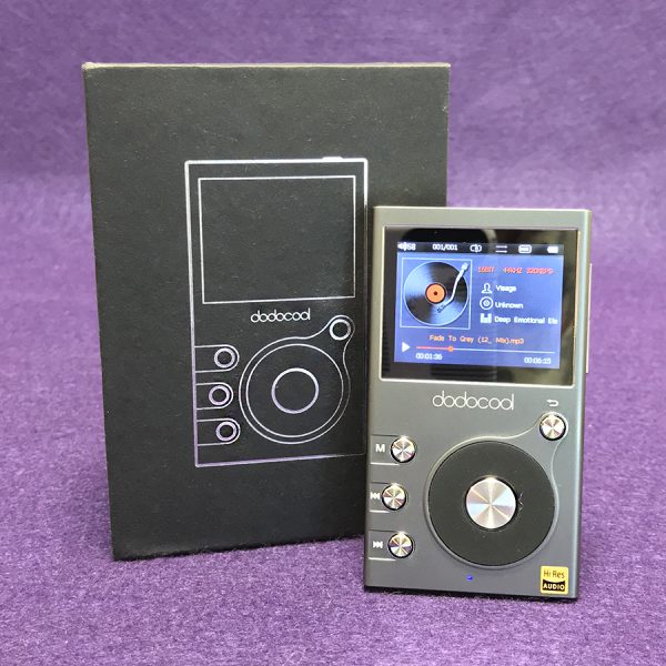
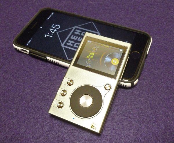
Let’s begin with what exactly the Dodocool DA106 player is: The DA106 is a small player that will play music files much like an iPod Nano (remember those?). However, unlike the Nano—or any other iPod or iPhone, the DA106 can play hi-res music files. And it sounds great doing it. Plus, Apple has discontinued all iPods except the Pod Touch, which is basically an iPhone without the phone part.

Design and features

And, oh is it cheap—in price only! The DA106 practically qualifies as an impulse buy. Yet it is built as well and with as many features as players costing much, much more.

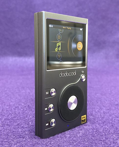
The Dodocool (can we change that name?) DA106 is a small, solid aluminum clad player that’s made for people who own their music in the form of ripped CDs and/or digital files. Since it’s a hi-res player, those files can be much higher resolution than what an iPod could ever handle. Higher res files sound better with more dynamic range and richness than any lower res MP3 file ever could. Keep in mind however, that recorded music quality is as dependent on the initial recording as how it’s been ripped or downsampled.

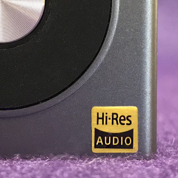
If you’re unsure what I mean by high or low resolution music files, it’s this: Songs bought from iTunes are 256 kbps (kilobits per second). That sounds large until you learn that CD tracks are 1411 kbps—quite a difference. Now people who are serious about digital music prefer even larger files upwards to 2,224 kbps and more. After a while it starts to get a bit silly. Suffice to say that the Dodocool player will play files up to 192kHz/24bit—far higher than a human ear can detect. Confused? Me too, and I understand most of this stuff. All you need to know is that unless you are a hard core audiophile, the DA106 will play anything you can throw at it.

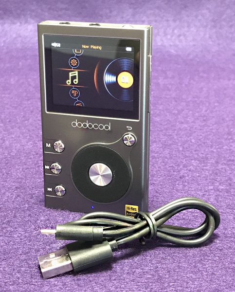
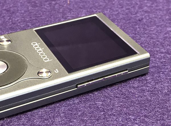
So how does the DA106 perform? That’s an open question, because up until now, nothing—and I mean nothing—equals the ease of use of the original iPod. Even now, iOS and Android aren’t as easy to navigate as the iPod’s original click wheel. The DA106 does have a click wheel that actually spins and clicks when you run your thumb over it. It’s not as smooth as the original iPod’s was. There are buttons next to the small click wheel that brings up File List, Skip Forward and Backward and a separate back button that goes to the previous selection. Apple managed to include these functions on the wheel itself—something that hasn’t been done since the iPod. Maybe Apple has a patent, because no one else is doing it.

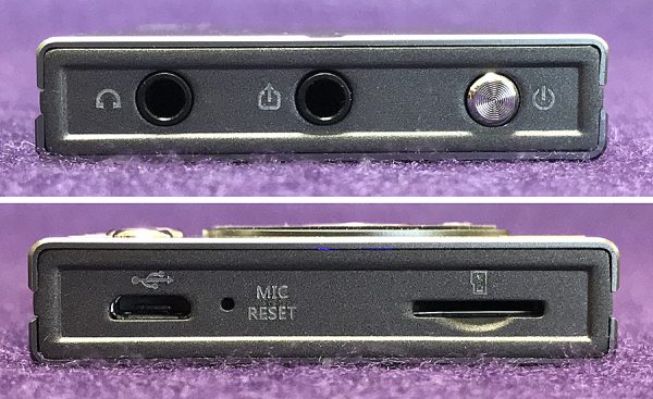
But enough comparison griping, because the Dodocool DA106 is one fine music player. It has a dual-core chip with DSD file support (this matters to audiophiles only). It’s solidly built and reassuring in its heft. It has 8gb built-in memory with an additional TF card slot that will accept a 256gb micro SD card. That’s a lot of music storage. There is 30 hours of playing time on a fully recharged battery.

But that’s not all. the DA106 has a built-in FM radio and an internal mic for recording either live voice or FM. If you conduct interviews, the DA106 will record the interview. However, note that there is no port for an external mic.

The DA106’s software is easily understood if a bit rudimentary. The small 2-inch color screen has a resolution of 320×240-pixels—not smart phone quality—but it is easy to navigate and read. That’s good because the included manual is almost useless. It points out what the slots and buttons are for, but that’s it. I learned what was where simply by clicking and scrolling.

The main window gives a choice of Files, Settings, Now Playing, Music, FM and Recording. Music offers more choices, but I mostly use Songs, Artists and Albums. Genres is useless and Storage lists what files are on the main internal memory and what is on the card. In the Now Playing section, there is a built-in equalizer. It’s confusing to use so I just leave it off—something I usually do anyway.

One big pain with the DA106 is that when the screen goes dark to save battery life, no buttons will wake it up—except the power button. Having to press the power button each time just to wake the player up gets old quickly.

So, how does the DA106 sound? Since it’s a high-end player, I decided to pair it with the Audeze iSine10 earphones. Due to their musical accuracy, these planar magnetic wonders will bring out the best—and worst—in music. I’m happy to report that the DA106 works quite well with the iSine10 earphones. The high-res music I loaded sounds natural and transparent. Bass might be considered a bit weak, but it isn’t—it’s just accurate. Anyway, that’s more of a function of the iSine10’s than the DA106.

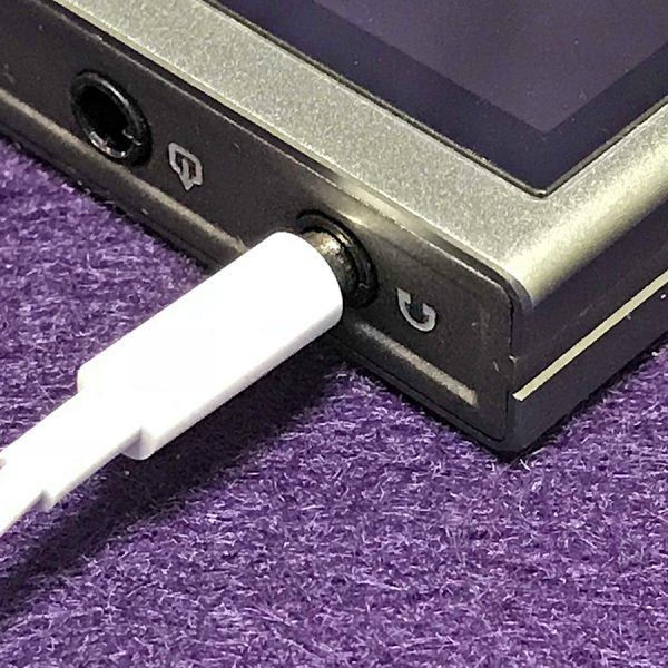
Note that the iSine10 earphones have to be hardwired to the DA106—there is no Bluetooth. However, there is line-out port next to the headphone jack located at the top of the player. This port allows the DA106 to be connected to an external player (such as a dash-mounted car player) and bypass that players usually inferior amp. Music plays louder when connected this way.

It doesn’t matter what genre of music I listen to with the DA106. It all sounds good, however you’ll get more bang for your buck by listening to higher resolution music files since that’s the reason why the DA106 exists. Lower res MP3s won’t sound any better than they do on your standard smartphone.

Going back to my Tale of Two Cities analogy at the beginning of this review—using the DA106 makes me sad because I keep wondering if the market for stand-alone music players is viable for the long term. As good as some of these players are—and the DA106 is an amazing player—I have never seen anyone on the street using them. Anyone I see listening to music in public is listening from a smartphone—every time. The mantra seems to be convenience over quality. Plus, let’s face it—MP3s and AAC files, Bluetooth and streaming are sounding better and better. Within a few short years, I can’t envision DAPs mattering anymore, except in the expensive and rarified high-end music arena with players costing upwards of $1000 or more. The inexpensive DA106 doesn’t fit into either the convenience or super high-end market.

Positives

  • Well built—as good as players costing much more
  • Solid—aluminum construction
  • Sounds great
  • Very Inexpensive

Negatives

  • Must press power button to wake

Final thoughts

Despite my misgivings about the viability of the DA106’s existence, it is a well built digital audio player that can easily compete with players costing much, much more. So if you’re interested in using something other than your smartphone to house your music collection, the Dodocool DA106 is a great place to start.

Price: $44.99
Where to buy: Amazon
Source: The sample for this review were provided by Dodocool. Please visit for more information.

Üllo Wine Purifier review

We drink a fair amount of wine in our world. From my wife’s Friday evening wine club to our many social engagements, we have the opportunity to indulge in some very good vino. A majority of the wine we consume comes from what most would consider classic vineyards. That said, we have several friends and coworkers who only drink sulfite-free wines. They usually pay extra and do not have nearly the selection we do across the board. So, when Julie asked if we wanted to try the Üllo Wine Purifier, the chemist in me thought it would be fun and interesting to see if it really removes the sulfites without impacting the wine itself.

The Üllo Wine Purifier is relatively simplistic in its design. The housing is engineered to hold a filter meant to remove a majority of the sulfites as you pour wine thru the assembly. The Üllo can de-sulfite both white and red wines, removing the sulfites added during the bottling process as a preservative.

According to the Üllo Kickstarter page — “An estimated three million Americans are sensitive to sulfites resulting in allergies or respiratory problems, while countless others blame these chemicals for headaches and hangovers”.

Üllo is a Chicago startup with a simple mission to bring wine back to its natural state. Doctor James Kornacki is the inventor of Selective Sulfite Capture™ technology and holds a doctorate in chemistry from Northwestern University. He founded Üllo in 2014 in Chicago as a Kickstarter effort that raised over $150k with thousands of backers.

  1. POUR – All wine contains sulfites, which are artificial preservatives added during production. They are no longer needed once the bottle is opened.
  2. PURIFY – Proprietary polymer technology filters away free sulfites and their bitter taste, while allowing other compounds in wine to flow through unaffected.
  3. PURE WINE – Through Selective Sulfite Capture™, free sulfites are reduced to a more naturally occurring level for most wines.

The ultimate goal is to “return wine to its natural state as if you opened the bottle right at the vineyard.” The Üllo is designed to remove the sulfites, restoring wine to its natural, preservative-free state thus reducing the bitter aftertaste that the chemical many times causes.

In the Box:

  • Üllo Wine Purifier
  • Travel bag
  • Display base
  • 4 Selective Sulfite Capture single bottle filters

Specifications:

  • Dishwasher safe, BPA-free materials
  • Height: 5 7/8” x Width: 4 3/8”
  • Üllo filters are made in the USA

The Üllo assembly is made from three pieces of BPA-free plastic and rubber that all click together, are easily pried apart, and dishwasher safe. Here you see the filter that contains a porous, food-grade polymer which selectively removes sulfites while allowing the other compounds in the wine to flow through unaffected. Each filter is supposed to reduce sulfites to less than 10 ppm (parts per million) for one bottle of wine.

The Üllo is engineered to be flexible in how you use it. If you prefer wine by the glass, the Üllo is designed to sit on top of a variety of wine glasses.

Or by the bottle, the Üllo can also fit inside or on top of the mouths of a multitude of carafes and decanters as well.

As I mentioned above, the Üllo Wine Purifier can not only remove/reduce sulfites, but the internal design can aerate red wine or allow white wine to flow thru. That said, I have to add this is the Üllo’s only design weakness. We tried a multitude of different bottles of wine thru the Üllo and even sitting minutes after pouring, we found the aeration it provided lacking. We have gotten used to and prefer the substantial aeration that the Aervana electric aerator produces. But we did try the Üllo in tandem with the Aervana and I believe that achieved the best results.

Does it work…

Well, that is the 24,000 dollar question. And truth be told, I cannot give you a concrete answer without sending samples to a lab for analysis. Being the nerdy scientist I am, I would LOVE to give you some cold, hard numbers into what is a pretty subjective review.  All I can give you (for the moment) is the report out from the Wine Club. And sadly results were all over the board. We tried the Üllo wine purifier on several occasions with a variety of nice wines: I found it smoothed out the flavor, a few found no change, and one thought it made the wine more acidic. Like I said…extremely subjective :-/ .

My hope…

We have friends and coworkers who happen to make wine, with several of them owning full-scale wineries. We stopped by one of them to pick up a case for the holiday get-togethers and my wife mentioned the Üllo wine purifier to Steve, the owner. Well as the story goes, Steve was very interested in not only the chemistry of it but the potential for selling it to those sulfite-sensitive/allergic folks. He says sulfite content is a question that is regularly asked. Steve was so interested, that he volunteered to not only try the Üllo but send a few samples to his lab to see if it truly works. If/when he has results I’ll update this review with some rubber meets the road data. But until then, all I can say is that I found the wine smoother with the Üllo than without it.

Bottom line…

The Üllo Wine Purifier seems like an ideal gift for those sulfite-sensitive/allergic folks you know. The Üllo itself comes with four filters and costs $80. The Selective Sulfite Capture single bottle filters cost approximately $3 each and are available in packs of 6 or 15. The Wine Club thought the filters were a bit pricey on a per bottle basis. But considering how expensive and limited sulfite-free wine is, the cost may be worth it for those needing/preferring low sulfite wines.

Source: The sample for this review was provided by Üllo. Please visit their site for more info and Amazon to order.


Product Information

Price: $80
Manufacturer: Üllo
Retailer: Amazon
Pros:
  • Removes a majority of sulfite from wine
  • Restores wine to its natural, preservative-free state
  • Easy to clean and store
Cons:
  • Aeration could be better
  • Filter cost

Filed in categories: Reviews

Tagged: , ,

Üllo Wine Purifier review originally appeared on The Gadgeteer on December 9, 2017 at 11:47 am.

Note: If you are subscribed to this feed through FeedBurner, please switch to our native feed URL http://the-gadgeteer.com/feed/ in order to ensure continuous delivery.

Dittrich Designs AllDock multi-device charging station review

Organizing our workspace and dealing with the perpetual need to charge our devices frequently seem to work at cross-purposes. Cables sprawl around mice, keyboards, and desk trinkets. A stand just for charging can seem like a lot – unless it can organize all the cables and charging devices into a single location. This is the mission of the AllDock, a new product series from Dittrich Designs. I was sent a medium model in walnut to test.

Note: Photos may be tapped or clicked for a larger image.

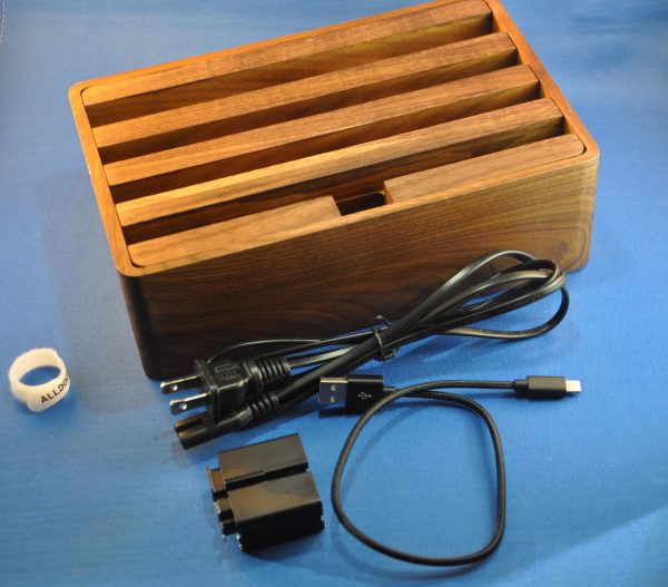
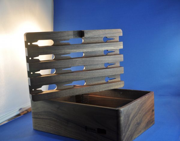
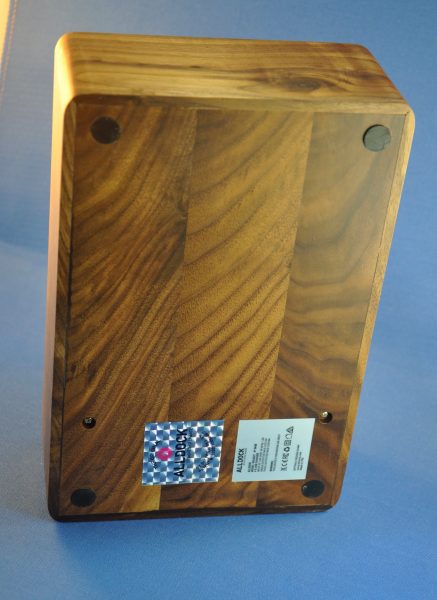
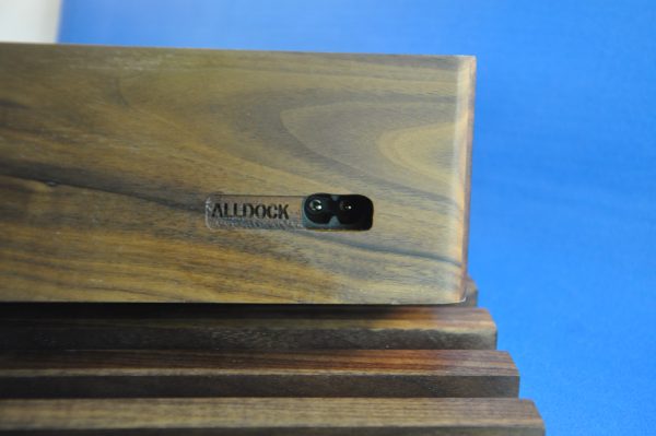
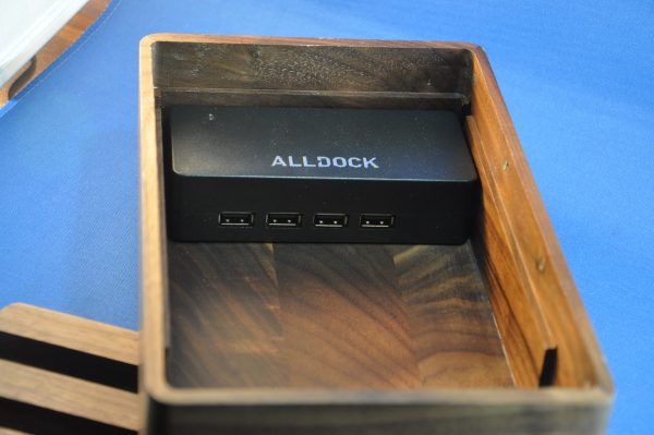
The AllDock is attempting to cover the ground that other charging platforms have in the past, but it uses warm, full grain, real wood to hide the technology. The base itself is a solid box of walnut or bamboo, 2.75” x 6” x 9”. Lengthwise across the top are four channels with three tear-drop cord holders in the bottom. Under the top, a 4-port high-quality USB charger is installed, so that you can attach cables to each port, and thread them up through the ports. From there, you can plug your device in, and stick it down into the channel with the power plug in the teardrop hole, and your screen upright for use. This could work great for a conference room, break area, or coffee shop, where you want to provide charging, but don’t want a bunch of ugly chargers and cables strewn about.


The top is held in place by six pairs of rare earth magnets along the long sides. They are strong enough that I can lift the box by one of the top crosspieces and shake it, and it won’t let go. Once you “help” it with the other hand, it lifts readily, and you can change the cable arrangement at will.


The channels are of two sizes: the rear-most is .75”, while the other three are .5” each. My iPhone can fit into the smaller ones, even with the Apple Leather cover attached, but most cases forced usage of the rear slot. Without a case, my iPad Pro 10.5” can fit any channel in portrait, but even the thinnest case is too much for them, mainly because all my cases have covers, so they have to fold over. My Lovely Bride’s OG iPad mini fits either orientation without a case, but the case, again, is too thick, since it is a fold-over.
The front bar has a one-inch gap in the middle, which makes it perfect to press the home button of the device in that front-and-center position. The weight and bulk of the box make it very sturdy for using an iPad in portrait mode (as I’m doing now) so that you can use a standalone keyboard.


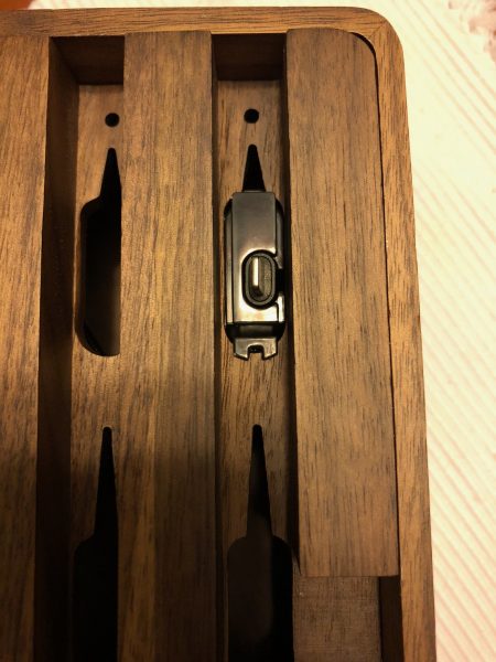
A few add-ons are available. One, a one-handed dock for Lightning, was included. You insert your cable, clip the holder up into the teardrop slot, and the cable is perfectly placed to receive your phone or iPad. Other add-ons include a hanging mount for an Apple Watch and a “sidecar” for Apple AirPods. You can even get a wireless charger to install, and lean your Qi comparable device against it.


I lied earlier when I said it was only available in wood. I didn’t want to spoil the mood. They also make slightly cheaper versions in a black or white ABS plastic, and the rack tops can all be mixed and matched. There are other sizes as well. A 6-port “Large” model, and an 8-port Tower with no rack are available. One thing to note is that each device has a full 2.4 mAh connection per port. The 8-port model delivers a whopping 19.2 mAh, the 6-port totals 14.4, and the 4 port 9.6. Few multi-port chargers deliver this amount of power per port.

I have a friend who claims I have a stand addiction. He said at dinner the other night “Smythe has never seen a stand he didn’t like – or buy.” He’s only partly wrong. There are some I like but didn’t buy because they weren’t something that would fit in my life. There were also some that I really wanted to like, but just had too many negatives to overcome. Sadly, for me, the Alldock falls into this category. It’s beautiful and made from quality materials, and the electronics are first-rate. The issue I have is that the grooves are too narrow to use with all but naked devices. I have cases on my iPads and my iPhones. Taking them out of the case is a hassle if I’m only doing it for charging, or even to leave on my desk while working. What do I do with those cases while I’m working with the naked iPad or iPhone? I have several different stands – some at work, others in various places around my home, and the only one that requires me to remove the case is the Flote stand, which I use least of all.

Source: The sample for this review was provided by Dittrich Designs. Please visit their site for more info and Amazon to order.


Product Information

Price: varies by size and material. As reviewed, $159.00.
Manufacturer: AllDock
Retailer: Amazon
Requirements:
  • Device cables, Thin devices for charging
Pros:
  • Full power per port for charging
  • many options for how to arrange devices
  • extra "sidecars" for earpods and Apple Watch
Cons:
  • channels for devices are too narrow for cases
  • Nothing wider than portrait for iPad

Filed in categories: Reviews

Tagged: ,

Dittrich Designs AllDock multi-device charging station review originally appeared on The Gadgeteer on December 9, 2017 at 8:37 am.

Note: If you are subscribed to this feed through FeedBurner, please switch to our native feed URL http://the-gadgeteer.com/feed/ in order to ensure continuous delivery.