Mohu Leaf Glide indoor HDTV antenna review

With the increasing popularity of streaming media like Netflix, Hulu and Amazon Prime, it’s becoming a much easier decision to cut cable and satellite TV from one’s monthly bills. I cringe every time I look at a statement from my cable company, and it seems to get more expensive with every passing month. But dropping cable doesn’t have to mean doing away with live TV altogether with ever-improving HDTV receiver technology, like the kind included in Mohu’s Leaf Glide antenna.

What is it?

The Mohu Leaf Glide is a compact, amplified HDTV antenna that promises the simplicity of an indoor antenna with the reception power of an outdoor antenna. It pulls in available free HDTV channels within a 65-mile radius.

Hardware specs

  • Powerful HDTV antenna with a 65-mile radius
  • Patented SignalLift technology is the best at receiving VHF channels
  • Amplified by Jolt™ with Clean Peak™ filter technology, removes unwanted RF signals and boosts the ones you want
  • Multi-directional, no “pointing” required
  • Paper-thin, reversible (white on one side, black on the other) and even paintable to match decor

What’s in the box?

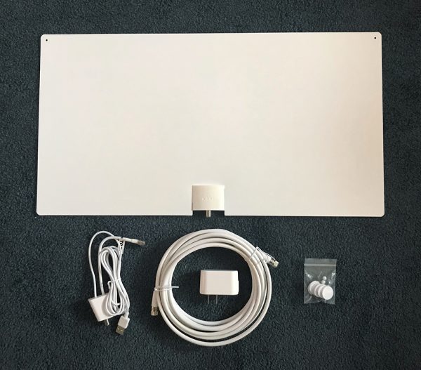
  • Leaf Glide antenna
  • 16’high-performance cable
  • USB/Cable connector
  • AC Adapter
  • Push pins and velcro stickers for mounting

Design and features

The Leaf Glide antenna was really simple to install. We’re talking 5 minutes and done. Since the antenna is essentially a sheet of plastic with a cable port on the bottom, it can easily be hung on any wall with the provided push pins.
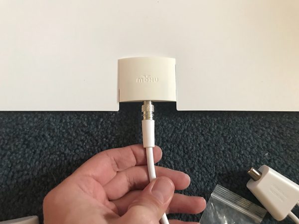
Step one – connect cables.

I like the fact that it has a black side and a white side. My walls are white, so the antenna is fairly unobtrusive.
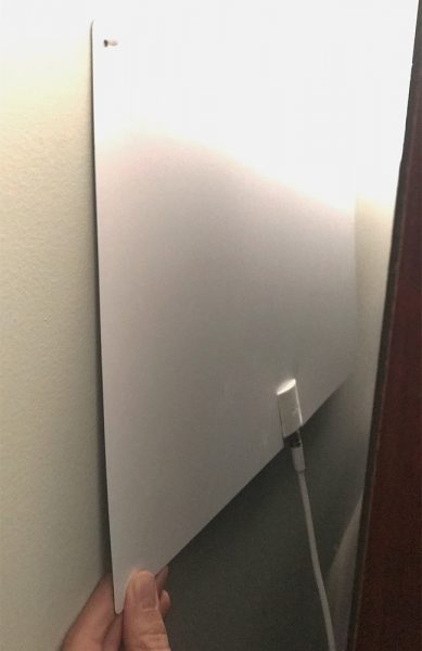
Step two – pin to the wall.

All I had to do was hook the cable the antenna, attach the USB power module, and hook that to the cable and USB ports on the TV.
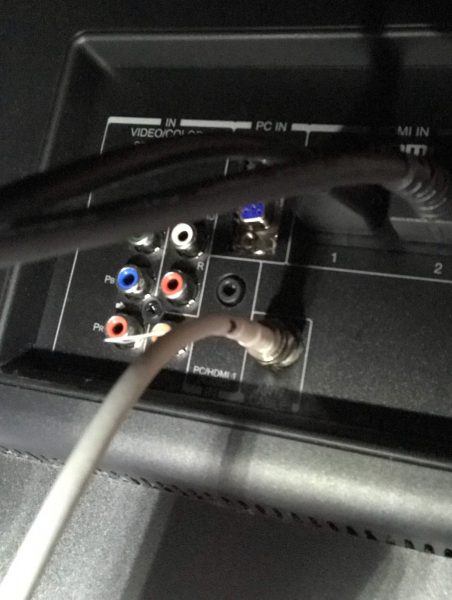
Step three – connect to TV coax port.

There is also an AC adapter that can be utilized, but the USB port on my TV seemed to be enough to power the antenna.
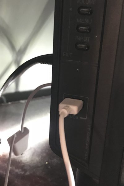
Step four – connect USB power to AC adapter or TV.

After a 5-minute channel scan, the channels were automatically indexed and added to my TV’s memory. I suspect that a lot of modern TVs will have the same type of easy channel scan in the setup menu.

My first test was to see how many channels were detected vs. how many were listed on Mohu’s website for my area. There is a search function on their website that will list out expected channels for your area. When I entered my ZIP, 20 channels were displayed, which sounded pretty great.
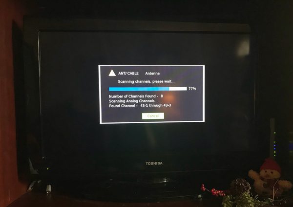
Step five – scan for new channels.

However, my TV scan saved only 10 channels into the memory. I tried adjusting the position of the antenna on my wall, moving several feet at a time, to see if that would affect the number of detected channels, but it didn’t seem to matter much.

I do wonder if I were to move the antenna upstairs if that would help. I live in a townhouse, so I have a house on either side of me. I may be a bit too insulated by housing material to pick up on that full list of 20 channels.

That said, the channels that did come in performed fairly well. Most of them were 3 “bars” on my antenna strength indicator on my TV  and also were in full HD. The signal remained strong and clear on most channels. A few of the weaker signals cut in and out a bit, enough to make it less than watchable. Really, I think I had about 7 good channels.

Step six? Free TV.

That’s not to say it’s false advertising on Mohu’s part. Their information is gathered from the FCC and the radius and results don’t take into account terrain. For instance, I live in a large valley, which might be too low for some of the signals to reach.

Their site also recommends trying different locations for the antenna until you get the best results, which means repeated attempts at moving, scanning, moving again, and scanning once more until you get the best results. I might try to do this to see if I get better/more reception.

It definitely brings to mind trying to position those old rabbit-ear antennas on the tiny TV I had in my room so long ago. I could juuuust manage to pull in Fox in order to watch The X-Files. This feels like a high-tech version of that old song and dance.

Anecdotally, for comparison’s sake, I had once tried a non-powered antenna on my TV, and it found zero channels. I just couldn’t get it to work from multiple spots in my living room and quickly returned it. So to find any channels at all with this antenna seems pretty great.

Positives

  • Easy to install
  • Can be powered by TV’s USB port
  • Paper-thin, unobtrusive design

Negatives

  • Didn’t quite find all the channels promised on the website channel search, but those results are based on a perfect topography
  • Still requires multiple antenna location tests as well as living in a good reception area

Final thoughts

I was impressed by the design and ease of setup of the Glide. It feels like cheating, in this day and age, to be able to plug in a sheet of plastic and get even a handful of free HDTV channels. I’d love to see how many more channels I could get with a little repositioning when I have the patience to attempt that.

For anyone thinking of cutting cable or satellite TV from their monthly bills, this is a great little tool for doing just that, well, depending on your location. It’s the perfect combination of size and power in an internal HDTV antenna and might be able to find quite a few more channels than a non-powered antenna.

Price: $74.99
Where to buy: You can purchase the Leaf Glide directly from their website and Amazon.
Source: The sample of this product was provided by Mohu.

Kodak Pixpro Orbit360 4K VR Camera review

The Kodak Pixpro Orbit360 4K VR Camera is a consumer level camera that has been designed to let you get your feet wet in the world of VR/360 cameras in an easy and fun way. They sent me their Pixpro Orbit360 Satellite Pack that includes a collection of accessories. Let’s take a look.
What is it?

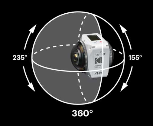
The Kodak Pixpro Orbit360 VR Camera is a 3 in 1 camera that can shoot 4K video like GoPro action camera,  4K 360-degree video, and 4K 180-degree video. Although it sports the Kodak brand, this isn’t actually a Kodak camera. It’s made by JK Imaging who is a licensee of the Kodak camera brand.

Hardware specs

Image Sensor A
Effective Image Sensor Pixels: 20.68 Megapixels
Focal Length: 1.633 mm
F number: F2.4
Lens Construction: 7 groups 8 elements
Focus: Fix Focus
Field of View: Max. 197 Degree [For Front Mode (16:9)]
Max. 155 Degree [For VR Mode (2:1)]
Focusing Range: 30 cm — ∞

Image Sensor B
Effective Image Sensor Pixels: 20.68 Megapixels
Focal Length: 1.257 mm
F number: F2.4
Lens Construction: 7 groups 8 elements
Focus: Fix Focus
Field of View: Max. 235 Degree [For Front Mode (16:9)]
Focusing Range: 30 cm — ∞

Electronic Image Stabilization (EIS)

What’s in the box?


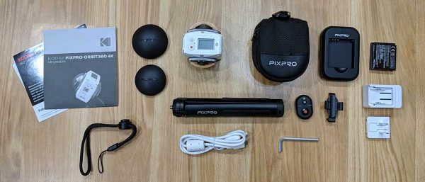
  • Kodak Pixpro Orbit360 4K VR Camera
  • Lens Covers
  • Protective Covers
  • Li-ion Battery + Charger
  • USB Cable + AC Adapter
  • Camera Carrying Case
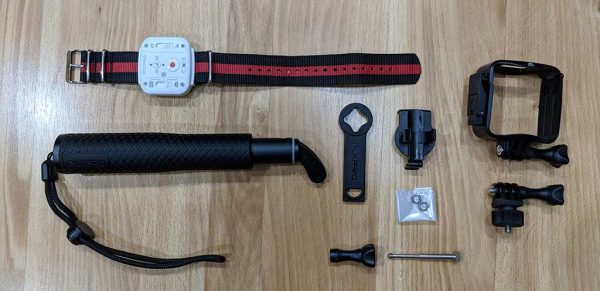
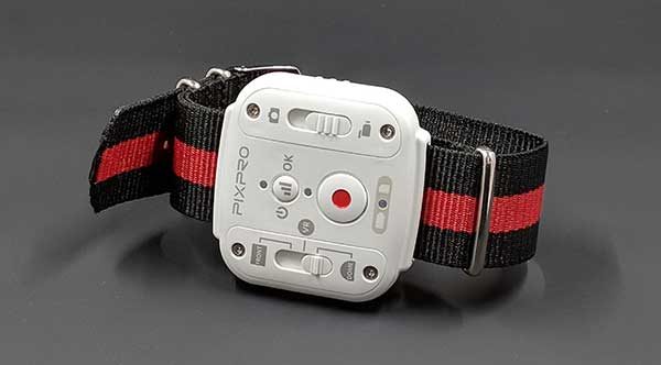
  • Wearable Remote Control, Mini BT Remote Control
  • Remote Control Mounts
  • Standard Housing
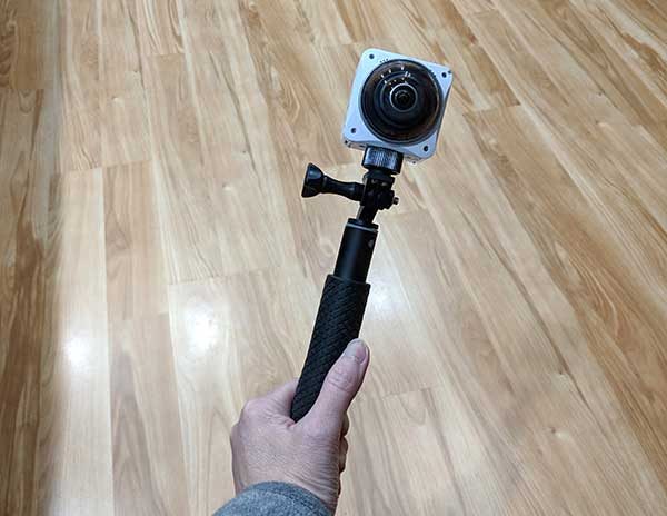
  • Selfie Stick, small tripod
  • Accessory Tool & Thumbscrew Adapter
  • Screw Mount
  • Cleaning Cloth
  • Quick Start Guide, Service Card, Online Company Store Card, Warranty Card, Team 360 Sticker

Design and features

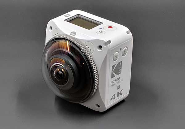
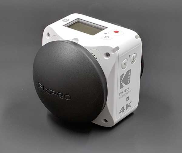
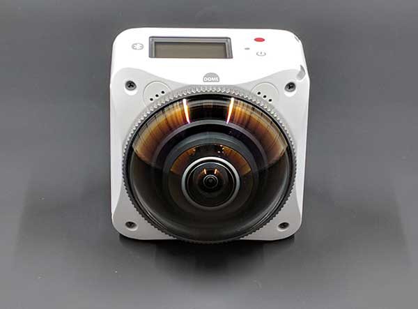
At first glance, the Pixpro looks like an action camera. But that’s just at first glance. It doesn’t take long to realize that the Pixpro is not an ordinary action camera. One give away is the dome-shaped lens cover that protects the 20.68MP lens.

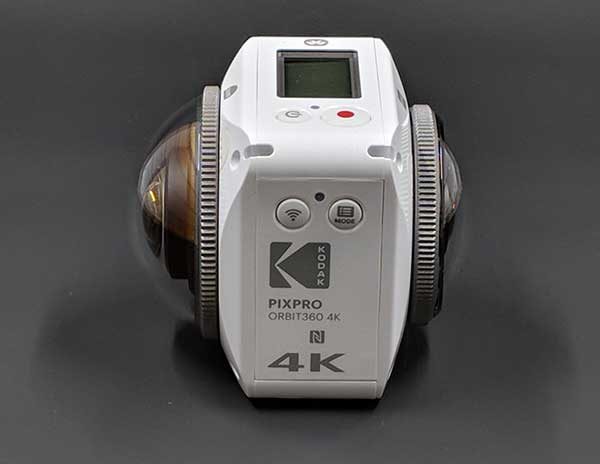
But the Pixpro doesn’t have just one lens, it has 2! The larger dome-shaped lens (B) is the 235-degree lens and the smaller lens (A) on the opposite side is a 197-degree lens.

To get a 360-degree image, both lenses are used and the images/video are stitched together.

Included with the Pixpro are 2 lens covers that protect the lenses when the camera isn’t being used. The covers do not have a way to attach them to the camera itself or anything else, so it seems like it would be easy to accidentally misplace them.

You would think that a 360-degree camera with two lenses would have all sorts of buttons, switches, dials, and displays, but the Pixpro has a relatively simple design.

On one side of the camera, you will find the WiFi toggle button and a menu button.

At 10 and 2 o’clock above each lens are built-in microphones and on each upper right corner is a status LED for each lens so that you will know which lens is recording video.

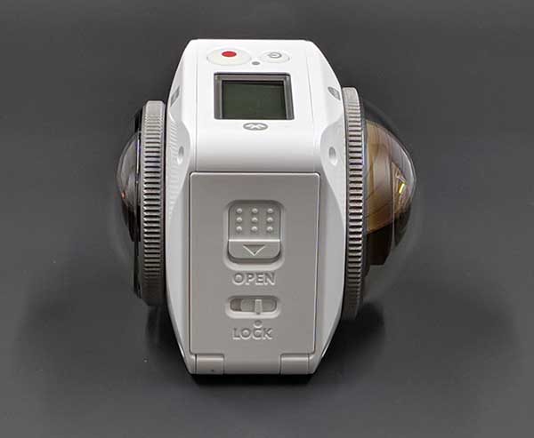
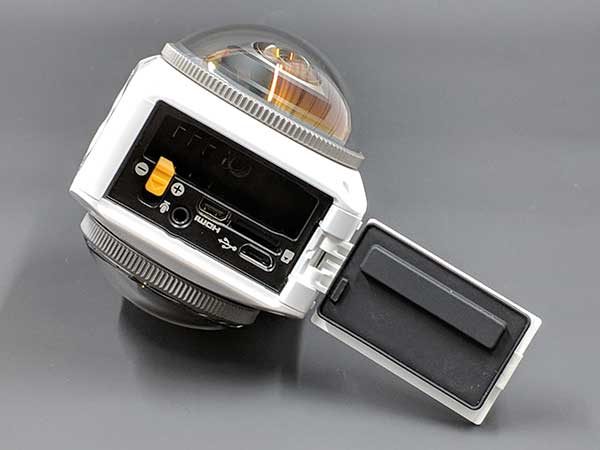
The other side of the Pixpro has the battery compartment.

Opening the latch reveals a removable battery, a micro USB port, a micro HDMI port (cable not included), a microphone jack (cable sold separately),  and a micro SD card slot (also not included). You’ll want to use a Class 10 or higher 8GB – 256GB micro SD card with this camera.

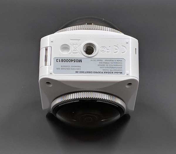
The bottom of the Pixpro Orbit360 camera is a standard sized threaded tripod socket.

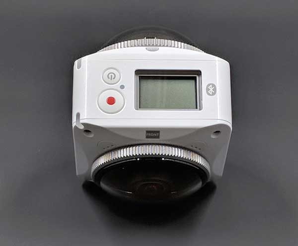
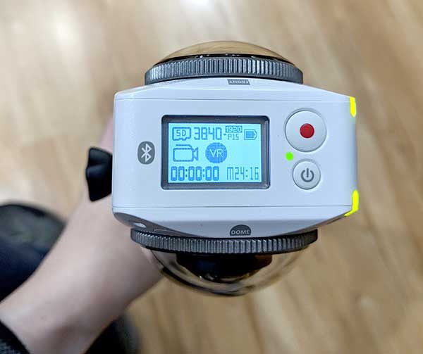
And the top of the camera has a small LCD, power button, and shutter/record button.

Unlike a lot of midrange action cameras on the market, the Pixpro’s display is very basic with no touch features. You have to use the menu button and WiFi button to navigate through the menus.

Luckily, the Pixpro Satellite Pack comes with a wearable remote control that lets you easily switch modes from camera to video and VR modes without wandering around in the menus.

Before you can begin using the Kodak Pixpro Orbit360 4K VR Camera, you’ll need to charge the battery using the included battery charger or by connecting a micro USB cable to the camera and a computer or a USB AC adapter.

Once the Pixpro’s battery is charged and you’ve inserted a micro SD card, you can begin capturing images and video.

Desktop software

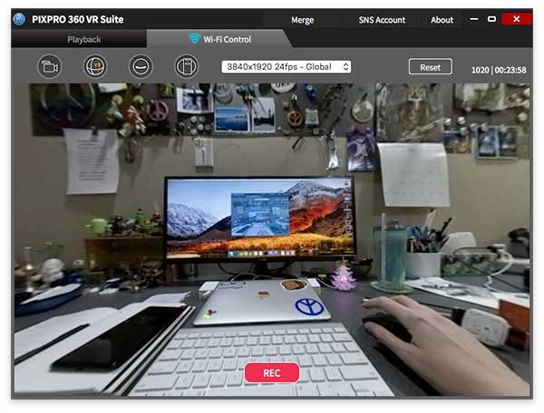
After you capture some images and video, you can install software on your PC, Mac, or smartphone that will provide a live view of the camera and help you process certain types of images and video.

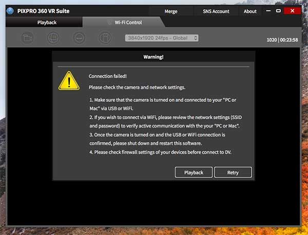
I downloaded and installed the free Kodak PIXPRO 360 VR Suite software on my 12-inch MacBook and had a lot of difficulties getting the camera to connect to my Mac and/or stay connected for any length of time.

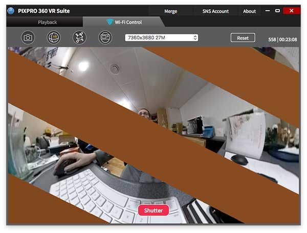
I also experienced odd graphical issues which I was told was due to my computer not being able to handle the streaming video connection to the camera.

Overall, I found the desktop VR Studio software to be buggy and frustrating to use.

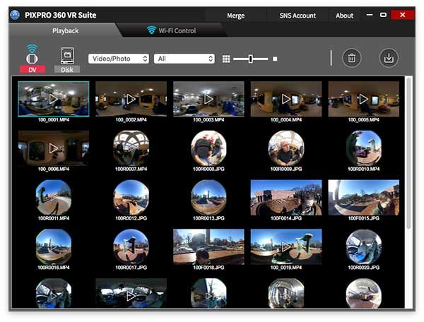
Loading thumbnails of the images and video stored on the micro SD card in the camera was painfully slow and anytime you would leave the file view to go to another part of the app, the list would have to load again when you came back to the list view.

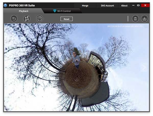
The only reason I even wanted to use the VR Studio software was to be able to create Tiny Planet pictures like the one you see above. I was finally able to create such a picture on my MacBook using the VR Studio macOS software but then found out that you CAN NOT export the Tiny Planet pictures from the desktop software to a new file on your computer. The only way to export it is to use the smartphone version of the software. What the heck?!

Smartphone software

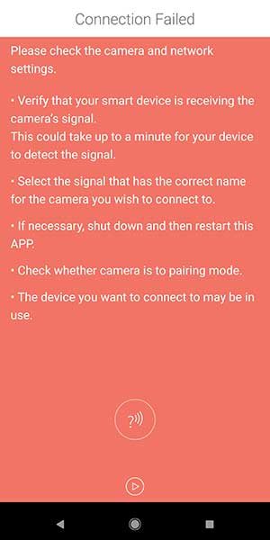
I had no luck at all connecting the Pixpro to my Pixel 2 XL using the Android app, but I was able to get it working on my Samsung Galaxy Tab S3.

Using the app isn’t difficult, but there’s way to live stream to Facebook or Youtube because the camera has to be paired with the mobile device in order to control and view the saved images and videos. While your mobile device or desktop computer is connected to the camera, it uses it’s own WiFi connection so you aren’t connected to the internet. The app will allow you to save video and images to the mobile device but it can take awhile to process a 360-degree video.

Image and video samples

Here are a couple images taken directly from the micro SD card.

You can click the image to see the original size but you won’t be able to pan around to see the 360-degree view when you’re viewing the JPG on your computer.

The problem with the images are the stitch lines. You don’t notice them that much in the image above…

But in this image, the stitch lines are pretty obvious.

I’m sure you’re wondering why you can’t pan around in these images since the Pixpro is a 360-degree camera. For a 360-degree view of static JPG images, you can view them through the VR Studio desktop or mobile app or you can upload the JPGs to social media sites like Facebook. Here’s a sample. Click to view.

Testing the Kodak Pixpro Orbit360 4K VR Camera

Posted by Julie Strietelmeier on Thursday, December 28, 2017

Another Kodak Pixpro Orbit360 4K VR Camera test.

Posted by Julie Strietelmeier on Thursday, December 28, 2017

Pixpro video is the same way, if you view the MP4 files on the micro SD card on your computer, they will have a weird ultra-wide angle look to them but no panning features. But your video will automatically have the panning feature when you upload them to Youtube (other social media sites like Facebook have this feature too, but I only tested video uploads on Youtube). Here are a couple 360-degree video samples:

You can pause and drag your mouse around in the video to see different views.

The Pixpro image and video quality were ok when captured in a bright setting, but low light video and images left a lot to be desired.

Positives

  • 3-in-1 camera
  • Easy to use
  • Removable battery
  • Nice build quality
  • Wearable remote makes camera control easy
  • Dustproof, freezeproof, splashproof and shockproof

Negatives

  • Expensive
  • Can’t live stream
  • Image quality isn’t impressive; visible video stitching seams
  • Desktop and smartphone software is slow and buggy
  • No way to attach protective lens caps or a safety tether to the camera
  • A waterproof housing is currently not available

Final thoughts

The Kodak Pixpro Orbit360 4K VR Camera was my first experience using a 360-degree camera. I wanted to love this camera and although I did have fun using it, I was disappointed in the video quality and quickly became frustrated when I wanted to view the images and video using the apps. Using the desktop and mobile app was annoying because you have to use a live connection to the camera instead of just loading the video files on your computer from the micro SD card. The app wouldn’t work at all on my Pixel 2 XL, felt slow on my MacBook, and was just ok with my Samsung Galaxy Tab S3. Considering the price, I feel this camera is overpriced for what it can do.

Price: $499.99
Where to buy: Amazon
Source: The sample for this review was provided by Kodak.

iOttie Easy One Touch 4 Phone car mount review

As long as there have been mobile phones, I’ve struggled with figuring out a place to mount them in a car. I’ve had iOttie car holders before, but I had a chance to try out some of the newest in the Easy One Touch lineup.

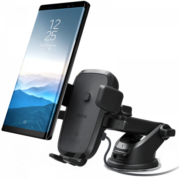
I recently purchased the Apple iPhone X, which finally features wireless Qi charging. Now I have a chance to try out the iOttie Easy One Touch Wireless Fast Charging Dash & Windshield mount.

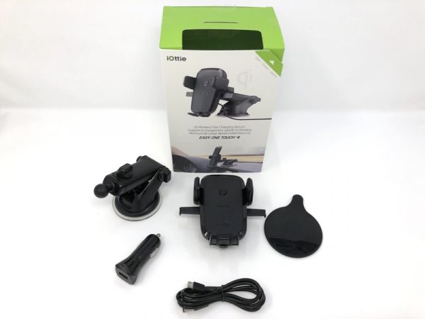
In the box, you get the cradle assembly and a USB adapter with plug (micro USB).

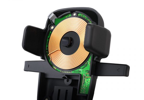
Somehow, iOttie managed to cram in a Qi charging coil around the holder trigger button.

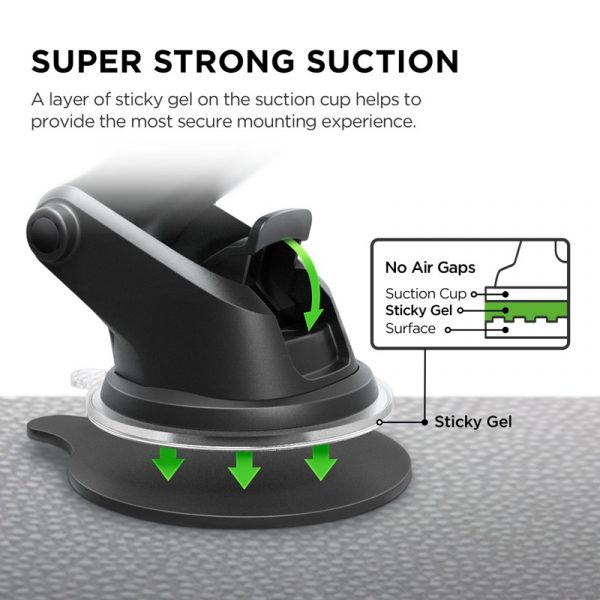
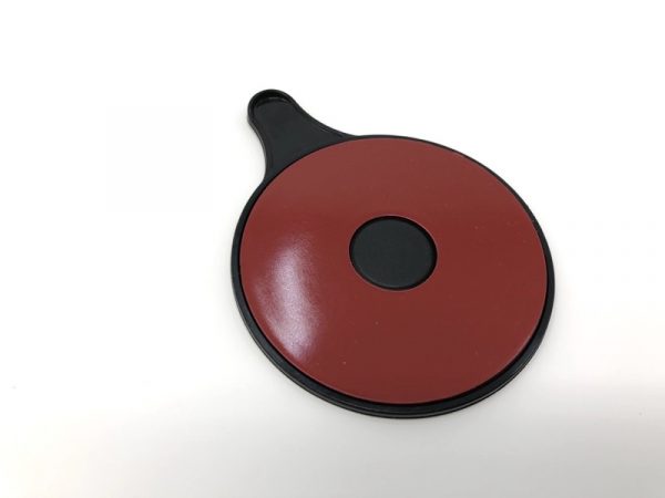
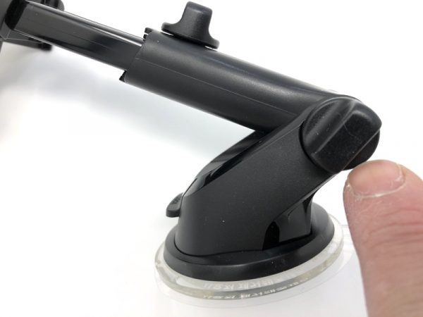
iOttie uses this sticky, gummy suction cup that’ll attach to darn near anything. If you have a curved or uneven surface, they’ve included an adhesive disk to help with adhesion.  The dark red circle is a peel-off backing.

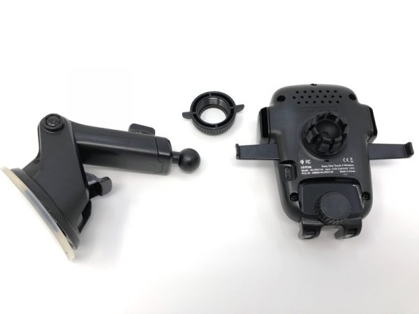
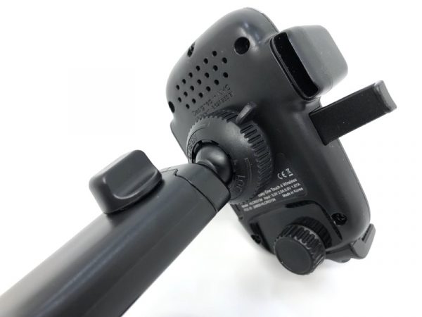
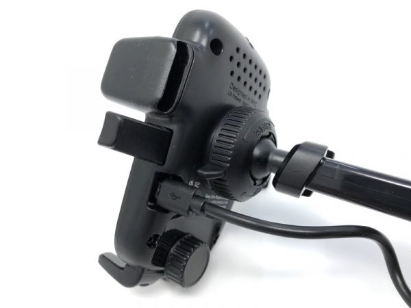
The back of the holder is a ball and socket joint.  A wingnut-style ring adds tension, keeping things in place. Note the ventilation holes on the back of the cradle for the charging electronics.

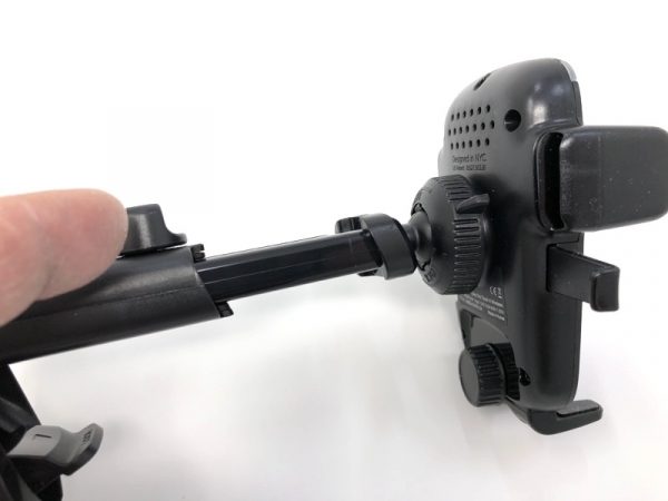
There are so many adjustments on the iOttie wireless fast charging cradle.  You can extend the holder…

…or adjust the angle…

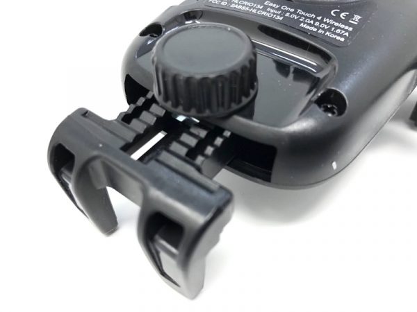
…and even change the resting height of the phone itself.  I found that with the iPhone X, this bottom “claw” could remain at the smallest position.

The included micro USB plug goes in the back of the cradle as shown.

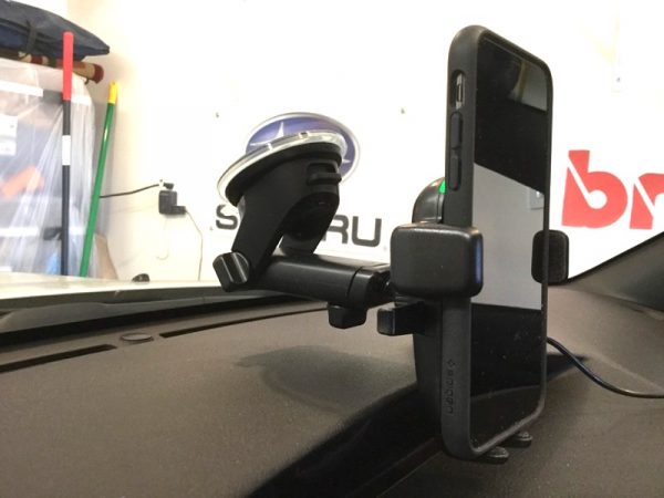
In this mounting example, I have the mount attached to the center of my windshield.  Always obey local laws when mounting your iOttie cradle. You can see the green charging LED in the upper-left corner of the cradle holder, next to the volume down button on the phone.

It’s a little hard to describe how the holder works, so take a look at the video.

When the “arms” are open, simply drop your phone in and the button/trigger on the backplate activates the spring-loaded grip. If your phone is Qi-compatible, charging begins. To release, simply squeeze the two release tabs.

I found the iOttie Easy One Touch Wireless Fast Charging Dash & Windshield Mount to be sturdy, adjustable, and incredibly handy if you want to charge your Qi-compatible phone without the hassle of plugs.

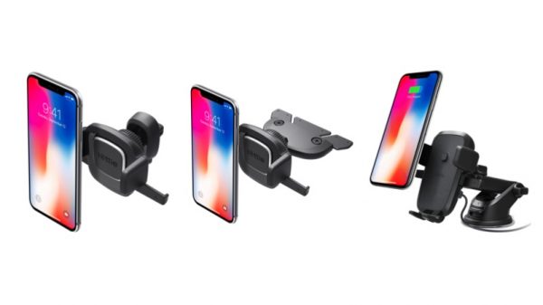
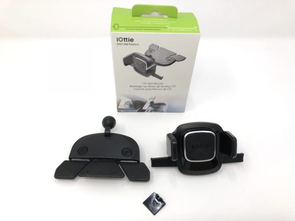
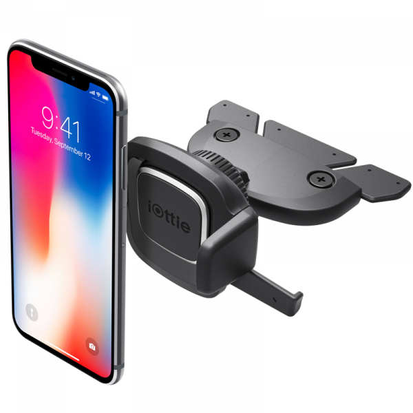
The folks at iOttie also sent me two other phone holders.  One was the Easy One Touch 4 CD Slot Mount.

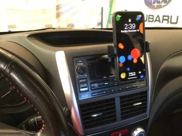
This is another style of phone mount that uses the CD slot in your car audio system. I haven’t used a CD in a very long time, so it made sense to use a part of the car that was not being used.

There’s not a whole lot to the package. There was a tiny black spacer which I didn’t use.

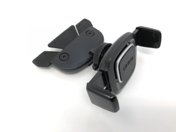
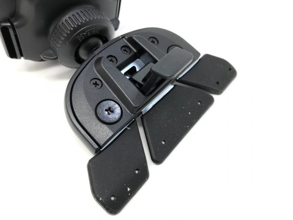
Like most of iOttie’s phone holders, the CD Slot Mount also uses a ball and socket mount, but a very peculiar “paddle” that goes into your CD slot.

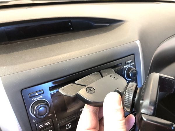
Here, I’m inserting the “paddle” into my unused CD slot.

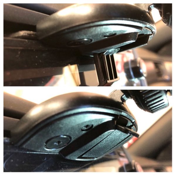
Once in place, you flip the locking tab in the up position.  This spreads the “paddle” inside the CD slot, giving the whole thing grip.

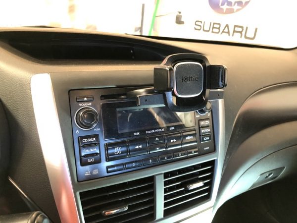
Here’s the holder in place…

..And the holder plus iPhone X.  I thought the iOttie Easy One Touch 4 CD Slot Mount was a pretty clever system, but it obstructed the view of my radio display. Of course, your results may vary, but this wasn’t quite for me.

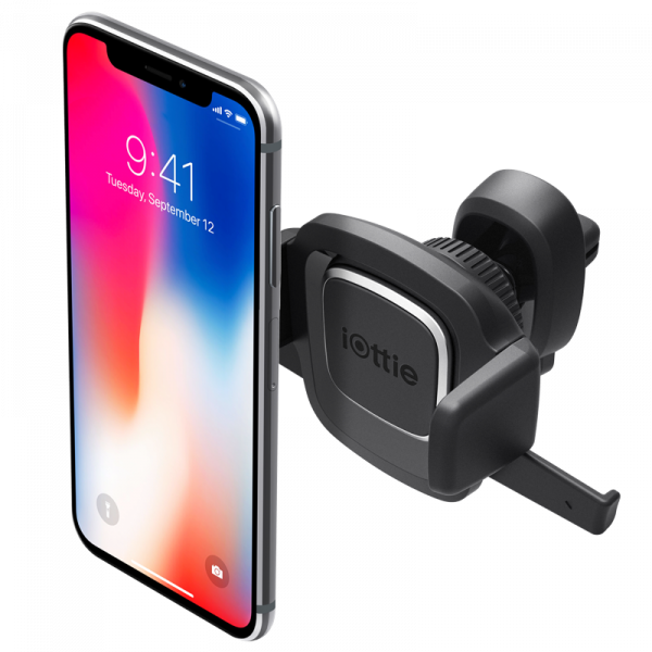
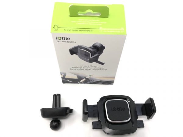
Finally, I tried out the iOttie Easy Touch 4 Air Vent Mount.

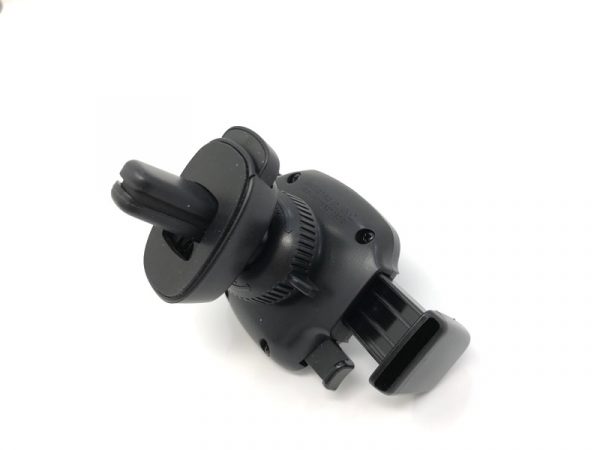
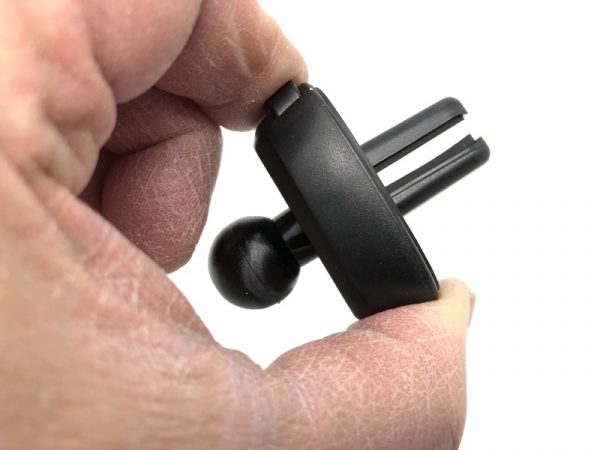
This mount is even more straightforward: It consists of just the spring-loaded mount and a duckbill-shaped vent grip on a ball mount.

The “duckbill” opens up just a little with a firm squeeze of the button. It’s pretty tight.

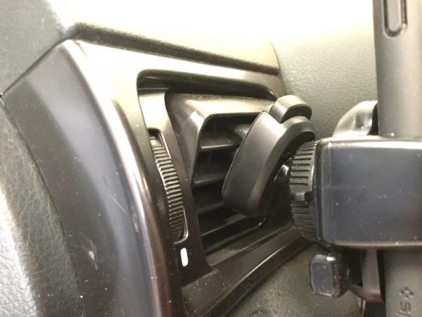
In my car, I found out that the mount causes my vents to sag down a bit. I had to play around with slot selection to get something that worked.

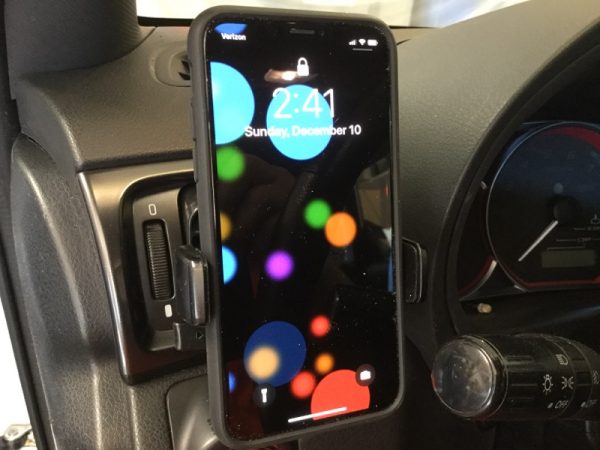
The results look great, however.  In my car, this position doesn’t block my view of the road or my car stereo display. The iOttie Easy One Touch 4 Air Vent Mount is a little more dependent on how sturdy your air vents are. In my car, they’re pretty wobbly.

Positives

  • The One Touch mechanism really works
  • Suction cup, CD slot, air vent… there’s probably a mounting solution that works for you
  • Qi charger lines up every time (Wireless Fast Charging model only)

Negatives

  • CD slot model may block displays or controls on your dash (CD Slot Model)
  • If your air vents are loose, you may get a wobbly fit (Air Vent Model)

Final thoughts

Not all of the iOttie car mounts worked perfectly, but I’d say the Easy One Touch Wireless Fast Charging Dash & Windshield Mount is my runaway favorite, but only because my CD slot location isn’t optimal, and my vents are a bit on the wobbly end.

Price: $54.95 (Easy one Touch Wireless Fast Charging Dash & Windshield Mount), $24.95 (Easy One Touch 4 CD Slot Mount or Easy One Touch 4 Air Vent Mount)
Where to buy: www.iottie.com and Amazon
Source: The sample of this product was provided by www.iottie.com.

Fossil Q Explorist (& Q Venture) Stainless Steel smartwatch review

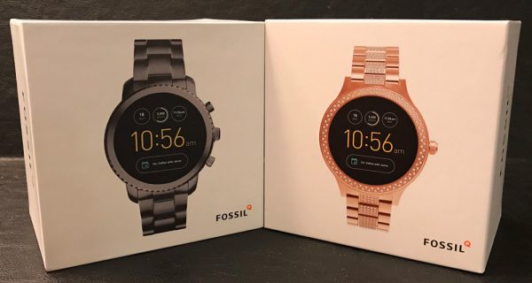
Since Fossil sent me two of their latest GEN3 smartwatches, one much more masculine than the other, I thought it would be fun to do a joint review. So I drafted a longtime gal-pal of mine to try out the bedazzled rose gold Venture since it was just too bling for me to handle 😉 . Kati isn’t the classic Gadgeteer tech-geek but does know and like her electronic gear to work when & where she needs it. We’ll see how the latest smartwatches from Fossil fair in a relatively niche and unforgiving market.
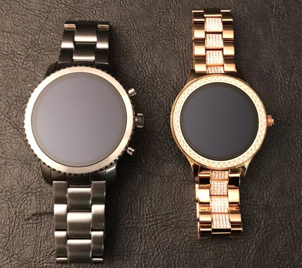
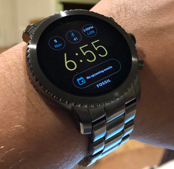
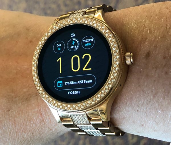
Dave’s comments are in black and Kati’s are in blue. Dave will be discussing the Q EXPLORIST SMOKE and Kati will be looking at the Q VENTURE ROSE GOLD-TONE both made from stainless steel.

Dave: the Q Explorist and Q Venture are both GEN 3 Android Wear smartwatches by Fossil featuring a solid list of features you’d expect in a modern wearable. Though there are a few features that are sadly missing as well.

Kati is a founding member and has been part of my wife’s Friday evening Wine Club forever. Sadly she’s had to listen to me go on about countless tech-toys I’ve reviewed over the years. Very glad she has agreed to join me on this review, cause, no matter how high-tech or futuristic something is, pink bedazzled just ain’t me…

Kati: Long-time reader, first-time reviewer, I am what you might consider a ‘late adopter’ of tech products, I like them to be well vetted and easy to use. My wearable tech experiences are mostly wireless earphones or Fitbit products. I am currently on my third iteration of Fitbit, using the Alta which I wear pretty much 24/7 to track exercise and sleep. Even for the tech I have, I use them sparingly (other than the Aervana electric wine aerator…but that’s a different review) and don’t want to work too hard to reap the benefits of my products, this is where I feel the Venture falls short, if I could access the tech faster and more intuitively, I might be more inclined to wear full-time. (see below for Apple vs Android comment)

Tech details

  • Storage: 4GB
  • Operating System: Android Wear™
  • Sensors: Light, Accelerometer, Gyroscope, Optical
  • Compatibility: Android™ Devices 4.3+ and iOS 9+ / iPhone 5+
  • In the Box: Wireless Charger (USB Type), Quick Start Guide
  • Connectivity: Bluetooth® Smart Enabled / 4.1 Low Energy, Wi-Fi 802.11 b/g/n – Powered by Android Wear™
  • Battery Life: Estimated all day

Functionality

  • Outside Temperature: Yes
  • Heart Rate: No
  • Activity Tracker: Built-In Fitness Tracker
  • Touchscreen: Yes
  • Notifications: Social Media / Text / Email / App Alerts / Multiple Time Zones / Alarm Clock / Calendar Alerts
  • Timer: Yes
  • Text and Voice: Yes

Physical details

  • Case Color: Black
  • Case Size: 46mm
  • Case Shape: Round
  • Case Thickness: 12.5mm
  • Case Material: Stainless Steel
  • Strap Closure: 2 Pusher Foldover Clasp
  • Strap Color: Black, Gunmetal
  • Circumference: 200 +/- 5mm
  • Strap Width: 22mm
  • Strap Material: Stainless Steel
  • Weight:

Wearability

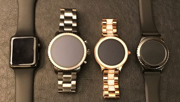
Dave: Neither smartwatch is small by any stretch of the imagination. But the Explorist is HUGE, measuring in at 46mm in diameter, 12mm thick, and weighing a hefty 5.6oz (aka 1/3 of a pound). This behemoth makes my already small wrist look like a toothpick. Though I’m pretty sure I could stop bullets like Wonder Woman with this slab of tech.

Kati: The Venture is smaller than the Explorist but still bigger than I would normally wear and heavy, but after a while, you get used to it. I did need to shorten the band, but no instructions on how to do this unless you go to the internet. Eventually, I used the tool that came with my Fitbit to shorten the band and it fit like a charm.

Dave: I needed to shorten my band as well. This is something you typically do once and you’re done with it. Many folks would just have a jeweler take care of this. I took mine to an actual Fossil store in a nearby mall. The guys there were happy to help me out and took care of it in about 5 minutes. They were all very interested in my Gadgeteer review lifestyle. Bottom line is that I was impressed Kati adjusted her band by herself…cause she has people who do this sort of task for her (aka me) but has been truly embracing her first Gadgeteer review.

Setup

Dave: The Fossil GEN3 smartwatches run Android Wear 2.0 and are compatible with smartphones running Android 4.3+ or iOS 9+. I’ve set up my fair share of smartwatches over the years, using both Android and iPhone alike. For me, setting up the Q Explorist went well and was uneventful. Basic watch functions, notifications, music, and fitness tracking all happened quick and easy (15 minutes).

Kati: This is where my non-tech world collides with Dave. I typically rely on Dave for most of my upgrades (ok, all) and I use a mix of ‘read the instructions’ and ‘push buttons until something happens approach’. This was good for this particular watch as the instructions were minimal, at best. I easily set up the app and connected / synced both, however, the app was silent on all the bells and whistles this watch has to offer. It assumes I know what I am doing…I don’t.

Dave: As Kati said, she typically gets her tech support from me. It usually involves “here please fix it or could you get this working”. But we thought it would be more “fun” for her to jump off the cliff to see if the parachute would open…guess it didn’t. 

Kati: I did add my email (I think) but still looking to download music so I can have only the watch and no phone when out for a walk. And I don’t even know all the other cool things this could do to improve my life. Hmmm – maybe I am in the vortex (of pain) between iPhone and Android apps…**looking at the help section I think this may be my issue…everything related to Google products and not my prime music or apple apps…might be good at the outset to mention it is Google-centric and not universal – unless I am missing something.

Dave: Yes, Kati is correct…it is much easier to use this watch if you lived completely in the Google ecosystem. But its no worse than if you had an Apple Watch & an Android smartphone.

Hardware

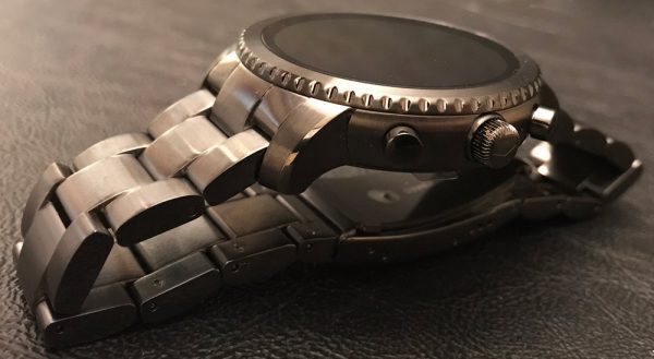
Dave: Other than size, color, and a bit of bedazzling, the main difference between the Explorist and Venture are the two programmable buttons on the right side of the Explorist.

Kati: uh, it has two buttons??

Dave: No, not yours… Though both smartwatches are made from stainless steel with a brushed gunmetal and rose gold finish on them. Both bracelets are more of the same and have a 2-pusher foldover clasp to keep them securely on your wrist. Both are well made and have a classic wristwatch appearance (other than the front face that is). The stainless steel is thick and heavy with a quality heft and feel to it.

Kati: I like the rose gold and would wear this as a work or ‘fancy’ watch, but cannot see it as a daily experience as I fear I would bang it up as the face is so large. (I do like the whole ‘change the look of the face on a whim’ option of the digital watch – who knew?) 

Dave: The front face has a large touchscreen that is responsive, vivid, and can be seen in daylight conditions. The watches also have a built-in microphone and speaker that is surprisingly loud and clear considering its size.

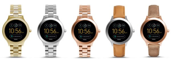
Both the Venture…

…are available in a multitude of colors and band choices.

Functionality

Dave: The Explorist and Venture are definitely smart wearables giving you the all the basics of time, date, notifications, fitness tracking (aka steps), music, swappable/tweakable watch faces, etc. But Fossil has excluded what I consider some key functionality: heart rate monitor, GPS, waterproofing…what I “need” for my epic workouts. The GEN3 of Q series smartwatches are much more fashion focused and a lot less fitness based. A choice that definitely bucks the current generation of other wrist-based devices.

Kati: I pretty much only use it for time, date and looking at steps taken. Obviously, this is me as I can’t figure out how to download music to take up the 4gb of space, but for what it has/I use, I like it. I kept a ‘review diary’ and multiple times I wrote something to the effect of “it’s different than I expected, but I like it.”

Dave: Both Kati and I found the battery life lacking. Kati’s experience worse than mine. On the days I worked out with it, I streamed music for about an hour over lunch and it was down to approximately 20% by dinner time.

Kati: Where mine rarely lasted a full day worth of use.

Positives

  • Quality stainless steel casing and band
  • Feels like a classic timepiece
  • Bright, vibrant color screen
  • Android Wear 2.0
  • Will be upgraded to Oreo

Negatives

  • Heavy and huge
  • Lacking heart rate monitor/GPS/waterproofing
  • Instructions are nearly nonexistent
  • No LTE option

Final thoughts

Kati: I’m like a magpie, easily distracted by sparkly things. This watch is all that and more. Anytime I wore it, I received positive compliments and I have to say, as a fashion watch, I quite like it. As a functional, everyday watch, I can’t commit as I want something that can take me from morning to gym, to work, and then bed to track sleep. Since this is ‘smart’ the charge did not last enough to track sleep. Plus there is no way that I would wear this gem to the gym for fear of damaging it and ruining what makes it so lovely. I do think if I was able to fully unlock all the functionality of the watch then I would use it more. But for now, it will be relegated to a beautiful, functional work or evening watch that is pretty, but more jewelry than high-tech wearable.

Dave: Fossil’s GEN3 Smartwatches are decent players in a crowded field but I say that with much subjectivity. It really boils down to what type of person you are and wearable you want/need. I completely agree with Kati about fashion vs function and perhaps features. As the workout enthusiast, I am, I want heart-rate, GPS, waterproofing (or at least sweat-/rain-proofing), to even consider a wearable on my daily wear list. Plus considering it’s size, the Explorist (or Venture) should have better battery life, all the additional features I mentioned, and heck LTE too. Apple, Samsung, and Huawei can do it…why can’t Fossil??? That said, as a smart fashion watch the entire GEN3 Q series of wearables would meet most people’s needs as a wearable but more as jewelry than fitness tool.

Price: $275.00
Where to buy: Available at Fossil or Amazon
Source: The samples of this product was provided by Fossil.

808 HEX TLS Bluetooth speaker review

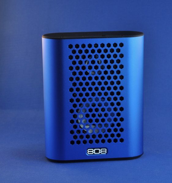
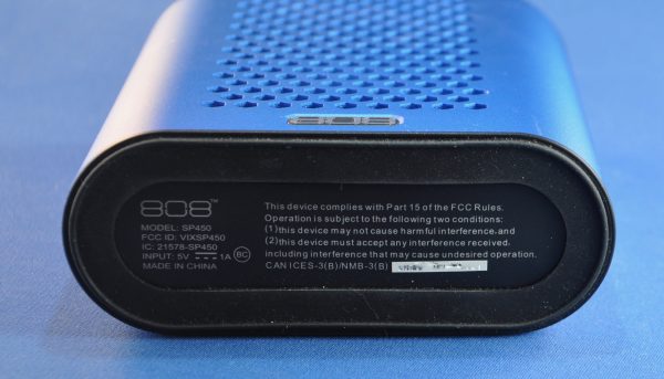
There’s a lot to be said for Bluetooth speakers. We review a goodly number here at The Gadgeteer, but I daresay few of us as reviewers stop and consider the fact that just 10 years ago, having a full-power speaker system embodied in a single device and your phone was a dream as yet unrealized. Sure, there have been speakers out there for a while, but they weren’t this powerful, this small, or this cheap. The latest unit I have been asked to review is the 808 HEX TLS speaker, which measures smaller than most of the cookbooks in my kitchen. At 6″x4.75″x 1.75″, it’s easy to slip into a day bag, a bike pannier, or most parka pockets. You can play it while traveling, or wait until you’re somewhere you want to fully set up shop.

Note: Photos may be tapped or clicked for a larger image.

I have been using it around the house for a week or two, when I’m wanting to listen to some music or a podcast while cooking, installing various security upgrades to the house, or playing a game. The size belies the amount of sound this little unit can put out. We have two public rooms in our house that are nearly 30″ long each. The sound playback from a phone, laptop, or even a newer iPad can thin out over that much space. The 808, however, fills it quite well, and the sound has a full, rich quality, due to the size of the speakers. While there is no thumping bass, there is a loudness switch, which gives the illusion of bass. This afternoon, I was listening to a Diamonds and Rust from Joan Baez playlist Stefan Larsson on Spotify curates. The close-mic-ed acoustic guitars of Baez, Nick Drake, Leonard Cohen, Simon and Garfunkel, and Neil Young, as well as the easy swing of Dire Straits and the Mamas and the Papas all sounded better than I’ve heard in years. When I finished my listening session, I still had well over 75% of the battery left. Actually, I’ve had several sessions of an hour or more on this charge.

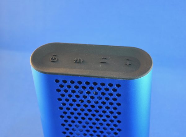
There are volume controls on the top of the unit, as well as the on/off and loudness buttons, but what is missing is a speakerphone control. If I could add one thing, it would be the ability to start, mute, and end calls without having to fumble for the phone if it rings. For $59.99, this is a really nice size, weight, and sound space.

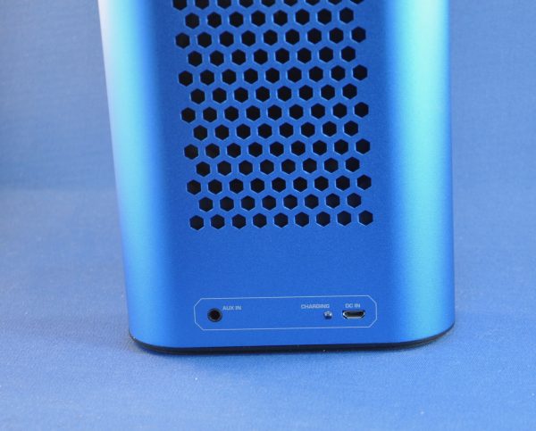
The rear of the unit has the AUX in, a microUSB charging port, and an LED that indicates charging. There is a single blue LED that lights on the top center of the front grille when it’s up. While there are slightly irritating startup and shutdown sounds, those can easily be silenced through the controls.

Positives

  • Really good sound
  • Easy access ports on back for charging or connecting non-Bluetooth sources
  • Loudness button boosts bass

Negatives

  • No dedicated phone controls or mic
  • Without using the Loudness button, sounds can be a little thin

Final thoughts

Being just a bit larger than a paperback novel, this speaker will not crowd your gear bag while you’re running off for a weekend getaway or midweek hike. While there’s no phone control, the sound is pretty good for whatever place you find yourself. It definitely improves the sound to have the speaker stand upright. Larger diaphragm gives more consistent low notes than many similar powered speakers.

Price: $59.95
Where to buy: Amazon
Source: The sample for this review was provided by 808Audio.