Catsby food dish for cats, SHOTBOX photo studio, PITAKA Pixel 2 XL case, and more – Review updates

Here we go with the first set of review updates for the new year. What are review updates? They are quick blurbs added to the end of our past reviews where we comment about how the product has performed since the review was posted or since the previous update. You can click the links below and then scroll to the end to read the latest update (except for the first one… I’ve made numerous updates to the favorite gear page).

Julie’s favorite gear page

Dr. Catsby’s bowl for whisker fatigue review by Julie Strietelmeier

SHOTBOX portable photography light box review by Julie Strietelmeier

OROS Discovery jackets review by Julie Strietelmeier

PITAKA Aramid Pixel 2 XL case review by Julie Strietelmeier

PhotoLemur v2.2 Spectre photo software review

Back in May, I reviewed the first version of PhotoLemur, a Mac app that lets you computationally enhance photos for better colors, light, skies, and faces.  Well, here in this holiday time of year, the elves have been busily applying their digital hammers and saws to the code and have offered a significant upgrade. I was given an opportunity to test the new program and want to share my findings with you. I started this review working with version 2, but it’s been recently upgraded to 2.2 Spectre, and it’s quite a bit improved!

Note: Photos may be tapped or clicked for a larger image. Images may take some time to load.

What is it?

The first version of PhotoLemur was a one-trick, one-shot, stand-alone deal: Here’s your photo, or here’s your photo with our program applied. Take it or leave it. In version 2.2, they have the same singleness of purpose and application (you can’t select a single area and change just it – it’s still all-or-nothing on the photo itself), but the level of change and enhancement can now be modulated. Also, in addition to stand-alone, there are plug-ins for the two largest photo-editing programs: Adobe LightRoom and Apple Photos.

Design and features

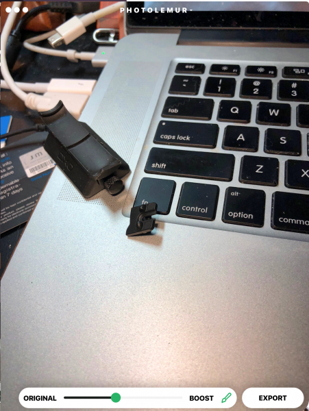
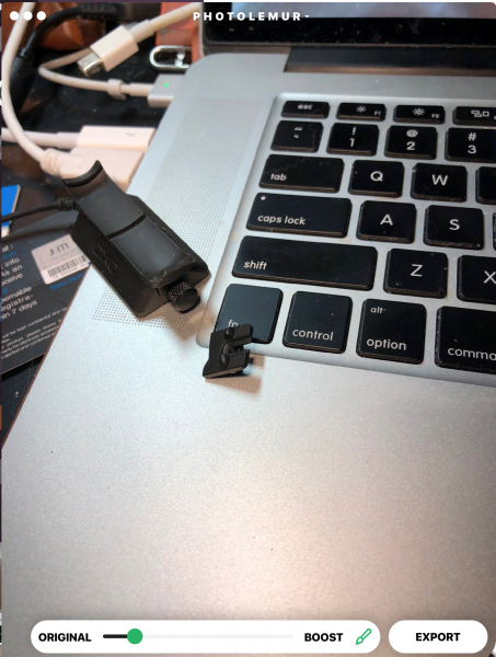
The interface is almost identical: open an image, and you’ll see a partition with your original photo on the left, and the enhanced version on the right. But in the right corner beside the “Export” button, there is a new button with a paintbrush. When you click on this, you are able to view the entire altered photo. There is a slider at the bottom where you can basically choose the amount of processing you want to use. Rather than the 100%, all the way to the right (which was the original version’s only setting), there is now an infinite slider where you can say “For this photo, I only need 40% Lemur, but for this other one, it needs maybe 70% Lemur.” (And, yes, I am officially verbifying a noun, and you can’t stop me! It’s the 21st century, and making up new words is a cottage industry these days.)

I ran a couple dozen photos through PhotoLemur during the first review, mainly from my back-catalog of early digital photos, and there were some really nice changes that were made to these images. For this next version, I decided to up the challenge. I have been using quite nice computational cameras for the last few years: an iPhone 6s Plus and recently an iPhone 8 Plus. In spite of this, there are some photos that need to be “fixed” – the sky is wrong, or the grass is wrong or the skin tones are wrong or whatever. No matter the finesse of the algorithm, the final judgment is always the viewer’s eyeballs. Here are a few representing varying levels of Lemur. Above, a night scene, just as it’s begun to snow. Note the details in the building to the right under the software’s effects, as well as the patterns in the sidewalk where the snow was drifting.

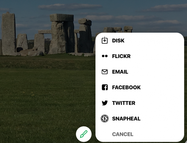
The finish of the process has changed as well. The initial version was pretty cut-and-dried – hit export, choose a filename and location, and your freshly Lemured photo is ready to go, and the program is ready to start on another. Now, there are sharing options for email, online storage, social media, other programs to move the photo to… It’s a whole new world!

If you’re in the plug-in version, it will save to your camera roll. In standalone, you can also add a group of photos and work through them, rather than having to hunt down each one individually.

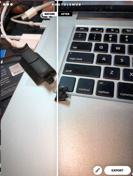
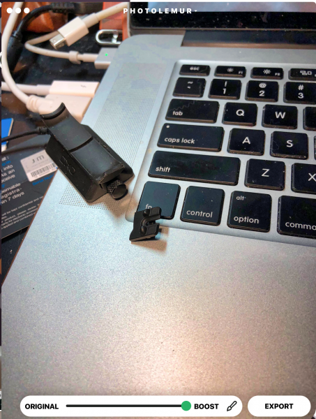
The second photo was taken with normal room lighting (all digital) of a broken part I had to return. Note the noise created by the bead-blasted finish on the MacBook Pro’s palm rest in the 100% correction.

 Tech Requirements

  • Windows

    • Intel® Core i3 or AMD Athlon® 64 processor; 2 GHz or faster processor
    • 4 GB of RAM (8 GB recommended)
    • 1024 x 768 display (1280×800 recommended)
    • 4 GB of available hard-disk space
    • DirectX 10-capable video adapter
    • Microsoft Windows 7, 8,10 (64-bit)
    • Internet connection and registration are necessary for required software activation, validation of subscriptions, and access to online services.
  • MacOS

    • Multicore Intel processor with 64-bit support*
    • 10.11 (El Capitan), 10.12 (Sierra)
    • 2 GB of RAM (8 GB recommended) 1024 x 768 display
    • 1 GB of Video RAM (VRAM).
    • 4 GB of available hard-disk space
    • Internet connection and registration are necessary for required software activation, validation of subscriptions, and access to online services.

Performance

The photos load fast, and once it is loaded, the changes are all updated instantly. You only have to swipe the dividing line to see before and after or the paintbrush to decide how much effect you’d like.

What I Like

  • Easy interface – two sliders
  • Solid upgrade with great user-oriented enhancements.
  • Much better pricing strategy
  • no confusing tools or masks
  • Integration into existing photo software is amazing!

What could be Improved

  • Limited – full frame editing only
  • No way to know what will be changed or enhanced – it’s a black box

Final thoughts

The bottom line is this: How much do you want to post-process your photos? When I first started in digital photography 20 years ago, I had to run every photo through some sort of software, originally because I knew little about the mechanics of how the process worked and was just shooting things and expecting that to fix my lack of knowledge and preparation, as well as the shortcomings of my beginner-level equipment. Over time, as I started to learn how to adjust settings to prevent some of the things I had to correct post-capture, I was able to edit less, but also to move into less intrusive tools.

Now, with hardware tools at a level where you really don’t have to worry about all those mechanics, the software options have come down to tiny tweaks that you may or may not care about. Many look at a photo and say to themselves, “Yeah, that’s how I remember it.” A few will want to change how those memories are stored. If you’re one that wants to fix certain things in photos “just so,” you may want to consider PhotoLemur. At $30, for me, I’d probably have bought it after trying the free version. Let me show you a photo that sold me, which I took just last spring. Just another day on the Salisbury Plains, right?

At 40% Lemur, the difference in the grass, the sky, the colors of the stones all were amazingly more real.

But at 100% Lemur, it pops your eyes out!

If you’re not one who wants to tweak, it may help with your back-catalog, but then, your current photo software may do more than you will ever use. Know it’s out here, and, if the need presents itself, grab it. You may find you are a tweaker more than you realized. You are, after all, reading a gadget website. ;-).

Price: $29 for one device/$49 for 5 devices
Where to buy: The software is available through the company website.
Source: The sample of this product was provided by PhotoLemur.

Other Gadgeteer posts that you might like…

Rowkin Micro wireless headphones review

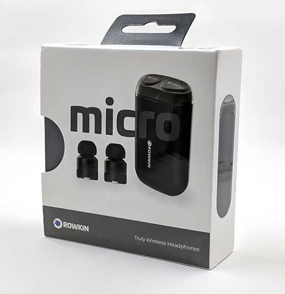
Never satisfied with what I have, I’m always on the lookout for my next favorite pair of Bluetooth earbuds. Comfort and long battery life are two of the most important features that I look for, other than audio quality, of course. The latest pair of wireless earbuds that I’ve had the opportunity to review are the Rowkin Micro Truly Wireless Headphones. Let’s see if this updated version of Rowkin’s Bit Charge earbuds which I reviewed over a year ago fixes any of the issues I had.

What is it

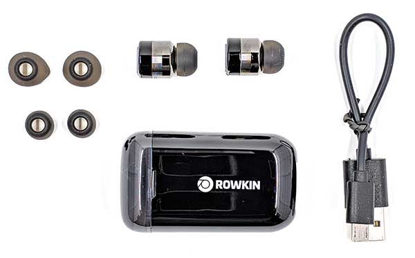
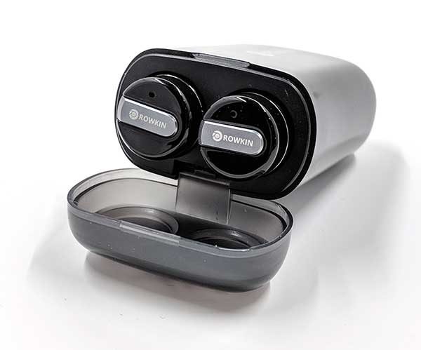
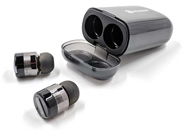
The Rowkin Micro wireless headphones are tiny Bluetooth earbuds that store in a small case that has a built-in battery that recharges the earbuds when they aren’t being used.

What’s in the box?

Rowkin Micro Bluetooth Earbuds
Charging Case
USB Charging Cable
3 Sets of Ear Tips

Hardware specs

Frequency Response: 20Hz-20kHz
Bluetooth Version: 4.1
Bluetooth Profiles: HFP, HSP, AVRCP, A2DP
Standby Time (Power On): about 27 hours
Standby Time (Power Off): about 120 days
Music Time: up to 3 hours
Talk Time: up to 3 hours

Design and features

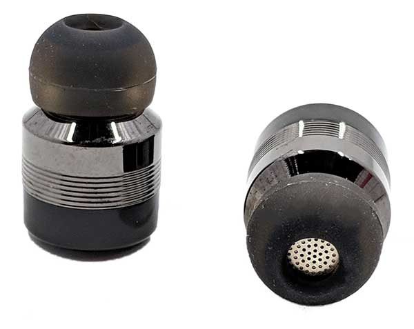
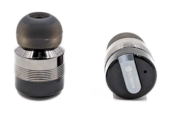
Physically, the Rowkin Micro earbuds look identical to the Rowkin Bit Charge earbuds that I reviewed over a year ago. They are the same size, same color, and have the same bullet design with ridged sides. There is no designation for the left earbud vs. the right earbud. But, when you power the earbuds on, a voice will tell you which channel is the left channel and which channel is the right channel, so you will know which ear to put them in.

Each sweat and water resistant earbud has a button on the end that toggles power, is used to go into pairing mode, and to toggle play/pause. The left earbud button must be used to answer and end calls, but you can press either earbud to pause music and then either earbud to resume.

Each earbud also has a tiny LED on the end that blinks white when the earbuds are powered on and being used. The LED glows red while charging and blinks red/white when in Bluetooth pairing mode.

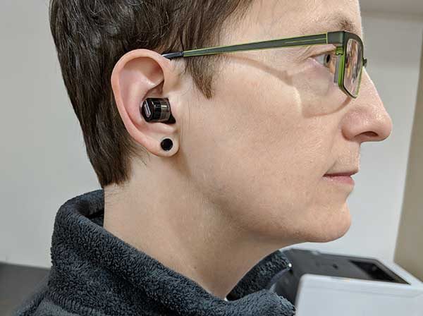
The Micro earbuds are lightweight and comfortable to wear for hours at a time. Their shape might be problematic for some people, but they stayed in my ears without any issues even during low impact workouts. I wouldn’t recommend them for running though.

The main difference I noticed between the Bit Charge and Micro earbuds is the new case design. The Bit Charge earbuds had a larger metal case, while the Micro’s case is smaller and made of plastic.

This case doubles as the charger for the Micro earbuds.

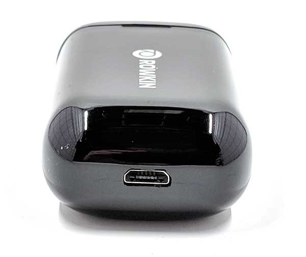
The Micro case has a built-in battery that charges the Micro earbuds when they aren’t being used. The micro USB connector on the back is used to charge the case.

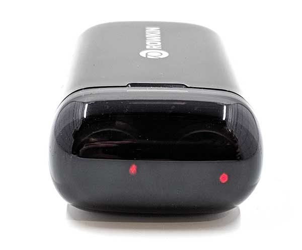
The LEDs on each earbud glows red while the earbuds are being charged. The battery has the capacity to recharge the Micro earbuds up to 4 times, for a total of up to 12 hours of playback time. Yes, that means that the earbuds only have 3 hours of play time per charge. The good news is that 15 minutes charging in the case will give you an hour of listening time and 1 hour in the case fully recharges the earbuds.

A blue LED next to the Rowkin logo on top of the charging case will blink 1-4 times when you pick up the case to give you a status of the built-in battery.

Pairing with your mobile device

When I first unboxed these earbuds and tried to pair them with my Pixel 2 XL smartphone, they would not pair. My phone showed the Rowkin Bit S-B device in the new device list, but would not connect no matter how many times I tried. On a whim, I deleted all my other paired Bluetooth audio devices and tried pairing the Micros again and it worked and has been working fine ever since. I don’t know if this is/was a problem with my Pixel 2 XL or the Micro earbuds.

Note that you can use the earbuds individually by pairing them one at a time. This will add two entries in the Bluetooth device list but gives you the ability to double the use time by just using one earbud while the other is charging.

Sound quality for music, movies, and calls

I no longer have the Rowkin Bit Charge earbuds, so I can’t compare the sound quality of the two versions. That said, the Micros sound good. They won’t blow your mind and do lack a little bit of rubble in the low end. But they sound pretty good and listening to my favorite tunes through Spotify or Amazon Prime Music has been enjoyable.

When I checked my past review of the Bit Charge earbuds, I saw that I had problems with audio cutting out between the two earbuds every hour or so. I’m happy to report that I have not had that same issue with the Micro earbuds after listening to music for many hours.

However, I do have one issue with listening to music with the Micro earbuds. The volume level resets each time you use them which means you will need to adjust the volume on your mobile device since the earbuds don’t have their own volume buttons.

I also tested the earbuds with Netflix, Amazon Prime Video, and YouTube. I haven’t noticed any problems audio syncing with the video.

Next up, phone call quality. For the most part, these Bluetooth earbuds are not much different than other earbuds I’ve tested. People will say that I sound OK but they can sometimes tell I’m talking through a headset. The audio on my end of call sounds fine although the audio only comes out of the left earbud.

What I like

  • Case charges earbuds when they aren’t be used
  • Tiny and comfortable to wear
  • You can use one earbud while the other one is in the charging case.

What needs to be improved

  • Only 3 hours of play time per charge
  • Volume level resets when earbuds pair to device after charging in case

Final thoughts

The Rowkin Micro truly wireless earbuds are my new favorite Bluetooth earbuds because I like that they are always charged and ready to go when I pull them out of the case. I also like that there’s no cable in between each earbud, so I can wear the main earbud in my left ear and leave my right ear open when I’m at work to hear my co-workers or talk to people when they walk up to my desk. It helps that they sound good and are comfortable to wear too.

Price: $129.99
Where to buy: Amazon
Source: The sample for this review was provided by Rowkin.

Other Gadgeteer posts that you might like…

Naztech Xtra Drive Mini review

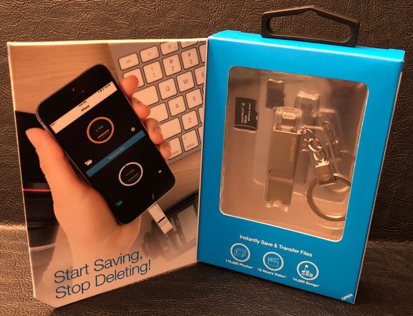
The Naztech Xtra Drive Mini is a device designed to access, store, and transfer photos, videos, and music to and from your iOS devices whenever you desire. This thumbdrive sized/shaped device is a microSD card reader engineered for plug & play connectivity with built-in lightning connector, standard USB connector, and memory card slot… 100% meant for those iOS junkies with space/capacity/backup issues in mind 😉 .

Design and features

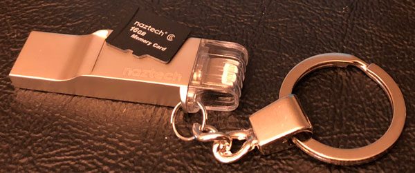
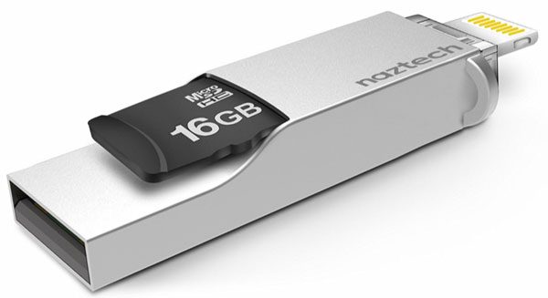
As I mentioned above, the Xtra Drive Mini is a thumbdrive sized microSD card reader that can add up to 256GB of extra storage space (on a single card) to any lightening port enabled iPhone, iPad, or iPod. It can also act as a memory storage device for any standard USB enabled computer as well. This small iOS accessory is made from an aircraft grade aluminum alloy, is relatively lightweight (8 grams), and comes with a built-in keychain.

What’s in the box:

  • Xtra Drive Mini
  • 16 GB microSD card
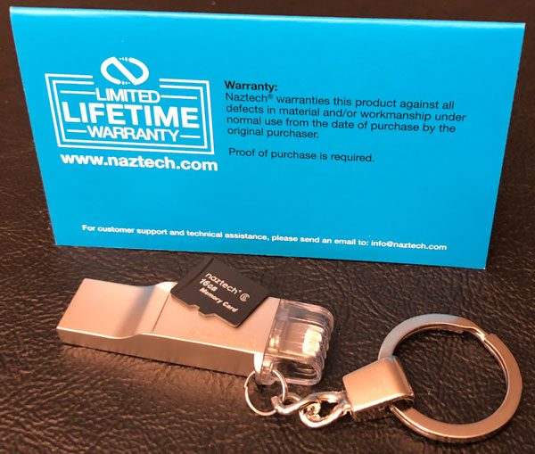
  • User manual/warranty card

The Xtra Drive Mini is designed to effortlessly transfer and/or store photos, videos, music, and data from any iOS device to your computer or other storage medium. Or simply to back up your important files and toss the microSD card in a safe place as a last chance/resort of recovering priceless 1’s & 0’s if need be.

One of the potential design issues I see with the Xtra Drive Mini drive is its standard USB connection. If this iOS accessory is truly meant for Apple fans, the MacBook and MacBook Pro users are a bit out of luck. USB-C only laptops will need some sort of adaptor, dongle or dock…shame Naztech didn’t include one out of the box.

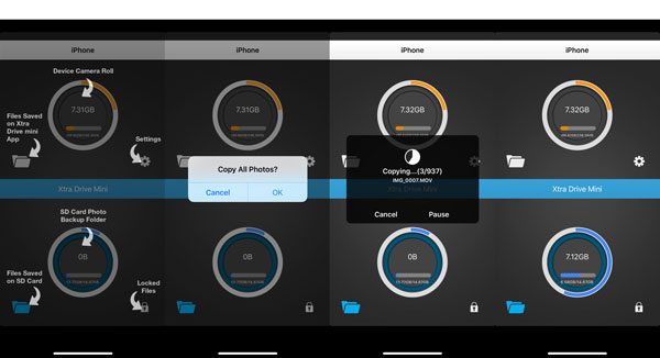
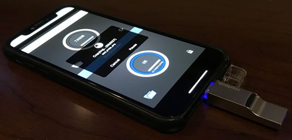
Before getting started, you will need to download the Xtra Drive Mini app from the App Store. But once installed, my iPhone X and iPad Pro both recognized the drive without issue. The app found all my photos and videos and copied them to the microSD card just as advertised.

The nearly 1000 files weighed in at just over 7gb in size and took approximately 15 minutes to transfer to the 16gb microSD card Naztech includes with the Xtra Drive Mini. The 16gb card is a class 6 and transfer speeds may increase with a better microSD card. That said, half gigabit per minute (approximately) is not unreasonable. Though a 64, 128, or 256gb class 10 card would hold a lot more data and theoretically have better transfer rates…but that might be overkill. All depends on how you use it.

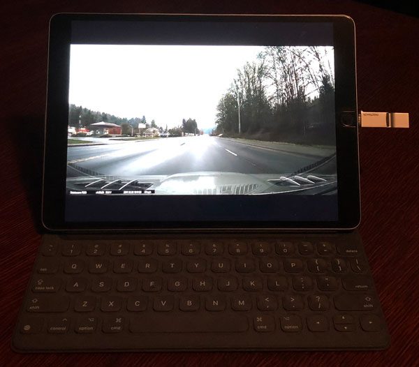
I also was able to view and transfer video files from my Thinkware F800 dashcam‘s microSD card to my iPad Pro. You can view files directly off the Xtra Drive Mini or transfer them onto whatever iOS device you choose without the need of computer or the Cloud. Streaming 2k video footage from the Xtra Drive Mini was smooth with no lagging whatsoever.

Positives

  • Small, transportable form factor
  • Very convenient way to move files around
  • Provides nearly limitless additional capacity to any lightening enabled iOS device
  • Well polished iOS app
  • Nicely constructed

Negatives

  • iOS only device
  • Naztech should include a larger/faster microSD card & USB-C adapter

I found the keychain awkward, clunky, and in the way a majority of the time. Removing it was easy and made the Xtra Drive Mini much more streamlined.

Final thoughts

The real question in today’s world, where you can buy iPads and iPhones with more than half a terabit of space and nearly unlimited Cloud storage available, is this already niche device relevant??? The Naztech Xtra Drive Mini is specifically made for Apple iOS users, with those needing extra space or greater file flexibility in mind. The Xtra does give you more control, convenience, and flexibility when transferring or backing up files if you need it.

Price: $59.99
Where to buy: Naztech or Amazon
Source: The sample of this product was provided by Naztech.

Other Gadgeteer posts that you might like…

RHA Dacamp L1 headphone amplifier and CL1 Ceramic in-ear headphone review

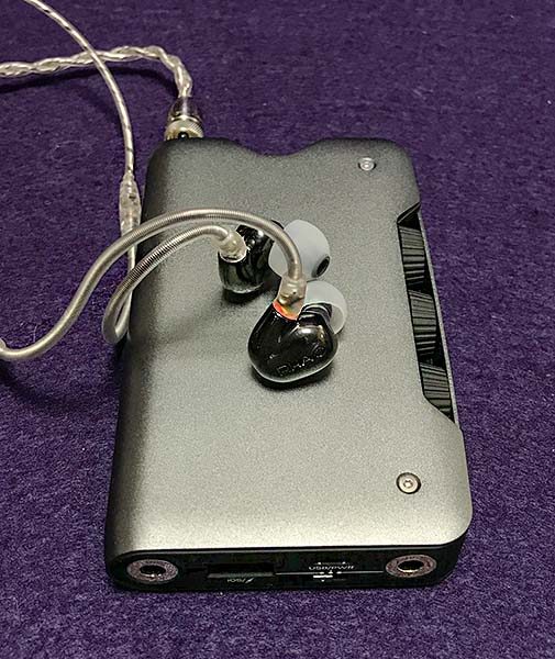
Few audio companies have risen as far and as fast as the Scottish Reid Heath Audio (RHA). There’s a good reason for this: RHA makes some extremely well made and great sounding earphones and (now) a headphone amp. And their quality has not been dependent on the cost—RHA’s lowest priced earphones feel as well made as their most expensive. What differentiates their products is the quality of the ingredients. Through the years, RHA has made unique items that consistently become their new flagship product—albeit at an increasing price. In 2017, RHA released two products that no only overshadowed their previous “best” earphone (T20i), but pretty much has overshadowed many competitors as well. The RHA CL1 ceramic in-ear headphone (earphone) and Dacamp L1 can be used independently from one another, but are designed to work best if used together.

What is it?

To begin, let’s look at each item separately. The Dacamp L1 is what its name says: a digital audio converter (DAC) and headphone amplifier (AMP) in one. A digital audio converter changes the digital music signal into analog, which is what you hear—you can’t hear digital.

The CL1s is an over-the-ear earphone that resembles RHA’s previous T10 and T20 designs but is made from a ceramic material rather than metal. The CL1 also contains a ceramic transducer—I’ll talk about that later in the review.

Hardware specs

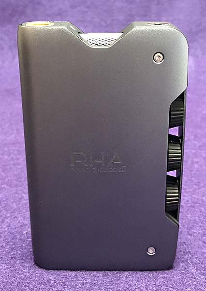
RHA spared little expense with the Dacamp L1. Its case is machined, extruded and punched into the shape that you hold in your hand. The materials that make up the L1 give it a weighty, solid feel as well as help reduce signal interference. RHA has managed to fit dual digital audio converters and amps into the L1—one for the left channel, one for the right. This is how more expensive stereo separates work. You just don’t often see it in portable gear. For the geeky among us, the DAC part of the L1 uses two ESS SABRE32 ES9018K2M chips and two Class A/B amps. The chips support audio formats up to 384kHz/32bit PCM and Quad DSD (11.2MHz, DSD256). The Class A/B amps will power headphones from 12-600 ohms—which is just about any headphone available. Don’t worry if you don’t get any of this—few people do. Just know that the audio produced by this combination of chips and amps is about as good as it gets for portable gear.
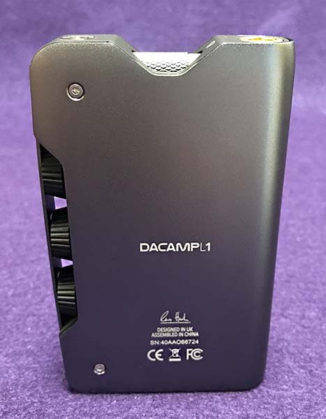
The Dacamp is made to be able to convert the highest resolution digital files. Believe it or not, not all DACs can convert all digital music. Music files can be such a high enough resolution that some DACS can’t handle them.

The L1 has a 4000mAh lithium-ion battery for up to 10 hours of use with both a regular 3.5 mm headphone or a 4-pin mini XLR port. It will also charge a Smart device via a USB port.
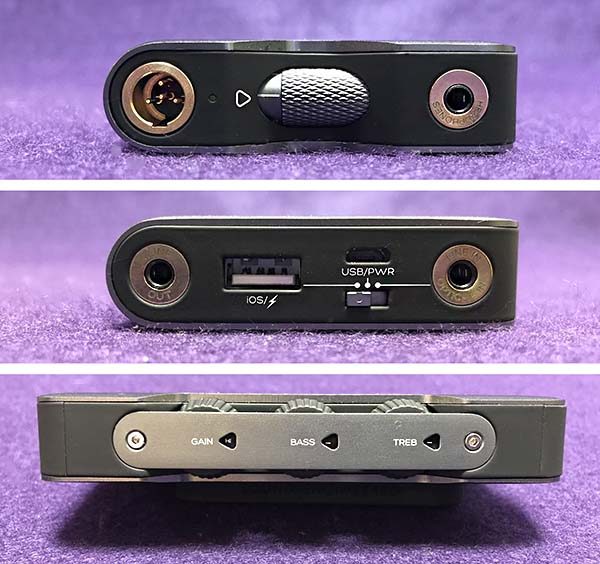
There are Optical Line In and Line Out ports. The optical line in port will fit a 3.5 mini-toslink optical plug. I wasn’t able to test the L1 with my iMac’s mini-toslink port because, in my collection of cables, I only have a mini-toslink to (regular) toslink cable—not a mini to mini cable. Unfortunately, RHA does not supply a mini to mini cable for such a connection. At the price range, you shouldn’t be required to buy more cables.

The Line Out port is useful when other sources other than headphones are connected to the L1, such as a car stereo unit or Bluetooth speaker.
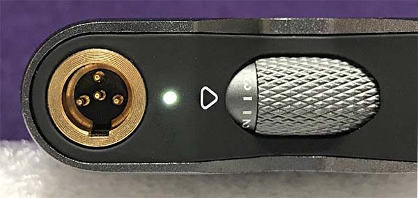
The Mini XLR connection is balanced keeping the left and right channels separate. However, if there’s an audio advantage between the two cables and connectors, I couldn’t hear it. Both sounded great.

Here is a complete list of the L1 Dacamp’s specs:

Output power (16Ω)
300mW

Output power (300Ω)
28mW

Output impedance
2.2 ohms

THD+N
>0.0018%

Dynamic range
111dB

PCM sampling frequencies
44.1 – 384kHz, 16 / 24 / 32-bit

DSD sampling frequencies
2.8224MHz (DSD64),
5.6448MHz (DSD128),
11.2896MHz (DSD256)

Input connections
3.5mm line in, USB A, USB micro-B, mini-TOSLINK Optical

Output connections
3.5mm line out, 3.5mm headphone out, 4-pin Mini XLR (balanced)

Battery
4000 mAh

Dimensions
118x73x20mm

Weight
233g
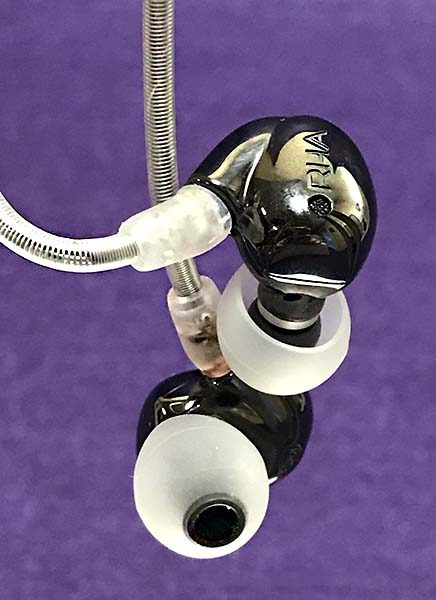
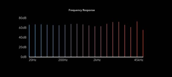
The CL1 has a dual transducer configuration—it combines a dynamic speaker (for bass and mid frequencies) with a high-frequency ceramic plate driver for better high-frequency response.
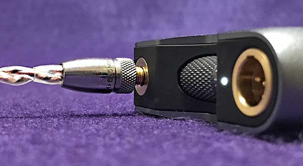
Although the CL1 is designed to be used with headphone amplifiers/DACs or more powerful and specialized digital audio players (DAP), I was able to use them connected directly to my iPhone with plenty of volume. Granted, the Dacamp L1 and other high-res sources provided better sound, but music straight from the iPhone sounded pretty good!

Here is a complete list of the CL1 earphone’s specs:

Drivers
CL Dynamic + Ceramic Plate

Sensitivity
89dB

Cables
Braided OFC (sMMCX-3.5mm), Ag4x (sMMCX-Mini XLR)

Frequency Range
16 – 45,000Hz

Rated/Max Power
10 / 50mW

Terminations
3.5mm/6.35mm, 4-pin Mini XLR

Impedance
150 ohms

Weight
14g (without cables)
What’s in the box?

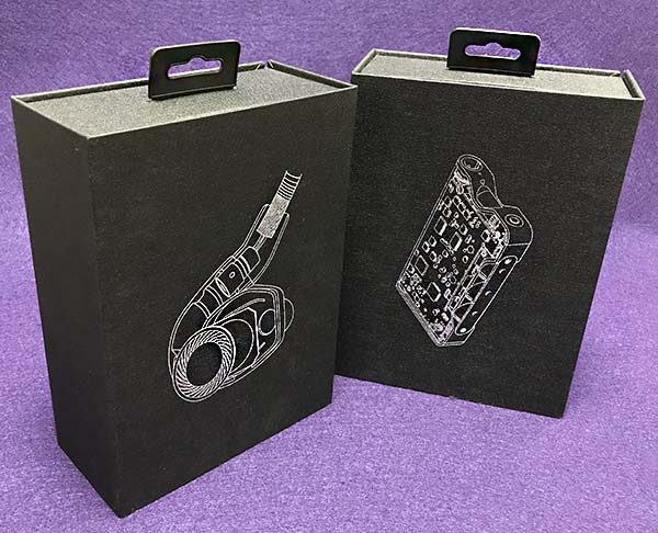
The packaging befits the high-end status of both the Dacamp L1 and the CL1 earphones. The boxes are a visual match showing a silver foil x-ray view of each product on the front flap. Inside, both the L1 and CL1 are presented in a dense foam while the accessories are separately housed underneath.
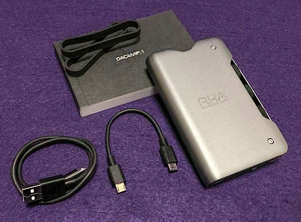
Dacamp L1:

Dacamp L1
manual
short mini-USB to USB cable
short mini-USB to mini-USB cable
two bands for strapping to smartphone.
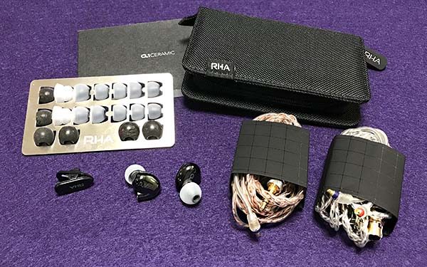
CL1 earphone:

CL1 left and right earphone
manual
4pin Mini XLR cable
3.5 mm cable
carrying case
many tips of different sizes with carrying card
1/4 in. adapter
shirt clip
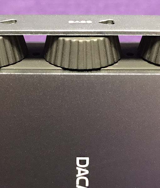
Design and features

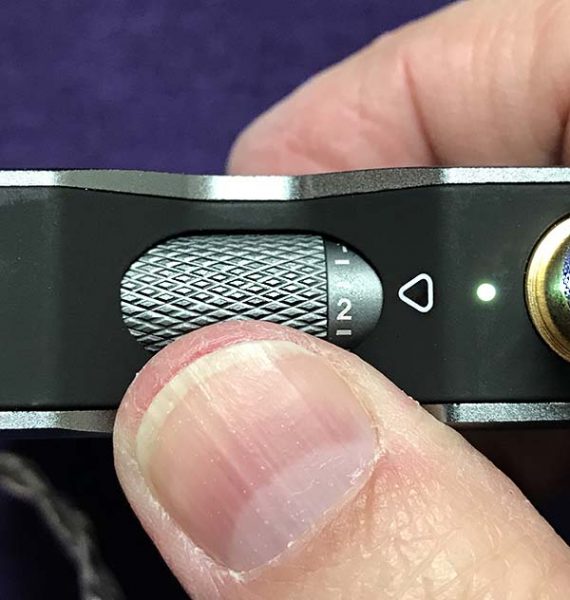
There are three knobs on the L1: Treble, bass, and gain. The treble and bass knobs are self-explanatory. They adjust those frequencies in 12 steps. Gain is a bit more complicated. It’s basically an adjustment that helps you get the most volume out of a particular headphone, depending on its sensitivity. If that’s too confusing, just leave the gain setting on high. I did.
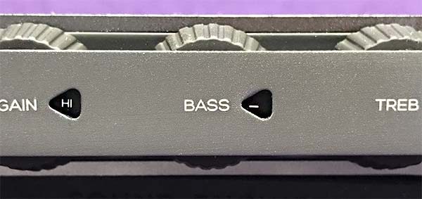
The Dacamp L1 takes a couple of liberties for the sake of design. The Bass/treble/gain knobs work flawlessly and are well protected by an attached band of metal with cutouts revealing indicator numbers that show the knob’s individual settings. However, I cannot see the numbers without using a magnifying glass. They are that small. It’s a confounding design decision because the rest of the L1 is a joy to look at and use. The on/off/volume control is a rolling wheel that’s easy to reach without having to look at it. Note that the unit does not turn itself off after a set time of not being used. I’ve drained the battery more times then I care to admit.
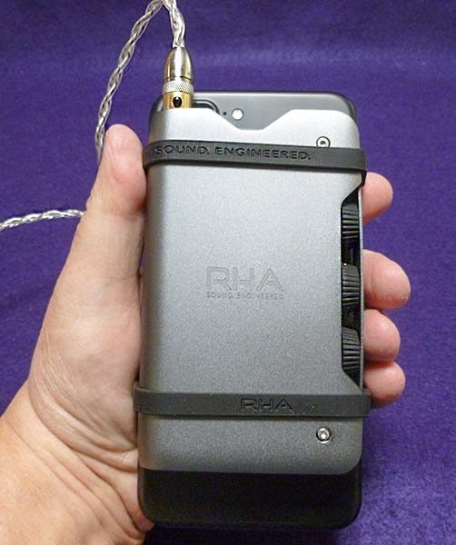
The L1 fits into my hand quite well. Its aluminum exterior feels solid—if a bit cold on a winter’s day. It’s an overused cliche, but the L1 is built like a tank.
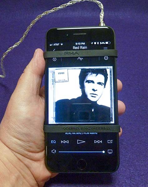
The L1 comes with two silicone bands to strap to a smartphone for a portable hi-res package. The bands are wide, which visually and tactilely blocks some of my iPhone screen, plus my iPhone 7+ is aluminum, just like the L1. When strapped together, this can lead to scratching of either or both the iPhone and L1.
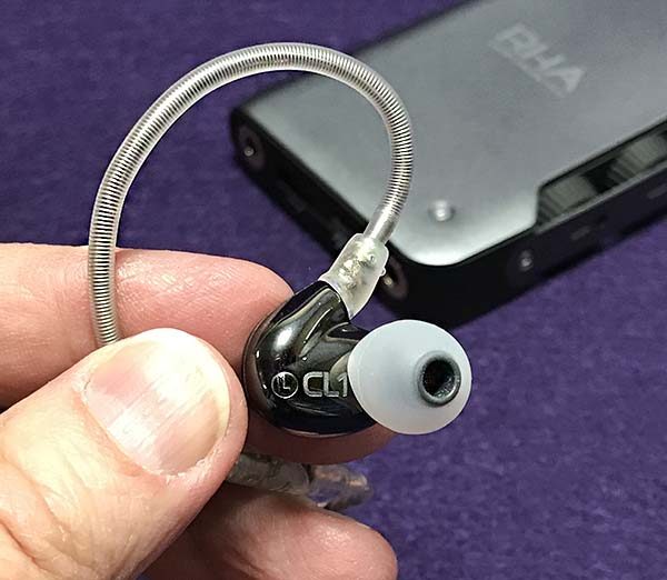
The CL1 can be used as a standalone earphone, but it’s designed to be used with the L1. It comes with both a 3.5 mm mini plug and 4-pin mini XLR connector cable, which matches the L1’s ports. Wiring for either audio connection is included. What’s not included is an Apple lightning cable—an Apple charging cable is required for connection to the L1. I guess RHA figures everyone who has an iPhone also has a charging cable, but it would have been nice to include one, especially at this price but also because RHA’s products are geared more towards Apple than other brands.
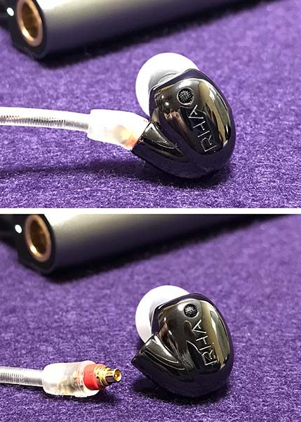
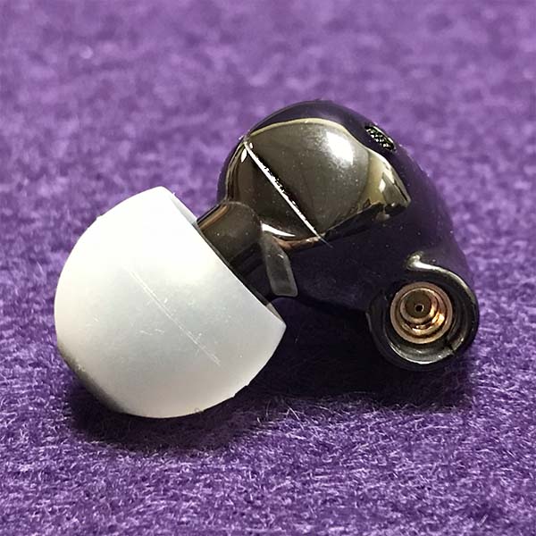
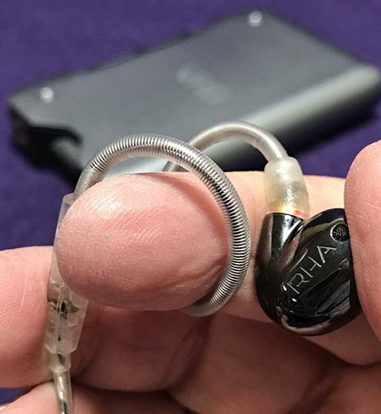
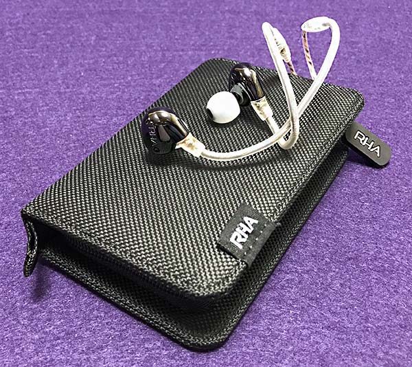
The CL1’s housing is made from a seven-stage ceramic injection moulding process. The design mimics RHA’s T10 and T20 earphones but has a super-hard glossy black ceramic finish. The look of earphone is quite striking—and is a fingerprint magnet. Unlike the T10 and T20, the CL1’s cable is detachable, using RHA’s custom sMMCX connections. The cable just snaps into place once proper alignment is made. The connectors are a bit small for my aging eyes making it tough to connect on the first try. Once the connection is made, however, it holds. The 4pin Mini XLR cable (made for the L1) is silver wrapped oxygen-free copper cable (OFC) while the 3.5 mm cable is OFC without the silver coating.
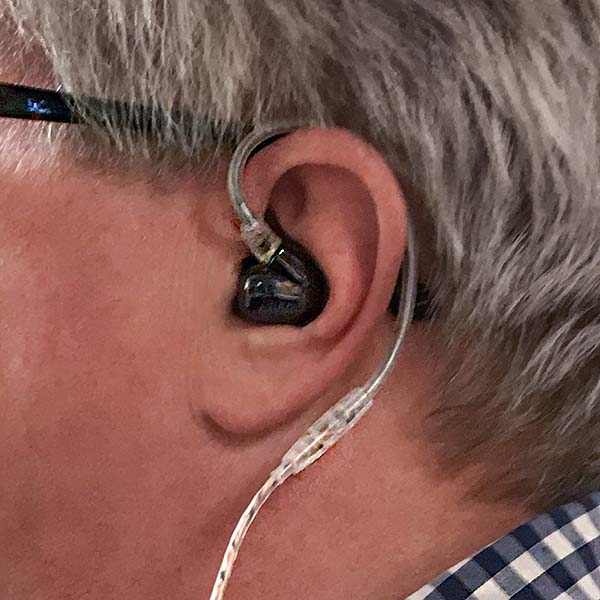
The CL1 earphone hooks around the ears exactly as do the T10 and T20 earphones. This behind-the-ear design cuts down on microphonics (that annoying noise transmitted from tapping or rubbing the cable) and helps with noise isolation. Comfort was also identical—as in quite comfortable over hours of use. With the correctly sized ear tip (from the many to choose from), sound isolation is also good.
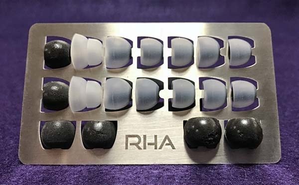
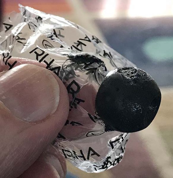
Speaking of ear tips, RHA provides an embarrassing amount of types and sizes to choose from: silicone, double-flanged and Comply foam. Unfortunately, the Comply foam tips were stuck to the interior of the sealed plastic bags they came in. When I pulled them apart, the outer layer of foam tore, making the foam tips useless. The silicone tips were fine.

By this point in the review, you may be wondering how it all sounds, especially since both the L1 and CL1 are designed to be a matched pair.
A few things became apparent when using the Dacamp L1 and CL1 together. I became curious about the L1’s power because the audio was louder when the CL1 earphone was connected directly to my iPhone 7 than connected to the Dacamp L1. When connected to the L1, I could turn both the iPhone and L1 up all the way without making myself deaf. And this is with the gain setting at Hi. Granted, It’s uncomfortably loud, but was not as loud as using just the CL1 earphone and iPhone. I don’t get it.
Despite that, audio was much more musical and involving using the L1. When I say “involving,” I simply mean it reminded me of listening to the warmth of analog records and not a cold digital file. Bass was hard-hitting and less muddy sounding while vocals were more distinct and forward sounding. I did have to boost the bass and decrease the treble knobs on the L1 because with both bass and treble set to “0”, the L1’s sound is a bit too bright for my tastes. Note that if you are a bass head, you may be disappointed. If I could just get more volume out of the L1, it would be close to perfection.

I realize that the Dacamp L1 was designed to be portable and technically, it is. However, strapping an amp to a smartphone (even if the straps are included) is not an ideal portable solution for anyone except maybe a committed audiophile. Plus the L1 weights a little more than my iPhone, so it’s like doubling the weight of what you’re carrying around. That gets cumbersome. My use of the L1 has been setting it on a desktop and connecting to my iPhone while working. But that’s me—it’s great that RHA made the L1 so that is can be used in different ways for different people.
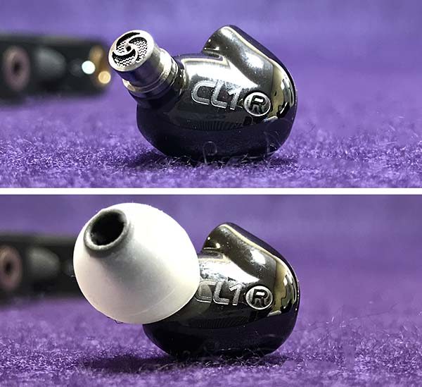
The CL1 earphone does not have removable filters like the T10/T20, but it doesn’t matter because the default tuning of the CL1 is pretty darned neutral with a slight emphasis towards treble. While bass may seem weak at first, it’s because they’re neutral and not bass monsters! Plus, if you want a bit more bass (as I did when connected to the L1), you can just dial it up on the L1. Note that when tweaking the EQ (bass and treble knobs) on the L1, leave the iPhone EQ set to Flat.
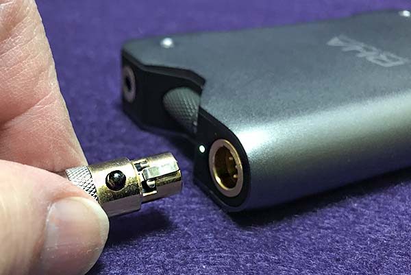
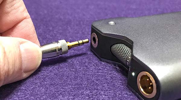
I can’t hear any benefit to using the balanced 4-pin Mini XLR connection vs. the mini-plug. If there is one, the difference is slight enough that it really doesn’t matter. You may hear the difference—I don’t.
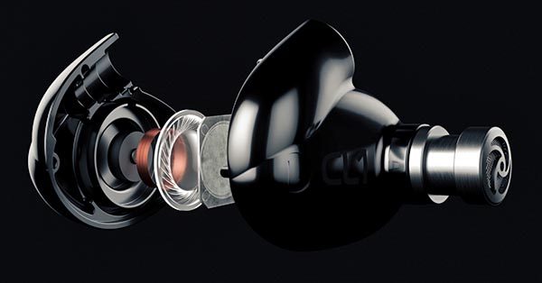
I’m not sure what advantage the CL1’s ceramic plate transducer produces, but the CL1 is one of the better all-round earphones available in its price range. The musical detail offered is first-rate, while still being fun to listen with. Believe it or not, sometimes earphones can be so accurate, they’re not much fun. With the CL1, RHA has managed to retain the accuracy while holding on to the fun factor—not an easy thing to do.
What I like: Dacamp L1

Built like a tank
Excellent sound quality—musically involving
Good for portable and desktop use

What needs to be improved: Dacamp L1

Setting numbers too small
Awkward for portable use
No Apple specific cable
What I like: CL1 earphone

Excellent sound quality
Detachable cables
Classy looking

What needs to be improved: CL1 earphone

A bit too bright

Final thoughts

RHA states that they have been developing the L1 for three years and it shows. Its small but solidly built and works as well with a smart device, separate digital audio player (DAP) or desktop PC. Matching it with an excellent earphone like the CL1 only sweetens the deal. RHA recently reduced the price of both the L1 and the CL1 by almost half, so even though they are still expensive, both products are now affordable, making them even more desirable as before.

Price: The Dacamp L1 sells for $299.95 US. The CL1 sells for $249.95.
Where to buy: Amazon
Source: The sample for this review was provided by RHA.