JBL Boombox portable Bluetooth speaker review

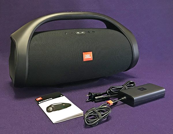
Within the last couple of years, I’ve gotten to review some big (in size and sound) Bluetooth speakers. These massive new generation boomboxes have replaced the old cassette and CD driven monsters from the 80s with better sound and much better ease of use. Factor in weather resistance and you’ve got yourself a winning package. JBL is one of the latest speaker makers to go much bigger than they have previously with the simply named JBL Boombox.

For those who thought the JBL Charge 3 or even the Xtreme were powerful, they pale next to the JBL Boombox. At almost three times the weight, think of the Boombox as a JBL Xtreme on steroids.

What is it?

When it comes to portable speaker chops, no one doubts JBL’s strengths—their sales numbers prove it. The Boombox is the newest and largest of their portable line of Bluetooth speakers. It’s designed to play outdoors just as well as indoors—there’s even an Indoor/Outdoor sound mode button. An IPX7 rating makes the Boombox totally waterproof—and it floats, so falling into a lake or pool shouldn’t be a problem.

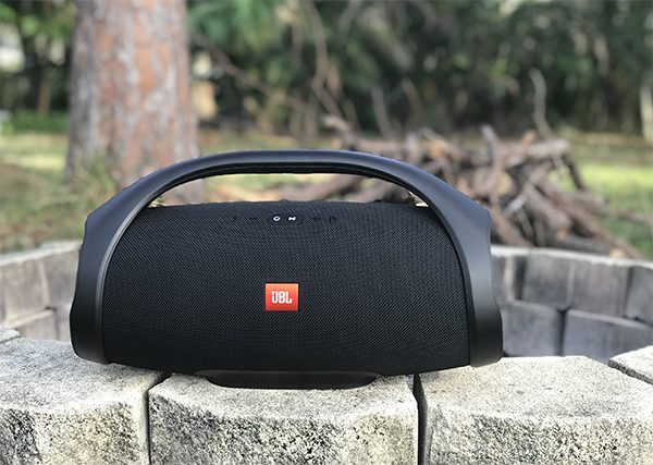
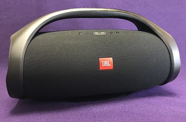
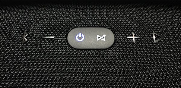
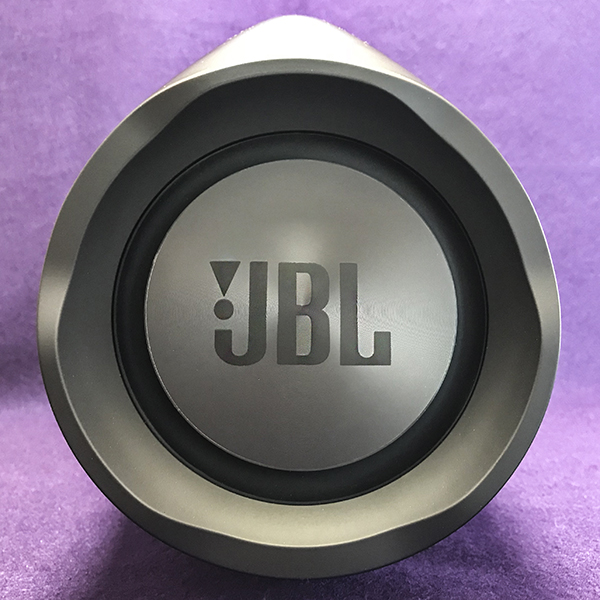
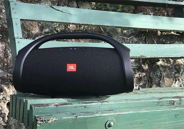
The Boombox has five buttons just below the handle: Bluetooth pairing, Volume down, Power/Connect+, Volume up and Play/Pause/Voice assistant/Speakerphone. More on these functions in the Design and Features section below. The Boombox is wrapped in a tight and durable cloth with a plastic handle which connects to supportive end caps that hold two large passive radiators. There’s a large, red square JBL logo plastered on the front. It looks out of place set against the classy cloth panel marring an otherwise beautiful design. There are two color choices available—black (my review) or olive green. It’s interesting that the bright colors available on other JBL speakers is not available for the Boombox. Hopefully in the near future, there will be added color choices.


Hardware specs

The JBL Boombox has some impressive audio credentials. There’s two 20mm tweeters for mid to high frequencies and two 4 in. woofers for lower mids to deeper bass. The earlier mentioned passive radiators allow the dual woofers to move a lot of air—one of the main reasons that bass on the Boombox sounds so big. It’s cool to watch the radiators move to the beat on bass-heavy songs. Try this: Set the Boombox on its side and fill one of the radiators with water. Then turn on the music to watch the water vibration show. Since the Boombox is totally waterproof, it’s perfectly safe to do this.

Even though the Boombox is tubular shaped, a large flat rubber-coated base holds the speaker in place. Note that even though the Boombox is round, the speakers are only in the front. There is no 360° sound as on some similar speakers.

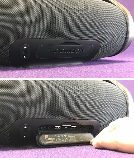
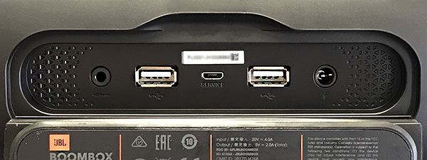
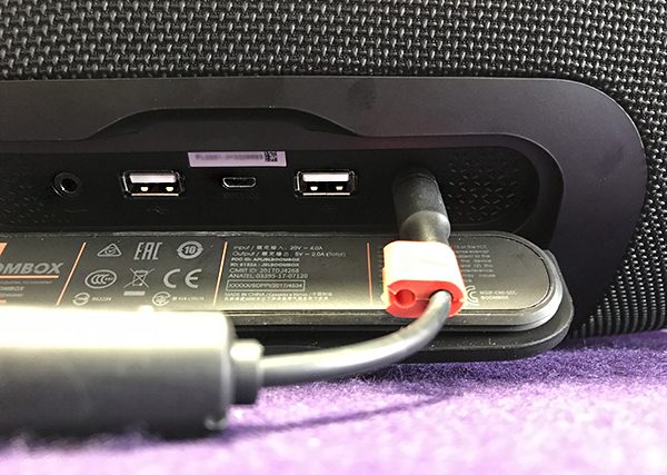
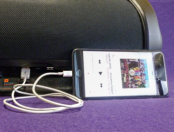
Located near the base at the back of the Boombox are ports protected by a watertight cover. There are two USB ports (good for charging two devices such as smartphones or tablets), an AUX port for hard wiring, a power cord port and a mini-USB port exclusively for future firmware upgrades. A massive 20,000mAh built-in rechargeable Li-ion battery supports up to an impressive 24 hours of playtime (depending on volume level), so any get-together will end long before the power runs out.

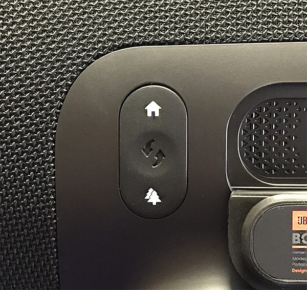
Right next to the covered ports is an Indoor/Outdoor button that is self-explanatory. Indoor mode has no bass boost since bass resonates off objects indoors. There’s nothing outdoors to reflect bass, so Outdoor mode compensates for this by boosting the bass. Despite this, the outdoor bass boost is subtle at best. I’ve mistakenly left Outdoor mode on while using the Boombox indoors and not realized it.

Specs

  • Frequency response
  • 50Hz-20kHz
  • Signal-to-noise ratio
  • 80dB
  • Music playing time
  • up to 24 hours (Varies by volume level and music content)
  • Weight
  • 5.25kg (11.57 lbs)
  • Dimensions (H x W x D)
  • 254.5 x 495 x 195.5mm
  • Transducers
  • 4-inch woofer x 2, 20mm Tweeter x 2
  • Bluetooth version
  • 4.2
  • Battery charge time
  • 6.5 hours
  • Battery type
  • Lithium-ion Ploymer (74Wh)

Design and features

Even though it’s large and heavy at 11.5+ lbs, the built-in ergonomically rounded handle makes the Boombox easy to carry for short distances before its weight becomes bothersome. Plus, it weighs much less than either the similar Braven XXL (18 lbs) and Monster Blaster (16.8 lbs) speakers.

The top function buttons are difficult to see in the dark except for the blue lighted power and white Connect+ buttons. JBL’s Connect + allows up to 100 JBL wireless speakers to be simultaneously connected. That’s not a misprint. It’s a ridiculous number, but JBL’s point is that any and all compatible JBL speakers you own will connect for multi-room audio or to just show off. Note that each JBL speaker must be Connect+ compatible—not all are.

Bluetooth pairing was quick and painless. Plus the signal held up when within its Bluetooth distance limits. A pair of Bluetooth devices can be paired with the Boombox together, so two friends can easily switch between devices to share music. I was able to get well over 50 ft. Bluetooth range when outdoors with no hiccups.

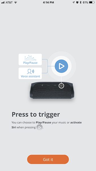
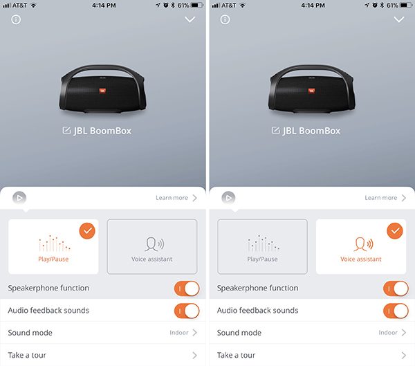
The Play/Pause/Voice assistant/Speakerphone button is interesting. This button can be programmed (only through the JBL Connect smartphone app) to either be a standard Play/pause/skip button or a Voice assistant button. With Voice assistant on and enabled on a smart device, pressing the button activates either Apple’s Siri or Google Now. The button must be pressed to activate Voice Assistant. You can’t just start talking to the speaker.

The Boombox will also function as a speakerphone—but not a great one. Although I could hear the person I talked with just fine, they said my voice was loud enough, but it wasn’t clear and sounded fuzzy—not a pleasant experience. I expect better from a speaker in this price range.

Music on the JBL Boombox sounds really good. The Boombox manages to sound full regardless of how loud or soft the volume is set. And the bass—oh my, the bass. What I really like is that bass is bold without being boomy or distorted. In fact, the volume would reach into the painful zone and still—no distortion. In some instances, high frequencies can border on harshness—especially as volume increases. This mostly depends on whatever song is playing.

Moby’s song “Swear” has a low, low bass undercurrent that the Boombox handled with ease. There was not a hint of unwelcome vibration. With the volume set high, you can feel the bass as well as hear it.

“Devil’s Playground” by Gram Rabbit can be a bit heavy on middle and higher frequencies. Some speakers can sound brittle with this song. The Boombox did exhibit a bit of a harsh edge, but it never crossed over into unpleasantness no matter the volume.

Johann Strauss’s “The Blue Danube” from the 2001: A Space Odyssey soundtrack is as good as it gets with uncompressed bass and treble dynamics. There are quiet parts punctuated with crescendos that reach ear blasting levels. The Boombox doesn’t care—it just reproduces it quite well.

What I like

  • Solid build
  • Powerful, but tamed bass
  • Comfortable to carry
  • Can withstand outdoor elements

What needs to be improved

  • Expensive
  • Lackluster speakerphone
  • Harsh treble at higher volumes with some music

Final Thoughts

The Boombox is bigger, louder and sounds better than most other portable Bluetooth speakers—at a price. Can it replace a standard stereo speaker setup? Not unless you buy two and use them in stereo mode (which you can!). The Boombox is expensive, but if you only want or need one speaker that can sound good loud both indoors and out, then the JBL Boombox may be that speaker.

Price: $449.95 US
Where to buy: Amazon
Source: The sample of this product was provided by JBL.

The Findables Company XY4+ tracker review

On average, we spend ten minutes a day, or two and a half days a year looking for lost items. The XY4+ is a tracker that can help you find items it is attached to. It claims a longer range, louder sound, and longer battery life than competitors. Read on to see what I think!
What is it?

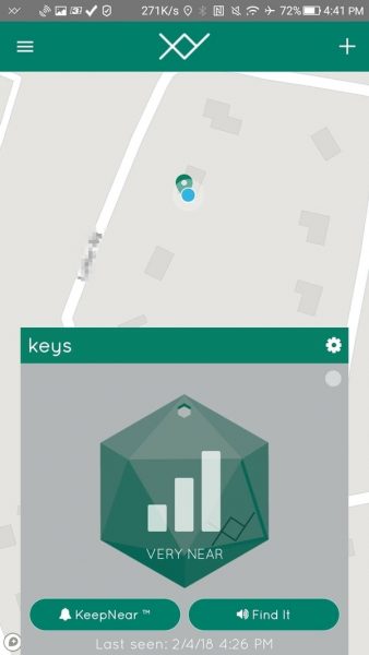
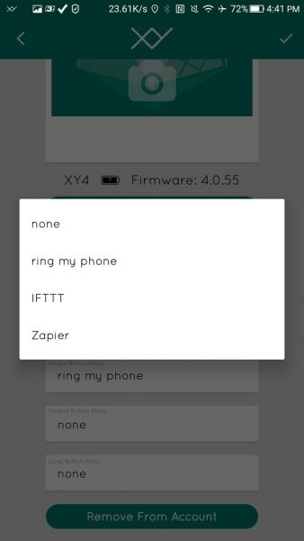
The XY4+ is an update to XY3, the previous version of the tracker manufactured by The Findables Company. The previous model was reviewed on The Gadgeteer about a year ago at this link. The XY4+ claims to provide a larger battery, increased range and a louder speaker than the previous model. The XY4+ also integrates with IFTTT and Zapier so that you can automate actions based on triggers and even have the finder beep based on other automation triggers.

What’s in the box?


The XY4+ tracker is the only item in the box.

Design and features

Prerequisites

The XY4+ requires and Apple or Android device.  It is compatible with iPhone, iPad, and iPod touch with iOS 9.0 or later.  The Android device must have Kitkat (4.4) or later.

Unboxing

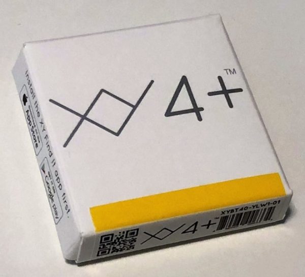
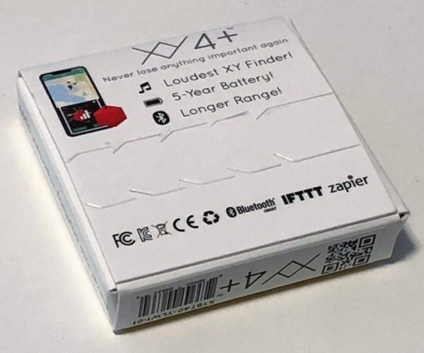
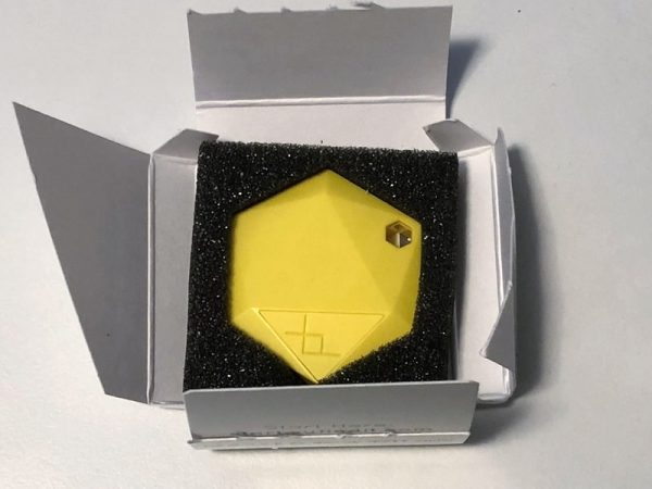
It seems that The Findables Co. is doing everything in its power to demonstrate superiority to its competition (Tile, TrackR, Chipolo, etc.). It seems that environmental footprint is also an area that the manufacturer is focusing on. They have a very small retail box. However, the product is packaged in non-recyclable foam.

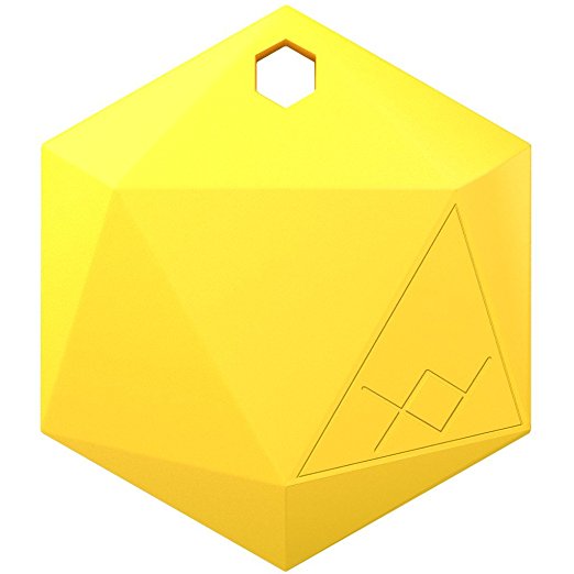
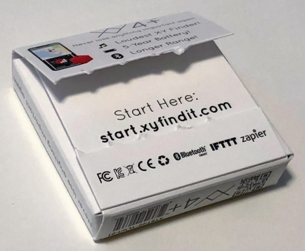
I received a bright yellow XY4+. Even if I can’t hear the buzzer it’s still plenty loud. There isn’t a manual. All instructions and disclosures are on the web.

Design

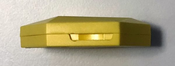
The tracker is made from ASB plastic and is snapped together from two halves. The assembly is quite durable, even though it is designed to be opened. The XY4+ is designed to fit onto a key chain or maybe in a pocket or a bag. It makes sense for it to have a smooth profile, but while the top of the tracker is somewhat curved the bottom is completely flat and has some point edges.  I would expect the tracker to be more clam shell shaped. The top features a triangular shaped button with the XY logo on it.

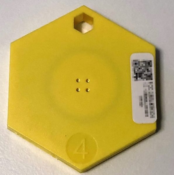
On the bottom is the number “4” for the version of the unit and four small speaker holes.

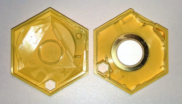
The tracker is meant to be opened in order to replace the battery. There’s a slot on the side into which a coin can be inserted to split the device open.

Once the device is open you can see the peizo-electric buzzer and the circuit board.

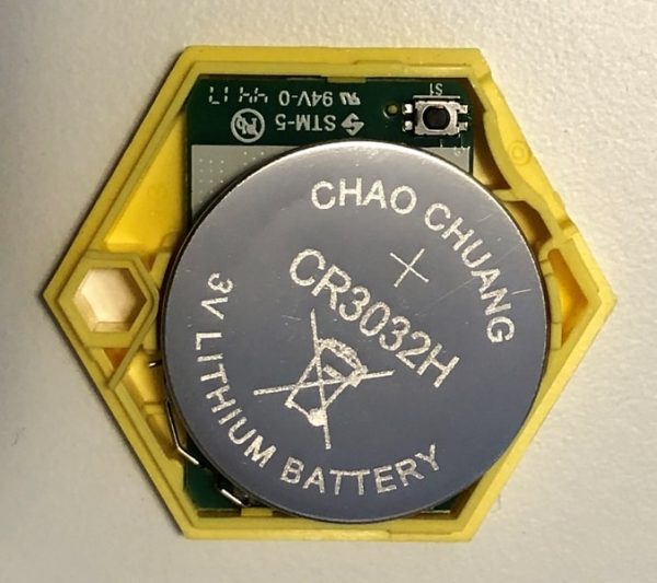
The tracker is powered by a CR3032. This behemoth battery is claimed to power the XY4+ for five years. (I’ll let you know how that turns out in 2023!)

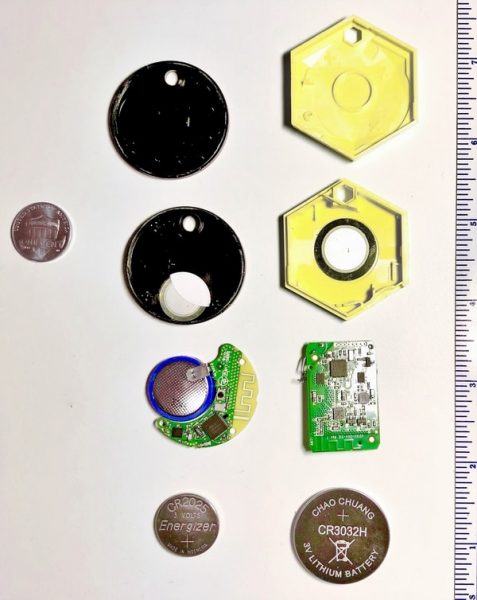
For sake of comparison I have the XY4+ next to a Chipolo+ and also next to a scale and penny. The CR2032 battery the Chipolo+ is powered by is welded to the PCB, so I have also included a CR2025 for comparison which has the same diameter as the 2032. It’s interesting to note how many more components the XY4 has on the PCB.

Extra battery life is great, but you pay for it in size. The XY4+ measures 1.5″ on the flats, 1.75″ on the points, and is 0.4″ think. It’s about twice as thick as some competitor devices. Is replacing a battery once a year in a tracker so bad if 90% of people do it annually in their smoke detectors?

Operation

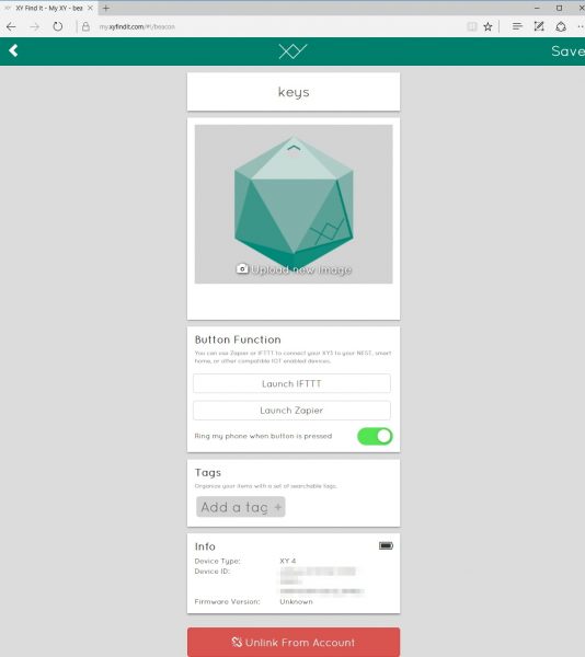
The XY4+ can be accessed by iPhone and Android devices but the last known location can also be seen on any web browser at https://my.xyfindit.com. The web browser will show a map of all of your item locations.

Clicking on any of the items will bring up a menu for that item. The menu indicates if IFTTT pr Zapier is linked to what type of button presses (short, double, or long) and gives a shortcut link to the web portal for both IFTTT and Zapier. The web also shows the approximate battery strength.

Pictures can by associated with the device and the pictures will be updated across platofrms.

I found that, in general, operation on the devices that communicate with the tracker is problematic.

iOS

Operation on the iOS app has a lot of issues:

  1. The app must be running for the XY tracker to ring the phone (in case the phone is lost).
  2. The app will not operate to ring the tracker unless location services is active.
  3. Running the app requires significant battery power (to constantly use the GPS).
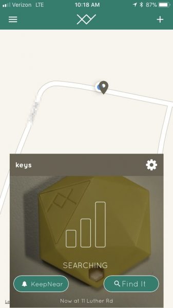
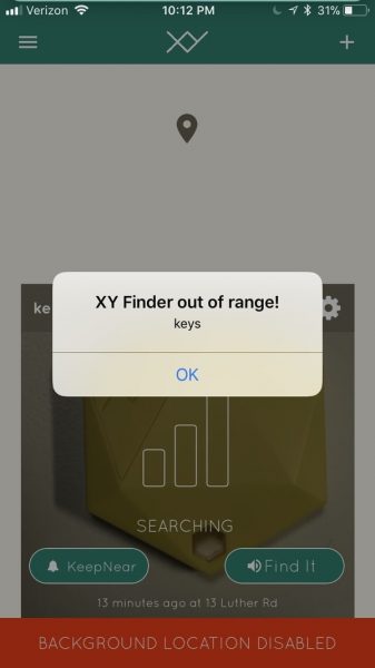
  4. The KeepNear function, which should alert the user if the tracker and phone are separated, doesn’t work reliably. When it does work it presents a dialog box that the tracker is out of range, not a notification.
  5. The image associated with the tracker is occasionally lost by the software.
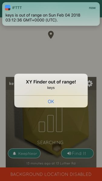
  6. The IFTTT and Zapier triggers are forwarded to the IFTTT app. However, actions are not passed (the tracker never beeps).
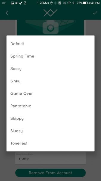
  7. There is no way to change the music.
  8. The battery icon may be inaccurate. The icon shows 100% when the battery is 76% – 82%.
  9. There is no way to upgrade the firmware of the tracker.

Android

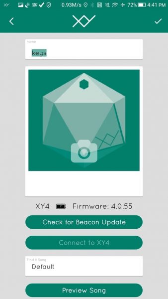
Operation on the Android app is a bit better. The app supports running as a service, auto start with the phone, vibrate on notify, adjustable KeepNear sensitivity, battery saver mode and tips of the day, and use the notification screen to alert the tracker is out of range.

The app provides more interaction with the IFTTT and Zapier apps:

The app also lets you select music that the tracker rings:

But:

  1. The image associated with the tracker is occasionally lost by the software.
  2. The KeepNear system only says when the keys are out of range, not when the signal strength is low. I don’t want to wait until I’m 300 ft away from the keys until I’m told they’re forgotten.
  3. The IFTTT and Zapier actions are not passed (the tracker never beeps).

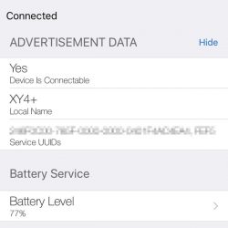
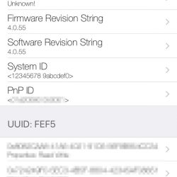
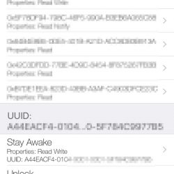
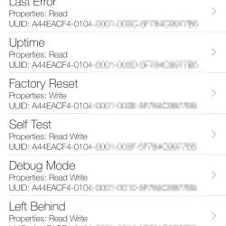
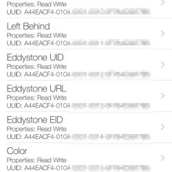
I used LightBlue Explorer to interrogate the tracker and found these are all of the settings within. The hardware seems to have a lot of functionality.


The fact that the Android app has so many more features leads me to believe that the iOS app will catch up.

Performance

I compared the XY4+ to the Chipolo alert. The XY4+ is louder than the Chipolo, but It doesn’t seem like it is twice as loud.

I was unable to get even a fraction of the range on the tracker compared to its stated range. Whereas the Chipolo+ worked up to 160 ft away in this review, the XY4+ works to only about 80 ft under the same conditions. The signal also doesn’t reestablish until about 50 ft away.

Latency between the time you push the “Find it” button and the time the tracker rings can be long so its difficult to tell if you should be listening out for it or if it hasn’t started to beep. In my tests, I usually found the tracker before I heard it.

What I like

  • Integration with IFTTT and Zapier
  • Some choices for melody

What needs to be improved

  • App performance is poor
  • Range is overstated

Final thoughts

The XY4+ tries to beat the competition by offering a device with superior specifications. However, the tracker fails to capitalize on what makes other trackers so successful: good software, reliable operation, and a well-established user base. I used a Chipolo tracker and the XY4+ tracker while reviewing this product and the Chipolo outperformed every time.  At the moment the Chipolo is the recommended device. If the software improves and this fixes the range issues, latency issues, and usability issues then perhaps my recommendation will change. But for now, my keychain will have a small round tracker on it, not a larger hexagonal one.

Price: $39.99
Where to buyAmazon.
Source: The sample for this review was provided by The Findables Co..

Mission Workshop Icon City Pants review

I hate to say it but I am a jeans/Carhartt wearing kind of guy. I rarely have to get dressed up, for work or otherwise (if I could live in sweatpants or basketball shorts I would). I have a few pairs of reasonably nice slacks but that’s it. So, when Mission Workshop offered their new Icon City Pants I thought it would be fun to try a pair of high end, modern day trousers for a change of pace 😉 .

What is it?

The Icons are a multipurpose pair of pants designed for modern day city dwellers. Mission Workshop have engineered the Icon for work and play, made from an advanced 4-way stretch textile developed specifically for them by Mectex M.I.S. at their mill near Lake Como, Italy and manufactured in China.

According to the Mission Workshop website:

The Icon is built for foot travel, train/air travel, office work, physical labor, and all types of riding including bikes, skateboards, scooters, etc. Built to endure.

…structured drape of the fabric, combined with a forward silhouette and seam detailing, give the pant the credentials for both workplace and street.

Design and features

The Mission Workshop Icon are a charcoal gray utility pant with a modern fit and style. They have two hand pockets, knife/coin pocket, zippered right thigh pocket on the front and single (right cheek) back pocket. The cotton/nylon blend fabric used to create the Icon is engineered to have high level of durability, breathability, and freedom of movement while remaining soft yet water-resistant.

Material and construction quality:

The Icon is constructed from an Italian fabric made from 55% Cotton / 35% Polyamide / 10% Elastane. The textile has a very fine weave and the quality is excellent. The stitching and finish is also of the highest quality.

Funny story…I needed to get the pants hemmed. So instead of asking my wife to shorten their length, I went to a professional seamstress. She was surprisingly impressed with the Icon’s quality, construction, and styling.

I wish the zippered thigh pocket was a little bigger. Sadly it isn’t large enough for my iPhone X…not a chance of a phablet fitting at all. Though an iPhone SE does just barely squeezes inside.

Fit and sizing:

I was a bit worried about sizing. I usually wear a 33 waist and 34 inseam in US Levis and Carhartts. Thus Mission Workshop sizing was a bit foreign to me. So, I got out a measuring tape and did my best. I would prefer a little loose than overly tight. Overall, I hit the mark pretty well and other than length, the Icon’s fit very nicely. They’re relatively form fitting and definitely designed for a certain body type (think lean and long). If you’re not relatively skinny, the Icon’s probably won’t fit you due to the limited sizing and body ratio matrix Mission Workshop has.

Dorky as it sounds, the first comment that comes to mind when I look at this picture is: do these pants make me look fat? The Icon’s are comfortable and feel almost sweatpants-like. All the while, looking modernly professional. But the truth be told, they are more for the Gadgeteer Kid (aka the young & lean of the world)…perhaps just a bit too hipster/millennial for the 50ish crowd. That said, I did receive many unsolicited compliments regarding how nice the pants looked from family, friends, and coworkers.

The Icons can be washed in cold water and are not supposed to be tumbled dried. A cold iron can be used to press them or “gentle” dry-cleaned.

Positives

  • Excellent material & construction quality
  • Water-resistant finish
  • 4-way stretch
  • Breathable

Negatives

  • Expensive
  • Rigid/limited sizing
  • Zippered thigh pocket should be bigger

Final thoughts

While not much of a tech-toy or gadget, I really like the Icon City Pants. Mission Workshop has done an excellent job creating a high quality pair of pants that are not only comfortable but look good in the office or puttering around town. I’m debating on keeping them for myself or giving them to the Gadgeteer Kid, cause the realist in me knows how much better he would pull them off. They are without a doubt expensive but if money is no object and you’re in the market for a pair of excellent urban wear, the Icon City Pants are worth your consideration.

Price: $285
Where to buy: The Mission Workshop.
Source: The sample of this product was provided by Mission Workshop.

Contour Design RollerMouse Red plus ergonomic mouse review

I’ve recently been on a mission to find a new mouse to help alleviate some problems that I’ve been having with my right hand and thumb. After reviewing Contour Design’s Unimouse, they followed up with an offer to review their Rollermouse Red plus which they felt might help me more than their Unimouse. I’ve been using the RollerMouse Red plus for the past couple of weeks and am ready to share my thoughts.

What is it?

The RollerMouse Red plus is a unique cursor moving device, aka “mouse”. But unlike a traditional corded or wireless mouse, the RollerMouse Red sits behind your keyboard and moves the cursor by moving a rubber covered tube. That makes it sound much stranger than it really is, so keep reading.

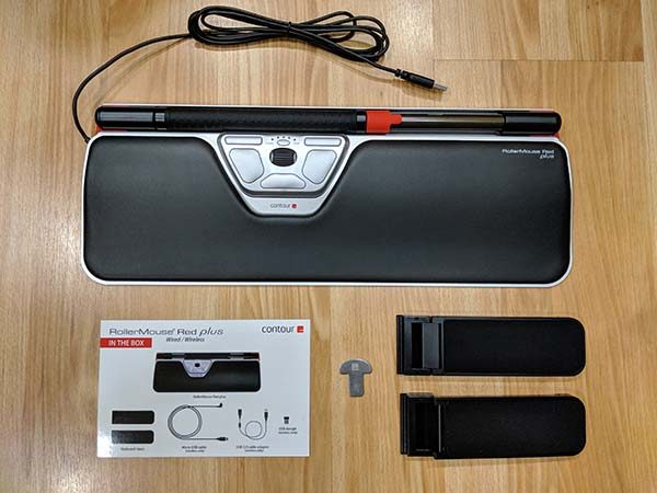
What’s in the box?


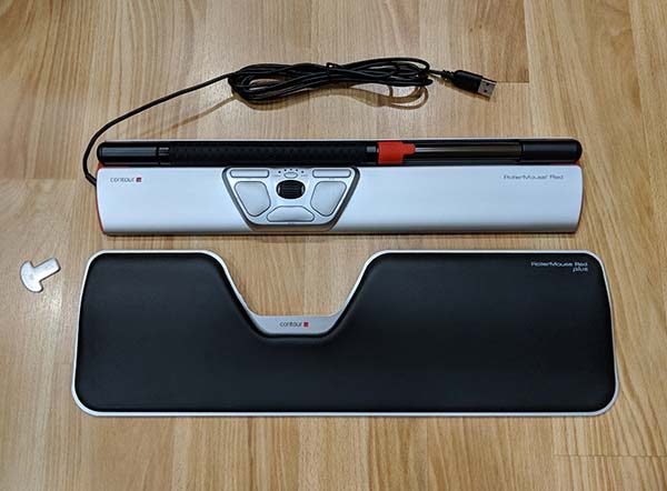
Rollermouse Red Plus
Keyboard supports
Key to remove wrist rest

Design and features

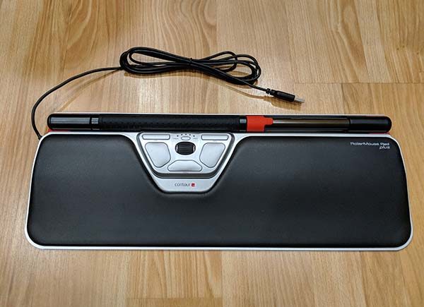
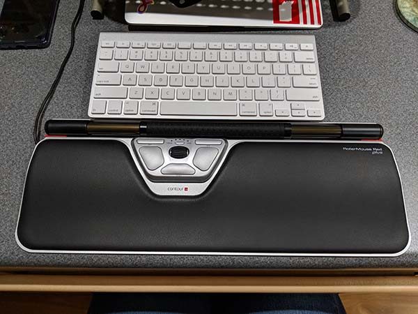
The Contour Design RollerMouse Red plus is premium looking and feeling product which features a large padded wrist rest with the roller bar attached above it.

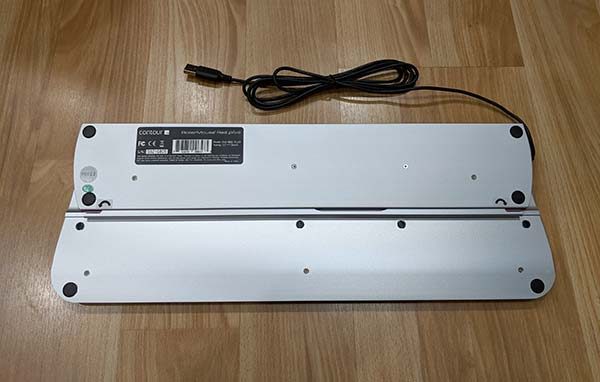
The base of the RollerMouse Red plus is made of aluminum which has enough weight that it does not move around once you place it on your desk.

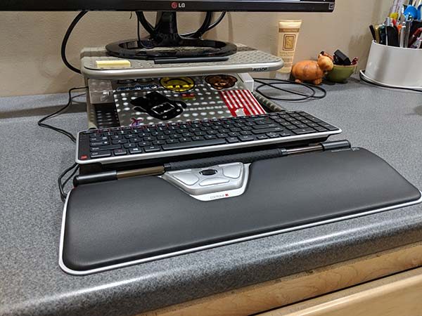
If you don’t have room or really like the wrist rest, it can easily be removed by using the included tool. I personally like the wrist rest and find that it enhances the comfort of using the RollerMouse Red plus.

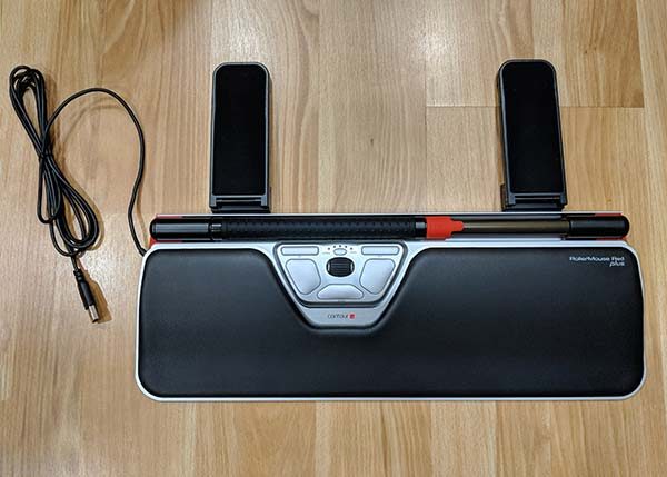
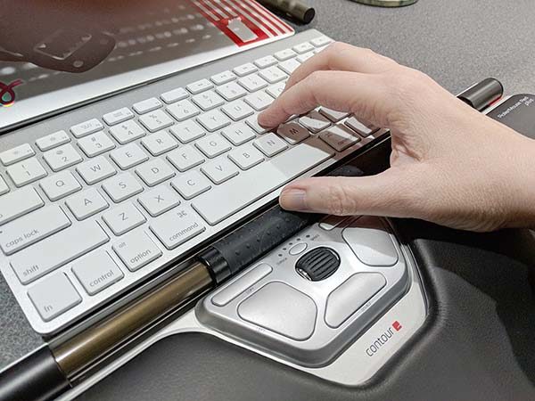
Also included with the RollerMouse Red plus are two keyboard supports that slide into slots on the base of the device. These supports allow you to position your keyboard so that it is raised to the level of the RollerMouse Red plus.

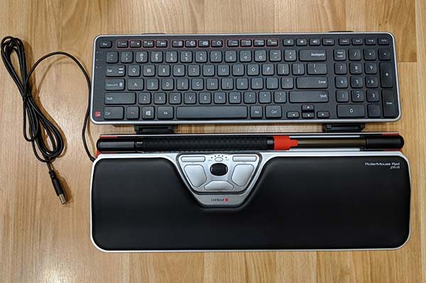
Contour Designs also included their Balance Keyboard which has been designed to be used with their roller mice. I started out test the RollerMouse Red plus with the Balance Keyboard, but I ditched it for my original Apple wireless keyboard early on in the process. The keyboard is nice, but the layout of the Balance Keyboard didn’t work that well with my MacBook.

My Apple wireless keyboard looks tiny compared to the RollerMouse Red plus, but it works fine for me.

How does the RollerMouse Red work?

The RollerMouse has an 11.75-inch long tube with another tube over it that can roll up and down and be moved side to side with one or both of your thumbs. This is what moves the cursor on your computer. The roller bar has a rubber cover with nubs that make it easy to move around without slipping under your thumbs.

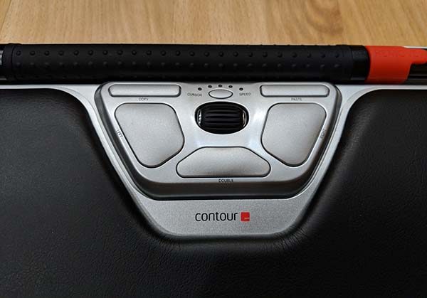
The roller bar can be clicked to select things. In addition to clicking the roller bar, there are other ways to select items with this “mouse”. Below the roller bar are dedicated left and right mouse buttons, copy and paste buttons, and a one-touch double-click button. There’s also a small roller in the center that is used as a scroll wheel. This scroll wheel can be clicked to open pages in a new tab in your browser.

You’ll also notice a small oval button between the copy and paste buttons. This button is used to customize different settings for the RollerMouse Red plus. You can customize the cursor speed, click force of the roller bar, and the volume of the button clicks.

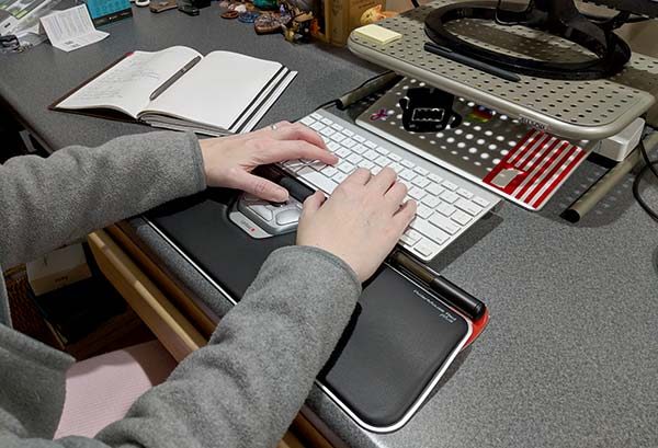
As I mentioned above, I’ve been using the RollerMouse Red plus for the past few weeks. At first, I didn’t think I was going to like it because it felt awkward to use the roller bar especially to select things by clicking it. When I first started testing the RollerMouse, I still had my Logitech mouse next to the keyboard and I found that I would unconsciously reach for it and use it instead of the RollerMouse without really paying attention to what I was doing. I was using my traditional mouse as a crutch of sorts. After I finally took the Logitech mouse and put it in a drawer, I quickly acclimated to the RollerMouse and it now feels second nature to me.

The whole idea behind this mouse is that you don’t have to move your hands away from the keyboard to use it. I can just drop my thumbs to the roller ball to move the cursor or to the smaller scroll wheel to scroll pages while still keeping my fingers on the home row of the keyboard.

Positives

  • Keeps hands on the keyboard
  • Comfortable
  • Multiple buttons and scroll wheel
  • Can be used with any keyboard

Negatives

  • Slight learning curve
  • Accidental presses of the dedicated left mouse button
  • Expensive

Final thoughts

I really like the Contour Design RollerMouse Red plus ergonomic mouse because it’s comfortable to use and I don’t have to move my hands away from the keyboard like a traditional mouse to use it.

There are two downsides to the RollerMouse Red plus that I want to mention. I noticed that the palm of my left hand would sometimes accidentally press the dedicated left mouse button which would end up moving the cursor to a new location. This usually happens when I’m typing and will cause me to start typing new text in the wrong location. It doesn’t happen to me very often, but when it does, it’s kind of annoying.

But the biggest issue with the RollerMouse Red plus is the price. At $265, it’s not a frivolous purchase. That price will scare a lot of people away from buying one, which is unfortunate because it’s quickly becoming my favorite “mouse” of all time.

Price: $265.00
Where to buy: Contour Design or Amazon
Source: The sample of this product was provided by Contour Design.

Wiplabs Slope universal tablet stand review

I’ve had several years of happy tablet use with my venerable Dell Venue 8, but found that when I wasn’t using it, I left it in odd locations – a piano bench, cluttered dresser top, even on the kitchen counter. Wiplabs Slope universal tablet stand has finally given me a place to park my tablet. My little buddy has found a home.

What is it?

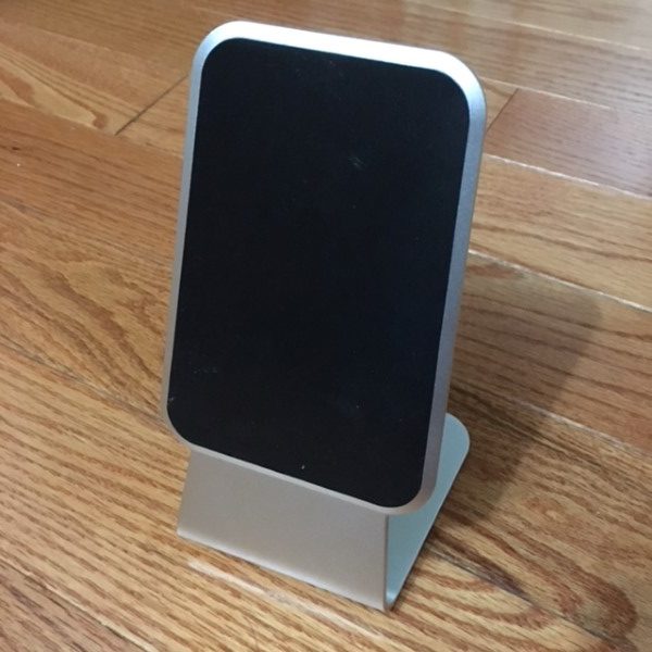
Wiplabs Slope universal tablet stand is a sturdy, brushed aluminum parking spot for your tablet or smartphone. It’s equipped with sticky pads on the face and base, to securely hold your device.

Hardware Specs

  • Brushed aluminum construction
  • Strong grip pads on the front and bottom
  • 7-1/2” tall
  • 4” width at its widest
  • 4” deep
  • 8.9 ounces

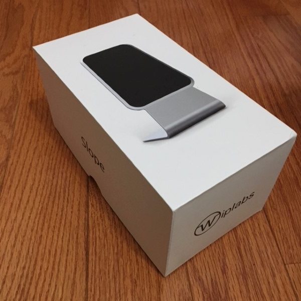
What’s in the box?

  • Slope stand
  • User manual

Design and features

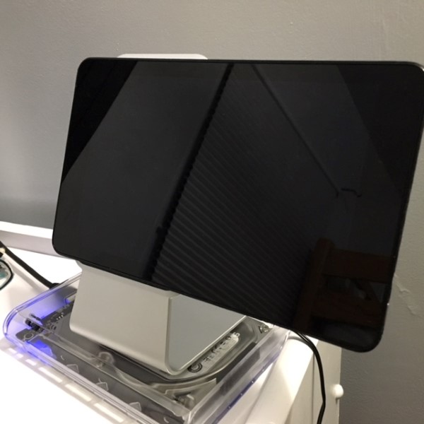
The Slope is an aluminum frame with sticky pads allowing an attached device to be used without shifting, sliding, or slipping. It’s simple, tough and works very well.

At first glance, I thought, “This looks fairly intuitive. Why should I read the manual? All that needs to be done is peel the protective plastic covering off the sticky pads, put it down, and slap my tablet in place.” I’m so glad I went through the manual first…

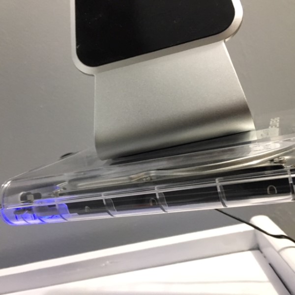
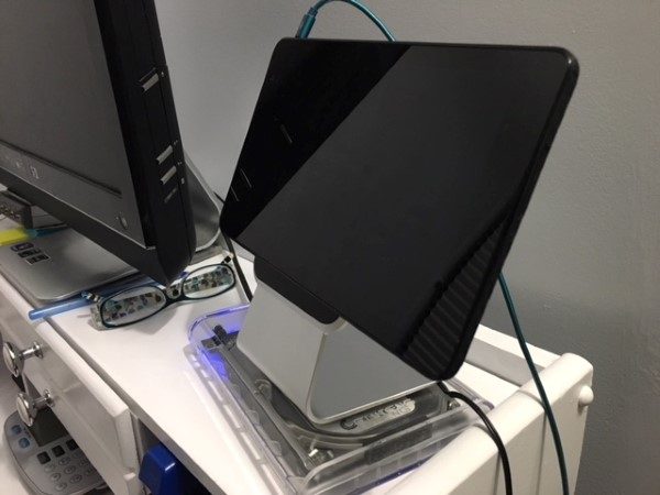
The fresh sticky pads on the Slope are downright powerful. The first time I put it down, I was shocked at the gripping power. The manual contains warnings about placing it on a painted surface and they aren’t kidding. I suspect that if the Slope were placed on a loose surface, it could easily pull fresh paint, laminate or even a heavy glass desk protector loose.  The grip is so secure, it completely lifted a clear plastic USB hard drive enclosure I had placed it on. The manual states that normal wear, dust, and debris that sticks to the pads will lessen its grip, but after a week, it’s still holding on tight.

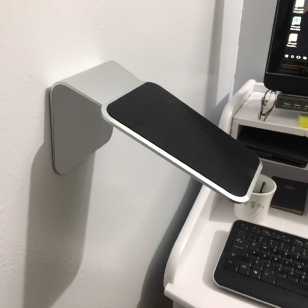
The next photo is in the correct orientation. Yes, it’s really sticking to the wall.

The sticky pad on the face is the same, but I had a little challenge to overcome. Having worked in factories and tough environments, I had applied a carbon fiber skin to my tablet. I had previously tried similar products with little success holding onto the carbon weave, but the Slope’s stickiness had no trouble gripping the irregular surface.  I was able to place the tablet vertically and horizontally with no difficulties. I was also able to offset the tablet, pushing the center of gravity considerably off balance with no problems. I have no doubt the Slope can hold considerably larger tablets with ease.

Having my tablet in its new home brought new uses. The viewing angle is very good so, while I’m fiddling around with my desktop, I was able to pull up Netflix and comfortably watch. As a result, my tablet is seeing more usage.

What I like

  • The sticky pads hold very securely, horizontally or vertically
  • The viewing angle is very good
  • Sturdy, attractive construction

What needs to be improved?

  • I would recommend Wiplabs place a warning label on the sticky pad peel-off plastic protectors to prevent their customers from damaging their desks! 🙂
  • At $49.99, it’s expensive, but definitely premium quality

Final thoughts

The Wiplabs Slope universal tablet stand is handsome, well-constructed and works better than other sticky type stands I’ve used, particularly with the carbon fiber cover on my tablet.

Price: $49.99
Where to buy: Wiplabs.com or Amazon
Source: The sample for this review was provided by Wiplabs.