Canvas Press canvas print review

Last year for vacation, my husband and I joined another couple for a trip to Santa Fe, New Mexico.  The very first day we were there, we were walking around the main square as the ‘Golden Hour’ hit.  For the photography nuts reading this, you will know the Golden Hour is the hour after sunrise and the hour before sunset where you can get some really optimal lighting.  Just down the street was the Cathedral Basilica of St. Francis of Assisi.  It was the perfect ‘Kodak’ moment!  I ran like a fool down the street stopping traffic so I could stand in the middle of the street and get the shot.  When we got home I had the image printed on metal and have it hanging proudly in our living room.  Our friends who went on the trip with us have said that they really want a copy of the image for themselves.  Lucky me, Julie posted up an offer to review the canvas prints from Canvas Press.  I jumped at it and now I have the perfect gift for our friends who are getting married in September.

What is it?

Canvas Press is a web-based photo printing company.  They have been in business since 2006. They offer canvas, metal and paper prints.  They even offer murals using a set of stock photos.  I was given the opportunity to try out a 16 x 20 1.5 inch canvas print.
How is it done?

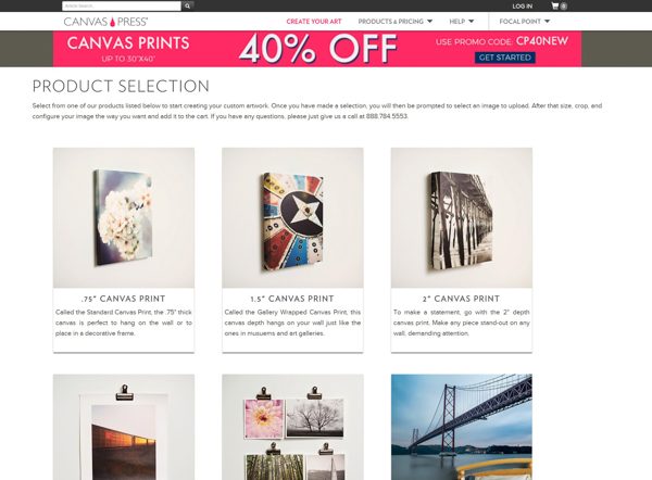
You start by going to their website at www.canvaspress.com and click on the ‘Get Started’ button at the top of the screen.  The picture above shows you the various products they have available.  They offer .75 inch, 1.5 inch, 2 inch and non stretched canvas prints.  I clicked on the 1.5-inch Canvas Print option.
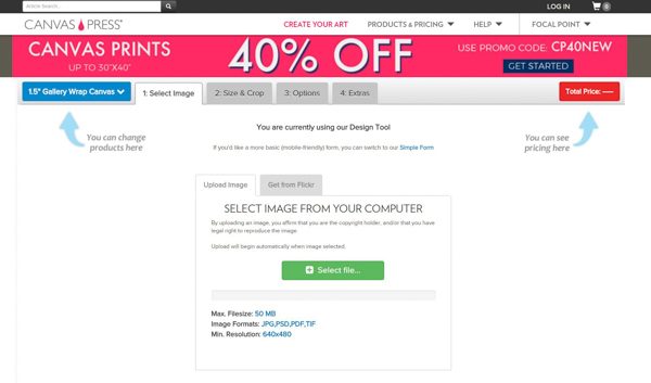
I was then presented with the screen above.  You have the choice of picking a picture off your computer or you can also download an image from Flickr.  They do give the following limits when downloading your photo:

  • Max file size of 50 MB
  • Image formats limited to JPG, PSD, PDF, TIF
  • Minimum resolution is 640 x 480

I choose the photo from my computer and proceeded to upload the photo to their website.
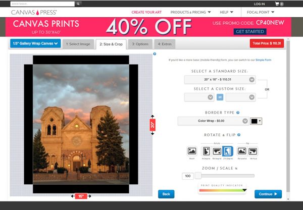
On the next page, I was presented with my photo.  I could easily rotate the photo to the proper perspective. I could also place my mouse on the picture and move the picture around as necessary. The first thing the site asked was what size I wanted for my print.  I chose 16 X 20 but they do offer the following sizes:

  • 8 x 8
  • 10 x 8
  • 14 x 11
  • 20 x 16
  • 24 x 18
  • 30 x 20
  • 30 x 24
  • 36 x 24
  • 40 x 30
  • 40 x 36
  • Custom size of your choosing

They also offer multiple options when it comes to the border type on the canvas print.  The standard is a mirror wrap option.  Depending on what is in your picture different options might make more sense.  On the canvas print I made a few years back I chose the ‘image wrap’ option where the image was carried around to the sides of the photo.  This option works great if you have a lot of extra image to wrap around.  They also offer a mirror image option where they replicate pieces of your picture on the sides. This would not work for the image I was using.  In my case, I chose ‘color wrap’ and then picked the color black.  This will give me black on the canvas edges as you can see above.  One thing to note is that at the bottom of the screen they are showing you a print quality indicator.  Depending on how many pixels your image is, the print quality can get really poor if you try to print large images or zoom in too much.
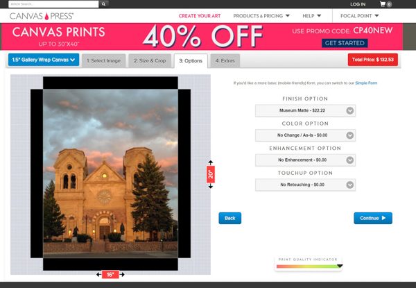
The next page presented me with several options.  The first was the ‘Finish Option’.    The ‘Standard Canvas’ is the default no charge option.  The next option is ‘Museum Glossy’.  The website states this will give you a smooth surface and deep rich blacks.  Since this print would be going into a room with lots of light I chose the next option of ‘Museum Matte’ which would give me the matte finish and not have so much shine to it.

The next option is ‘Color Options’.  I defaulted to the ‘No Change/As Is’ option which is how I had the previous version of this picture printed.  I wanted to try to compare the two using the same options I could.  There are several other choices such as black and white, sepia and blue suede shoes.

The third option is called ‘Enhancements’.  I left mine with no enhancements.  They offer such options like ‘Oilworks’ where they can make your picture look like a painting, pop comic and various other options that are a lot like some of the filters you see in apps like Snap Chat.

The final option is retouching.  Here I left the setting at the default of ‘No Retouching’.  I did not have my first print of this picture retouched so I wanted to be sure they just printed what I gave them.  You can pay extra for things like minor or major retouching.  The major retouching will do advanced things like background replacement and large object removals from the picture.
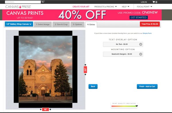
The last and final page only includes two options.  The first is a text overlay option. This option will add a text label to your picture.  I chose none, but if you do choose to add text, it lets you pick the font, size, and color of the text.  The website then lets you position the text wherever you want it on the image.  It is actually a pretty cool idea.  The last and final option is your mounting choice.  I left it at the default ‘Sawtooth hanger’, but you also have the choice of wire, security (in case you think someone will still your print!) or no hanger at all.  The last thing you do is click add to cart and you pay for the print.

I did all of this on a Sunday.  I chose the standard ground shipping which cost me $12.58.  I found the picture waiting on my doorstep the very next Wednesday.  I found out the company is located in Houston, Texas and I am located in San Antonio, Texas.  This explains the really fast turnaround I experienced.  It does speak well that my picture was printed and shipped the very next business day.

What it looks like
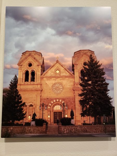
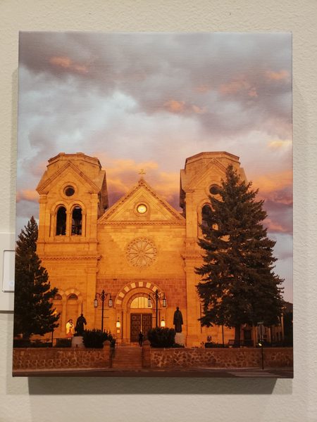
The above picture was the print on metal from another printing company.

The picture above is the same picture in a smaller format on canvas from Canvas Press.  Notice I did not choose any type of touch-ups or enhancements, but they did lighten the image.  The trees are more distinct, but the church itself is now, in my opinion, a bit too yellow/orange looking.  Because the entire picture has been brightened we also lost some detail in the clouds.  I still think it is a good print and I know my friends will love it, but I do wish they had printed it exactly as I sent it to them.  I believe the top print was more true to the original scene.  The sun was setting but the church itself and the clouds behind were bathed in a nice glow.  The trees are just a part of the frame for the church in my mind.
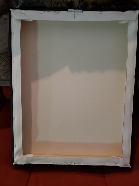
I took a picture of the back of the print to show you how they mounted the canvas to the frame.  This is pretty standard with another canvas print I have at home.  The sawtooth hanger is also pretty standard and works well.

What I like

  • Super fast printing
  • Lots of options when deciding what and how you want it printed.
  • Prices are comparable to other canvas print sites
  • Canvas quality is great and the picture is stretched tight over the frame.

What needs to be improved

  • Don’t touch up the picture if I ask you not to. NOTE – this may not be an issue with other folks and they may appreciate this and call it a feature.

Final Thoughts

Overall I think they delivered a very nice product.  I have seen some canvas prints from other companies not be stretched tight enough across the frame, but Canvas Press did a great job with this.  They also had next day printing and shipping when I ordered on a Sunday.  I also loved the plethora (I love using that word!) of choices when designing your print.  I think if you are looking for a place to try printing on canvas I would certainly give them a try.

Price: $132.53 for a 20 x 16 1.5in canvas print.  I paid extra for the matte finish.
Where to buy: Canvas Press website
Source: The sample for this review was provided by Canvas Press.

The post Canvas Press canvas print review appeared first on The Gadgeteer.

Filed in categories: Reviews

Tagged: ,

Canvas Press canvas print review originally appeared on The Gadgeteer on March 29, 2018 at 11:00 am.

Note: If you are subscribed to this feed through FeedBurner, please switch to our native feed URL http://the-gadgeteer.com/feed/ in order to ensure continuous delivery.

PortraitPro 17 Studio Max photo editing software review

What is it?

PortraitPro 17 Studio Max is a very intuitive and easy to use photo editing software that allows even the most novice of users to quickly learn and edit photos for a truly professional look. It provides a set of tools that is able to fix just about every defect in a photo, and it also works as a plugin for Adobe Lightroom and Adobe Photoshop to ensure that it fits into a complete professional workflow.

Design and features

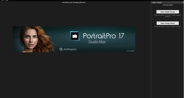
When you first run the PortraitPro Studio Max application, the first screen is a splash screen with 2 choices that allow you to open a single image to edit or to open a batch of images for editing.

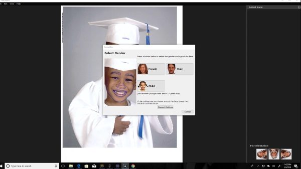
If you select to open a single image, the file manager will open and allow you to navigate and select a photo. Once the photo is selected, it will appear in the background with a selection dialogue box over it asking you to select if the picture is male, female or child. I do believe that the software uses this information for the face detection algorithm. This screen also has the option to rotate the picture to the correct or desired orientation.

Once the selection is made, and in this case, I chose child since I used my son’s picture for this review, a split screen appears with a left and right pane. It is important for me to explain that I bought this photo of my son’s graduation to support his school. However, it was painfully obvious that it was overexposed and taken in such harsh light that it just about ruined the photo. This made it the perfect photo to test PortraitPro.

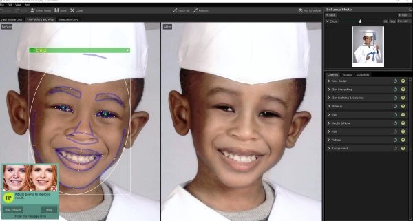
On the left pane, there is the picture with the face detection mask outline with nodes, that allow you to change the shape to define the facial area as you would like. On the right pane is the same picture without any masking. The picture on the right pane reflects the changes that you make on the left throughout the process. The toolbar on the right shows the original picture on the top and the available editing categories and tools below. There is also a floating “tips” box that can be hidden as desired.


There are 3 main tabs for the editing tools which are Controls, Presets, and Snapshots. The Controls tabs contain all of the tools that you use for original editing. The Presets tab contains presets for the controls, and the Snapshots tab is for saved snapshots. Under the “Controls” tab there are 9 editing categories:

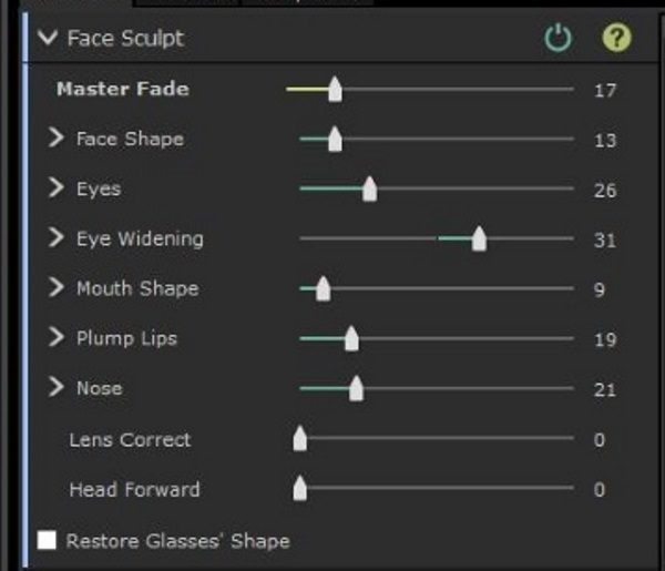
Face Sculpt


As depicted by the tool selection, the face Sculpt toolset allows you to reshape all the aspects of the face to either correct them to be true or to enhance them for the required look.

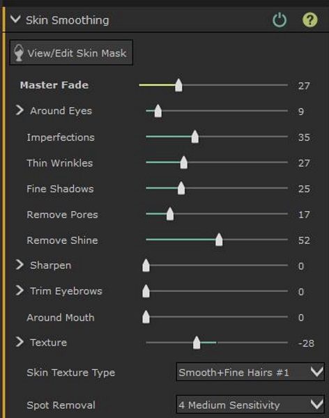
Skin Smoothing

Skin smoothing allows you to smooth out the normal skin imperfections like bags under the eyes, wrinkles, bushy eyebrows, skin texture, spot removal, etc. It really does a great job in this category as well.

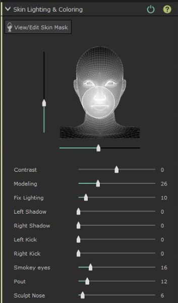
Skin Lighting and coloring

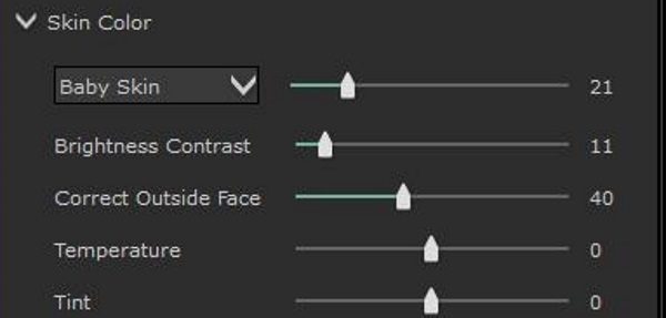
Skin lighting and coloring is made up of two sections. There is the main section that allows you to edit all of the lighting properties of the portrait. There is also a second section that includes two categories that are Skin Color and Tan. Skin color allows you to edit contrast, temperature, and tint along with brightness and color correction of the skin immediately outside of the mask area.

The Tan section allows you to saturate and darken the skin color, and tweak the level of “gold” in the skin color to get the desired skin shade.

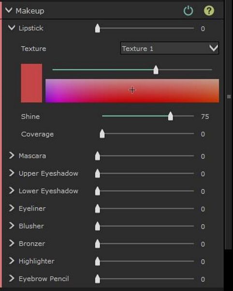
Makeup

The Makeup category is another section that really shines in this software. The ability to not only fix makeup imperfections highlighted by the lighting when the picture was taken is an amazing tool. You are also able to add makeup effects to enhance the photo.

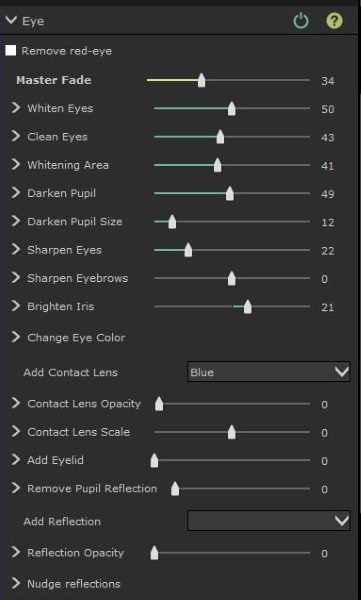
Eye

The “eye” tool is another amazing capability of this software. As I played around with the tools I was really impressed by the effects that can be added and how much you can actually alter the mood and/or facial expression by altering the appearance of the eyes.

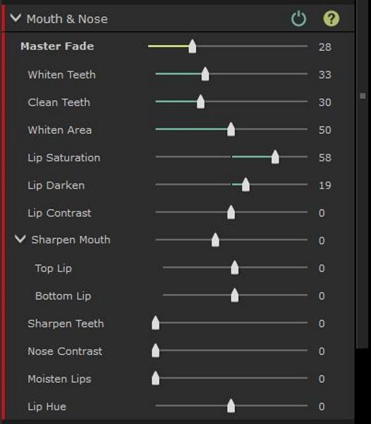
Mouth and Nose

This is simple but effective set of tools that allows you to enhance the appearance of the mouth and lips and remove some of those unwanted digital artifacts that can be the result of bad lighting or an unprepared subject.

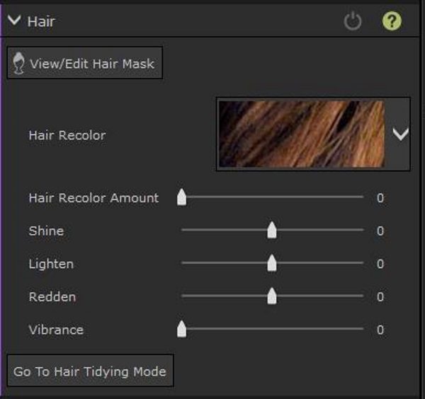
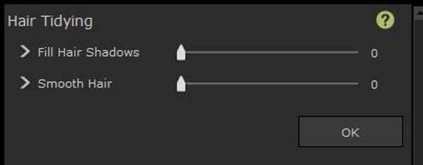
Hair

The hair tools are a simple set of tools that allow you to get the correct look and smooth appearance of hair which is key to a good portrait. Smoothing and tidying hair that may have been a bit ruffled from movement or from wind is a great ability. Being able to alter the color of the hair is also nice.

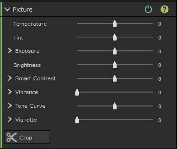
Picture

The picture tools allow you to change the overall lighting and other attributes of the picture including vibrance, exposure, temperature, tint, etc.

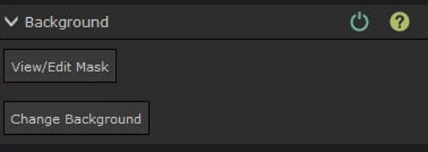
Background

I had a really enjoyable time playing around with the background tools. This category offers two sub-categories.


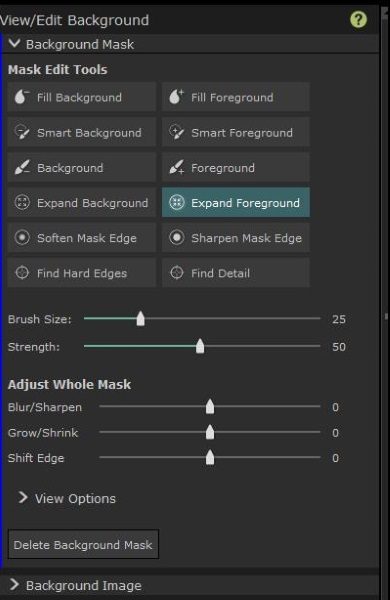
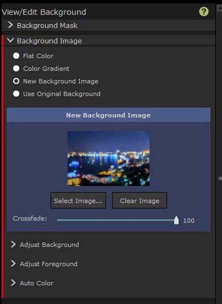
The Background Mask tools allow you to fill the foreground and the background along with several other adjustments. I am sure that once these tools become familiar, that replacing backgrounds is easy and very well done.

The Background Image category allows you to add background images or colors, and to adjust the background and foreground to blend as desired. The color gradient can also be tweaked to satisfaction. There is also an Auto Color category that allows you to blend the colors.

 What I like

There are so many really great things to like about this software. It includes a really great set of tools that are in my opinion, a great asset to any level of photographer or editor. I was very impressed with what I was able to do to fix and enhance the photo. I really like the numerous specific tools and tweaks that are included that allow you to get a picture just right. I was able to edit what I considered to be a horribly taken photo of my son, albeit that it was taken by a supposed professional photographer, and I was able to fix almost everything that was very wrong. Whatever I was unable to fix was due to my lack of knowledge of how to manipulate all of the great tools, and I am very sure that the more I work with this software, that perfection will be obtainable.

I also like that compared to the many other available software packages, PortraitPro is a great bang for the buck. Its ability to be added as a plugin to Adobe Lightroom and Photoshop makes it a permanent part of my workflow.

What needs to be improved?

While the PortraitPro software is a simply excellent photo editing set of tools, there are a few improvements that can be made to make it the obvious “go to” application. I feel that the face masking could be slightly more accurate in its initial detection, and could include more nodes on the lines of the masked areas, for more precise adjustments to the facial contours. I also think that the background detection can be more accurate by possibly doing a better job at detecting the edges of the subject so that a basic mouse can do the job as opposed to the Wacom Tablet that I had to use to get more precise edges of the photo. While the brush size can be adjusted, using the mouse for this did not feel as comfortable.

I also think that this software can be the perfect tool if a hardware controller is designed to precisely adjust the sliders, much like the Loupedeck does for Lightroom.

Final thoughts

Before

After

I am very impressed by what PortraitPro offers and what I was able to accomplish with my first try with the software. As you can see from the photo above, my initial attempt while not perfect has yielded very nice results. I have no doubt that as I continue to work with the software that I will not only get better at using all of its editing tools, but I am sure that it will continue to be an integral part of my workflow, especially if PortraitPro continues its current trend and releases updates and new versions to add to its already great set of tools.

PortraitPro is available in three editions: Standard, Studio and Studio Max which is the version used for this review.

Price: Starts at $39.95 for the standard edition.
Where to buyPortraitPro
Source: The free software license for this review was provided by PortraitPro

The post PortraitPro 17 Studio Max photo editing software review appeared first on The Gadgeteer.

Filed in categories: Reviews

Tagged: ,

PortraitPro 17 Studio Max photo editing software review originally appeared on The Gadgeteer on March 28, 2018 at 4:52 pm.

Note: If you are subscribed to this feed through FeedBurner, please switch to our native feed URL http://the-gadgeteer.com/feed/ in order to ensure continuous delivery.
Alexa in your car, Bellroy wallet, and more – Review updates

Do you ever wonder what happens after we review a product? Do we immediately stop using the product because it breaks? Or do we continue to use it for years and even decades? To answer those questions, we periodically like to update our past reviews with new information. Check out our latest review updates by clicking on the review links below and then scrolling to the bottom of the page to read the newest dated updates.

Speak Music Muse Alexa voice assistant review by Julie Strietelmeier

Optoma NuForce BE6 Bluetooth wireless headphones review by Andy Jacobs

Bellroy Note Sleeve wallet review by Andy Jacobs

ONOTONE Concrete and Bamboo iPhone X Case review by Ryan Pagel

SOLGAARD Lifepack: The Carry-On Closet review by Ryan Pagel

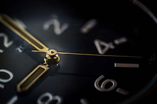
Albert Clock review: Improves your math skills and looks cool by Ryan Pagel

The post Alexa in your car, Bellroy wallet, and more – Review updates appeared first on The Gadgeteer.

Filed in categories: Reviews

Tagged:

Alexa in your car, Bellroy wallet, and more – Review updates originally appeared on The Gadgeteer on March 28, 2018 at 12:15 pm.

Note: If you are subscribed to this feed through FeedBurner, please switch to our native feed URL http://the-gadgeteer.com/feed/ in order to ensure continuous delivery.
Colonel Littleton No. 30 Leather Composition Journal review

OK, we’re definitely going old school on this review. The Colonel Littleton No. 30 Leather Composition Journal doesn’t have any chips, batteries, buttons, etc…it doesn’t even protect or carry tech. This journal is meant to capture your thoughts, dreams, notes, todos by putting pen to paper. Over the years, I have attempted (and failed for the most part) to write down what’s going thru my mind or take better notes when need be, hopefully a closer look at the Colonel’s latest creation will help me get that done.

What is it?

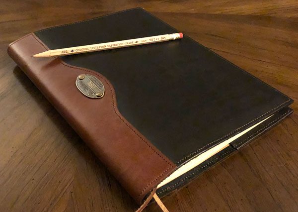
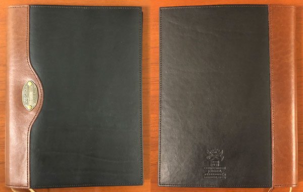
The No. 30 Composition Journal is a leather book cover, designed to hold Colonel Littleton’s journal register paper insert. The exterior is made from polished, full grain leather with a timeless, Old World style and functionality to it, meant to hold and protect the notepad (and what’s written) within. 

According to Colonel Littleton –

The leather composition journal has been around since the mid-1800s or thereabouts.  Even with a proliferation of electronic devices, its popularity and relevance endures.

Funny thing is, my 20-something nieces have preferred to read real books (vs ebooks) and take notes on an actual pad of paper their entire lives. I’ve dogged them a bit over the years but they continue, even into adulthood, to prefer the feel of flipping the pages and putting pen to paper. My point is, the Colonel is spot on and this sort of classic design and functionality spans the test of time, generations, and technological progress.

Design and features

The journal is made of thick, well-finished leather that is not only gorgeous but durable enough to last decades of use. The No. 30 Composition Journal is created for executives, writers, journalers, educators, students, note takers, list makers, etc. Really anyone who wants to memorialize something in real life vs virtual zeros and ones. The leather notebook measures 10.5” H x 8” W and opens vertically. There are insert pockets on both sides that hold the front and back cover of the writing journal securely in place.

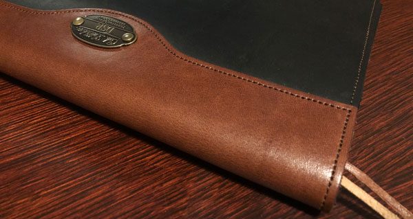
The leather pieces are sewn together using high-quality thread that is finely stitched. The spine is reinforced with an extra piece of leather for greater strength and added style.

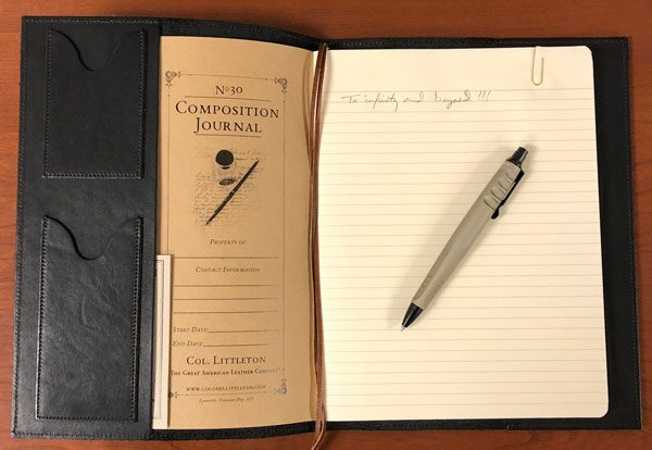
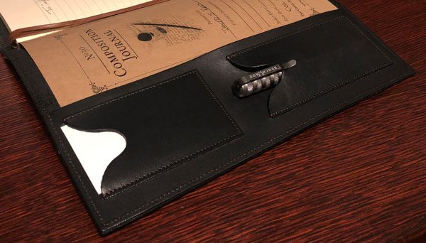
The inside cover has slipper pockets meant for business cards and pens. Both slipper pockets are initially very tight and take a bit of force to get the cards and pen inserted, but should loosen with time and use.

The Colonel Littleton composition journal has dedicated space for date, owner information, and subject on the inside cover, enabling you to chronicle/organize each notebook when filled. The journal is lined and is meant to be written on both sides of each sheet of paper.

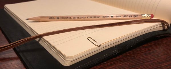
The Colonel includes a wood pencil and brass paper clip to truly round out the Old World functionality of the journal.  In addition to the (very lose-able) brass paperclip, the No. 30 journal has two integrated leather bookmarks for saving locations within the notebook.

Specifications:

  • Leather Composition Journal Overall Dimensions 10.5” H x 8” W (Closed)
  • Journal Register Paper Insert 9.75” H x 7.38” W x 0.5″ D (Closed)
  • Left and Right Journal Insert Pockets (hold writing journal secure) 10″ H x 3.25″ W
  • Business Card Pocket 3.5” H x 2.25” W (Inside dimensions)
  • Pen Pocket 4.25” H x 2.25” W (Inside dimensions)

Material quality and craftsmanship:

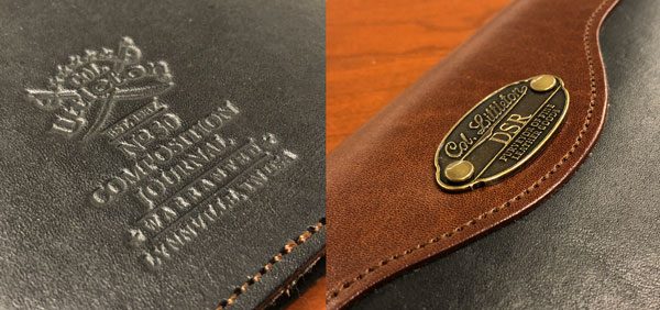
Like all of the Colonel’s products, the journal’s craftsmanship and attention to detail is second to none. It is definitely eye-catching with an Old World charm that truly stands out. The front of the journal has a riveted brass plate where your initials can be engraved. The back has the Colonel Littleton logo embossed into the leather. The edges are all stitched for strength and well finished. The black with brown trim version of the No. 30 journal has opposing thread color which really gives it a nice touch.

The No. 30 Leather Composition Journal is handmade in Colonel Littleton’s leather workshop in Lynnville, TN. It is available in vintage brown, saddle tan with brown trim, black with brown trim, American alligator, and American buffalo.

Colonel Littleton designs his products to last a very long time. He stamps each one with a single word: *warranted* and backs that promise up. I use my 1943 Navigator bag almost every day and it’s definitely aging very well. But when one of the brass clips failed, his crew didn’t bat an eye when I asked if it could be repaired. My point is, that it’s nice to know that in our disposable society there are still those who create things meant to last a lifetime and backs that up without hassle or BS.

Positives

  • Handmade from thick, supple leather
  • Excellent Old World craftsmanship & functionality
  • Comfortable to carry from meeting to meeting
  • Captures your thoughts, ideas, notes, todos, etc.
  • Great warranty

Negatives

  • Expensive

Final thoughts

As I have gotten older my memory has gone to cr@p, so I have been haphazardly writing things down more and taking better notes when I think to do so. Though I typically do this on scrap paper and old business cards I find in my wallet, most of which I sadly misplace or worse yet, loose. I hate to say it, I need to be more diligent and systematic about upping my game on this front. The Colonel’s No. 30 leather composition journal is an excellent and stylish was to make that happen.

Price: $137.50
Where to buy: Colonel Littleton.
Source: The sample of this product was provided by Colonel Littleton.

The post Colonel Littleton No. 30 Leather Composition Journal review appeared first on The Gadgeteer.

Filed in categories: Reviews

Tagged: ,

Colonel Littleton No. 30 Leather Composition Journal review originally appeared on The Gadgeteer on March 28, 2018 at 11:00 am.

Note: If you are subscribed to this feed through FeedBurner, please switch to our native feed URL http://the-gadgeteer.com/feed/ in order to ensure continuous delivery.
VogDUO 30W Wall Charger review

Since every gadget that I own requires charging, it sometimes becomes a challenge to get everything plugged up.  And I am sure that you have struggled, as I have, with keeping all the cables in check and organized on your desk.  I have used charging hubs for years that sit on my desk or bedside table, but many of those take up too much space or look ugly, or both.  I have also used numerous wall chargers that have multiple power plugs or USB plugs, but they are usually bulky and are hard to use when behind a piece of furniture.  With the VogDUO 30W wall charger, I believe I have found the solution to some of my problems!  And at a price of $39.99, it won’t break the bank.

What is it?

A thin 3-port USB wall charger that is only .5 inches thin and rotates up to 270 degrees therefore giving you several options of orientation to plug up your USB devices.

Hardware specs

Model: SPC001
Charging capacity: 6A (30W) output allowing you to charge up to 3 USB devices at the same time.
Input: AC 100-240V
Output: DC 5V 6A
Size:  Approx. 2.4 inches wide by 3.5 inches tall by .5 inches thick
Weight: 3.0 oz
Safety: UL and FCC certified to protect against over current, over voltage, & over temperature.

What’s in the box with the VogDUO?

Just the VogDUO wall charger and a small pamphlet of instructions.

Design and function

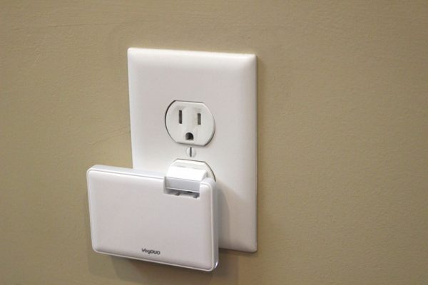
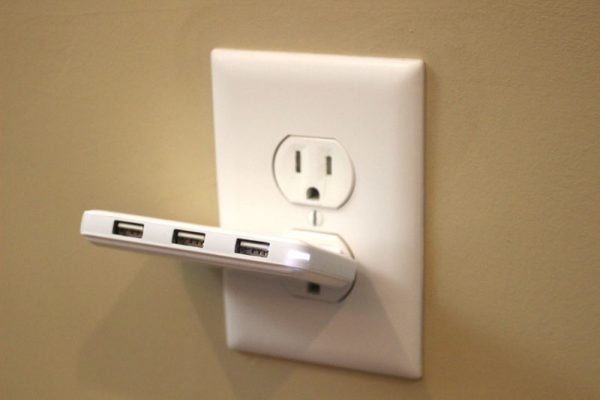
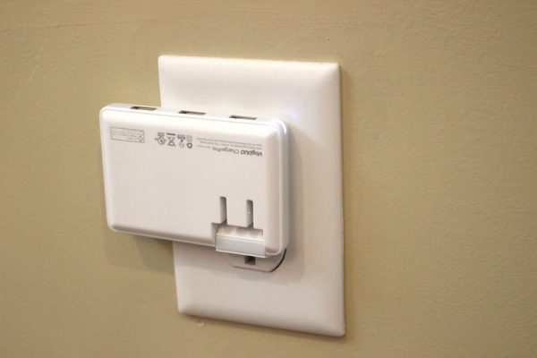
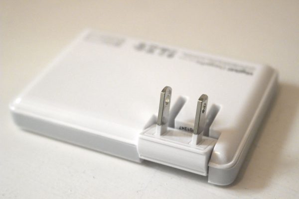
The real beauty of the VogDUO wall charger is how it swivels the built-in standard electrical plug to either fold inside the case when you are transporting it somewhere.  And that built-in plug then folds out and rotates a full 270 degrees to allow you to fold it flat against a wall when plugged up behind your desk, either with the USB plugs coming in from the top or up from the bottom.  Let’s look at some pictures of it plugged up to see what I am talking about.

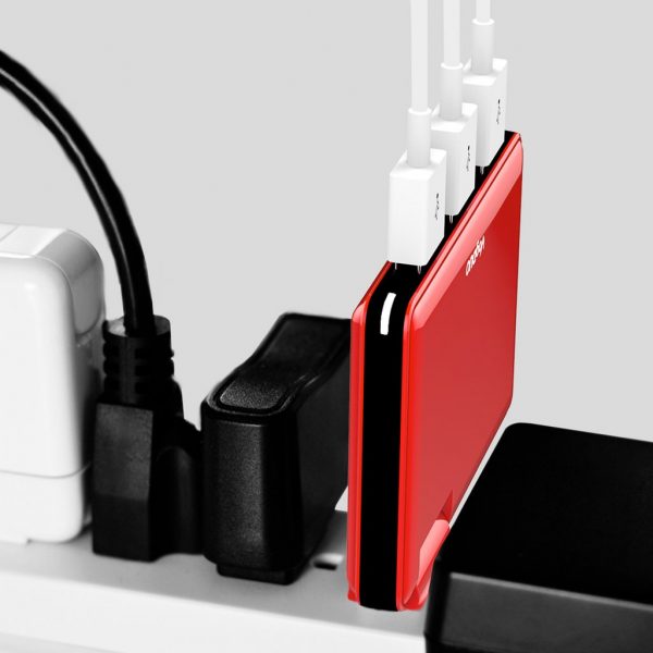
I do not use a power strip at home, so I grabbed one of VogDUO’s pictures to show the real convenience when using the VogDUO with a power strip.

Image by VogDUO
Image by VogDUO

With the full 2A of output for each USB plug, it was able to charge all my gadgets, including our tablets, at normal or fast charging speeds just as if it was plugged up directly to a wall outlet.  It performed great and never got hot like some chargers.

But like any gadget, it’s not perfect.  Like any wall charger, if you plug it up behind a piece of furniture, you’ll struggle to plug and unplug your USB cables because it sits flush to the wall.  It also doesn’t have USB-C plugs, so as the gadget world moves toward that standard, this device will fall out of favor, although I imagine VogDUO is already working to address that.

Positives

  • Great price
  • Elegant design
  • Easy to store and transport

Negatives

  • No USB-C outlets means newer USB-C gadgets are out of luck.
  • Does not come with USB cables, but then again, not many gadgets do anymore
  • When used behind furniture, it is awkward plugging up the cable into the VogDUO

Final thoughts

The elegant design, ease of use and functionality, and portability make this gadget a must-have for anyone who struggles with the cable mess that comes with multiple gadgets.  I highly recommend you get one.  Or two!

Price: $39.99
Where to buyAmazon or VogDUO
Source: The sample of this product was provided by VogDUO

The post VogDUO 30W Wall Charger review appeared first on The Gadgeteer.

Filed in categories: Reviews

Tagged:

VogDUO 30W Wall Charger review originally appeared on The Gadgeteer on March 27, 2018 at 11:00 am.

Note: If you are subscribed to this feed through FeedBurner, please switch to our native feed URL http://the-gadgeteer.com/feed/ in order to ensure continuous delivery.