Roland GO:MIXER audio mixer review

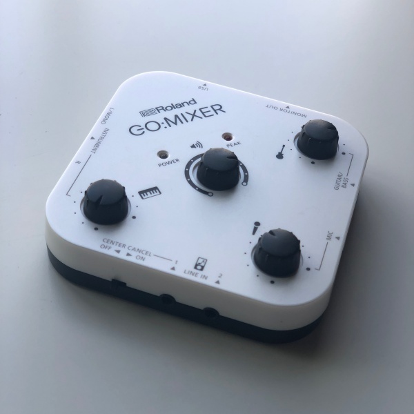
The GO:MIXER from Roland is a palm-sized audio mixer aimed at today’s content creators whether their taste is music, podcasts or video.

What is it?

It’s a small format mixer that lets you blend multiple input sources for a seamless output to a USB connected smartphone, tablet or laptop.

Hardware specs

Audio Channels: 8 input channels, 2 output channels
Connectors: Instrument (L/Mono, R) 1/4”
Line-in 1&2: 3.5mm stereo audio jacks
Mic-in: 1/4” (no phantom power)
Guitar/Bass: 1/4” (high-impedance)
Monitor out: 3.5mm stereo audio jacks
USB: USB Micro-B
Power supply: USB bus power
Current draw: 40 mA
Accessories:
     Lightning to USB Micro-B cable (~50cm / 1.5’)
USB OTG Micro-B to Micro-B cable (~50cm / 1.5’)
Size & weight: 95mm x 95mm x 28mm and 100gm (without cables)

What’s in the box?
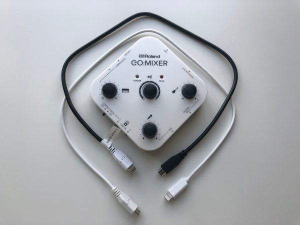
Roland GO:MIXER
Lightning to USB Micro-B cable
USB OTG Micro-B to Micro-B cable

Design and features

YouTube, Instagram and other video sharing sites continue to grow and the success of a clip can just as easily depend on production quality as it does on the content itself. It’s clear that Roland aimed this product squarely at these creators. Let’s dive in a bit further…

Setup

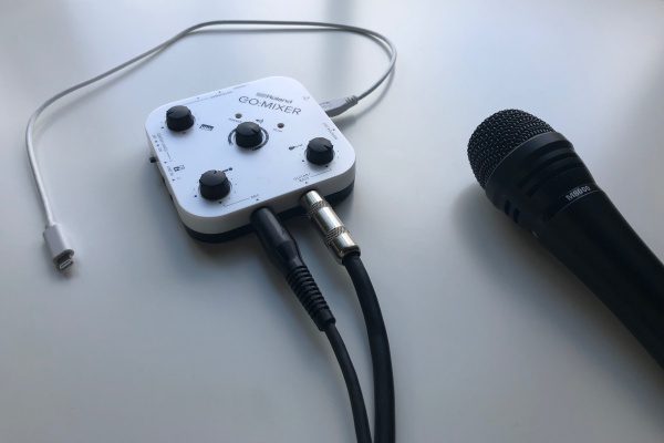
The GO:MIXER is really its own instruction manual. As with most traditional audio products all the inputs, outputs and knobs are clearly labeled with their intended use and function. There are input level knobs for each of the three inputs as well as a knob for master output volume. Depending on what you’re trying to do, all that’s left is to connect your instruments, mic and/or auxiliary audio with the appropriate cables. In this review we’ll be connecting a microphone and an acoustic electric guitar via 1/4″ cables.
Performance

My son is a guitar player and I’ve enlisted his help with this review. Over the years, he’s created a number of videos for social channels and quickly got frustrated with audio quality when relying on his phone to capture audio with the onboard mic. The solution was to record audio separately (he prefers Reason) and then use iMovie to sync them up after the fact. That process worked well but required a lot of time.

The GO:MIXER solves for this exact scenario. With it’s included lightning cable (Micro-USB for Android) any audio sources coming through the GO:MIXER are piped straight to the phone in lieu of the iPhone mic. Playing an instrument, a vocal take with a microphone, or any combination of sources all come through pristinely. It’s important to note all sources are live feed so they need to be simultaneous. If you want to layer multiple takes, you’ll still need to use editing software.

I’ve created A and B videos with an iPhone X for comparisons. I didn’t worry about getting the video perfect for these as it’s the audio we’re focusing on for this review. The videos in this case are to help provide visual reference for what you’re hearing.

Video A

This video is shot with an iPhone X in the standard camera app using the built-in mic. The phone is set up on a tripod using a Glif smartphone holder from Studio Neat.

Overall, it sounds pretty good for a video recording on a mobile phone. What you don’t hear or experience is the multiple takes necessary to avoid the barking dog or the truck rumbling by. The bottom line is you’re going to get whatever audio is happening around you.

Video B

This is the same guitar / iPhone / tripod setup, but with some direct connections. The GO:MIXER is connected to the phone with the lightning cable. The acoustic/electric guitar to the guitar input. An Audio Technica M8000 microphone to the mic line-in. (The mic is actually not a Sennheiser as described in the video; bad cues on my part there.)

In the video, you’ll notice that he voice is clearer (holding a mic obviously). The guitar is crisp with more of the many subtleties present (fingers sliding on strings, fretting, etc.) While the audio levels may not be perfect in this video, a little experimentation will land on the best settings for each sound source.

Observations

  • The included cables are pretty short; only about 18”. They work well with smartphones and tablets if you’re using the selfie or front facing camera. If you want to use the (usually better) rear-facing camera, the short cables put the GO:MIXER further away from you and out of reach which means you’ll need to have your settings figured out ahead of time, as well as a way to start your recording remotely. Not a deal breaker by any means, but something you’ll want to consider. Micro-USB to Lighting cables are not readily available, so finding one will be a bit tricky should you need one.
  • The USB-bus power is a cool feature and it means one less thing to charge. Connect the GO:MIXER to your phone and it’s powered. The only catch here is that if your phone turns off / times out, the power to the GO:MIXER is also cut. It’s not an issue if you’re actively recording or have an app set to keep the phone from sleeping, but if you’re just practicing and the phone times out, the audio drops. Setting your phone to never sleep is a quick fix but you’ll obviously drain your battery faster.
  • The GO:MIXER also works well with a computer. Just supply your own USB Micro-B to USB A cable and connect it. Make sure to select it as the source in whatever application you choose to use.
  • There’s also a karaoke feature called “center cancel”. This should knock vocals down on audio source connected to Line-in 1 or 2. This function does not work if you’re playing audio from the USB connected phone. Makes sense, but unfortunate given the phone is where most of us keep our music these days.
  • There is a note on their website that some Android smartphones may convert the stereo USB audio output to mono on receipt. This was something I was unable to verify with the equipment I had on hand.

What I like

  • No batteries or power supply
  • Lightweight and small
  • Simple, understandable controls
  • App agnostic
  • Relatively low cost

What needs to be improved

  • Length of the included cables
  • Center-cancel function doesn’t work on a USB connected music source

Final thoughts

The GO:MIXER is intuitive and does what they claim it will. For capturing clean signals from simultaneous sources Roland has made it very easy to record a video without a lot of setup or post editing. There are more expensive solutions out there that are dedicated to source input for editing software, but for a multipurpose solution with a focus on one-and-done, Roland’s got a winner here. If you need to know more, Roland’s GO:MIXER webpage has a lot of detail.

Price: $99.99
Where to buy: Amazon
Source: The sample of this product was provided by Roland

The post Roland GO:MIXER audio mixer review appeared first on The Gadgeteer.

Filed in categories: Reviews

Tagged:

Roland GO:MIXER audio mixer review originally appeared on The Gadgeteer on May 7, 2018 at 10:00 am.

Note: If you are subscribed to this feed through FeedBurner, please switch to our native feed URL http://the-gadgeteer.com/feed/ in order to ensure continuous delivery.

BenQ PD2710QC DesignView 27-inch Designer Monitor review

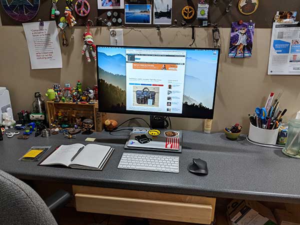
I’ve been using the same 29-inch monitor from LG that I reviewed four years ago but about a month ago I started thinking about upgrading. The universe must have been listening to my thoughts because BenQ contacted me to ask if I would like to review one of their monitors. Truth be told, BenQ had not been on my radar when I was dreaming about a new monitor. But when they offered the 27-inch PD2710QC DesignView Designer Monitor I decided to take a chance but wondered if I would regret losing 2-inches of screen real estate. Let’s find out.

What is it?

The BenQ PD2710QC monitor is a 27-inch monitor that has extra features including a built-in USB-C docking station for your laptop that includes a variety of connections.

Hardware specs

Screen Size: 27 inches
Resolution (max.): 2560×1440
Panel Type: IPS
Backlight Technology: LED backlight
Brightness: 350 cd/㎡
Native Contrast(typ.): 1000:1
Viewing Angle (L/R;U/D) (CR>=10): 178/178
Response Time: 5ms (GtG)
Refresh Rate: 60Hz
Aspect Ratio: 16:9
Display Colors: 16.7 million colors
Color Gamut: 100% sRGB/Rec. 709
Display Area(mm): 596.7(H) x 335.7(V)
Pixel Pitch (mm): 0.2331
PPI: 109

For the full specs listing, visit the spec page for this monitor on BenQ’s site.

What’s in the box?

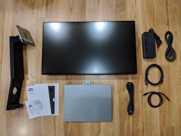
  • PD2710QC monitor
  • Power supply
  • USB-C cable
  • DP to mini DP cable
  • Quick start guide
  • CDrom with drivers

Design and features

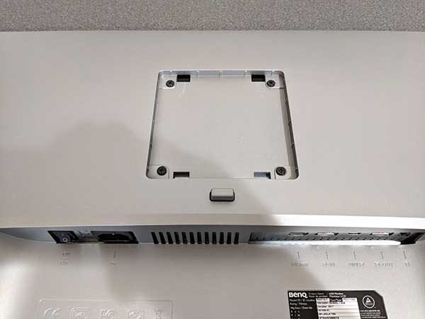
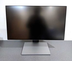
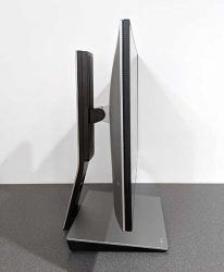
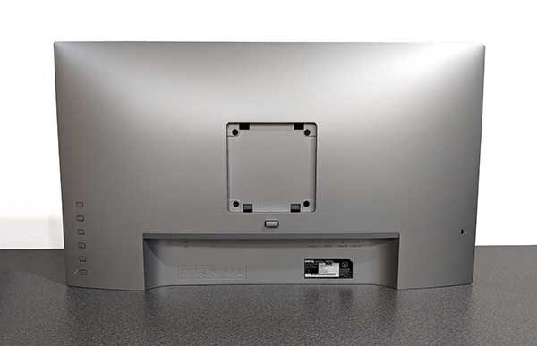
The BenQ PD2710QC monitor has a grey and black plastic shell. The front of the monitor is completely flat, but the back is curved with the support connection in the center, control buttons on one side, a 12. Kensington lock slot on the opposite side, and video and power connections in a recessed area.

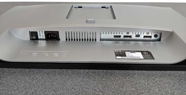
The connection panel has a power switch, power connector, HDMI socket,  DisplayPort socket, Mini DisplayPort socket, DisplayPort output socket (for Multi-Stream Transport, MST), and a Headphone jack. The bottom of the monitor also has downward firing speakers built into it.

The monitor comes has three main parts. The main monitor, the base/docking station, and the monitor support.

Assembling the parts is easy and does not require any tools at all other than your hands. First, you need to do is place the monitor face down on a flat clean surface.

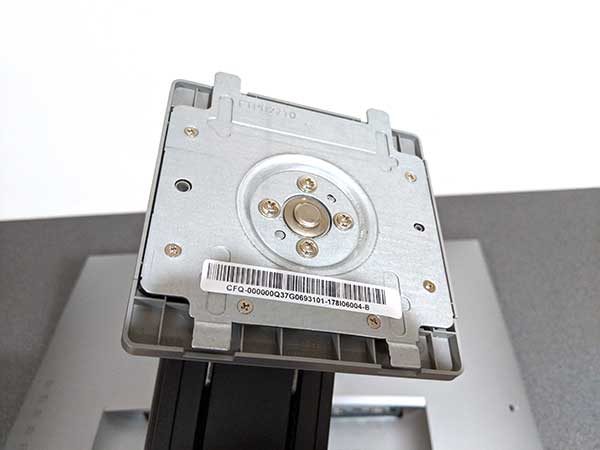
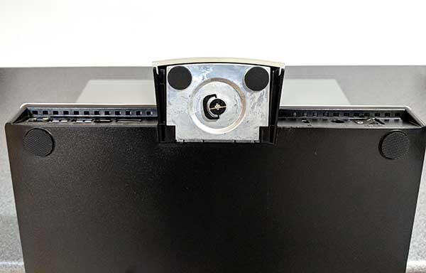
Then you take the monitor support which has a metal plate on the piece that snaps into the back of the monitor.

Attaching the two pieces is very easy because the support clicks and locks in place with minimal effort.

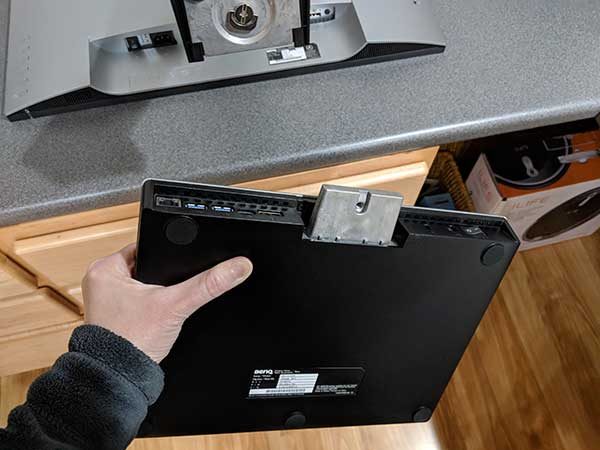
Next, you take the base/docking station which has metal arm protruding from the back, and you slide it into the bottom of the support arm.

A metal thumbscrew on the bottom tightens to secure the base to the support.

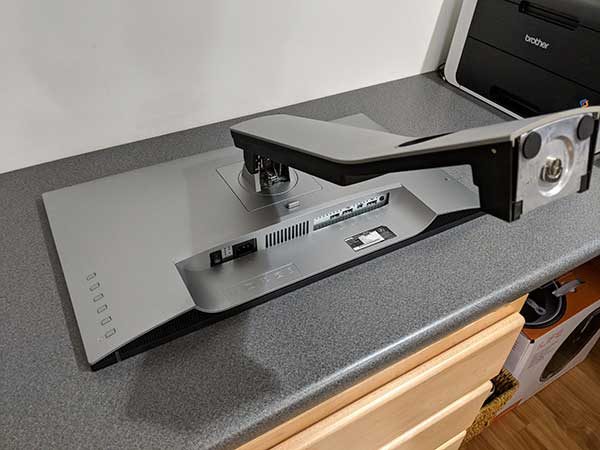
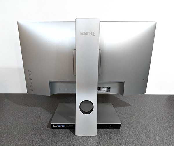
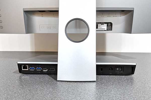
Here we can see the back of the assembled BenQ PD2710QC monitor. You’ll notice a circular cutout in the support arm. That cutout is a pass-through for the cables. Unfortunately, that’s the only built-in cable organization feature for this monitor. And since you have to connect 2 cables from the monitor and 2 additional cables from the base, it really needs better cord management.


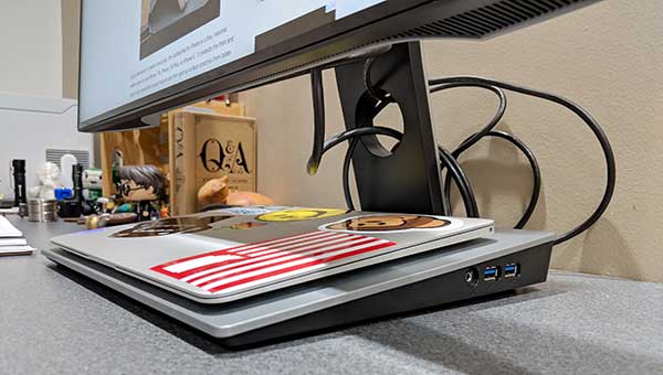
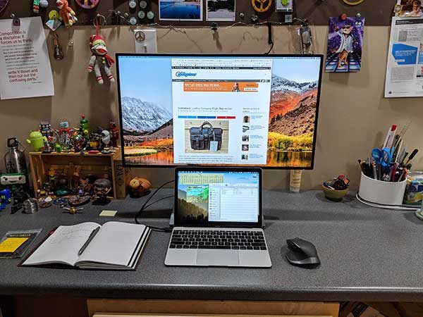
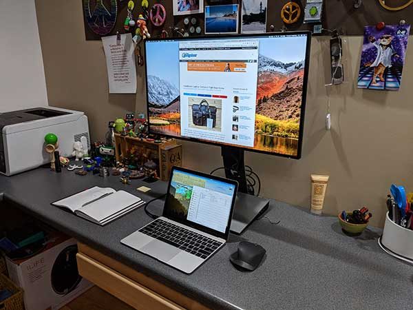
The BenQ PD2710QC’s base is 12 inches wide and 9.5 inches deep and provides a perfect home for my 12-inch MacBook.

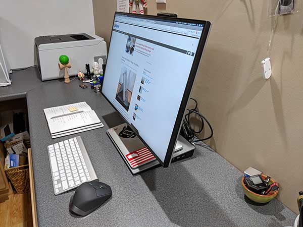
The base of the monitor not only a convenient shelf to place your laptop, but it’s also a USB-C docking station. On the back of the base, there’s an Ethernet (Local Area Network) port (RJ-45 connector), 2 USB 3.0 ports, USB Type-C port, DisplayPort socket, and a power switch for the base.

You’ll also notice that there are more ports on the side of the base/docking station. I didn’t even notice the additional 2 USB ports and headphone jack until about 2 weeks after I’d been using the monitor. The location of these ports provides easier access than the back of the docking station and is useful for flash drives and headphones.

Some people might think that the monitor’s large base is not attractive and dare I say clunky looking. I’m not one of those people. I like it a lot. But, I also have a large desk. So desk size is something to consider before buying the PD2710QC.

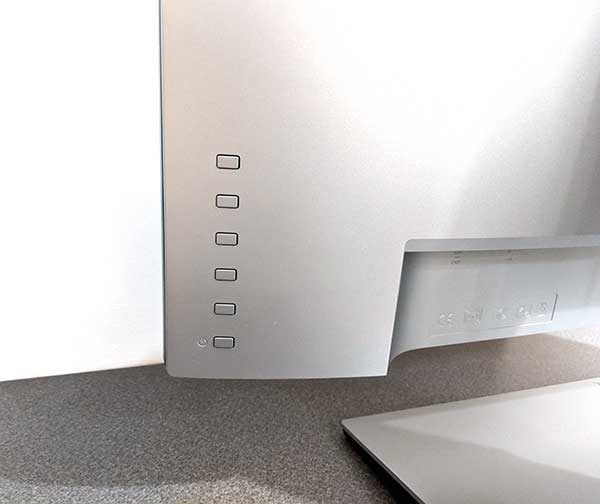
Let’s take a closer look at the control buttons. Guess what? The buttons do not have any labels except for the bottom button which is the power button for the display. How do you know how to change the monitor’s settings if the buttons aren’t labeled?

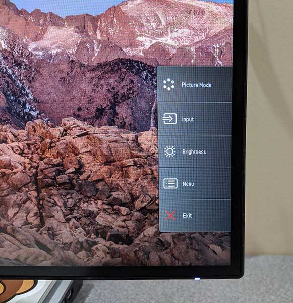
Pressing any button (other than the power button at the bottom) will cause a menu to pop up on the display. Then you can press the corresponding physical button on the back of the monitor to show that menu and navigate the settings.

It takes a little practice, but this method of going through the menus works fine as long as you don’t accidentally press the bottom button which will turn off the display and you’ll have to start over to find the setting you want to customize.

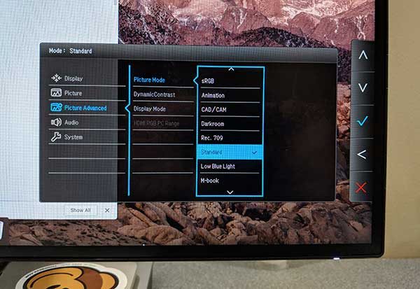
There are a LOT of display settings you can change on this PD2710QC monitor. From basic settings like brightness, contrast, sharpness and input choice, to individual RGB color levels and to choosing different display modes.

Display modes

The BenQ PD2710QC is a monitor that has modes for several different use cases. I’ve listed the modes with a brief description taken directly from the monitor’s manual.

sRGB

For better color matching representation with the peripheral devices, such as printers, digital cameras, etc.

Animation

Enhances the contrast of the dark shades so you could work on the details easily when making an animation.

CAD/CAM

Enhances the contrast if a CAD / CAM software is used.

Darkroom

For image editing and viewing in a post-processing environment with a dim light. This mode enhances the sharpness and clarity of shades and shows more details.

Rec. 709

For better color matching representation with Standard Rec. 709.

Low Blue Light

Decreases the blue light emitted from the display to reduce the risk of blue light exposure to your eyes.

M-book

Minimizes the visual differences between the monitor and the connected MacBook series product.

Standard

This is the default setting which basic PC application.

User

Applies a combination of picture settings defined by users.

I used the Standard display mode for weeks and then switched over to the M-book mode since I did all my testing with my 12-inch MacBook. I immediately noticed that the M-book mode is a lot brighter than the Standard mode but I’ve left it set to M-book and I think I prefer it.

As already mentioned I tested the PD2710QC monitor with my 12-inch MacBook connected via the supplied USB-C cable to the monitor’s base/docking station.

I have to say that I’ve fallen in love with the docking station which provides 4 additional USB connections, a headphone jack, Ethernet port, as well as a connection directly to the monitor.

I’ve used 3 different adapters and docks with my MacBook since buying it and the BenQ dock and I like this one the best yet just because it’s all one unit. That said, the base does not have a card reader for SD or micro SD cards and it only provides 61W of power delivery, so it might not be suitable for other laptops which use USB-C for power like the 15-inch MacBook Pro. Again, that’s something consider before purchasing this monitor.

Something else that should be mentioned is that you can use the USB ports on the dock to charge other devices, BUT, charging is only active when your laptop is connected to the dock. When I disconnect the USB-C cable from my MacBook, my Pixel 2 XL stopped charging when connected to one of the other ports on the dock.

When I use my MB with the monitor, I use it a couple different ways. Sometimes I raise the monitor and use the MB’s display below it like you see above. The monitor can be raised up a maximum of 11 inches from the bottom of the display to the top of the desk. You can tip back the screen and get a box to rest your keyboard and you have a standing desk! At the lowest level, the bottom of the screen is about 4 inches to the desk.

I will also place the monitor on the base and use it all by itself. Note that the monitor can tilt back as much as 20 degrees, and forward as much as 5 degrees.

You can also rotate it a full 90 degrees like you see here. This is great for web designers who want to check out the layout of their sites.

The BenQ PD2710QC’s display is gorgeous. I know it’s not 4K, but it’s sharp as a tack and everything I look at on it looks beautiful, vibrant, and crystal clear. I’ve used the monitor for everything you typically use a monitor for. I’ve surfed the web, watched movies, played a few games, edited images in Photoshop, read documents, typed out documents and more.

Like other BenQ monitors, the PD2710QC has been Technicolor Color Certified and individually factory calibrated and validated against industry color standards.

I’ve found that the monitor’s viewing angle is excellent and the non-glare coating makes it easy on my eyes and I enjoyed using it no matter what task I was doing.

Extra features that I didn’t test

If you’re a Windows user, can also install the BenQ Display Pilot software which will allow you to partition the screen. I’m a Mac user, so I didn’t test this.

I also didn’t test the display daisy chain feature that will allow you to connect up to 4 monitors using MST (multi-stream transport technology) to span your laptop’s screen across the monitors.

What I like

  • Clear, crisp and vibrant colors
  • The built-in USB-C docking station
  • 3-year warranty

What needs to be improved

  • Needs better cable management
  • Needs an SD or microSD card reader in the base
  • The base may not be able to charge the battery on some laptops
  • Power delivery on dock’s USB ports deactivates when the laptop is disconnected
  • Built-in speakers are only ok
  • Requires two power cords. One for the monitor and one for the base. I wish it only needed one.

Final thoughts

I’ve been using the BenQ PD2710QC monitor for the last month and I’ve been more than happy with it for all the tasks I do on a daily basis. The display provides my 12-inch MacBook with a place to sit and a selection of ports. But it’s also easy on my eyes and gives me great color and crispness for everything I look at.  I may not have had BenQ on my radar for monitors before, but now I’m impressed and will make sure to check out their monitors the next time I need to upgrade.

Price: $599.99
Where to buy: Amazon
Source: The sample for this review was provided by BenQ.

The post BenQ PD2710QC DesignView 27-inch Designer Monitor review appeared first on The Gadgeteer.

Filed in categories: Reviews

Tagged:

BenQ PD2710QC DesignView 27-inch Designer Monitor review originally appeared on The Gadgeteer on May 6, 2018 at 4:50 pm.

Note: If you are subscribed to this feed through FeedBurner, please switch to our native feed URL http://the-gadgeteer.com/feed/ in order to ensure continuous delivery.
Nonda ZUS OBD-II Smart Vehicle Health Monitor review

The ZUS Smart Vehicle Health Monitor is a Bluetooth adapter for an OBD-II Data Link Connector. The adapter communicates with custom software for iPhone and Android and can debug problems, check engine data for potential problems and display real-time information. Read on to see what I think!

What is it?

The ZUS Smart Vehicle Health Monitor belongs to a class of devices known as OBD-II adapters. The adapter fits into the OBD-II Data Link Connector standard on all gasoline cars manufactured in the United States since 1996. (It is compatible with diesel cars since 2004.) The automobile’s on board computer powers the adapter and transmits coded digital information about the car’s status, features, and information to the adapter. The adapter, in turn, transmits this information to the connected Bluetooth device. The connected device can analyze the data, log the data, provide trends, as well as use the trip data in combination with other sensors, such as the phones accelerometers or GPS to provide even more information.

What’s in the box?

ZUS Smart Vehicle Health Monitor
User Manual

Design and features

Specifications

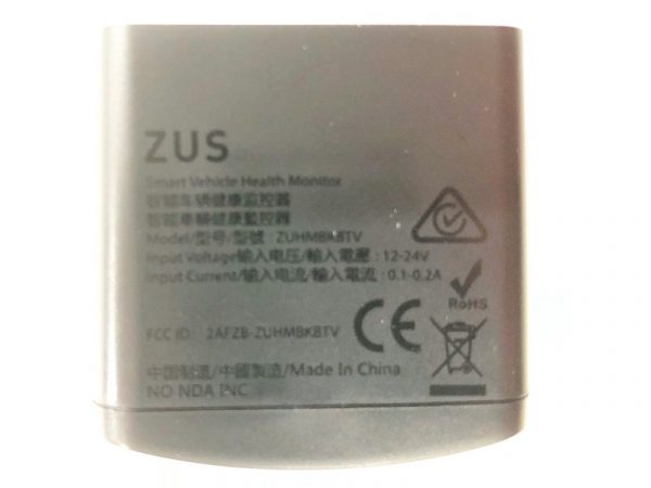
Input: 12-24V, 0.1-0.2Amp
Weight:0.88oz / 25g
Max Output Power:-9dBm
Size:1.65 x 1.63 x 0.85 in / 42 x 41.5 x 21.7 mm
Operating Frequency Range:BT2.4Ghz

Unboxing

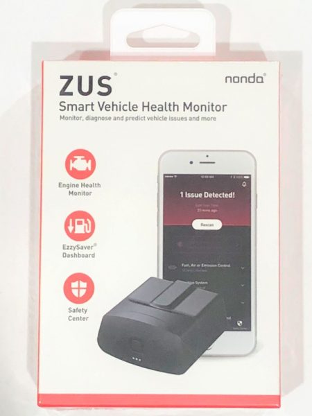
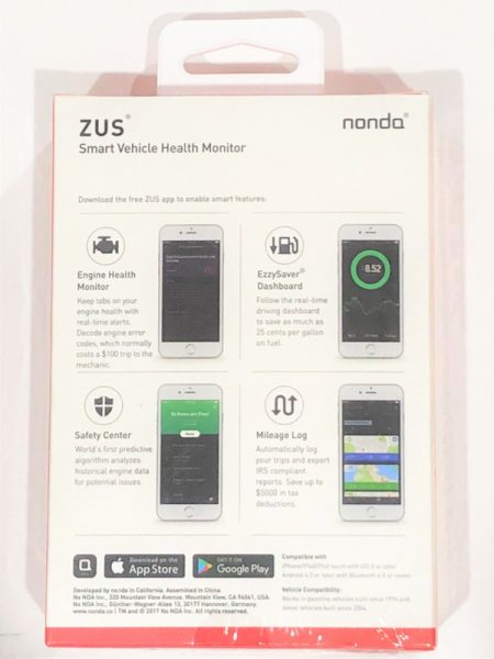
The ZUS Smart Vehicle Health Monitor (SVHM) comes in a fairly standard printed cardboard box. The front and rear of the box lists the main features of the device, which includes engine health monitor, EzzySaver Dashboard, mileage log and Safety Center.

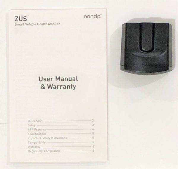
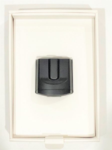
The ZUS SVHM sits inside a cardboard tray inside the box. The user manual / warranty is packaged below the cardboard tray.  The instructions and the warranty card are in the English language only.

Design of the ZUS OBD-II SVHM

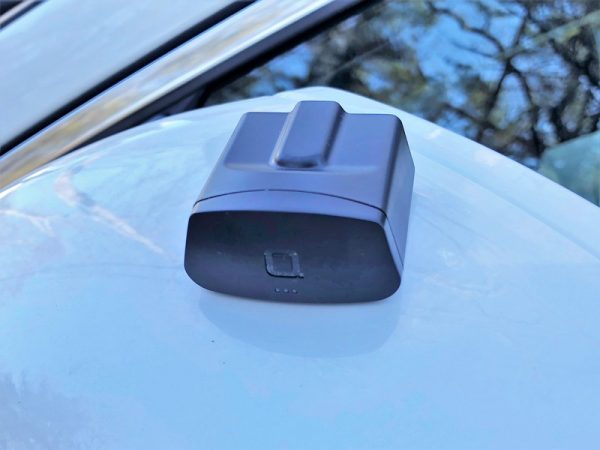
The ZUS OBD-II SVHM is an unobtrusive black plastic adapter.  Its small size is useful if the OBD-II connection is towards the front underside of the dash. The front has a gently curving face with the stylized “a”  logo of the Nonda company. Below the logo are three LED that indicate the status of the automobile and Bluetooth connections.  Honestly, the adapter is better looking than it needs to be considering it will spend most of the time plugged in underneath the driver’s front seat. Installation is easy; the adapter fits firmly into my car’s connector so that it will not fall out unintentionally. Removal only requires a simple tug.

Installation

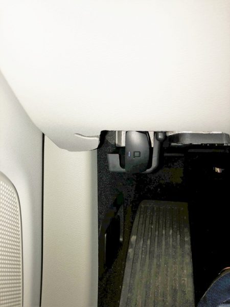
Operation of the SVHM is straightforward assuming that you can find your OBD-II Data Link Connector. On passenger vehicles it must be within two feet of the steering wheel.

The adapter only works with the Nonda app for iPhone or Android. The app is a common control and user interface for the entire Zus Connected Car System. It not only controls the SMHV but smart car chargers,  smart tire safety monitor, smart backup camera, key finder, and car audio adapter produced and sold by Nonda.

The app requires a login for use. This functionality allows Nonda to determine if you have a mileage log subscription or are operating on the free version. A login also permits Nonda to upload your mileage to a server so that it can be viewed on the web. It doesn’t appear that the program can be used without a login, although if you prefer not to give out your information, a mailinator address will work just fine. If you don’t have one or more of these items the welcome screen also takes you to the Nonda.co website to purchase an adapter.

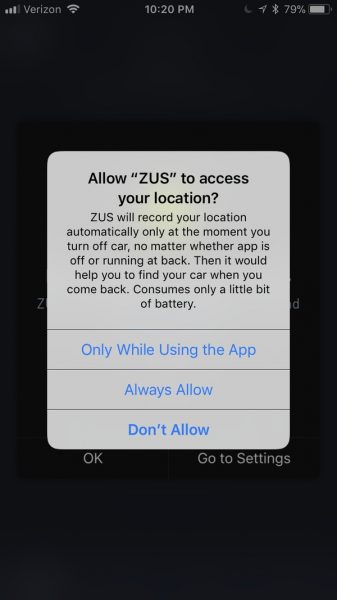
The software has some permission prerequisites to enable geolocation services. The explanation below implies that the Zus system will provide an option to find the car after parking. However, I found that this is not the case. The smart car finding function is only available with the smart car charger adapter.  The app does not require location awareness for the functions that the smart vehicle health monitor provides.

Even though the software cautions against operating without the geolocation on it will still function adequately and will not provide additional warning messages.

Operation

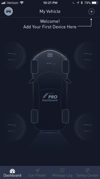
The dashboard screen provides some indication of the different functions that the Zus Connected Car suite provides. Each peripheral below provides a unique set of features:

  • The Smart Car Charger – Car Finder, Car battery Health Monitor, Mileage tracker, Car finder
  • Zus Smart Tire Safety Monitor – Tire Pressure monitor, Slow Leak Detection
  • Smart Vehicle Health Monitor – Safety Center, Engine Heath Monitor, Savings Dashboard*

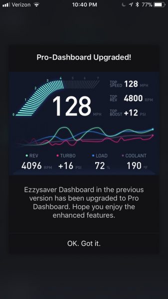
* Upon syncing the SVHM with the app, a window informs that the EzzySaver Savings Dashboard has been “upgraded” to the PRO Dashboard.

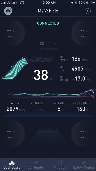
Once connected and paired the app shows the info in the image above. Despite the claims that the app includes an upgrade to the EzzySaver function, there is, in fact, no indication of the instantaneous fuel consumption.  Furthermore, the only record of the values captured are the speed, revs, turbo pressure, load and coolant temp. None of the other 235 sensor values supported by the ECU standard are available, and no logs of data are available either. Without logs, it is necessary to consult the data while driving, but it is difficult to see the small text and graph on the screen while driving.

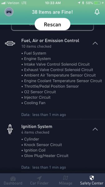
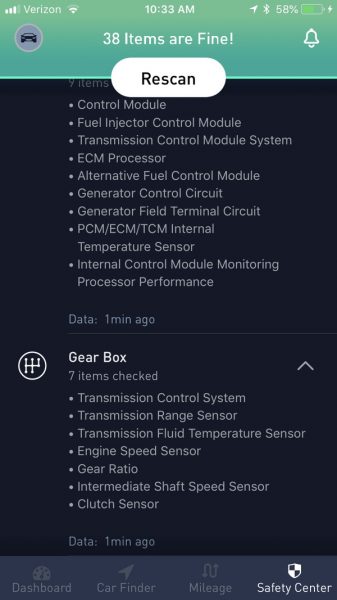
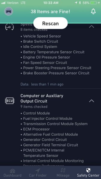
The Safety center performs a number of checks but does not provide any indication of the measured results. Many of these checks, if not all of them are either true or false. I don’t believe the SVHM can predict when an item may malfunction simply by the car’s ECU returning a working or failed indication. So, I’m not really sure what this safety check is doing. The results of the check came back fine on my car. The manufacturer’s website includes a couple of videos where the ECU returned an out of tolerance EVAP condition because the fuel cap was left off. Unfortunately, my car doesn’t include a gas cap (it has a capless gas tank fuel-filler) so I couldn’t test this feature.

All in all, I expect that the items checked vary per vehicle; the screenshots below are the results of my scan.

Performance

The screenshot below indicates that the top speed is 166 MPH, but in reality, the top speed is probably the speed pictured. If the only record of speed the app provides is the top speed, it should be accurate.

Except for the erroneous top speed, during my test drive, the speed and revs were very close to the values the car displayed on the dash.

It seems that keeping the device in the OBD-II Data connector may be convenient, but constant installation may drain the car’s battery. Also, keeping this installed precludes using other OBD-II items, like you may get from your auto insurance provider.

What I like

  • easy to pair
  • small

What needs to be improved

  • does not do what the manufacturer’s website and box indicate
  • poor logging features
  • ambiguous safety check features
  • erroneous data logging

Final thoughts

The most flagrant issue with this item is that it claims that the PRO Dashboard is an EzzySaver functionality upgrade, but in reality, the functionality is no longer a product offering. Also, while the package states that the SVHM includes mileage log functionality, in my experience this is simply not true. I believe that a safety scanner is not necessary if the car has a check engine light.  Consequently, I’d like to know what condition this can identify ahead of the car’s own ECU and check engine circuitry. If real car data is what you are looking for, this will disappoint. I’d recommend an OBD-II scanner that can log data as well as provide systems analysis.

Price: $59.99
Where to buyAmazon
Source: The sample for this review was provided by Nonda.

The post Nonda ZUS OBD-II Smart Vehicle Health Monitor review appeared first on The Gadgeteer.

Filed in categories: Reviews

Tagged:

Nonda ZUS OBD-II Smart Vehicle Health Monitor review originally appeared on The Gadgeteer on May 6, 2018 at 9:07 am.

Note: If you are subscribed to this feed through FeedBurner, please switch to our native feed URL http://the-gadgeteer.com/feed/ in order to ensure continuous delivery.
Fanstereo Studio43 Bluetooth Headphones review

When it comes to headphones, there seems to be a sliding scale of form and function. Looks, comfort, sound quality and price are all factors that fluctuate wildly. Do the Fanstereo Studio43 Bluetooth Headphones deliver on all categories?

What is it?

The Fanstereo Studio43 Headphones are premium wireless Bluetooth headphones with clean aesthetics and comfortable, sound-insulating design.

Hardware specs

  • Bluetooth V4.1 (Operation range up tp 35 feet)
  • Sensitivity 102 + 3db, Frequency Response: 20-20 kHz
  • Drivers: 40 mm
  • Impedance: 32 Ω OHM
  • Charge connector Micro USB
  • Charging time 1-2 hrs max
  • Standby time 300 hrs max
  • Playing time 13 hrs max
  • Weight: 162g
  • Battery capacity 250 MAH

What’s in the box?

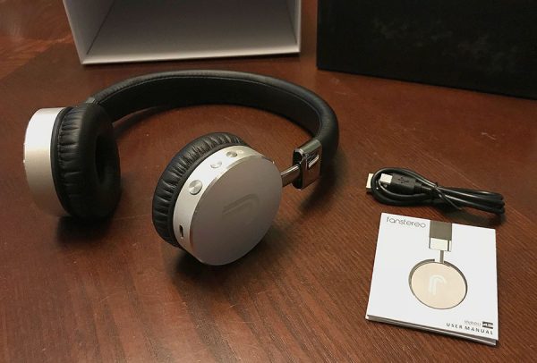
Studio43 headphones on table
Nice packaging, and you even get a charging cable.
  • Fanstereo premium aluminum headphones
  • Owners manual
  • Micro-USB cable

Design and Features

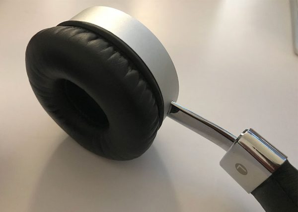
Up close photo of Studio43 ear cushion
They’re as comfortable as they look.

I like the overall aesthetic of the Studio43. They’re nice and simple and look great on my desk next to my iMac and other black and stainless steel office supplies. They also look expensive. They feel like premium headphones. The ear cushions are as soft and plush as they appear, perhaps even more so, and do a great job in forming a seal to insulate noise. They don’t leak much sound to the outside.

Fit and Feel

As mentioned, the Studio43 headphones are high quality. The headphone band is very flexible and exerts a very small amount of pressure on your ears. The band doesn’t feel like it would break very easily.

Most of the force keeping the headphones on your head comes from them resting on top of your head. I’ve never really been a fan of over the head headphones because of my thick hair… they tend to irritate my scalp after an hour or so. These were no different for me, however, that seems like it would be limited to me in particular.

side profile of Studio43 headphones
Side view.

My ears didn’t get sweaty or hot, which is another issue I run into with these type of headphones, because they rested so lightly on them and the earphones have an excellent amount of cushion. Overall, they were comfortable. I think I’d have a much better go if my hair was much shorter.

Sound Quality

I’d rate the sound quality of these headphones somewhere in between Fair and Good. The mids and treble seemed quite good, but they were a bit lacking in the bass. Some minor adjusting so as to create a better seal around my ears did help the quality a bit. I was able to coax them into a fuller sound through some equalizer in the music apps I tested them with, but out of the gate, I’d rate them as Adequate.

Functionality

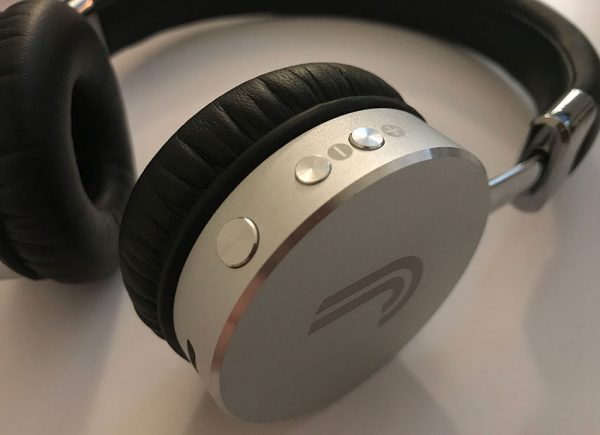
On the back of the right headphone, there are three buttons that serve multiple functions. The large button serves as the power button as well as start/pause. Holding it for about 5 seconds powers the headphones on or off.

The two smaller buttons are the volume up and volume down. Double clicking those buttons work as forward or reverse track skip.

Close up of headphone hardware buttons
The hardware buttons are easy to feel for.

There is a neat “AI” function when your phone receives a call, a voice prompt simply asks “Yes or No?” and awaits your answer. It doesn’t read the name or number of the caller, so you’d have to check your phone screen to see if you want to talk to that person or not. But the response mechanic works well. I answered “No” and the mic picked up my voice and started the music again.

Battery life seems to be close to advertised. The manufacturer claims the headphones have a 13-hour life, and I was seeing numbers closer to 12, which is pretty great.

One thing that drove me crazy about these headphones was the confirmation beep for every action. It’s fairly typical to hear a feedback tone when adjusting the volume or maybe even skipping a music track when you’re pressing a button on the headphone itself. But the Studio43’s gave the same feedback beep when adjusting things on the actual device. So when I hit the volume button on my iPhone? Beep. I dragged the volume slider on my Mac. Beep beep beep beep forever increment. I selected a new playlist. Beep. It even beeped when one track ended and went to the next song, without pressing any buttons on any device. It was just like, “BEEP just thought you’d like to know that you’re listening to a different song now!”

There was no way to disable this as far as I can tell. I noticed that it didn’t do this in Spotify, but did so in the Apple Music and Amazon Music apps, on my iPhone and my iMac. Your mileage may vary.

Front view of Studio43 headphones
Front view. Is my head too big or the phones too small? The jury’s out on that one.

It also features a small personal peeve, the Intermittent Blinking LED. It’s one of those external indicators that let you know that the headphones are on, which is unnecessary. LED on when it’s charging? Sure. That’s a good method of letting you know that it’s actively charging. I usually work in a dimly lit room, and I can’t deal with a blue strobe light illuminating any close surface every 6 seconds. The light isn’t that bright, but it’s just one of those design choices that irks me.

What I like

  • Good sound isolation
  • Looks great
  • Comfortable

What needs to be improved

  • Just okay sound
  • Beeping feedback with *literally* every action

Final thoughts

With a product like headphones whose entire purpose is to deliver sound, if they sound awesome but are uncomfortable, that’s almost as bad as comfortable headphones that sound terrible. The Fanstereo Studio43 headphones offer a good mix of high comfort, great looks, and just-good sound.

Price: $139.00
Where to buy: You can buy the Studio43 Headphones in silver or camel brown from their website or Amazon.
Source: The sample of this product was provided by Fanstereo.

The post Fanstereo Studio43 Bluetooth Headphones review appeared first on The Gadgeteer.

Filed in categories: Reviews

Tagged:

Fanstereo Studio43 Bluetooth Headphones review originally appeared on The Gadgeteer on May 5, 2018 at 11:00 am.

Note: If you are subscribed to this feed through FeedBurner, please switch to our native feed URL http://the-gadgeteer.com/feed/ in order to ensure continuous delivery.
Adonit Droid stylus review

I remember when you had to have a stylus to enter text on your PDA. Then when finger friendly touchscreens took over, styluses became an accessory that most people no longer needed or even wanted. That said, there are still many people who enjoy using styluses to draw and write on their tablets and smartphones. Through the years, Adonit has been an innovator in the stylus market and their latest offering is the Droid stylus that has been designed for Android devices. Let’s take a look.
What is it?

The Adonit Droid is a capacitive stylus just for Android devices. It doesn’t require batteries, Bluetooth, or any special software in order to use it.

Design and features

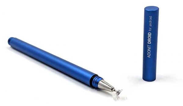
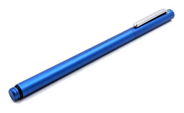
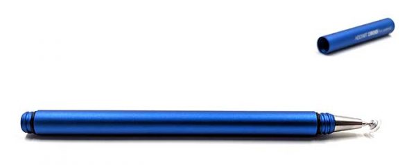
The Droid stylus is made of anodized aluminum and is available in three colors including the blue version that was sent to me. It has a smooth sandblasted type of finish that makes it comfortable to hold.

With the cap in place, the Droid stylus is 4.72 inches (120mm) in length.

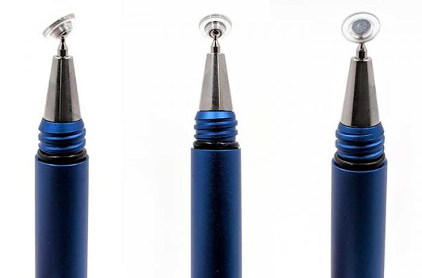
The cap unscrews to reveal the stylus tip which is a small plastic disk that Adonit calls the Precision Disc. The disc swivels on a metal ball joint tip.

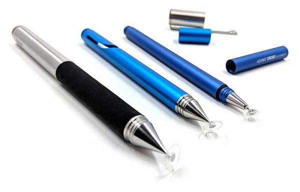
This type of stylus tip is not new. Adonit has featured this type of stylus many times over the years. In the image above, I show two other Adonit styluses with the new Droid stylus on the right. The main difference between the Droid and the other Adonit styluses shown here is the size of the disk. It’s significantly smaller at 0.19 inch (4.75mm).

As mentioned above, the Precision Disc swivels on the tip to allow for natural writing. The Adonit website states that the Droid has a non-removable tip, but it appears that Adonit actually sells disc replacements in their shop for $14.99 each. That’s pretty spendy for a tiny piece of plastic and a metal tube. It’s more than half the price of the whole stylus.

The stylus cap can post on the back of the stylus barrel which is a nice feature. The stylus itself is very slim at only 0.27 inches (7mm) wide. Although I didn’t find it uncomfortable to use, a slightly larger version of the Droid stylus might be more comfortable for people with larger hands than mine.


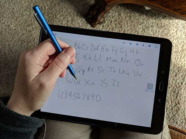
I tested the Adonit Droid stylus on my Samsung Galaxy Tab 3 and my Pixel 2 XL and found that it felt like similar capacitive styluses that I’ve used. I also tried it on an older iPad and it would not work at all which surprised me. The only thing I can think of is that the tip is just too small for iOS devices.

I had no real issues using the Droid stylus, but the experience is not even close to as nice as the Samsung S Pen which truly does feel like using a pen on paper. Granted, the S Pen is only compatible with certain Samsung devices so it’s not fair to compare them.

What I like

  • Small and slim
  • Doesn’t require batteries
  • Doesn’t require Bluetooth or special software

What needs to be improved

  • The price for a replacement disc should not be so expensive

Final thoughts

I still find styluses useful especially for doodling and sketching and occasional note taking. I find that scribbling a long note with a stylus is a lot faster for me than using the onscreen keyboard. I like that the Adonit Droid’s Precision Disc stylus tip is so small because it makes it much easier to see what I’m writing or drawing. Other capacitive styluses can have large rubber tips that block the view of the digital “ink” as you’re trying to work.

If you are an Android user and use a stylus, check out the Adonit Droid. It’s a nicely made stylus that barely takes up any space in your pocket or bag. And although it’s expensive to replace the disc tips, it is nice that the option is available.

Price: $24.99
Where to buy: Amazon
Source: The sample for this review was provided by Adonit.

The post Adonit Droid stylus review appeared first on The Gadgeteer.

Filed in categories: Reviews

Tagged:

Adonit Droid stylus review originally appeared on The Gadgeteer on May 4, 2018 at 12:00 pm.

Note: If you are subscribed to this feed through FeedBurner, please switch to our native feed URL http://the-gadgeteer.com/feed/ in order to ensure continuous delivery.