Dyson Cyclone V10 Absolute stick vacuum cleaner review

Through the years, I’ve reviewed products I liked and products I really liked. Then along comes a product that just suc… okay, sorry—I just couldn’t resist. I’m reviewing a vacuum cleaner, get it? But this is not just any vacuum cleaner—it’s a Dyson, and it’s one powerful vacuum—a stick vacuum no less. But is it as good as a Dyson corded vacuum cleaner?

What is it?

The Dyson Cyclone V10 is a stick vacuum cleaner, which is a lighter, more easily handling cleaner. Previously, the convenience of a stick-type vacuum usually outweighed its lack of power when compared to a more traditional corded vacuum. The Cyclone V10 is a rule changer.

It’s convenient and powerful. It comes in three versions depending on your needs and budget: The V10 Motorhead, V10 Animal and what I’m reviewing—the V10 Absolute.

What’s in the box?

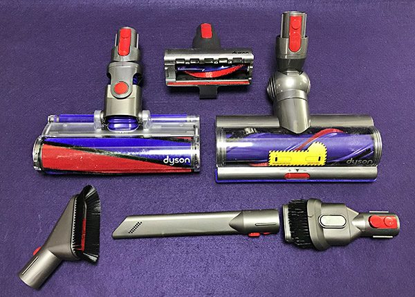
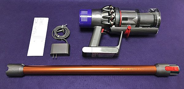
The Cyclone comes in parts—many parts. Here’s what’s included:

  • Vacuum cleaner main unit
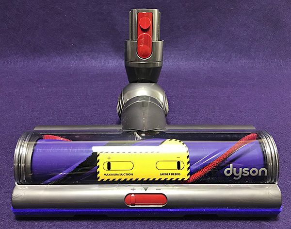
  • Torque drive cleaner head
  • Charger
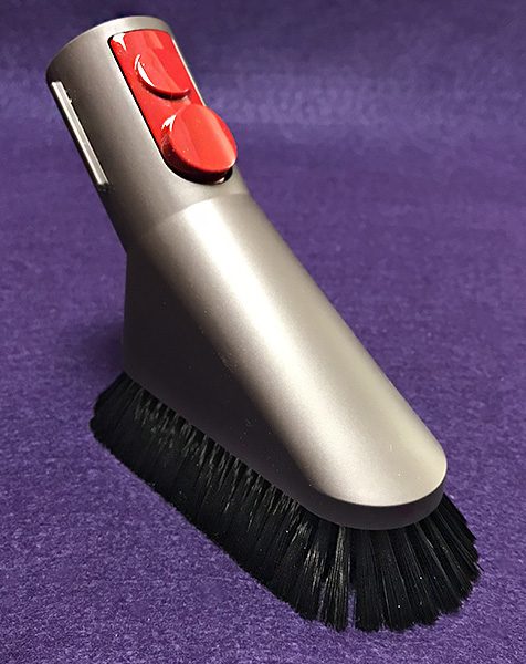
  • Mini soft dusting brush
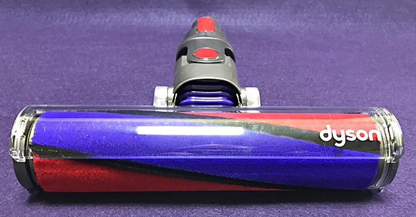
  • Soft roller cleaner head
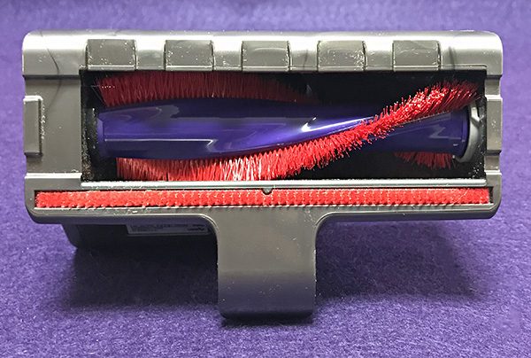
  • Quick release mini-motorized tool
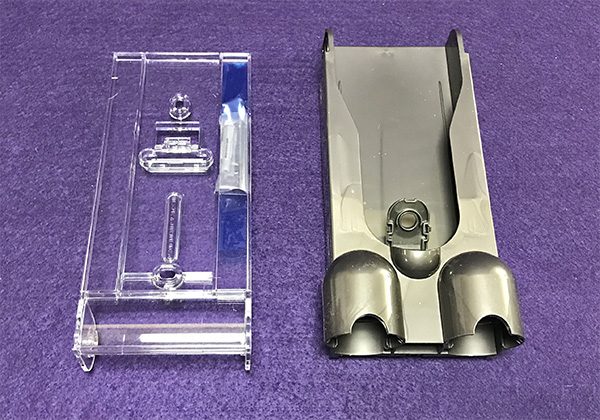
  • Docking station
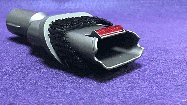
  • Crevice tool
  • Combination tool

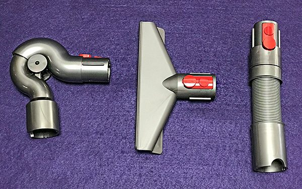
Registering the V10 gains you three additional free attachments of your choice. I chose:

  • Quick release up top adapter (for ceiling fans)
  • Quick release mattress tool
  • Quick release extension tool
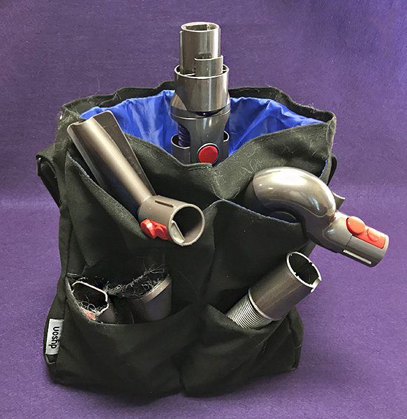
  • Tool bag (I bought this since I had maxed out my three free tools)

Specs

• Weight: 5.9 lbs

• Charge time: 3.5 hrs

• Bin volume: 0.2 gallon

• Run time (Suction mode 1): 60 mins

• Cleaner head: Torque drive

• Cyclone technology: 14 concentric array cyclones

Design and features

We’ve owned a Dyson Ball upright vacuum cleaner for a few years and it still performs admirably. It’s always easy to maneuver and its suction is great, both on our tile floor and area carpets. However, it’s big, heavy and the built-in extension hose is a huge pain to use. When the Cyclone V10 became available to review, I got excited for a couple of reasons: the V10 is lightweight and it’s cordless. That’s a big deal to me. I wondered if vacuuming could become a fun chore—much unlike the corded Dyson.

Face it; nothing looks like a Dyson product. The performance and especially the design are unique. 

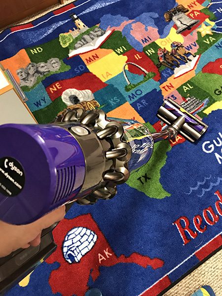
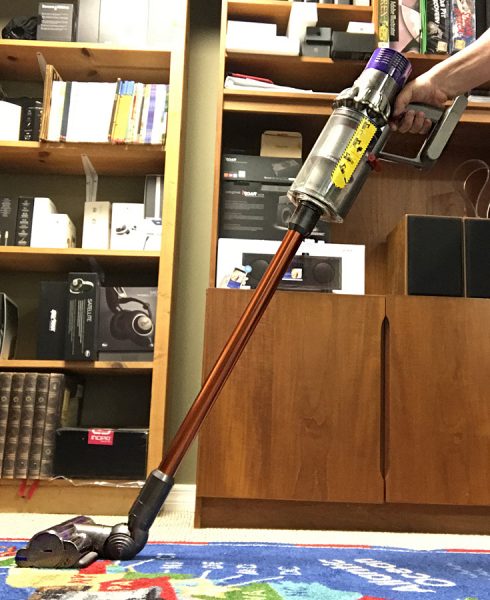
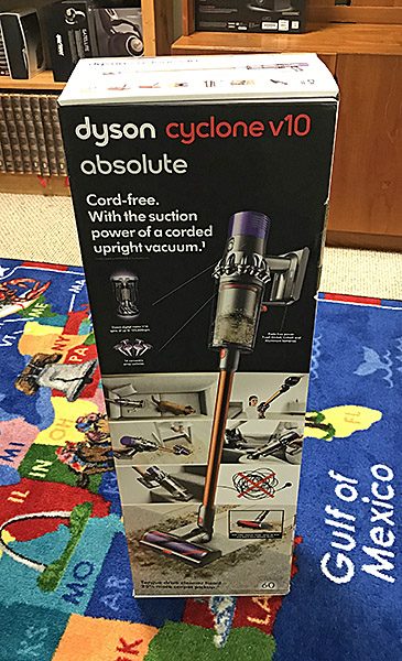
When I opened the box, I was surprised at all the attachments and pieces. There was nothing to assemble—it was just connect this to that and voila—a vacuum! After taking photos (I wanted a pristine machine to shoot), I vacuumed the two oversized rugs in my studio building. I was impressed. The V10 felt as powerful as our upright at a fraction of the weight. I vacuum the rugs every other week and yet the V10 sucked up stuff I’ve never gotten before.

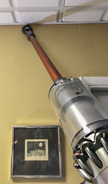
The V10 is also light enough for me to vacuum the area where walls meet the ceiling—a favorite place for Florida spiders to make their webs. Most of the weight is in the handle, so it’s easy to vacuum at any angle without muscle strain.

My wife (who suffers from allergies and asthma) has used the V10 more often than me, so I asked her to write down some thoughts—pro and con. Here’s what she wrote:

  1. Bill went over the living room rug right after I had vacuumed it with my floor-model Dyson, and it picked up a lot of dog hair.
  2. My puppies are terrified of it, even though it’s quiet and cordless.
  3. It stores in pieces. At first I was frightened because of all the pieces. So I looked at the manual to figure out what to do with all the pieces.
  4. It’s a little awkward to swap out the rug and hard floor heads. It’s easier to swap the heads on a counter top, but I’m not putting something that’s been on my floors onto my counter.
  5. The heads are smaller than on the corded Dyson, which means I have to do more passes in a large room. But I do like that the smaller heads are also more flexible so I can easily go under furniture without going into contortions
  6. There’s no cord for me or my puppies to trip on.

My wife also dislikes the storage bag. Even though it’s a Dyson branded bag, it seems generic in design because while the attachments fit in the pockets, all of them don’t fit that well. The V10 does have a wall mounted docking station which seems handy, but I am holding off attaching it to the wall in our laundry room until I can have an electrician install an outlet right below it. Otherwise, I have to recharge it somewhere other than while attached to the docking station, which seems counter-intuitive. 

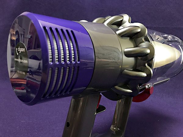
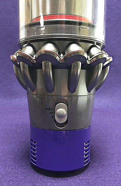
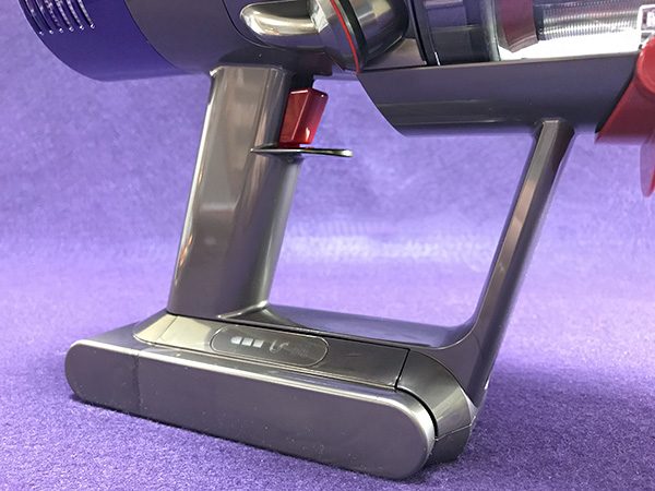
The motor housing looks like a weapon from “Blade Runner.” The handle of the V10 is similar to a pistol with a trigger that powers the vacuum. Press it and it powers up; release it and it turns off instantly. The motor spins at an astounding 125,000 rpm. Just know that those speeds create a lot of suction. Dyson claims that this motor is the most powerful of any cordless vacuum. I have no way of proving that, but it wouldn’t surprise me if it was true. It certainly feels powerful enough.

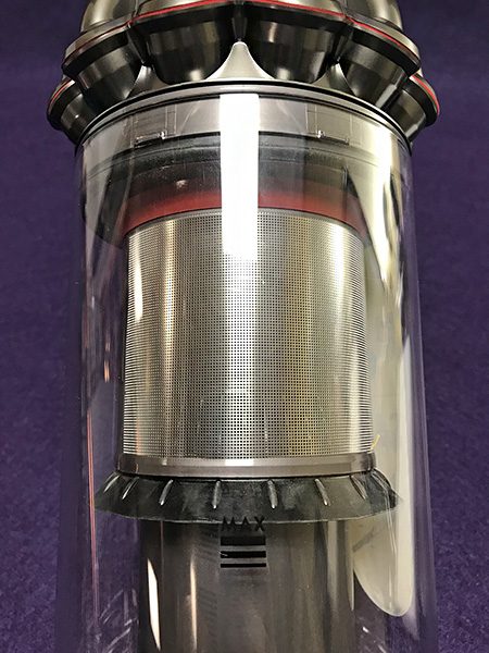
The V10 has a sealed filtration system that will trap up to 99.97% of particles as small as 0.3 microns – expelling cleaner air. There’s a re-designed suction path that’s straight, which makes this Cyclone more efficient than previous models like the V8 or V6 (which Dyson still sells). Keep in mind that you need to pay attention to how quickly the removable filter can get clogged. When that happens, suction is reduced. However, it’s easy to clean and rinse off—just make sure it’s dry before reattaching.

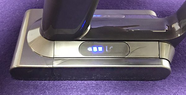
The Cyclone V10’s battery is more than powerful enough. It has three settings: One (dot), two (dots) and MAX. The battery is rated at one hour on the lowest setting. Even though the majority of our floors are tile and wood, I feel more comfortable using the two (dots) setting. Battery life at this setting drops to 23 minutes, which is enough to clean our house—barely. On MAX, the battery lasts for a whopping 8 minutes, so you only want to occasionally use this setting. All of these times are based on a 3.5 hour charge. One cool feature is that the V10 only works when the trigger is pressed, so there is a potential battery savings as a result. Plus, the battery works at full power right up until it runs out of juice—there is no power fade.

One big drawback with the battery is that it’s not removable. The whole motor unit must be plugged into the wall using the included proprietary charging cord. If the battery was removable, you would have the ability to swap out a drained battery for a fresh one and keep vacuuming—but you don’t have that option. This may be a deal-breaker for some, especially considering the cost of the V10. Hopefully, a future model will have removable batteries.

Using the attachments is much like other Dyson vacuum cleaners. There is only one way pieces will connect. The main head unit is called a powered torque drive unit. It can suck up a lot of dirt and pet hair out of carpets—at the expense of battery life. The MAX setting cleans the deepest, but remember, the battery will only last for eight minutes in this mode. It’s best to use the middle setting for normal cleaning and save the MAX setting for tough spots. 

Also included is a soft roller cleaner head made for hard floors and suctioning larger items, like cereal. I’m not a fan of this head because it seemed that almost as much hair and dust stuck to the rotating carbon fiber roller as was collected in the bin. Plus, as my wife stated earlier, switching heads to clean rugs and then hard flooring, is a pain. I ended up leaving the soft roller head in the Dyson tool bag.

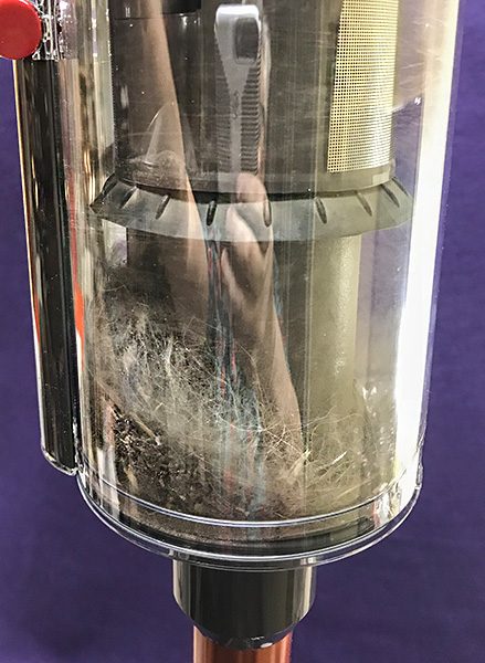
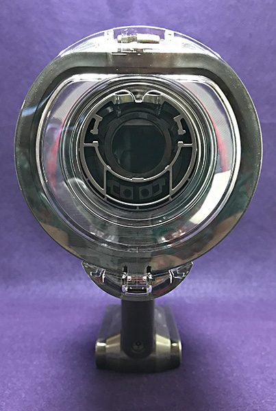
Emptying the V10’s bagless bin is easy and your hands don’t get as dirty as with some other cleaners. A simple push of a lever and a door opens into the trash. You do have to manually close it though which can get dust on your hands.

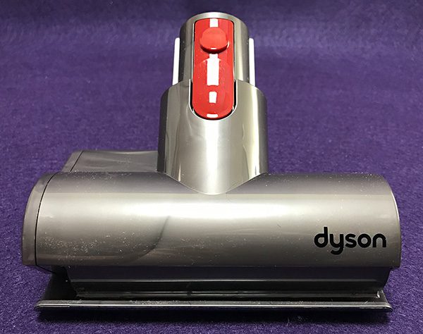
Because it’s a stick vacuum, the Cyclone V10 doubles as a handheld. This allows the V10 to be used as a duster and a powerful furniture vacuum. My excitement of this feature was tempered a bit when used in my car. The V10 is not a large vacuum, but inside the tight spaces of an auto, the V10’s stout frame becomes an issue. One solution is to attach the optional (and flexible) extension tool to go under and between seating using the included mini-motorized and crevice tools.  

Lastly, the V10 comes with a handy wall mount.

What I like

The Dyson Cyclone V10 is lightweight, powerful and easy to use, no matter what you’re vacuuming. Attachments are easy to add and remove and the bin is the easiest to empty of any vacuums I’ve used.

What needs to be improved

As I said, the battery should be removable. The V10 is almost all plastic and the futuristic style might not appeal to some—although I like it. I would have preferred a storage bag designed specifically for the V10’s tools and attachments instead of the generic-feeling one. 

Final Thoughts

Since reviewing the cordless EGO lawn blower, I have become a huge fan of battery operated devices that require a lot of power. The Dyson Cyclone V10 is no exception. Despite a few minor quirks and it’s non-removable battery, I have come to enjoy using it to the degree that I look for things to vacuum. How weird is that?

Price: $699.99 US
Where to buy: Amazon
Source: The sample of this product was provided by Dyson. Visit www.dyson.com for more information.

The post Dyson Cyclone V10 Absolute stick vacuum cleaner review appeared first on The Gadgeteer.

Filed in categories: Reviews

Tagged: ,

Dyson Cyclone V10 Absolute stick vacuum cleaner review originally appeared on The Gadgeteer on May 30, 2018 at 10:00 am.

Note: If you are subscribed to this feed through FeedBurner, please switch to our native feed URL http://the-gadgeteer.com/feed/ in order to ensure continuous delivery.

Rocketbook Mini Everlast Notebook review

Note takers, rejoice! Now you can have your old-school notebook AND the convenience of digitizing your hand written brilliance… and you’ll never have to kill another tree again. What sorcery is this? It’s Rocketbook. Let’s check it out!

What is it?

It’s a pocket-sized erasable and reusable notebook that, when paired with the Rocketbook app, enables you to scan and upload your note pages to your favorite cloud services.

Hardware specs

  • 3.5” by 4.6” notepad
  • Synthetic blend paper
  • Erasable and reusable
  • Pre-printed smart grid pattern on all pages

What’s in the box?

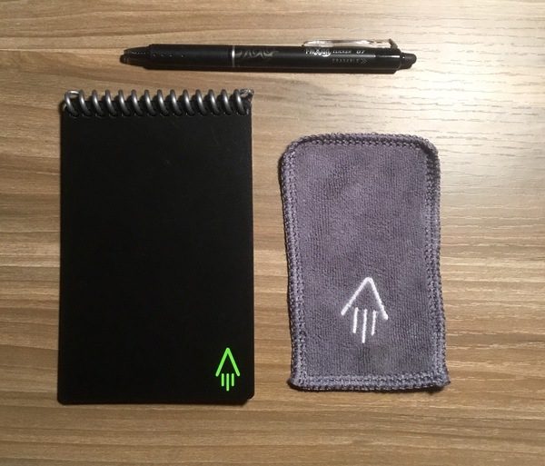
The Rocketbook Mini Everlast Notebook is now available on Indiegogo in a variety of packages. My sample came with the notebook, a black FriXion pen, and a microfiber towel.

Design and features

The Rocketbook Mini Everlast looks and feels like a traditional paper notebook, but the pages are actually made from a synthetic blend that repels water and is very difficult to rip or tear (I know. I tried). Thick covers and a heavy plastic coil binding make this a deceptively tough little notepad. It’s been kicking around as part of my daily kit for a month now with no signs of wear and tear other than a few random scratches.

Erasable pages

The key feature to the Rocketbook Mini Everlast is it’s erasability and re-use. Designed specifically for use with Pilot’s FriXion pens, the ink bonds to the pages after about 15 seconds. 

To erase, you add a bit of water and wipe down the page. Once it dries, you’re good to add more notes. Theoretically, you could reuse the pages an infinite number of times. I did notice that a bit of residue can build up on the pages. A thorough scrub takes care of the worst of it. Since the notebook is waterproof, you could do this in the sink.

The notebook has 24 double-sided pages that give you plenty of room for notes, to-do lists, sketches and scribbles before needing to erase anything. I did see some ink bleed-through when using both sides because the pages are slightly transparent, so I’d probably just use one side at a time for my notes.

One note about the ink: when Rocketbook says 15 seconds to dry, they mean it. The FleXion ink smudges rather easily, so so you’ll want to be patient before flipping the page. Something to keep in mind if you are trying to take rapid-fire notes.

Digitizing your notes

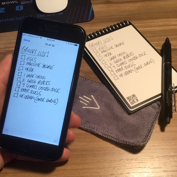
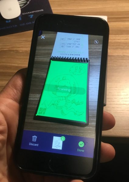
The Rocketbook Mini Everlast is designed for easy scan and upload of your pages using the Rocketbook smartphone app. Tap “new scan” to access your camera, and position your phone over the desired page. The app uses the pre-printed black frame & QR code on each page to align and scan your notes. Wave your camera over the page to position it for automatic scanning:

When completed, the scanned image is saved to the app. You can tweak the settings for scan quality, but I found it to do a great job right out of the box:

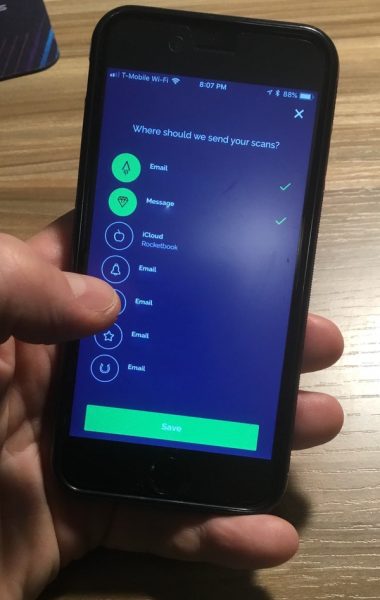
You can then send your page (or pages) to an e-mail address, an iOS message, or an assortment of cloud-based services like Google Drive, Evernote, or iCloud. The Rocketbook web site has a complete list of compatible services; add your login information to the setup and the app will store the info for future use.

You can customize the file format for each destination as a JPEG or PDF. You can also set preferences for sending bundle scans or even make animated GIFs from a series of scans. I sent this scan to my Gmail account as a PDF:

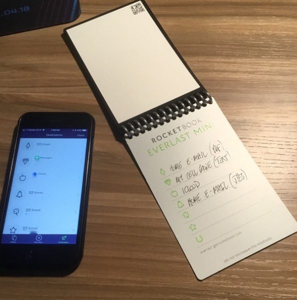
The Rocketbook app is set up with 8 different icons, one for each preset destination. You can use the cheat sheet on the inside cover to remember what your destinations and settings are:

The best thing about the app is that it’s an easy system to learn and use. The scan alignment feature saves fighting with your camera to get a clean shot of your notes, and you can send off your scans with a couple of quick taps. You can drop a day’s worth of notes and have them scanned and shipped in a few minutes.

Performance notes & use cases

I see the Rocketbook Everlast Mini as a bridge for those of us who like old-school note taking but want the ability to digitize our work on demand. Yes, you could always just take pics with your smartphone camera from any old notebook… but the well-integrated Rocketbook app adds an extra level of convenience and usability that some might find more useful.

If you’re a heavy note taker, however, you may find that the form factor here is not to your liking. The pocket-sized Everlast Mini really caters towards jotting down quick thoughts and scribbles, and the need to wait for the ink to dry does take away the speed factor. Rocketbook does make a full-sized version of this notebook that would cater to those taking extensive meeting notes, and the full-sized pages allow for a bit more time to let that ink dry before you have to flip your pages. If you like the idea of an erasable notebook but need more room to write you may want to consider the larger size. Check out the Rocketbook web site for more information.

What I like

  • Endlessly erasable format saves paper (and collecting old notebooks)
  • Durable design
  • Seamless integration with the Rocketbook app
  • Quick, easy ability to send your notes to multiple destinations

What needs to be improved

  • Waiting for the ink to dry may not work for you if you are taking rapid-fire notes

Final thoughts

The Rocketbook Everlast Mini Notebook is a clever piece of design that solves multiple problems for old school pen and ink note takers. The durable erasable pages can be used repeatedly. The app, while simple, is well-integrated with the notebook and has nice usability. It’s also offered at a really nice starting price point ($16 for the starter kit) if you want to test one out yourself. Just consider your intended use to see if it might work for you.

Price: The Rocketbook Everlast Mini is currently being offered through an Indiegogo campaign starting at $16. This kit includes the notebook, a FleXion pen, the microfiber towel, and a pen holder that attaches to the notebook. Other options are also available. Shipping begins in July 2018.
Where to buyCheck out the Indiegogo page for more information.
Source: The sample of this product was provided by Rocketbook.

The post Rocketbook Mini Everlast Notebook review appeared first on The Gadgeteer.

Filed in categories: Reviews

Tagged:

Rocketbook Mini Everlast Notebook review originally appeared on The Gadgeteer on May 29, 2018 at 7:46 pm.

Note: If you are subscribed to this feed through FeedBurner, please switch to our native feed URL http://the-gadgeteer.com/feed/ in order to ensure continuous delivery.
BatchPhoto software review

If you work much with digital photos, sooner or later you’ll probably come across the need to edit a batch of photos, applying some form of edit to all of them. Regardless of whether or not you use something like Photoshop, Lightroom, or another image editor, sometimes the right tool for this job is one specifically designed for batch operations – like BatchPhoto from Bits&Coffee.

What is it?

BatchPhoto is a batch photo editing software program for Windows and Mac that can process multiple photos in an automated or semi-automated manner, applying specified actions to each one. There are 50 edit actions that can be applied. BatchPhoto calls them filters, but they’re more than just an Instagram-like filter. These filters include things like applying text, watermarks, resizing, rotating, image touch-up, and many more. Each filter has settings so that you can customize each filter to do exactly what you want it to.

What’s in the box?

The download for BatchPhoto is 34.5MB for Windows and 56.2MB for Mac. The download includes all available versions and has the ability to unlock the full (paid) version with a product key so there’s no re-downloading and installing the paid version if you decide to buy a license.

The installation was pretty much a standard installation, nothing unusual to mention.

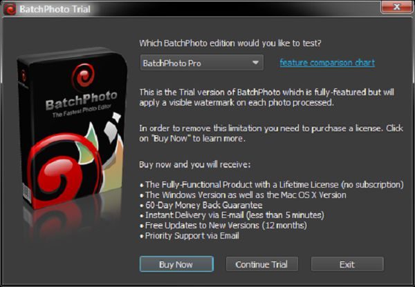
When you first start the program you’re presented with a dialog where you can choose which version to evaluate. There are three versions to choose from, Home, Pro, and EEnterprise.This review covers the enterprise version. For a comparison of features included in each version, see the comparison chart.

BatchPhoto is available in the following languages: English, German, French, Spanish, Italian, and Japanese.

Design and features

The program uses a simple wizard-like three-step approach:

  • Step 1: Add photos.
  • Step 2: Edit Photos.
  • Step 3: Setup.

Clicking the “Process” button starts the real action of the program, processing each image with the settings you have specified.

Although the program is wizard-like, you can jump between steps at will. You can even skip step one if you’re going to be using a profile to automate the processing of images at a later time (more on profiles later).

Step 1 – Add Photos

BatchPhoto handles just about every image format there is. It can process over 170 image formats, including quite a few RAW formats (including Canon, Sony, Nikon, Olympus, Fuji, Kodak, Pentax) that photographers use. It can also output to almost all of these formats as well. Some formats can’t be output to, like RAW files that are specific to digital cameras.

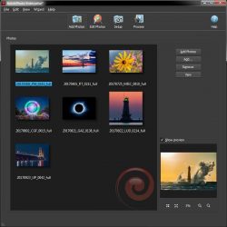
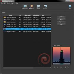
You can add photos via drag and drop or browsing for specific files, or adding files from a folder or multiple folders. The photos list also includes multiple view modes such as detail list, small icons, medium icons, and large icons (icon meaning thumbnails). A Preview window is also in this step and supports zooming.


Step 2: Edit Photos

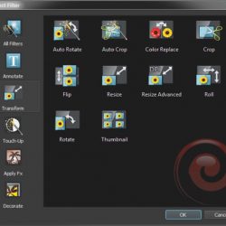
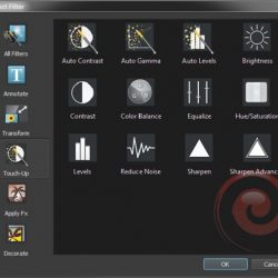
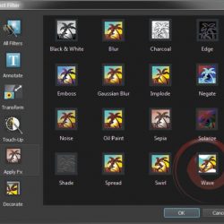
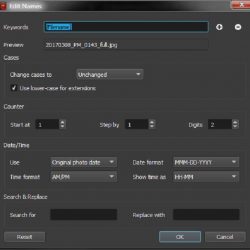
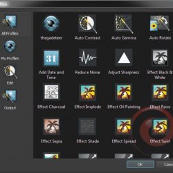
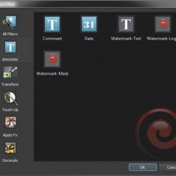
In this step, you specify filters and file renaming options. This is the heart of the program. There are 50 filters, each with its own customizable settings. You can do just about anything that you would want to automate.

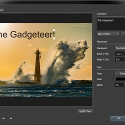
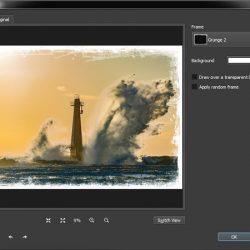
There are far too many filters here to cover each one individually, but I’ll include screenshots of the filters here, along with a couple of their edit dialogs as well.


Step 3: Setup

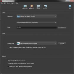
This is where you setup the output options. You can specify the output folder, output format, and other miscellaneous options.

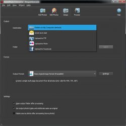
The output options are:

  • Folder on your computer
  • Send via E-mail
  • Upload to FTP
  • Upload to Flickr
  • Upload to Facebook

PDF, TIF, and GIF output formats can create multi-page files where all of the images are included in a single file.

There are also settings for setting the output photo’s date and attributes to match the original file, as well as an option to delete the source file after processing.


Processing

One of the key features of BatchPhoto is its ability to process multiple photos at the same time, greatly reducing the time it takes to process photos. For those who are into technical stuff, this means it will use multiple threads to process the photos. There’s also an option to turn this off if you want.

One of the things I really like is that you can save your settings as a profile for easily loading those settings later, and applying them to batch operations using the “watch folder” feature of the included monitor program. For example, you might have one profile for processing “proof” images, and another profile to process “final” images or one for outputting small images and one for outputting large images.

One thing I did note is that you save the profile via the file menu, but you load them via the wizard menu. BatchPhoto includes many pre-defined profiles for your convenience including a “Convert to PDF Album” that will output your photos to a PDF file and a “Send via E-mail” profile.


Automated processing

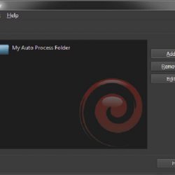
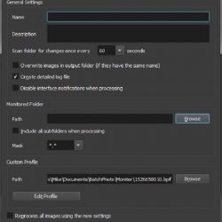
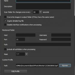
BatchPhoto includes a utility program called Monitor. It can be launched and will run separately from the main program. It can be configured to watch a local or FTP folder for new files. When the new files are detected, it will process them automatically based on a specified profile.

This is a very powerful feature for users that want to automate the processing of files. An example use would be to automatically process and upload files simply by copying or moving them to a watched folder. As soon as that folder is checked (at an interval that you specify), the new files are automatically processed.


Semi-Automated processing

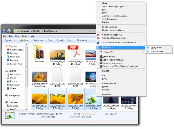
BatchPhoto also includes the option to integrate into the Windows Explorer shell. You can simply select your images, then right click and choose BatchPhoto then Apply Profile and the program will prompt you to select a profile and the selected images will be processed with that profile.

What I like

  • Very versatile in input and output formats
  • Video tutorials on the BatchPhoto website.
  • Profiles for quickly specifying options
  • Output option for processing the files to a subfolder of the original folder.
  • Configurable file renaming options.
  • Multiple thread output. 7 threads on an 8 CPU (4 Core) system.

What needs to be improved

  • I would like to see a ZIP output format where all the files would be created and then moved into a zip file.
  • I saw errors outputting files using the grunge frame with multiple files while using multi-processing. The error did not occur when the setting was turned off.

Final thoughts

BatchPhoto is an excellent batch photo processing solution. It provides powerful editing features, superb configuration options, as well as great output formats and destinations. Whether you’re an amateur or a professional, you’ll probably find that this program will meet most, if not all, of your needs.

Price: $29.95 – $129.95
Where to buy: BatchPhoto
Source: The sample of this product was provided by Bits&Coffee

The post BatchPhoto software review appeared first on The Gadgeteer.

Filed in categories: Reviews

Tagged: , ,

BatchPhoto software review originally appeared on The Gadgeteer on May 29, 2018 at 10:00 am.

Note: If you are subscribed to this feed through FeedBurner, please switch to our native feed URL http://the-gadgeteer.com/feed/ in order to ensure continuous delivery.

LifeProof Goa 22L Backpack review

What is it?

You know the company, LifeProof, who created those insanely durable smartphone cases back in 2013? Well, it turns out there’s a demand for many of the products in our lives to be “life proof” or, protected from water, snow, dirt, and drop damage, including our backpacks! LifeProof has created such a backpack with the Goa 22L Backpack and it is pretty awesome.

What’s in the box?

In the box came the beautiful, black and green LifeProof backpack, alone. I fell in love at first sight.

Design and features

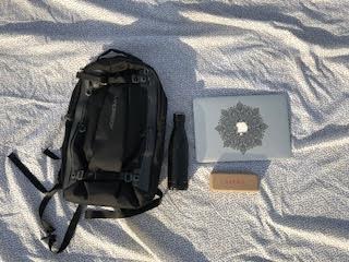
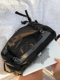
This heavy-duty pack has a multitude of features that set it aside its competition. It’s made from a water-repellent fabric, and even has a sealed, fleeced lined weather-resistant tech pocket that holds up to an iPhone 8 Plus. The tech pocket has a pass-through for cords like headphones and charging cables. If that pocket wasn’t cool enough, there’s also a hydration reservoir pocket that holds up to 3 liters, so you’ll always be hydrated on your adventures. There’s a detachable chest strap for extra comfort, and plenty of convenient smaller pockets on the inside to keep your gear organized. The exterior has 4 side stash pockets for smaller items like passports, wallets, etc. Also found on the outside is a separate reinforced laptop and/or tablet side pocket with padding to keep your electronics safe.


What I like

What I like the most about this pack is the padded laptop pocket, because it’s perfect for me as a traveling student journalist. I adore the ergonomic straps that make the pack completely comfortable, no matter how heavy I make it. The lifeproof-ness is something I particularly favor, also!

What needs to be improved

There isn’t much that I can see needs to be improved with this pack. It comes in 4 sizes, so it can appeal to almost anyone. Though I’m assuming it isn’t 100% waterproof, (I’m not going to soak it in the ocean to find out…) it is water resistant, meaning I can wear it out in the rain, and I plan to! The only thing I can think of is adding the option for more colors or styles. But, this company is pretty on-the-ball, so I’m sure they’ve already considered that.

Final thoughts

This is a greatly anticipated, well designed, nearly flawless backpack and I plan to keep using it for a  long time, being as it will last me a very very very long time! Go LifeProof!

Price: $159.99
Where to buy: https://www.lifeproof.com/en-us/backpacks-coming-soon.html
Source: The sample for this review was provided by Lifeproof.

The post LifeProof Goa 22L Backpack review appeared first on The Gadgeteer.

Filed in categories: Reviews

Tagged:

LifeProof Goa 22L Backpack review originally appeared on The Gadgeteer on May 28, 2018 at 12:00 pm.

Note: If you are subscribed to this feed through FeedBurner, please switch to our native feed URL http://the-gadgeteer.com/feed/ in order to ensure continuous delivery.
ZAGG InvisibleShield Glass Curve Elite Samsung Galaxy S9 screen protector review

I have used many different screen protectors on my phones, watches and digital camera screens over the years.  The majority have been the peel and stick type that you apply with a water base.  I have used tempered glass screen protectors and a couple of phones and currently on my Garmin Fenix 5s.  I do not, however, have a screen protector on my current phone which is a Samsung Galaxy S9.  I have been hesitant to put one on because I figured that curved screen would give me issues.  Does the new  InvisibleShield Glass Curve Elite from ZAGG make this an easy task?  Let’s find out!
What is it?

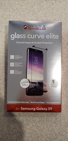
The ZAGG Glass Curve  Elite is a tempered glass screen protector.  The one I have was made specifically for the Samsung Galaxy S9.  They make it for the S9 Plus and several other models of Samsung including the S8,  S8 plus and the Note 8.

Hardware Specs

  • It has a custom curved fit to specifically fit the model of phone it was made for.
  • It has a built-in shock absorbent layer that helps prevent the impact of an unexpected drop from shattering your phone.
  • Smooth tempered glass that does not impact the clarity of the screen.
  • Provides impact and scratch protection
  • Provides for precision touch sensitivity (you do have to increase the touch sensitivity in your phone settings before installing the protector)
  • It has a smudge-resistant finish

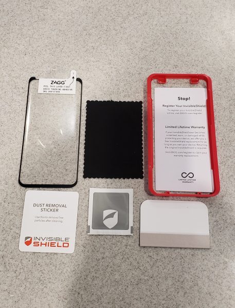
What is in the box?

  • The screen protector
  • A micro fiber  cloth
  • An alcohol wet wipe
  • Instruction book
  • Plastic template to help install the protector on your phone
  • Dust removal sticker
  • A stiff card with cloth on one end to help set the glass to the phone.

Installation process

First off, and I cannot say how important this is, please be sure you are in the most dust free area in your home.  Unlike the peel and stick type protectors, if you get a dust particle under the middle of the protector you will have little to no chance to get it off without breaking the protector.  You can pull back the edges pretty easily to fix bubble and remove dust, but to pull it back all the way to the middle really risks cracking the glass.  That is essentially what happened to me on the first time I tried to install it.  The next time I used the tried and true method of using the bathroom.  I ran the hot shower for a few minutes to steam up the room and remove the dust particles from the air.  I then followed the next steps of shutting the phone off, wiping it down with the alcohol wipe and then wiping with the micro fiber cloth.  I finally used the dust removal sticker and went over the entire screen with it.

The next step was to place the red plastic template over the phone.  In the picture above it goes over the top of the phone exactly in that layout.  It really does help you to position the protector exactly where it should be on the phone.   I then peeled the back sticker off the protector and used the two tabs on the top and bottom of the front of the protector to position the protector.   Once in place, I pulled the top sticker off the top of the template holding it in place on the bottom of the screen.

At this point, you take the hard card and using four fingers, slowly slide the cloth side of the protector towards the top of the phone.  Once the middle of the protector is set, you flip the hard card over and use the non-cloth covered side to slide up the edges.   Watch the video below to see how the installation should work.  They certainly make it seem easy!


What I like

I love the idea of having a tempered glass screen that will fit the curve of the newer Galaxy phones.  I often find that the peel and stick type protectors leave the screen feeling slightly ‘funny’ and it was really noticeable on my Note phones when I used the stylus.  Glass protectors also tend to be much clearer and less susceptible to scratches and ‘dents’ that the plastic type protectors would often get.

What needs to be improved

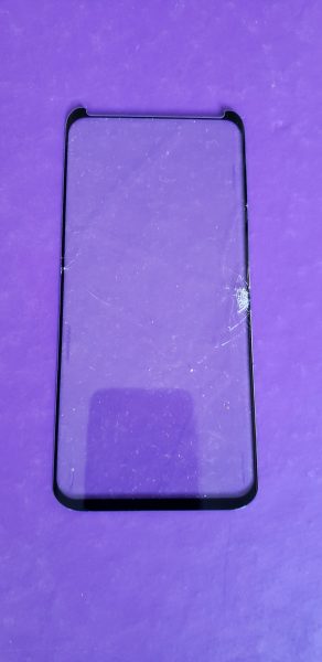
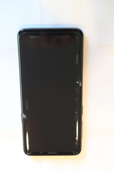
Unfortunately for me, even with three different tries on installing this protector it just did not work for me.  The first time I will totally blame myself.  In my excitement, I tried to install the protector in my breakfast area.  We have a Shetland sheepdog in our home and he is a walking dust magnet.  Even going through the whole alcohol wipe, microfiber wipe, and dust sticker, I still had a ton of dust under the protector.  The sides also failed to seat at all and that could have been due to the amount of dust.   My second attempt I used the bathroom process described above.  I was getting bubbles under the corners and having some difficulty again trying to get the sides of the protector to seat on the phone.  Somehow in the process of trying to seal it the screen cracked on the side.  You can see a picture of it below.

Third time is a charm, right?  Well NO, darn it.  Things were really going well this time.  I was still having issues trying to get the sides to seal on the phone.  I had flipped the card around to the non-cloth covered side and was repeatedly trying to push down and get those sides to de-bubble.  I guess I must have been too firm and I got a crack again.  You can see where I had bubbles on the sides of the phone on the top right and just above the other crack on the left.  For a protector that costs $50 you want to get it right the first time.

Final thoughts

I really wanted this screen protector to work.  Even with three attempts, I could not make it work.  This screen protector is extremely expensive at $50 and I would have spent $150 and still had no protection on the screen of my phone.  The video makes it seem effortless, but I did not find it to be that way at all.  I just can’t recommend this protector unless you feel like you have that special touch and really want to try it yourself.

Price: $49.99
Where to buy: ZAGG and Amazon
Source: The sample for this review was provided by ZAGG.

The post ZAGG InvisibleShield Glass Curve Elite Samsung Galaxy S9 screen protector review appeared first on The Gadgeteer.

Filed in categories: Reviews

Tagged:

ZAGG InvisibleShield Glass Curve Elite Samsung Galaxy S9 screen protector review originally appeared on The Gadgeteer on May 28, 2018 at 10:00 am.

Note: If you are subscribed to this feed through FeedBurner, please switch to our native feed URL http://the-gadgeteer.com/feed/ in order to ensure continuous delivery.