Lululook Canvas Backpack for men review

Convertible bags are great, but they also present a tricky design challenge to make sure the bag works in both vertical (backpack) and horizontal (messenger) mode. Today we’re looking at Lululook’s take on the convertible backpack/messenger bag. There are ‘s a lot of interesting  design happening here. How does the whole package come together? Let’s have a look!

What is it?

It’s a canvas backpack that converts to a messenger bag.

Hardware specs

  • Cotton canvas with leather accents
  • Molded plastic hardware
  • 12” by 18” by 7”

Design and features

The Lululook Canvas Backpack is a convertible backpack/messenger that’s all about urban style. Tan is the primary color in my tester, but there’s some well-balanced use of earth tones in the trim & hardware (plus some leather hits) that provide visual interest. It’s a good looking piece of carry.
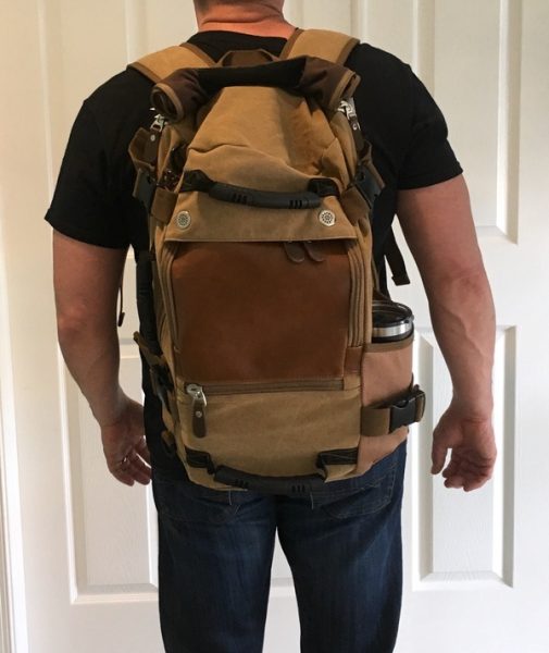
The exterior seems pretty well put together for a bag at this price point. Soft cotton canvas is the primary material, with cotton webbing used for straps throughout. Rugged plastic hardware and chunky zippers (not YKK, unfortunately) add to a build that feels fairly substantial. The interior fabrics are an issue, however, as we’ll see below.
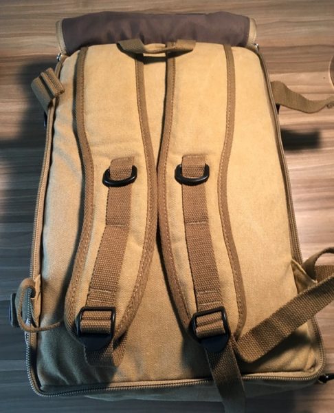
The design is built around a simple 12” by 18” by 7” box shape. The backpack straps are hidden behind a zippered panel on the rear of the bag that rolls up and velcros to the top of the bag when in use. See below for the walk through:
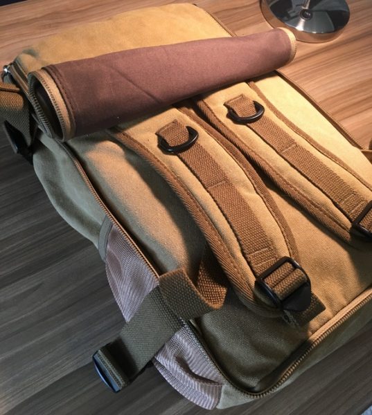
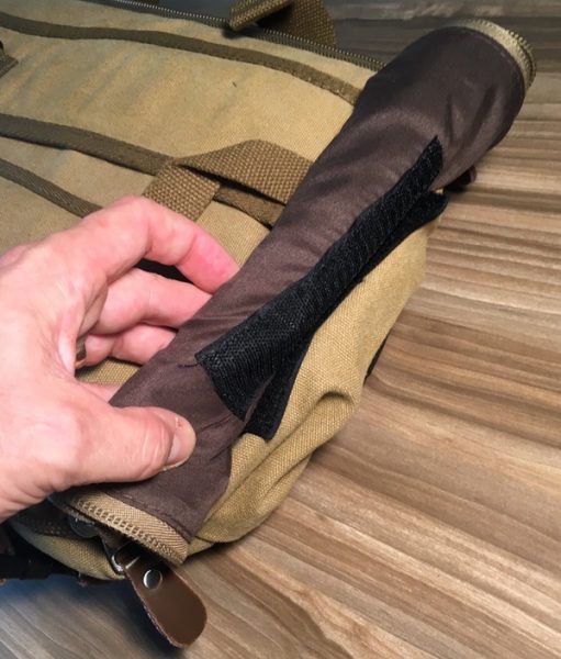
It’s a clever solution that, when combined with the low-profile backpack straps, gives you a nice option for stashing those straps without adding a lot of extra bulk. Those straps are also comfortable despite the light padding.

You’ll find two pockets on the front face to organize your goods. That leather flap unzips on three sides to reveal a monstrous pocket that runs almost the full height and width of the bag. There’s also a horzontal pocket below it that’s plenty big enough for power bricks and such.
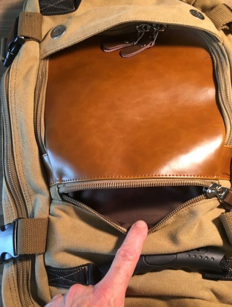
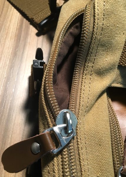
This presents one of the challenges I have with this bag design. See how those zips have to get under that rain hood at the top of the bag? It’s really tough to make that zipper turn those corners under the grommets without a fight. Maybe the zips will loosen up over time, but I found it really hard to get into this compartment.

This leads to the second issue I have with the front pocket: not only is it huge and tough to get into, but the pocket is backed by nothing but a thin piece of fabric. There’s a thin fabric divider in this space, but it just gets in the way. I dropped a 9″ by 11″ textbook in there… you can’t see it, can you?
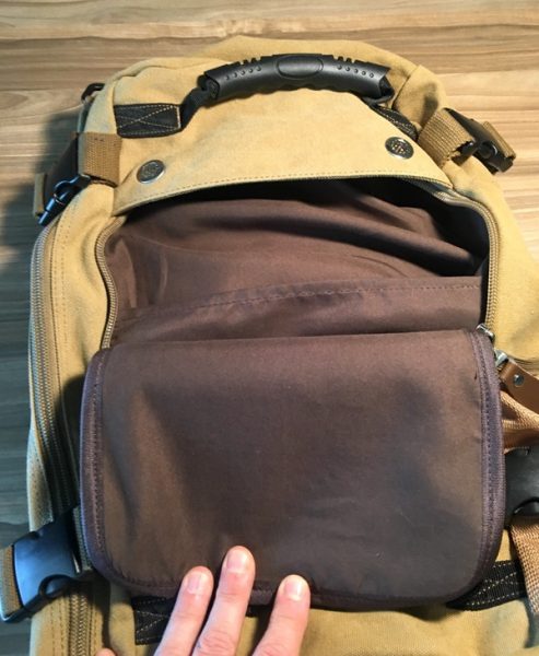
With no internal support, that space just turns into a big floppy black hole. Big items get lost, and small items vanish into the void. Between this and the trouble working that zipper, I found myself not using that pocket much on a day-to-day basis. I also see that thin fabric as an area with a high potential for tearing over time.

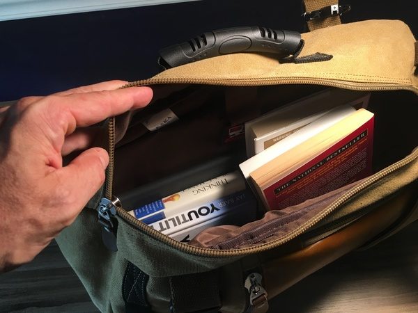
On the plus side… the main compartment is enormous. Some soft padding on the rear panel and the divider will protect a laptop up to 15″, and the rest is just open space for whatever you like. We’re talking roughly 30 liters of space if you’re not putting too much in the front compartments.
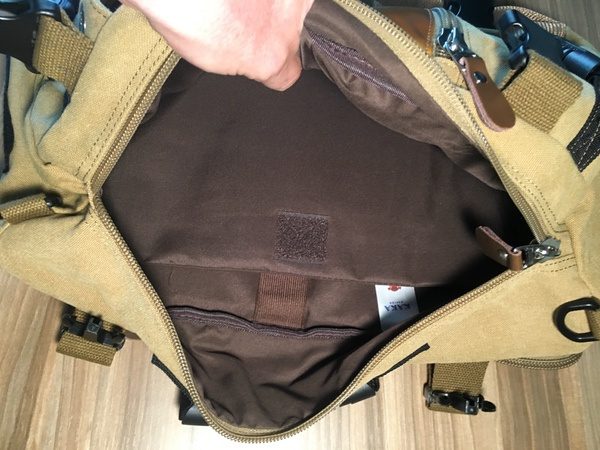
I stuffed 6 books, my laptop, and an ipad in there in addition to the textbook in the front compartment with plenty of room to spare. If you like big spaces to bung all your gear, you’ll like this.
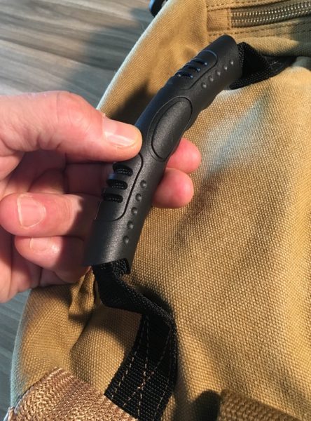
There are some thoughtful additions to design that I like quite a bit. Three rubberized grab handles are placed at the top, bottom, and side of the bag for tossing it around. They’re nice & grippy, and work well when getting in and out of vehicles:
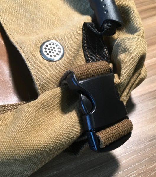
Compression clips at the four corners of the bag are very much appreciated for cinching things down if you’re lightly packed:
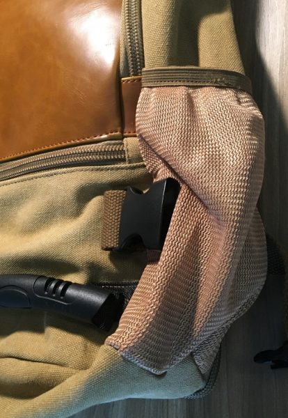
The elastic mesh water bottle pocket is also a nice touch… while I have that compression strap unlocked here, it actually expands with the pocket to handle the Yeti 24 ounce mug you’ll see in some of the other pics:
When you want to go to one-shoulder mode, the included cotton web strap clips on the same side as the main compartment opening and side grab handle (which now becomes a briefcase-style handle). There’s no shoulder pad, but the strap is sturdy and comfortable. The hardware and attachment points are all solid.
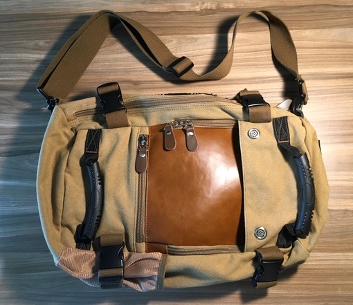
Sadly, that front panel pocket is even less usable in this mode. It’s just impossible to access when the bag is turned on its side. The messenger-style carry works great for the main compartment, however, which turns into one big ol’ stuffable space. Note that the compression straps need to be unlocked to unzip to the main compartment in this mode. 
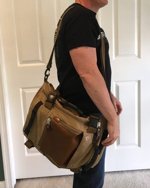
With all those soft fabrics and no framing, it’s important to note that the bag tends to sag and flop based on whatever you put in it. You can see that everything I loaded into the bag sinks to the bottom as shown below:

There’s a lot to like in this bag, but I found myself dealing with tradeoffs in both backpack and messenger mode that took away from the overall usability. If you’re an organizer with a lot of tech, you probably won’t be happy with this bag. If you like a floppy, unstructured bag that will accommodate all kinds of stuff, this may be a good fit for you. I’d prefer to see that front pocket redesigned (or removed entirely) to make this bag really usable.

What I like

  • Good looking, modern style
  • Some nice additional features in the compression clips, multiple grab handles, and water bottle pocket
  • Roomy

What needs to be improved

  • The main front pocket is not very usable
  • The bag could use some more structure to keep your stuff from sinking to the bottom
  • Interior fabrics are flimsy
  • Very little organization for tech and small bits

Final thoughts

The Lululook Backpack for Men is a mixed bag (pardon the pun) for me. It looks great, and there are some nice design elements that I quite like. There are some challenges in the overall layout, however, that you may want to consider if you’re thinking about this one.

Price: $45.99
Where to buy: Visit the Lululook web site for purchasing information.
Source: The sample of this product was provided by Lululook.

The post Lululook Canvas Backpack for men review appeared first on The Gadgeteer.

Filed in categories: Reviews

Tagged:

Lululook Canvas Backpack for men review originally appeared on The Gadgeteer on July 9, 2018 at 2:00 pm.

Note: If you are subscribed to this feed through FeedBurner, please switch to our native feed URL http://the-gadgeteer.com/feed/ in order to ensure continuous delivery.

Ninja Cooking System with Auto-iQ review


REVIEW – Lately, I’ve had a few reviews that were a little bit on the frustrating side, either dealing with problems or just a lot of figuring things out due to the lack of features or inadequate software. The Ninja Cooking System with Auto-iQ broke that trend by being simply a joy to use.

What is it?

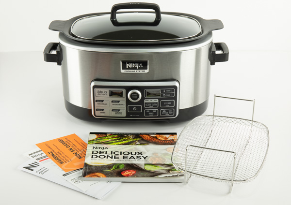
The Ninja Cooking System with Auto-iQ is a multi-cooker system that is four appliances built into one. A slow cooker, a stovetop for searing and sautéing, a steamer, and an oven for baking. Not only that, but it has a little bit of seamless technology tossed in that makes it even nicer to work with.

What’s in the box?

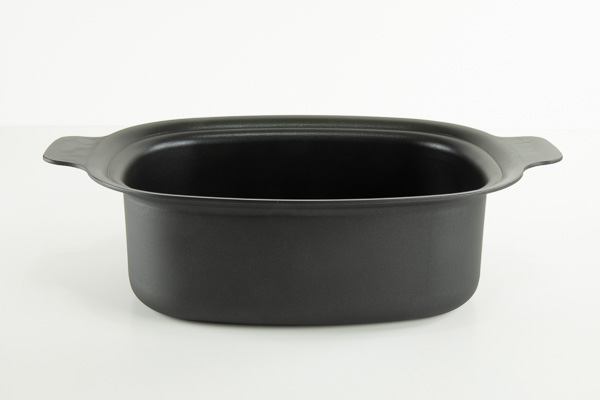
  • 6-Quart Lightweight Nonstick Cooking Pot
  • 80+ Recipe Cookbook
  • Steaming/Roasting Rack
  • Glass Lid with Handle
  • Multi-Purpose Pan


Design and features

I work from home I and often do a lot of cooking in our household, not just because my wife often works later into the day than I do, but because I enjoy cooking, and I enjoy eating! The Ninja Cooking System was a welcome addition to the various cooking appliances I have, and may very well send a couple of them to an early grave.

I was initially intrigued by the Ninja’s ability to do several things. Often multi-use kitchen items work, but they don’t do each individual task they’re designed to do very well. The Ninja does each thing very well, and I think that’s because they’re each close in function to each other.

The first thing I did after taking unboxing photos was to toss in a bison roast and fire that baby up for a nice 9-hour slow cook. I must say, it came out fabulous. I think it was one of the best roasts that I’ve cooked. My old slow cooker only had warm, low, and high settings which were often either too low or too high of a temperature. Not with the Ninja! If the settings on the slow cook mode aren’t to your liking you can simply put it into bake mode and set any temperature in the range from 250°–425°F.

I really liked the steam mode, as it had much more room than my regular steamer. The removable steamer rack is 7.25×10.5″ and provides 3.5″ of vertical room to the top edge of the pot. That’s a lot of vegetables! It’s also easier to clean than my steamer.

The steamer rack can also be used to place a small pan or loaf pan in the cooker for baking bread or other items. It did a pretty good job of cooking a small loaf of bread.

The stovetop mode is just as it sounds, it’s like cooking in a pan on the stove top. This was a welcome addition to my kitchen because I really don’t like the electric stove I currently have because it’s too hard to control the heat. The stovetop mode also lets you sear meat and then cook whatever you want without having to dirty a separate pan. When I cook my chili I like to sear my meat very well, then I would normally have to add a little water to get all the caramelized goodness into my crock pot. With the Ninja, I simply seared the meat and then added my other ingredients directly to the pot without using a frying pan.

If you’re not comfortable with the manual cooking modes, there are the Auto-iQ modes. Simply pick a meal from the included 80+ recipe cookbook, follow the easy directions and select the recipe number and press start. Some recipes are as simple as just dumping in all the ingredients, selecting the recipe number and pressing start. You can choose from over 80 pre-programmed recipes divided into four Programs: Quick Meals, Layered Bowls, Grains, and Poached Infusions.


I found that the non-stick surface on the cooking pot was fabulous, it cleaned up very easily, even after cooking BBQ ribs for 8 hours. Unlike some slow cookers, being able to remove the cooking pot for cleaning was a real time saver and it is extremely light-weight as compared to a ceramic slow cooker. My wife even commented on how easy it was to wash.

Although the product I received did not include the multi-purpose pan, the product listed on the Ninja site shows that it is included when ordering it through their store.

A PDF of the cookbook is also available on the Ninja website if you want to check out the delicious recipes in the recipe book. The recipe book also contains a chart for steam times for various vegetables and a slow cook chart for various meats.

What I like

  • Additional accessories available such as a loaf pan, mini muffin tray and multi-purpose pan.
  • Temp and Time bake mode
  • Auto-stay warm feature when cooking is done
  • Steaming/Roasting Rack
  • 6-quart capacity

What needs to be improved

I can’t really think of anything that could be improved with this cooker as it does everything so well. If I wanted to be really picky I would say that the stove top feature could heat up a little quicker, but I like how the current model works because I don’t have to worry about it getting too hot too fast.

Final thoughts

Whether it was a roast, ribs, steaks, or corn or whatever else I cooked (can’t remember everything because I’ve used it a lot) everything came out great. I really like the control of time and temperature, without the need to constantly babysit stuff as I would on a stove top or oven. I’m so impressed with this cooker that I’m going to purchase another one because you can never have enough slow cooked food!

Price: $149.99 (other models available also)
Where to buy: Ninja and Amazon
Source: The sample of this product was provided by Ninja Kitchen

The post Ninja Cooking System with Auto-iQ review appeared first on The Gadgeteer.

Filed in categories: Reviews

Tagged: ,

Ninja Cooking System with Auto-iQ review originally appeared on The Gadgeteer on July 9, 2018 at 10:00 am.

Note: If you are subscribed to this feed through FeedBurner, please switch to our native feed URL http://the-gadgeteer.com/feed/ in order to ensure continuous delivery.

Incipio DualPro Pixel 2 XL case review


REVIEW – I love my Pixel 2 XL. It’s a beautiful phone, but it is $850 and since I’m such a klutz, I must cover it up with a case that provides drop protection. I currently have a Caseology Vault case that provides military-grade drop protection, however, the case is a boring black color. I then spied the DualPro case from Incipio which also provides drop protection and thus, I was eager to check it out. After testing, I found that it is a well-made protective Pixel 2 XL case but adds a moderate amount of bulk to my beautiful phone and is also a fingerprint magnet.

What is it?

The Incipio DualPro case is a two-layer cellphone case with a scratch-resistant rigid polycarbonate outer shell and a shock absorbing flexible silicone inner lining that provides drop protection for the accident-prone like me.

Design and features

I received the merlot colored Incipio DualPro Pixel 2 XL case to test. The case also comes in black, gunmetal, iridescent red with black lining, and navy colors. I chose the merlot color because all the others were either too dark or too bright for my taste. I would have preferred a light blue.

The back of the case is a rigid polycarbonate shell that has a matte, velvety, “soft-touch” finish. It’s strangely fun and satisfying to feel this case.

The Also located on the back of the case is the INCIPIO logo. I find that this detracts from the design and overall appearance of the case.

The inside of the case is made of a flexible shock absorbing silicone material. There is no texture on the inside. In the photo above, you can see the inside of the separated layers of the DualPro case. On the left is the hard plastic outer portion and on the right is the inner flexible portion. The above photo shows the outside of the two separated layers. The inner layer is fairly flexible. The Pixel 2 XL slides easily into and fits perfectly in the DualPro case. There were no misalignment issues between the two layers after inserting the phone into the case. However, it is a bit more difficult to extract the phone from the case. I really had to wedge my fingers in between the case and phone just to pry it out.

The cutouts for the camera and the fingerprint sensors were large enough and properly located. In fact, the fingerprint sensor cutout seemed a tad too large, but I found that got used to it.
In the above photo, the cutout for the charging port illustrates that there is enough room for your USB-C charging cables. And the cutout for the microphone is perfectly placed. In addition, the power button and volume buttons are precisely positioned as well. There is enough of a lip (~2mm) surrounding the front of the phone to help prevent screen scratches when laying the phone face down on a surface. I do not own a screen protector for my phone, so I do not know how well the case works with one.

Performance

While using the case over this past month, I had no problems inserting any of the variety of USB-C charging cables I own into the phone’s charging port. I also did not have any problems taking pictures using the phone’s camera with the case on. The power and volume buttons were a little stiffer than those on my Caseology Vault case, but they were still clicky and responsive. The case also allows you to use the Active Edge feature of the phone without difficulty.

There were a few of things that I really didn’t like about the DualPro case. The dark merlot color is rather lifeless, the hard outer shell is a fingerprint magnet as shown in the photo above, and the case adds a moderate amount of bulk to the phone.

It also collects dust and lint around the edges of the case as shown above. Even so, I still prefer this case over the Caseology Vault, but only by the slimmest of margins.

My husband purchased the DualPro case for his HTC U11 phone. The silver color that he chose still collects fingerprints but seems to hide them much better. He also dropped his phone from about three feet onto concrete and it protected his phone; although, now there are scratches on the corners of the case where it bounced around. Incipio drop-tests the DualPro cases at 10 feet.

What I like

  • The case appears to be well-made
  • It provides military-grade drop protection (from 10 feet) using two layers
  • The cutouts are well sized and perfectly aligned (you are able to use different USB-C charging cables)
  • You can easily use the Active Edge features of the phone with the case on
  • The power and volume buttons are stiff but clicky and responsive

What needs to be improved

  • The merlot color is dull and lifeless
  • The case is a fingerprint magnet
  • It adds a moderate amount of bulk to the phone

Final thoughts

The Incipio DualPro Pixel 2 XL case is a decent case for those of you who want (or need) to protect your phone from impact. It provides military-grade drop protection and has precisely aligned cutouts for my phone. I can also easily use the Active Edge feature of my phone with the case on. In addition, the buttons are stiff but clicky and responsive.

However, it adds a moderate amount of bulk to my phone and the merlot color is rather dull and lifeless. Also, the case is a fingerprint magnet and collects dust around the edges which drives me crazy. Even so, this is the case that I am choosing to use at the moment because I trust it will protect my phone from me and my klutziness.

Price: $15.00 – $29.99
Where to buyAmazon and Incipio
Source: The sample of this product was provided by Incipio.

The post Incipio DualPro Pixel 2 XL case review appeared first on The Gadgeteer.

Filed in categories: Reviews

Tagged: ,

Incipio DualPro Pixel 2 XL case review originally appeared on The Gadgeteer on July 8, 2018 at 10:00 am.

Note: If you are subscribed to this feed through FeedBurner, please switch to our native feed URL http://the-gadgeteer.com/feed/ in order to ensure continuous delivery.
iFrogz Cocoon earbud charging case review

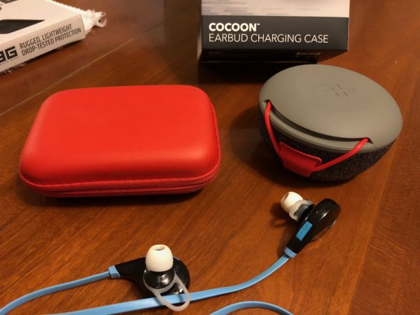
REVIEW – With the move from wired earbuds to wireless, there is one issue that we have to all deal with: How do you transport and charge these tiny wireless gadgets? Well, iFrogz is glad you asked. They have developed a rigid container that will hold most wireless earbuds on the market, as well as providing a battery to charge them during storage: the iFrogz Cocoon Earbud Charging Case. They sent me one in Grey and Red to test and report to you.

Note: Photos may be tapped or clicked for a larger image.

What is it?

As the name says, the Cocoon is a charging and storage case designed for wireless earbuds. The unit can be used to charge and store other electronics, as well as car keys, sim cards, mini tools, fitness trackers or anything else, but let’s consider it for the problem at hand first.


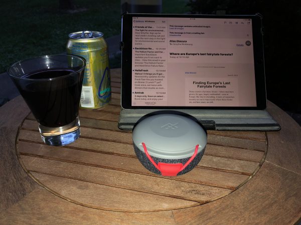
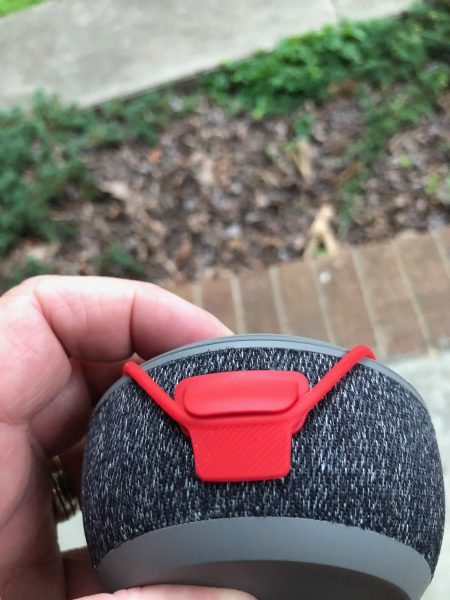
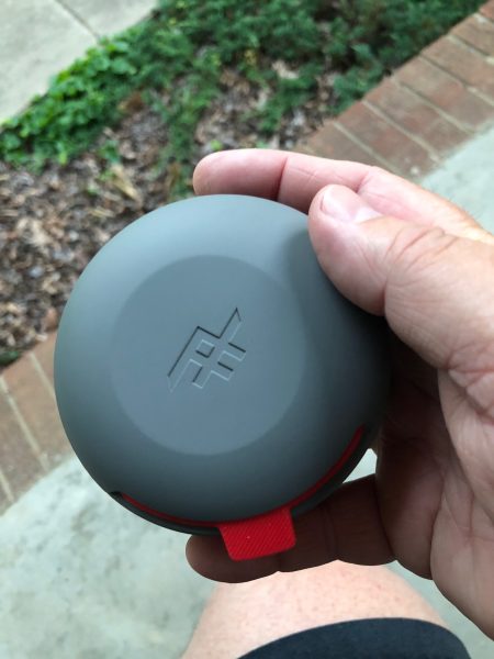
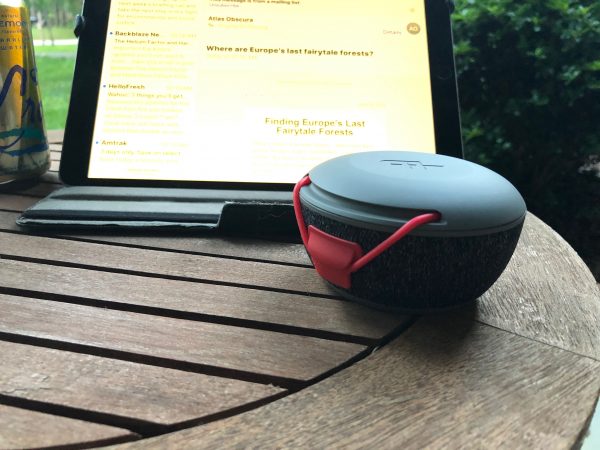
Available in Grey with Red or Blue silicone accents, the rigid, sealable box fits easily into pockets, packs, glove boxes, car consoles, or bike panniers. While no guaranteed IPx rating is stated, it seems to be reasonable to expect it to prevent dust and sand from getting in, but I’d shy away from taking it on a river cruise or to the beach. It’s a good place to store small items you want to prevent from getting lost in the bottom of a pack.

What’s in the box?

  • Cocoon
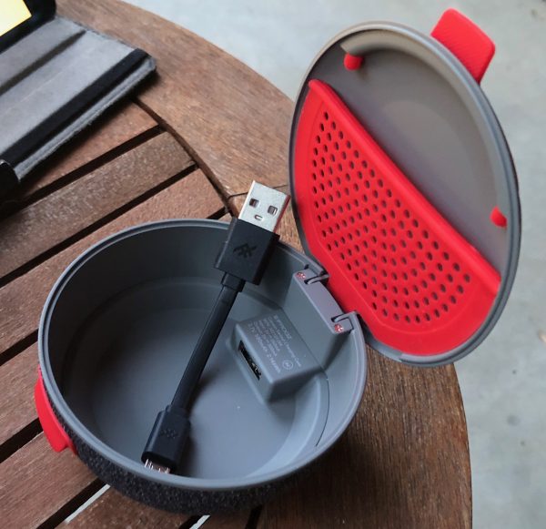
  • 4in micro USB cable.

Design and features

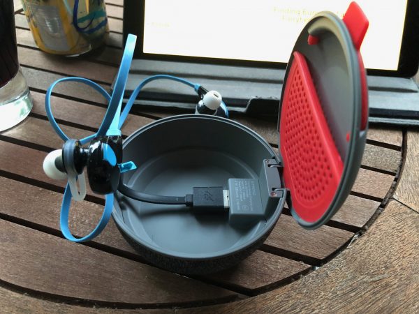
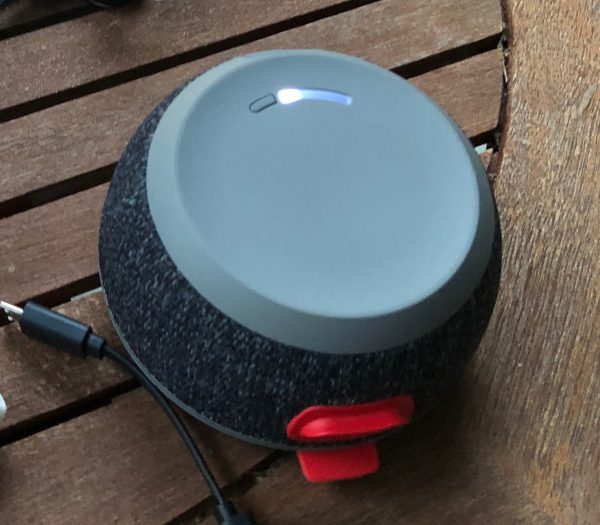
The iFrogz Cocoon is made from a rigid, yet smooth-surfaced plastic. The lid is 3.5” across, and the base is 2.375”. The entire outside is just under 2” tall. Inside, the lid curves up in a slight turtle shell and has a silicone net to hold a cable or other small item. The inside is almost 1.25” deep with a USB port under the hinge.

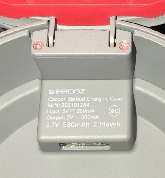
The difference between outside and inside dimension is the battery built into the base. There’s a battery gauge on the bottom with 4 LEDs to indicate how much juice is left. Given the small size of most wireless earbuds, the 580 mAh is supposed to recharge a pair 4-5 times. Your mileage will vary with the brand and charging pattern of your earbuds, I’m sure.

What I Like

  • Rigid case prevents tangling and crushing damage to earbuds.
  • Gives the user a place to store earbuds, rather than tossing them into a pocket.

What needs to be improved

  • Since it’s rigid, it takes up more room than just one or two sets of earbuds would.

Final thoughts

I have mixed feelings about this item. I like it for the charging ease, but the inside seems cramped for the amount of space the entire unit takes up. I previously had two earbuds in a semi-rigid zipper pouch, and it seemed to take up less space. but the Cocoon is much more protective and adds the charging capability. If you don’t have a current solution, I would consider this, but if you’re ok with where you store them now, I wouldn’t. Might make a good gift for someone you see always having issues storing their earbuds.

Price: $29.99
Where to buy: Amazon
Source: The sample of this product was provided by iFrogz, a division of Zagg.

The post iFrogz Cocoon earbud charging case review appeared first on The Gadgeteer.

Filed in categories: Reviews

Tagged: ,

iFrogz Cocoon earbud charging case review originally appeared on The Gadgeteer on July 7, 2018 at 10:00 am.

Note: If you are subscribed to this feed through FeedBurner, please switch to our native feed URL http://the-gadgeteer.com/feed/ in order to ensure continuous delivery.

Logitech Lightspeed Wireless Gaming Mice and PowerPlay review

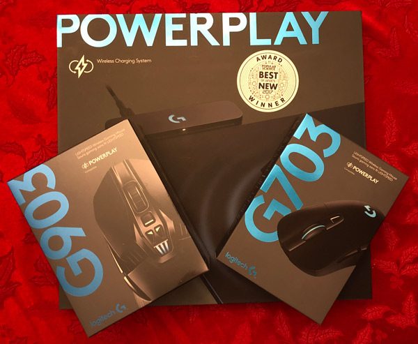
In the world of gaming, it’s not uncommon for large sums of money to be spent for the smallest increases in specs. Response time, clicks per minute, precision, all of these are thought to be immediately lost when buying a wireless mouse. Yet with the improvements made by Logitech, the G903 and G703 are able to maintain tournament level performance while also being user friendly wireless mice.

To combat the other weakness of wireless products, charging, the Logitech PowerPlay allows the user to charge their mouse as they play.

What is it?

The G903 and G703 are gaming mice that utilizes Logitech’s Lightspeed technology to support latency free wireless play. Though the G703 has many of the same capabilities, it lacks some of customizable hardware or ability to be used ambidextrously.

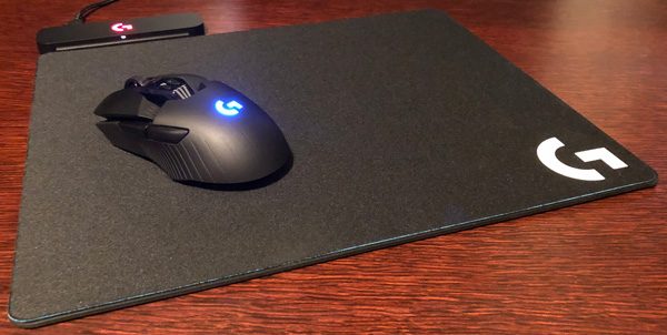
The PowerPlay is wireless charging station/mat that acts as a mousepad while the user plays. This prevents the need for stopping a play session to plug in the Logitech mice into power.

Design and features

These mice work well both on their own and with the PowerPlay pad. To get all of the features associated with the mice, you can download the LGS (Logitech Gaming Software), which allows the mice to use on board memory, change their lighting, and save power.

G903

The difference in latency between the Lightspeed technology and a corded mouse is quite literally impossible to notice. There are no moments of lag with this mouse, and the sensor is the most precise on the market and has an insane range of 200-12000 DPI. To take advantage of this, the software is programmable, able to save five different DPI settings to be switched between. In order to store these, the mouse has it’s own internal memory so that any settings saved on it will be shared with whatever computer it is connected with. These settings can be for different games, such as lower sensitivity for games that necessitate accuracy, and saved easily in the Logitech Gaming Software program.

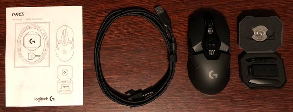
In the Box:

  • Lightspeed G903 gaming mouse
  • Plug-and-forget nano receiver
  • USB charging/data cable
  • Accessories case
  • Optional receiver extension adapter
  • Optional 10-gram weight
  • Optional side buttons (2x left, 2x right)
  • Button covers (left, right)
  • User documentation

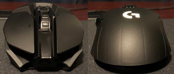
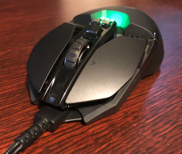
Even though it is relatively lightweight, the G903 is very well made with a solid quality feel to it. The design of the mouse is ergonomic, easy to manipulate, and comfortable to hold.

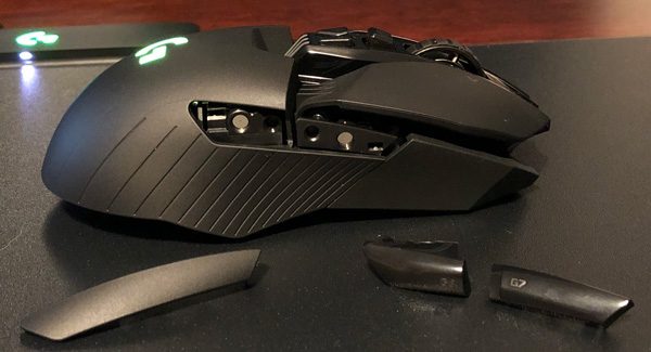
Not only is the software of the mouse adjustable, so is the hardware. The magnetic side buttons can be easily snapped onto the mouse, allowing the G903 to have up to 11 programmable buttons. They can be put on either side, meaning both left and right handed players can comfortably use the mouse.

Different configurations of buttons allow the user to input more commands on the mouse, which becomes convenient once a game uses more buttons than you can comfortably reach on the keyboard. For me, I assigned the melee and push to talk buttons on the left side of the mouse and the interact button on the scroll wheel. This enables quicker inputs as the buttons are kept closer to each of your fingers, rather than spreading out from your keyboard hand.

The 10g weight can help add a little more heft to moving the mouse, but for me the difference between the 110g mouse with or without the additional mass wasn’t that apparent when I was playing.

The mouse comes pre-charged in the box, so after plugging in the nano receiver and pairing the mouse, it’s ready to go. When it inevitably dies (more on that later), you can plug in the USB charging cord and use it as a corded mouse. The charge time with the USB is extremely short, being able to bring the mouse up to it’s full 24 hour (or 32 with no lighting) battery life quickly.

G703

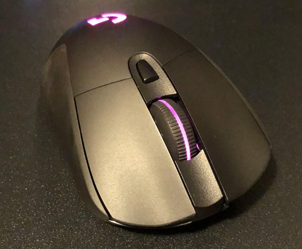
The slightly smaller and less expensive version of the G903 is just as powerful as it’s larger sibling, using the same sensor and Lightspeed technologies. The main difference between the two, is its simple right-handed frame without the magnetic customizability of the G903.

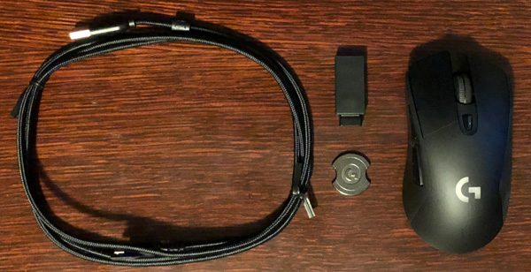
In the Box:

  • G703 gaming mouse
  • Charging/data cable
  • Wireless USB adapter
  • 10g optional weight
  • User documentation

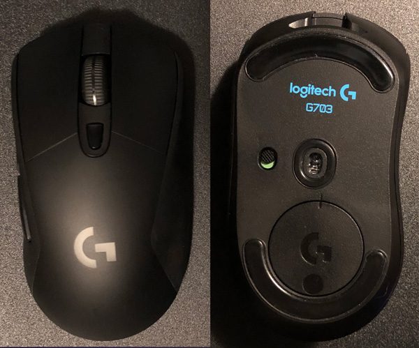
The design of the G703 works better for people who like less complicated mice, with two programmable buttons on the side and an additional one behind the mouse wheel.

Including the wheel, this brings the mouse to six programmable buttons, which can also be customized with on the Logitech Gaming Software.

In my hand, the G703 felt a little small (I have large hands), but the quality of the device made up for the minor inconvenience. Unlike the G903, the G703 also comes in white. Overall, the G703 is almost everything that the G903 is, but at a lower price point.

PowerPlay system

Even with the incredible abilities of the Logitech mice, they are still mortal wirelesses devices. Though both mice have impressive battery-life, it is Murphy’s law of devices that they will die at the worst possible time during a critical epic battle. The combination of a mousepad and charger solves this issue by providing power as you play. While this doesn’t charge the mouse in as short a time as the cord, it doesn’t matter because the pad can charge the mouse while it is in motion. So the user can play forever with the wireless trickle charging the pad provides. However, to prevent the mouse from constantly hitting 100% and hurting the battery, the pad keeps the mouse at around 85% constantly, which isn’t a problem unless you use it away from the POWERPLAY.

In the Box:

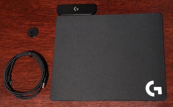
  • POWERPLAY Base
  • POWERCORE Module
  • USB charging/data cable
  • Hard Gaming Mouse Pad (G440)
  • Cloth Gaming Mouse Pad
  • User documentation

After replacing the magnetic weight on the bottom of the compatible mouse with the PowerCore Module, unplug the connection cord from the nano receiver and into the PowerPlay Base which should then light up. Once the mouse is on and paired, that’s it. Logitech has done well to make their devices work in sync without issue, with the cord included with the mice and the PowerPlay being the same as well.

One thing to note however, to connect the PowerPlay pad to another mouse, you must use the Logitech Gaming Software to unpair the current mouse and then repeat the pairing process with the new mouse. This wasn’t immediately apparent to me till I found it on the Logitech support page, but in all likelihood most users won’t have to do this unless they upgrade to a new logitech mouse.

The hard and cloth pads that the PowerPlay comes with are comfortable, providing users either a smoother surface for snap reflexes or a softer area with more friction for accuracy. While they are easy to switch out, they come with a caveat that trying to use other pads on top of the base may hinder or stop the charging process entirely.

What I like – G903

  • Well made
  • Ambidextrous
  • Easily customizable weight and configuration
  • Instantaneous movement/lagless play

What needs to be improved – G903

  • None

What I like – G703

  • Just as nicely made and fast as the G903
  • Easily customizable weight and configuration
  • Instantaneous movement/lagless play
  • Sleek frame

What needs to be improved- G703

  • A little small

What I like – PowerPlay

  • Wireless charging
  • Easy to pair
  • No need to stop for charging

What needs to be improved – PowerPlay

  • Specific mouse pads
  • Cost

Final thoughts

Both the G903 and G703 boast a lagless, truly wireless gaming experience that never needs to be recharged while retaining the performance and customization of the highest quality wired mice. The G903 is a high-end, feature rich mouse that can be personalized in both software and hardware. The G703 has the same technologies and performance for less. The PowerPlay can allow either of these mice to stay charged for as long as they function (a long time) but bears a relatively hefty cost for the convenience. In conclusion, I’d recommend the G703 the strongest, with the G903 as a close second if you need the extra utility, and reserve the PowerPlay only for true marathon gamers.

Price: G903 – $149.99 / G703 – $99.99 / PowerPlay – $99.99
Where to buy: Link to where you can buy this product from Logitech or Amazon.
Source: The sample of this product was provided by Logitech.

The post Logitech Lightspeed Wireless Gaming Mice and PowerPlay review appeared first on The Gadgeteer.

Filed in categories: Reviews

Tagged: ,

Logitech Lightspeed Wireless Gaming Mice and PowerPlay review originally appeared on The Gadgeteer on July 6, 2018 at 11:00 am.

Note: If you are subscribed to this feed through FeedBurner, please switch to our native feed URL http://the-gadgeteer.com/feed/ in order to ensure continuous delivery.