Vena 6Netic Magnetic Smartphone Bike Mount review

REVIEW – My husband and I have always been bicycle riders.  Back in the day, we used to do the MS Bike to the Beach here in Texas where we rode 150 miles over 2 days for Multiple Sclerosis.  Since then we have notbeen the true roadies we once were.  We have started to ride the numerous bike paths that they have finally built here in the San Antonio, Texas area.  In an effort to make himself use his bicycle more, my husband expressed a desire to be able to mount his IPhone to his bicycle’s handlebar so that he may use his bike as a method to easily get more Pokemon.  Yes, he is a die-hard fan of the game.  We have gone through several different mounts and not found one that is really stable and easy to use.  So when I got the chance to review the Vena Magnetic Bike Mount I jumped at it.  Let’s see how it worked out.

What is it?

The Vena 6Netic Smartphone Bike mount is a bike mount that uses two different methods to keep your phone safe and secure on your bicycle.  It uses a six magnet phone mount and a rubber strap system to securely hold your phone in place.

What’s in the box?

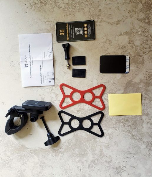
The box itself could not be any plainer.  There was no outside writing on it to even describe what was in the box.  However, everything inside was well packed and protected.   Inside the box I found:

  • The mount itself
  • A long bolt with a plastic screw head and nut that is used to attach the mount to the bike
  • Two different colored rubber strap systems (red and black)
  • Instructions on a single sheet of paper
  • A GoPro screw you can use to mount a GoPro camera to the front of the mount
  • Two rubber pads used to hold the mount on the bicycle handlebars
  • Two metal plates – one with 3m tape on one side and one plain
  • Sticker from Vena

Design and Features

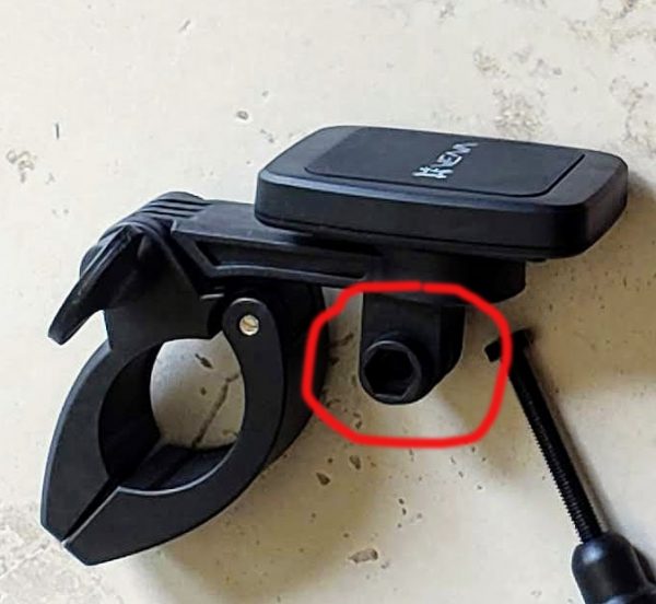
The picture below has the GoPro mount highlighted on the bicycle mount itself.  I do not own a GoPro so since I could not use it, I removed it from the mount.  This was easy to do with two small Phillips screws at the back of the mount.  The Vena website states that you can even mount some compatible headlights using this particular mount.
The next picture below shows you what my husband’s bike handlebars look like.  He has a Specialized Sirrus which we bought last year.  The handlebars are unusual in that they start off fat in the center by the stem and then go down to normal size when you get to the handlebars.  This has presented us with issues when trying out other bike mounts.  I would place the mount as close to the stem as possible and tighten down, but inevitably the mount would start slipping down the handlebar.   A lot of this had to do with the mounts tightening down using just a basic screw that I had to tighten down with a screwdriver.  Many of the mounts were awkward to mount and made tightening the mount really hard to do.   The Vena mount with its large hand screw made mounting really simple.

The next picture below shows the mount completely open where it would go around the handlebar.  I have just placed the two rubber grip strips inside the mount.  This was very easy to do and they mounted with the 3M tape that was already attached to one side of the rubber.  A lot of mounts will just give you a rubber strip you have to manually hold in place while you tighten down the mount.  Having these stuck in place made mounting very easy.
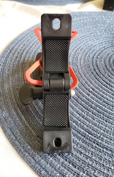
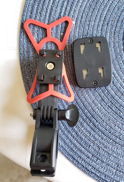
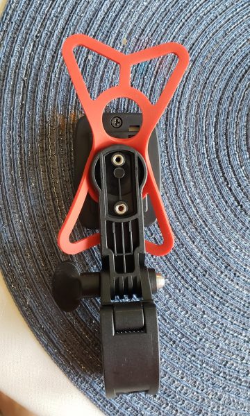
The next two pictures show how I mounted the rubber strap to the main mount.  The picture on the left is showing the back side of the mount.  This is the side that would be facing out towards the street in front of you.  You can see the two screw holes where I removed the GoPro mount.   The picture on the right is the side of the mount that would be facing the rider.  I simply slid the magnet holder up and it popped off the mount.  You are looking at the back side of the magnet on the right of the mount.  I then slid the rubber strap over the magnet mount then clipped the magnet back in place.   There were two identical circles in the rubber strap so I just picked on and left the larger part of the strap system sticking out of the top of the mount.  The instructions were not very helpful in showing how to mount this rubber strap.
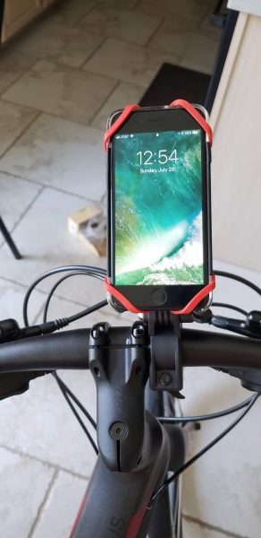
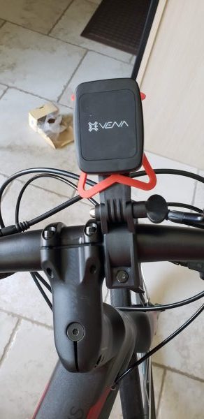
In the picture below you can now see the mount on the bicycle.  The knob on the right lets you adjust the angle in which the phone is viewed.
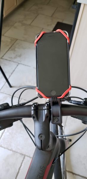
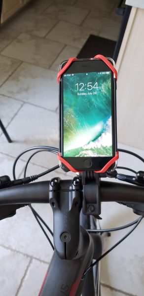
The next two pictures show you how the mount looks with my husband’s iPhone 7s installed.  Something to note, I wonder if you had an iPhone X with no bezels if the rubber straps would interfere with phone usage?  I took one of the metal plates and placed it inside the phone case between the phone and the case.  I could not even tell it was there once mounted.  I then place the phone on the mount where it was held in place by the magnet.  Finally, I pulled the rubber straps out and around each corner of the phone.  Let’s just say that phone is going nowhere.   I literally picked the bike up and bounced it several times on the tires in an effort to dislodge the phone and it never budged.    Time, of course, will tell if the mount itself will slip on the handlebars, but at least my husband will be able to hand tighten it out on the trail.
What I like

I love how easy it was to mount this smartphone holder on to the bicycle.  Just being able to have a nice sturdy plastic screw head to be able to hand tighten down the mount without any tools was awesome.  I also loved how they gave you the capability to easily change the angle at which you view the phone.  Finally not having to manually hold a rubber strip in place while trying to tighten down the mount was also a big plus.  So far the mount has held steady over a couple of rides with no issues.

What can be improved

The only concern I would have is what I mentioned before about the rubber straps going over a screen instead of just bezels like on the iPhone 7.  I wonder if the touch screen would think the straps are fingers touching the screen.  Maybe someone who has used a similar mount can comment on this.  They also could improve their instructions so they could show exactly how the rubber strap should go on the mount.

Price: $16.99
Where to buy: Amazon
Source: The sample for this review was provided by Vena.

Filed in categories: Reviews

Tagged:

Vena 6Netic Magnetic Smartphone Bike Mount review originally appeared on The Gadgeteer on August 10, 2018 at 10:59 am.

Note: If you are subscribed to this feed through FeedBurner, please switch to our native feed URL http://the-gadgeteer.com/feed/ in order to ensure continuous delivery.

Pandorra Willgoo Carrying Case and Power Bank for Apple Pencil

REVIEW – Tired of hauling your Apple Pencil accessories around in a zip bag so that you don’t lose them? Me too. The Pandorra Willgoo carrying case solves that problem for you and acts as an alternative charging source for your Pencil to boot. Let’s have a look!

What is it?

It’s a travel case for your Apple Pencil and all it’s accessories that also serves as a charging station.

Hardware specs

  • Length: 7.95 inches
  • Width: 1.73 inches
  • Height: 1 inches
  • Weight: 5.2 oz
  • Battery Capacity: 1700mAh
  • Input: 4.2V
  • Output: 0.3V-4.2V

What’s in the box?

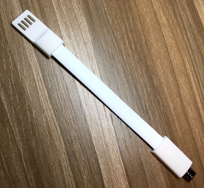
The Pandorra Wilgoo Carrying Case comes with the case and a USB cable to charge the unit. You’ll need to bring your own USB Lightning cable to charge your pencil.

Design and features

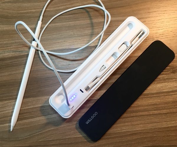
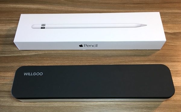
The Willgoo is a sharp looking case, made from solid hard plastics with a magnetic lid. The case itself is *just* a bit smaller than the Apple Pencil box itself (see pic below for reference). At roughly 8” by 1.75” by 1” it’s not super-compact, but it does slide easily into open spaces or slightly larger pockets in your bag.

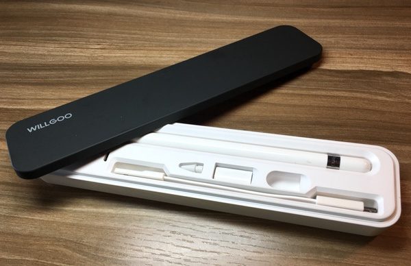
The hard plastic case does a good job of protecting your Pencil from knocks and bumps. The magnetic lid is secure enough that it won’t come loose in the jumble that is your bag. It’s also got a soft-touch padded on the underside to protect the components.

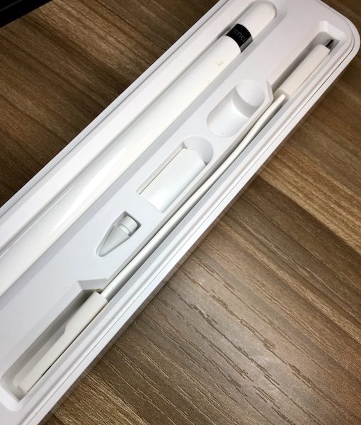
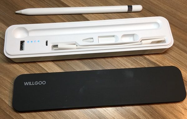
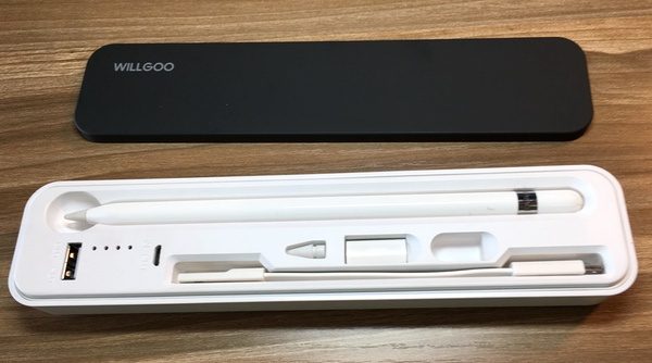
Pop off the lit and you’ll find a set of slots for your Pencil, the charging adaptor, an extra nib & the Pencil cap when charging. The included USB-to-microUSB charging cable also has its own place. Everything has a happy resting place.

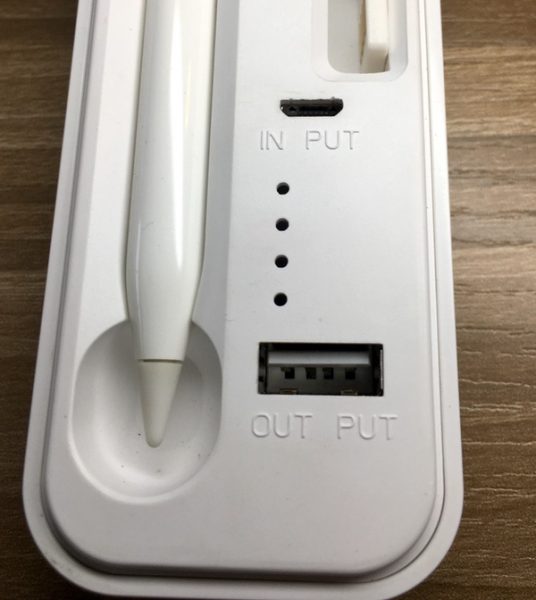
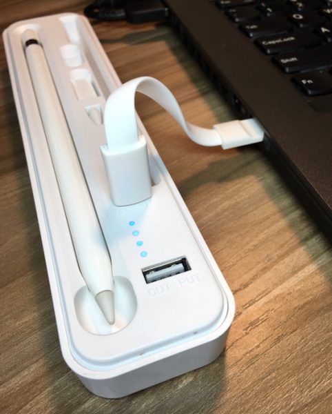
You’ll also find two ports on the Willgoo: one for charging the unit (marked “input”), and one for charging your Apple Pencil (marked “output”).

To charge the unit, you’ll plug the included cable into the “input” micro-USB slot, and then into a USB port. Blue indicator lights let you know your charge level.

To charge your pencil, plug a lightning cable into the USB port on the unit. The same blue indicator lights are activated to let you know how much capacity the battery has left. Note that the cap sits nicely in its slot and hasn’t run off to get into mischief…

The case has a battery capacity of 1700 mAh, which will give you plenty of charges for the Pencil (86 mAh capacity). You could use it to give you a partial charge for other devices, but it won’t get you too far.

Performance

The Pandorra Willgoo Carrying Case and Power Bank for Apple Pencil solves a couple of storage problems. It’s a great solution to keep around the office. I like the peace of mind it brings… I was always worried about losing the cap or that little charging adaptor. Mine is parked on the desk in my family room, keeping the whole kit in one space when I need it.

As far as travel and commuting go… well, it depends on your intended use.

For the day tripper, the Apple Pencil already has great battery life and portability. For that reason, most Apple Pencil cases are simply sleeves that you can attach to your iPad or a pocket. While this case does give you a spot for all your components, it is a bigger solution that will take up space in your bag. It seems like the unit is excessively beefy for what it holds and does, so carry minimalists may not be a fan of the solution.

If you’re traveling and foresee a need to charge your iPad on the go, you’re all set here. It will happily find an open space in your backpack, carry-on or messenger bag (or larger briefcase) and give you quick access to all the parts. While the charging capability isn’t an absolute necessity, it gives you a nice option if you need it. I’d like to see a design that’s a bit more compact, but the pros outweigh the cons in my mind.

I should also note that the components do sit loosely in those little slots. If you turn the case upside down with the cover off, they will spill out. It’s something to consider if you’re on the run.

What I like

  • A well-organized solution for your Apple Pencil & accessories
  • Nice protection in your bag or briefcase
  • Magnetized lid
  • Charging feature is a bonus, but not completely necessary

What needs to be improved

  • Could be more streamlined; probably too chunky for those with minimalist bags like thin briefcases or portfolios
  • Components will spill out of the case is flipped over with the lid off

Final thoughts

The Pendorra Willgoo Carrying Case and Power Bank is a nice solution for managing the Apple Pencil and its components. There are a few things I’d change in the design, but it’s a solid overall performer that has found a place in my daily kit. I’m happy to send the zip bag I was using for those little parts to the recycling bin.

Price: $25.99
Where to buy: Pendorra web site and Amazon
Source: The sample of this product was provided by Pendorra.

Filed in categories: Reviews

Tagged: , ,

Pandorra Willgoo Carrying Case and Power Bank for Apple Pencil originally appeared on The Gadgeteer on August 10, 2018 at 9:00 am.

Note: If you are subscribed to this feed through FeedBurner, please switch to our native feed URL http://the-gadgeteer.com/feed/ in order to ensure continuous delivery.
Fender Player Series Jaguar guitar review


REVIEW – Fender’s new Player Series Jaguar guitar is begging to be picked up and played.

What is it?

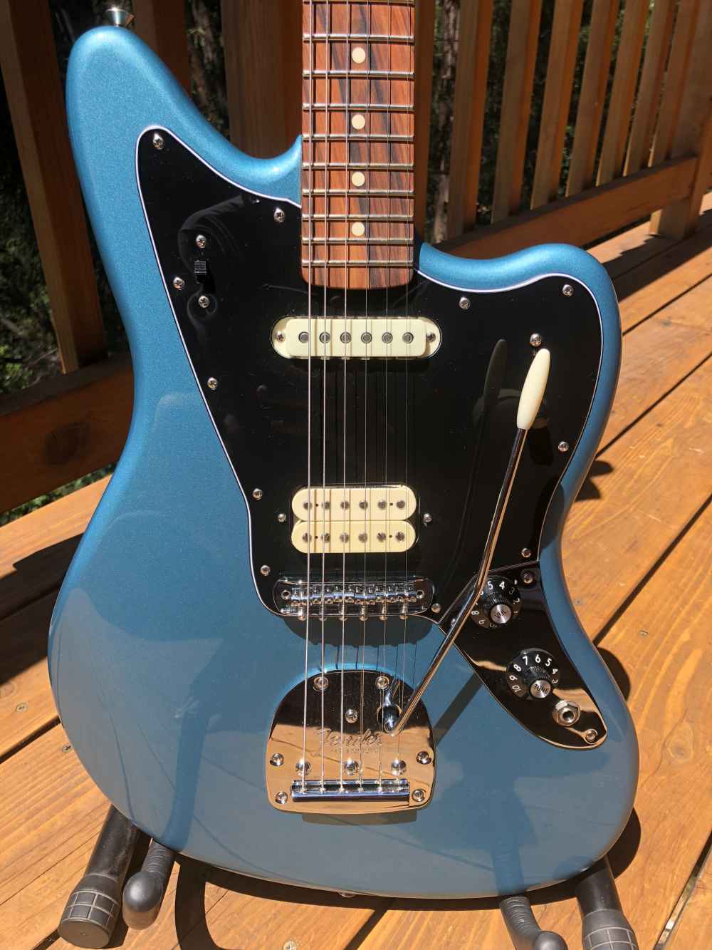
The Jaguar body style is a classic offset-body design that moves some of the mass towards the tail resulting in a very comfortable playing position. Clearly a descendent of the legendary Jazzmaster, the Jaguar has as impressive artist roster including Bob Dylan, Joe Pass, Johnny Marr, John Frusciante, Kurt Cobain and Thurston Moore. The new Player Series takes the heritage of the Fender brand, the authentic Fender sound, and adds accessibility and playability for this generation. In our house, there’s a bit of a role reversal as I’m into punk/metal/alternative and he regularly schools me in music that was clearly influenced or was created by musicians of my dad’s era. Funnily enough, the last guitar I purchased for myself (’95?) was a Fender Jag-Stang, a hybrid of Jaguar and Mustang bodies, so I was excited to see what’s new in a 2018 Jaguar.

Hardware specs

Body – Material / Shape / Finish / Color:
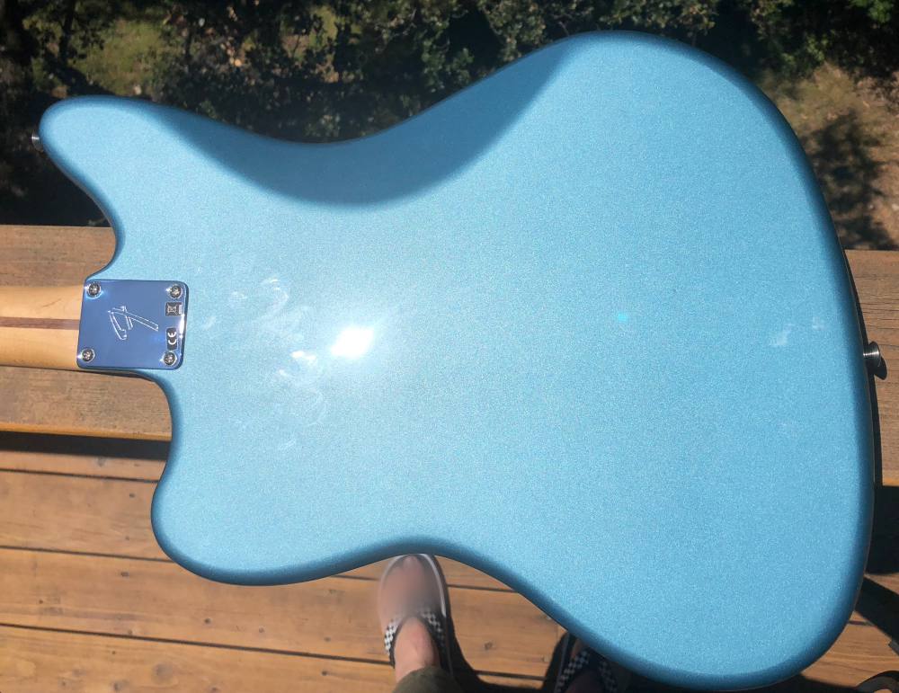
Alder / Jaguar® / Gloss polyester / Tidepool
Neck – Material / Shape / Finish:
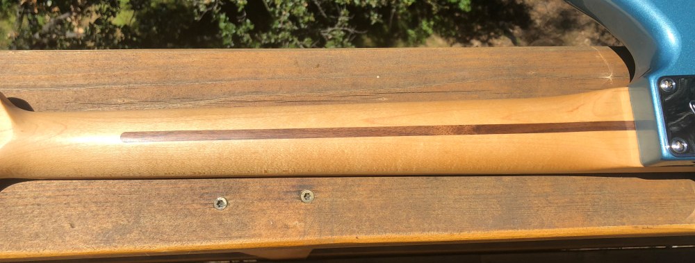
Maple / Modern C / Satin urethane on back of neck
Fingerboard – Material / Scale / Fret count / Radius:
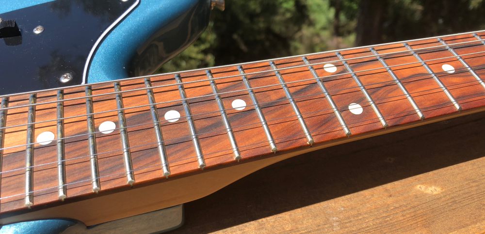
Pau Ferro / 24″ / 22 / 9.5″
Nut – Material / Width
Synthetic bone / 1.65″
Position inlays
White dots
Electronics
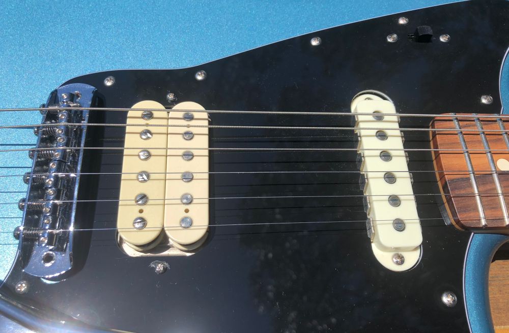
Bridge pickup – Player Series Alnico 3 Jaguar Humbucking
Neck pickup – Player Series Alnico 2 Jaguar Single-Coil
Controls – Master Volume, Master Tone
Pickup Switching – 3-Position blade: 1) Bridge pickup, 2) Bridge and neck pickups, 3) Neck pickup
Coil Switch – Slide switch to coil split humbucker
Hardware
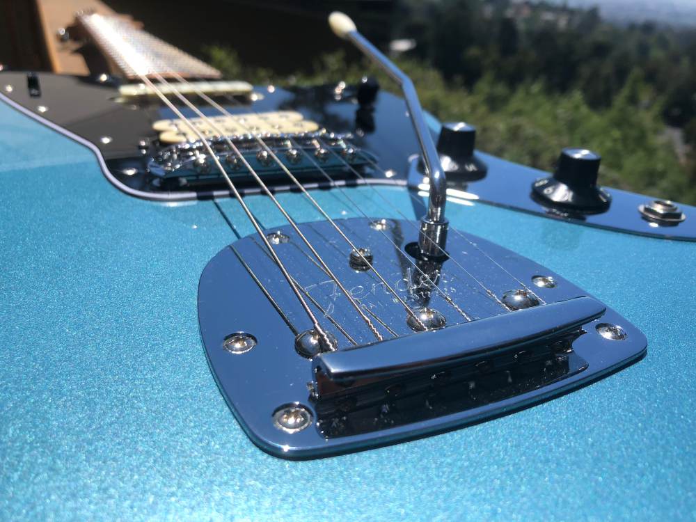
Bridge – 6-Saddle vintage-style adjustable with “floating” tremolo tailpiece
Tuning machines – Standard cast/sealed
Neck plate – 4-Bolt “F” stamped
Control knobs – Skirted amp knobs
Pickguard – 3-Ply black/white/black
Switch tip – Barrel style
Strings
Fender® USA, NPS, (.009-.042 Gauges)

What’s in the box?

  • Fender Player Jaguar Guitar
  • Tremolo arm
  • Allen keys
  • Assorted hangtags and a sticker

A quick public service announcement. Most guitars in the sub-$1000 range ship in a box well padded, but without a case. If you’re purchasing a guitar online without playing it first, make sure you carefully inspect the guitar upon receipt and notify the shipper right away if there’s any damage… And then get a good case or gig bag to keep it safe!

Design and features

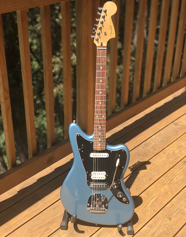
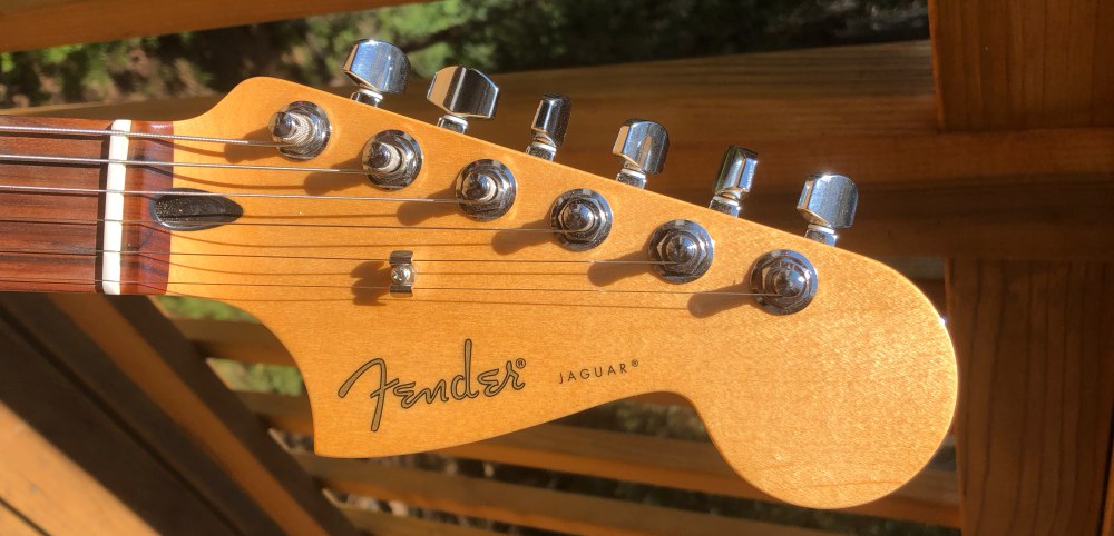
It would be hard to write a review about a Fender Jaguar and not to mention the body shape, so I’m going to start there. A lot of guitar bodies are symmetrical or have a lone cutaway below the neck for easier high fret access. The offset body style of the Jaguar accomplishes the same thing in regards to the high frets, but visually shifts some of the body mass as well.

The back of the neck is a modern “C” shape which is very hand friendly. The fingerboard has 9.5″ radius which is flatter than their 7.25″ radius which is a more vintage shape down to about a 1/3 of the guitars they make. The shape and radius they’ve chosen make this guitar very playable. The classic oversized headstock balances the body perfectly.

Another very visual aspect of the Jaguar is the floating tremolo which allows you to modulate all six strings at once for some very cool effects. The tremolo arm pushes into place and stays where you leave it; a great improvement over the older style that required screwing the arm into place or using an Allen key to lock it down.

The humbucking bridge and single coil neck pickup give you a wide variety of tone to play with and the 3-position slider makes it really easy to switch between them or run them both. There’s also a slide switch up high above the neck pickup. This effectively lets you split the bridge humbucker if you want to get more of a single coil sound out of it.

Setup

The Jaguar effectively comes ready to use out of the box. A quick look-over confirmed everything was adjusted well with action set neutrally without any fret buzz. All that was left was to remove the plastic film from the pickguard, a bit of string stretching and a final tune. Ready to roll.

Performance

There’s a bit of a role reversal as I’m into punk/metal/alternative and he regularly schools me in music that was clearly influenced or was created by musicians of my dad’s era. Funnily enough, the last guitar I purchased for myself (’95?) was a Fender Jag-Stang, a hybrid of Jaguar and Mustang bodies, so I was excited to see what a 2018 Jaguar would be.

My son has been playing jazz guitar for a good number of years now. His guitars have all been arch-tops and semi-hollow designs which lend themselves well to his music. He’d been eyeing a Telecaster recently and when the opportunity came up to review a Fender and to select between a Stratocaster, Telecaster and a Jaguar, I was a little surprised that it was the Jaguar he was drawn to. A buddy he plays in a band with gave him a bit of grief when he found out he passed up a Tele “Ugh, I hate that guitar. It’s so hipster”. On seeing the Jaguar in person a week or so later; “I completely change my mind, that is sick!”

Let’s jump into some videos so you can listen to how the Jaguar plays. The audio on these is recorded through the Roland Go-Mixer directly to an iPhone 8 with no effects. This first video is of some quick scales and arpeggios.

Here’s the tonal difference between the neck pickup, neck/bridge combined and the bridge pickup positions using the 3-position switch and ‘Black Dog’ by Led Zeppelin.

Having a little fun with ‘Back & Forth’ by Foo Fighters

And now for something a bit funkier

Here’s the tremolo in action and some of the sustain abilities of the Jaguar

What I like

  • Playability – Stays in tune even with tremolo
  • Comfort – Neck and fingerboard shape is friendly
  • Build quality – Solid feel, nothing feels wimpy or fragile
  • Color and finish – The tidepool is beautiful

What needs to be improved

  • Rear strap mount angle – If you push the body of the guitar left too far it can work itself right out of your strap.

Final thoughts

Guitars are personal. From body shape to neck feel to color to materials and sound, there’s someone out there for everyone. Fender’s Jaguar was instantly comfortable to play for both my son and myself. It’s not a light guitar, but with the right strap, long stretches of playing time should not be an issue. The tremolo is easy to use and just as easy to avoid if it’s not your thing. Overall this is a great guitar from a heritage brand, at a great price. If the way it looks piques your interest, please go play one and see for yourself.

Price: $675
Where to buy: Fender
Source: The sample of this product was provided by Fender

Filed in categories: Reviews

Tagged:

Fender Player Series Jaguar guitar review originally appeared on The Gadgeteer on August 9, 2018 at 11:00 am.

Note: If you are subscribed to this feed through FeedBurner, please switch to our native feed URL http://the-gadgeteer.com/feed/ in order to ensure continuous delivery.
Abode DIY Home Security System review

REVIEW – The Abode DIY Home Security System is an Internet-enabled, simple system of sensors, alarms, and cameras to help secure your home. It’s very easy to set up and maintain and there are a number of affordable add-on modules and services. At $229.99 for the basic system and no monthly contract needed, it’s a terrific bargain for those looking to add some security to their home or apartment.

What is it?

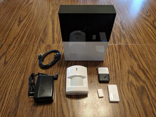
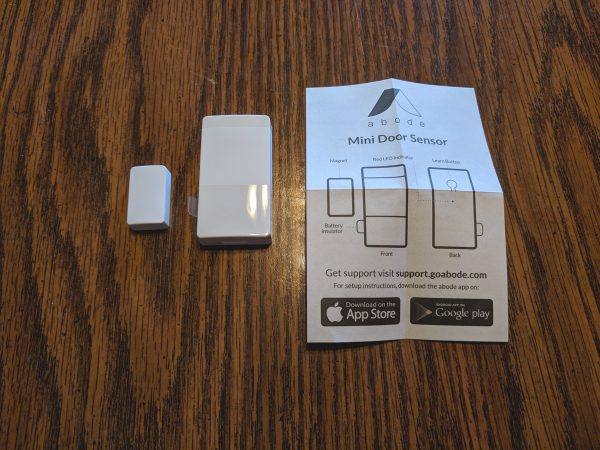
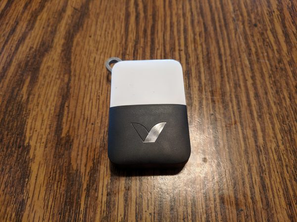
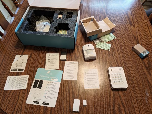
The Abode Home Security System is a modular alarm system that connects to your modem or router and, with the help of a mobile app, helps keep tabs on the security of your home. The Basic Abode System comes with a Remote KeyFob, a Mini Door/Window Sensor, and a Motion Sensor. You can add as many cameras, sensors, and alarms as you like because of the modular design and easy setup process.

For such an affordable system, the Abode offers some high-end options such as battery backup, cellular connected monitoring, and online cloud storage.

There are three no-contract options for professional monitoring plans; free, $10 monthly, and $30 monthly. There’s even an option for on-demand monitoring for vacations or times when you’re away from home and want to have some extra peace of mind. The monthly plans are able to be paid annually for significant savings.

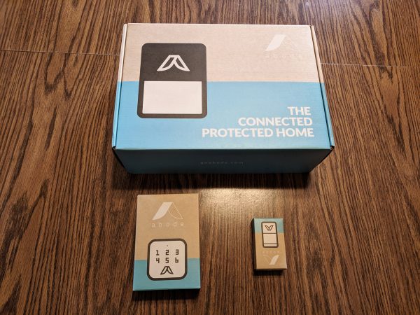
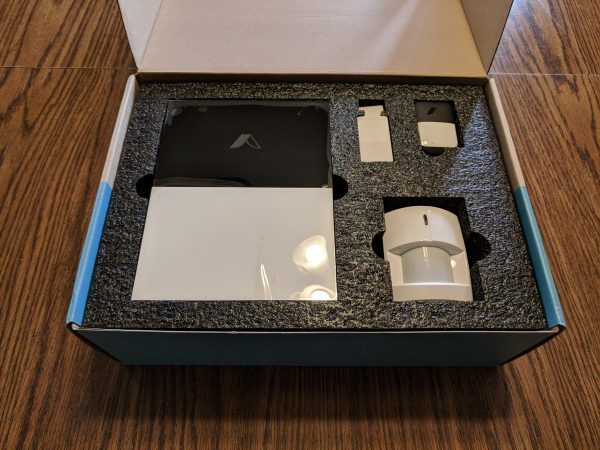
What’s in the box?

  • 1 Abode Gateway
  • 1 Mini Door/Window Sensor
  • 1 Remote KeyFob
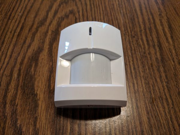
  • 1 Motion Sensor

Setup

The Abode Gateway is the brains, and mouth, of the whole Abode Security System. It runs the entire system and contains a 93db built-in siren to alert you of activity on your network.

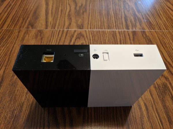
On the back of the Gateway, there is an Ethernet port, a USB port, a battery backup switch, a SIM card slot, and a power connection. The battery switch enables the internal Gateway battery backup which can power the unit in case of a power outage. The SIM card allows for an emergency cellular connection for the paid monitoring plans.

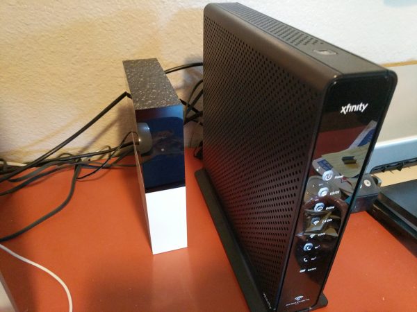
Once you connect the Gateway via ethernet cable to your modem or router and give it access to your network, it can interface with the Abode app and website. The Gateway itself doesn’t use your Wifi network, it communicates with the Abode devices via encrypted long-range 433MHz, ZigBee or Z-Wave wireless protocols.

Abode makes a number of useful modules such as glass break/vibration sensors, temperature and light sensors, smoke alarm monitors, and water leak sensors. The modules are all powered by small long-life batteries.

The Abode system can interface with a number of third-party cameras and smart home systems such as Alexa, Google Home, and Nest. Abode is also compatible with an impressive number of Z-Wave and ZigBee devices such as garage door openers, fire alarms, and smoke detectors. Utilizing IFTTT can expand Abode’s versatility even more.

Once the Gateway is wired to your network, the rest of the setup happens via the Abode app. The Abode app walks you through the whole setup process and then allows you to add in individual modules as well. The app is available for Android and Apple iOS.

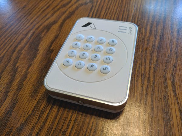
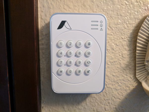
In addition to the Mini Door Sensor, Remote KeyFob, and Motion Sensor included with the Basic Kit, I added a second Mini Door Sensor and a Wireless Keypad.

All of the sensors I installed had options to mount them with screws or double-sided tape. I opted for installing the modules with the double-sided tape because I wasn’t sure what locations would work best and I wanted the ability to change the module locations.

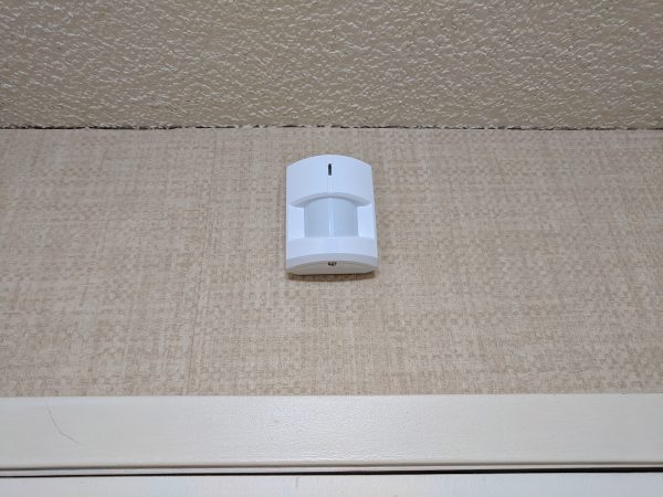
The included Motion Sensor utilizes passive infrared detection and can detect motion in most rooms up to 39 feet in a 110° field of view. It can be mounted flat on a wall or in a corner.

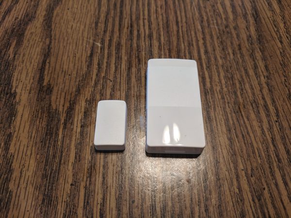
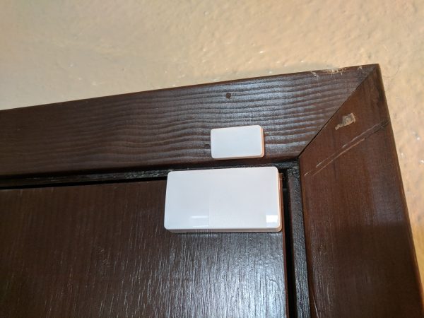
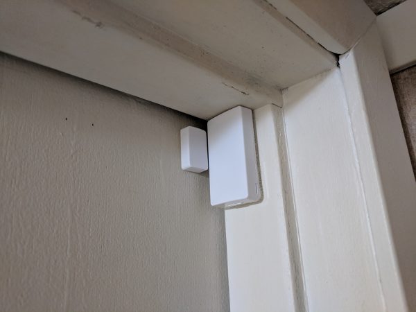
The Mini Door Sensors are able to be used on windows as well. Both sides of the sensor contain a magnet and when the magnetic field is broken because of too much distance, the sensor triggers the Gateway.

The Remote KeyFob looks just like a car alarm fob and acts much the same. There are buttons on the fob for arming, disarming, and setting the system to Home mode. There’s also a fourth button earmarked for future development such as a panic button.

Mounting the modules was very easy once I found the optimum spots for them. The Keypad was easiest, I placed it by the main entrance to the house. The Keypad and web app allow you to assign different PIN codes for different members of your household. This helps keep track of who did what at what time. Of course, this only works if nobody knows the PIN of anyone else.

With the Keypad, KeyFob, and Abode app, you’re able to set your system to Away, Home, or Standby. Away arms all sensors, indoor and out, and is used when you’re leaving your property. Home arms all external sensors and is used when you’re home and still want to be secure. Standby disables all security sensors; sensors like fire alarms and water detectors still stay active in this mode.

There’s also a great option for adding a Duress PIN code if you’re using one of the paid monitoring options. Entering the Duress PIN on the keypad will automatically alert the monitoring center. This is useful in a situation where someone is forcing you to disarm the system via the Keypad.

The Mini Door Sensors were a little more difficult to mount only because of the different types of door frames in our older house.

After some trial and error, I was able to find configurations that worked perfectly to trigger the sensors when the doors opened and closed.

Having the option to mount the motion sensor flat in the center of a wall or tucked into a high corner is great and adds flexibility to where you can place the useful sensor.

Performance

From the second the Abode System was set up it has run flawlessly. The instructions are easy to understand for old and young alike and everyone in our family has quickly taken to making sure the system is set to Away when we leave, Standby during the day, and Home at night.

Using the Abode website I was able to configure all sorts of alerts and notifications to keep me informed about the activity on the system. If you opt for one of the paid tier monitoring plans, the customization goes even deeper.

Given the success of our testing, we’re already planning on adding a number of other useful Abode modules to our system.

What I like

  • Super easy setup
  • Very reliable
  • Easy for all family members to understand
  • No required monitoring contracts
  • Modular design
  • A large number of compatible smart home products
  • Great customer support
  • Not reliant on WiFi

What needs to be improved

  • It would be great if the Basic System came with a few Door/Window Sensors
  • The website can be a little difficult to navigate if you’re just looking for basic explanations of how the system works

Final thoughts

I love the Abode DIY Home Security System and I’ve recommended it to a number of friends and family members. The price is right, the functionality is outstanding, and the performance is flawless. But, the best part about this system is that it can be as simple or advanced as you like because it’s completely modular.

Price: $229.00
Where to buy: Abode and Amazon.
Source: The sample of this product was provided by Abode.

Filed in categories: Reviews

Tagged:

Abode DIY Home Security System review originally appeared on The Gadgeteer on August 9, 2018 at 9:00 am.

Note: If you are subscribed to this feed through FeedBurner, please switch to our native feed URL http://the-gadgeteer.com/feed/ in order to ensure continuous delivery.
VIZIO M-Series (M65-F0) 4K HDR Smart TV review

REVIEW – I’m not ashamed to admit that I’m a couch potato and next to my smartphone and MacBook, my wall-mounted TV is my most used “gadget”. Jeanne and I enjoy keeping up with our favorite TV shows and every weekend it’s our habit to make popcorn and watch several movies. Since we spend a lot of time in front of a TV, we both appreciate picture quality and special features that make TV time as enjoyable as possible. Today I want to share my review of the VIZIO M65-F0 4K HDR Smart TV which was provided by VIZIO for free in exchange for posting this review. Let’s get started.

What is it?

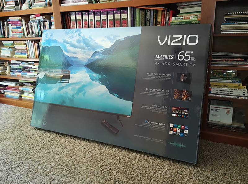
The VIZIO M65-F0 4K HDR Smart TV is a 65 inch TV that has smart features like a built-in Chromecast and various streaming apps like Netflix, Hulu, and more.

What’s in the box

VIZIO M65-F0 4K HDR Smart TV
Set of feet for table mounting the TV
Power cable
Remote control

Hardware specs

Class Size: 65″
Screen Size (Diag.): 64.50″ / 1638.30 mm
Panel Type: VA
Smart Platform: VIZIO SmartCast™ with Chromecast built-in
High Dynamic Range: Dolby Vision, HDR10, HLG
Resolution: Ultra HD – 3840 x 2160
UHD Upscale Engine: Spacial Scaling Engine™
Display Processor: V8 Octa-Core Processor
Backlight Type: Full Array LED
Local Dimming Zones: 40
Clear Action™: 360
Effective Refresh Rate: 120Hz
Active Pixel Tuning™: Yes
Dynamic Contrast Ratio: 20M:1
Aspect Ratio: 16:9
Viewable Angle (H/V): 178° /178°
Number of Colors: 1.07Billion
Built-in Wi-Fi: 802.11ac Dual Band
UHD Codec Support: VP9 and HEVC (H.265)
HDMI Ports: 4 (1 side / 3 bottom)
Component: 1 (side/shared with Composite)
Ethernet: 1 (bottom)
USB Ports: 1 (side)
TV Tuner: Yes
ARC: Yes
Speakers/Power Output: 15W x 2
Analog Audio Out: 1 (bottom)
Digital Audio Out (SPDIF): 1 (bottom)

Design and features

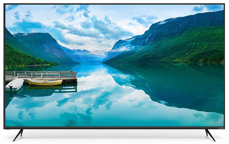
When it comes to the way the VIZIO M65-F0 looks, it is pretty much perfect in my opinion because it’s all screen. No gaudy chrome accents or huge bezels, just a big gorgeous display with thin bezels that you barely notice and a tiny status LED in the lower left corner.

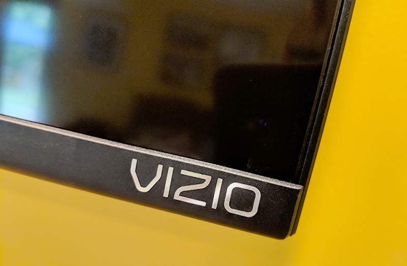
I said that the VIZIO has thin bezels and I meant it. The sides and top bezels are only about a 1/8 of an inch wide and the bottom bezel with the VIZIO logo in the bottom right corner is only about half an inch wide. This TV has the thinnest bezels I’ve ever seen. They are almost non-existent.

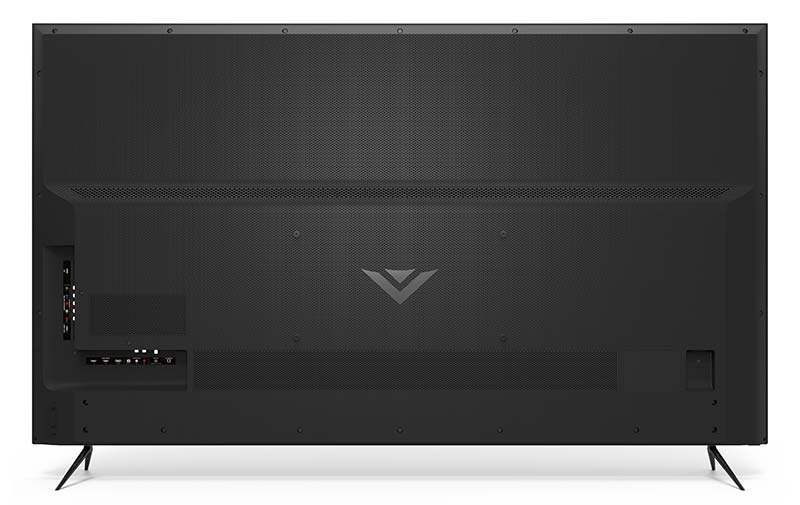
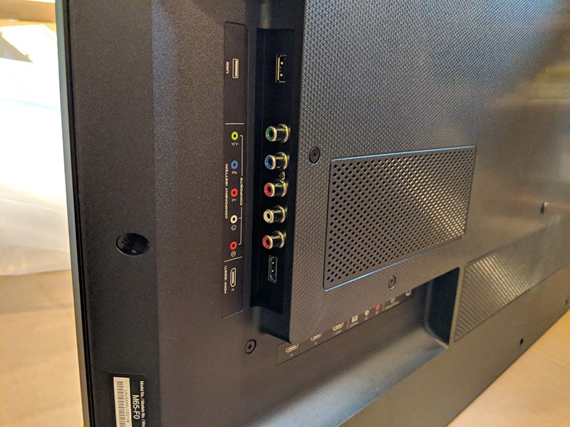
The back of the Vizio M65-F0 TV has a black plastic panel with the AV inputs arranged in a recessed L shaped layout on the left bottom edge and a physical power button and volume buttons on the same side.

The side of the input panel has a USB port, component connections, and an HDMI port.

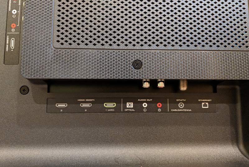
The bottom part of the input panel has 3 more HDMI ports (one with ARC), an optical audio out, audio out Left & Right, and an Ethernet port. But don’t worry, the set also has built-in WiFi so there’s no need to hardwire it into your network. The VIZIO M65-F0 also has a coax connector for an antenna and it has a built-in tuner. So you can cut the cord, hook up an OTA antenna and enjoy free content.

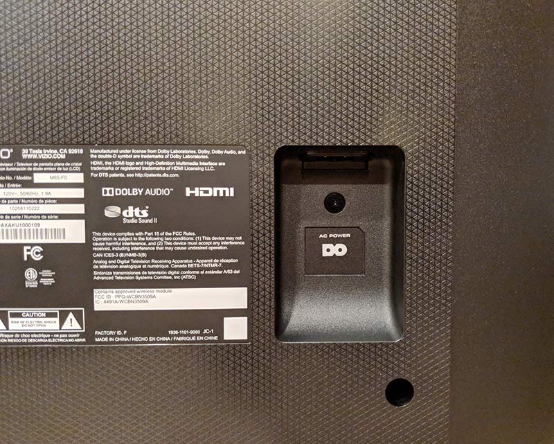
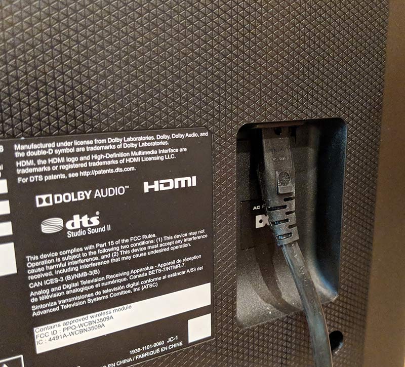
On the right side of the TV is the power port.

The port is recessed which is helpful if you plan to mount your TV on a wall like I do.

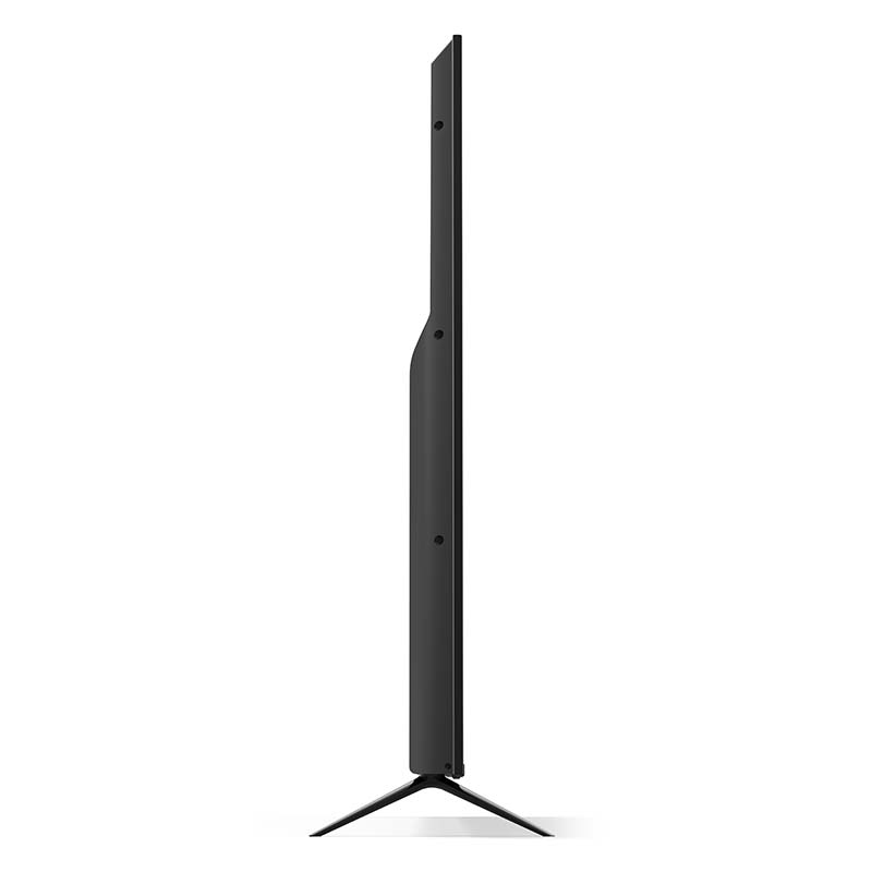
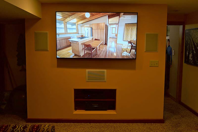
The VIZIO comes with a set of legs/feet if you want to use it on a table, but I don’t have a separate cabinet or entertainment system. I mount my TVs on the wall to get that home theater look and feel.

Installation

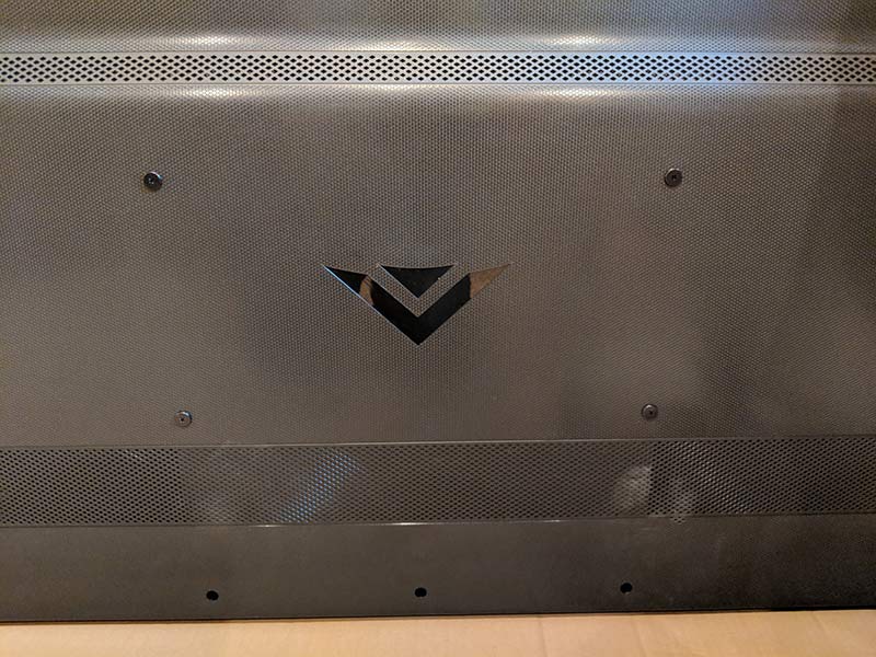
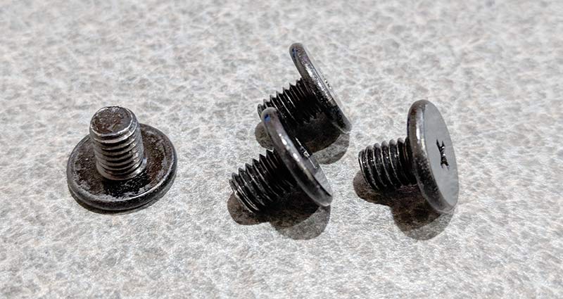
I was pretty excited when I first saw the back of the VIZIO with the VESA mount screws. Yes, I know that this it’s not unusual for TVs to have a VESA mount on the back. But upon first glance, I thought the screws in the back of the TV were the mounting screws.

I started to give kudos to VIZIO because I thought that they were nice enough to include screws for wall mounting. That’s until I removed them and realized they were just useless short place holder screws. Bummer! I was lucky that the screws in my previous TV were the same size/length needed for the Vizio but why can’t TV makers include the screws? I doubt that it would add more than a $1 to the price.

Here we see the M65-F0 mounted on the wall and ready for movie night!

Setting up the VIZIO M65-F0

It took only a few minutes to set up the VIZIO once it was mounted on my wall and connected to my Onkyo TX-SR608 AV receiver via an HDMI cable connected to the HDMI/ARC port on the back of the Vizio and a DirecTV receiver connected to the Onkyo.

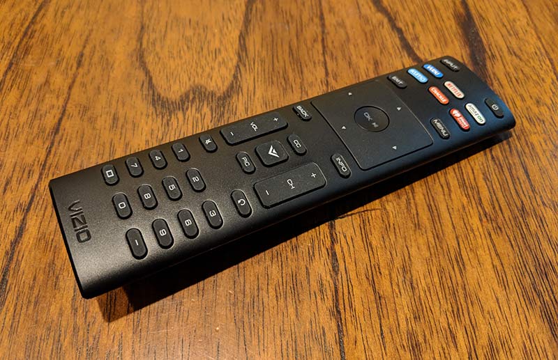
The included remote has a good layout and includes dedicated buttons to launch the SmartCast menu and for the built-in SmartCast apps for VUDU, Netflix, Amazon, XUMO, Crackle, and iHeart Radio.

One cool thing about the VIZIO is that you can control it using your voice control from Google Assistant and Amazon Alexa-enabled devices. I don’t currently have an Amazon Echo or a Google Home to test it but according to what I’ve read you can use your voice to power the set on or off, adjust volume, and other basic commands. I can see this as a useful feature if you are a true couch potato and are eating in front of the TV and don’t want to use your greasy fingers to change the volume using the remote when you can just use your voice.

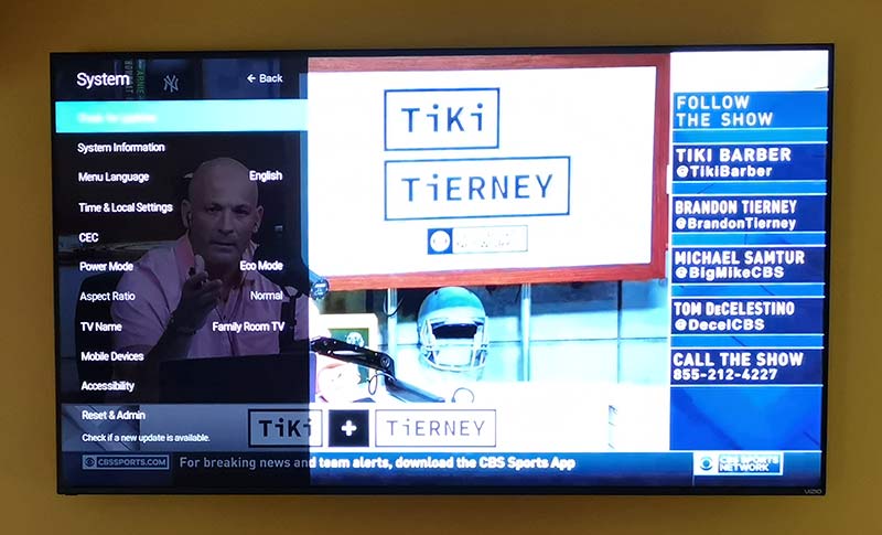
During setup, you’re prompted connect the TV to your wireless network so it can install any needed firmware updates. From there you can explore the menus that will let you customize the settings which you will definitely want to do because the default picture color settings out of the box didn’t impress me.

The M65-F0 has 6 picture modes to choose from: Standard, Calibrated, Calibrated Dark, Vivid, Game, and Computer. All of the modes except for Vivid looked washed and blah to me while the Vivid mode made people’s faces look too red or orange. I was a little worried by this during the beginning stages of my testing, but after some tweaks to the color settings, I got everything dialed in and looking great to my eyes. The TV has 6 custom memories to use for your own adjustments and you can save them with your own custom name like “Julie’s Daytime Settings; etc…”.

Blacks and whites on this set are deeper with more levels and the whites are brighter than my previous TVs which is a good thing but sometimes the whites are almost too bright which is where the Calibrated Dark mode is useful. Especially if you like to watch TV in the dark.

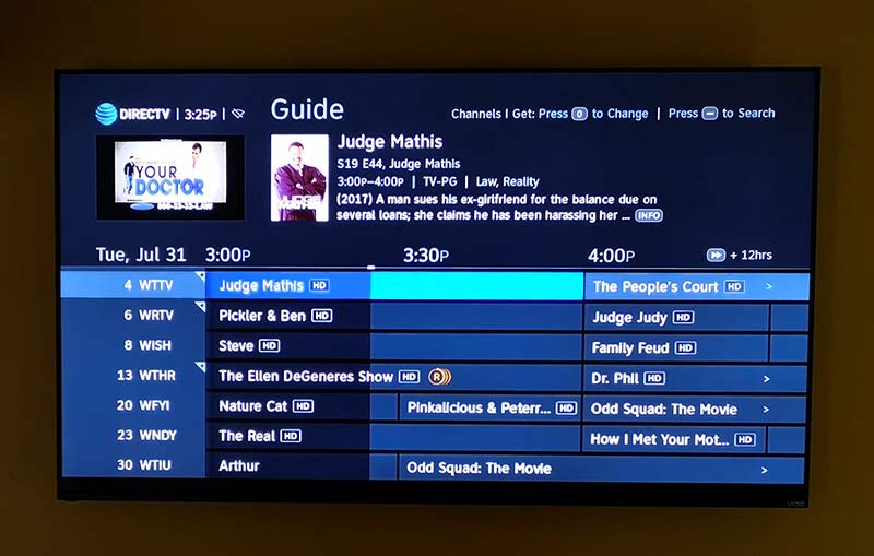
I do most of my TV watching through DirecTV, which isn’t exactly a great source of UHD programming to highlight the strengths of this set.

That said, DirecTV HD content looks sharp and the colors are vibrant. The M65-F0 has pretty good viewing angles too. You’re going to want to be directly in front of the screen for optimal sharpness and color, but off angle isn’t too bad.

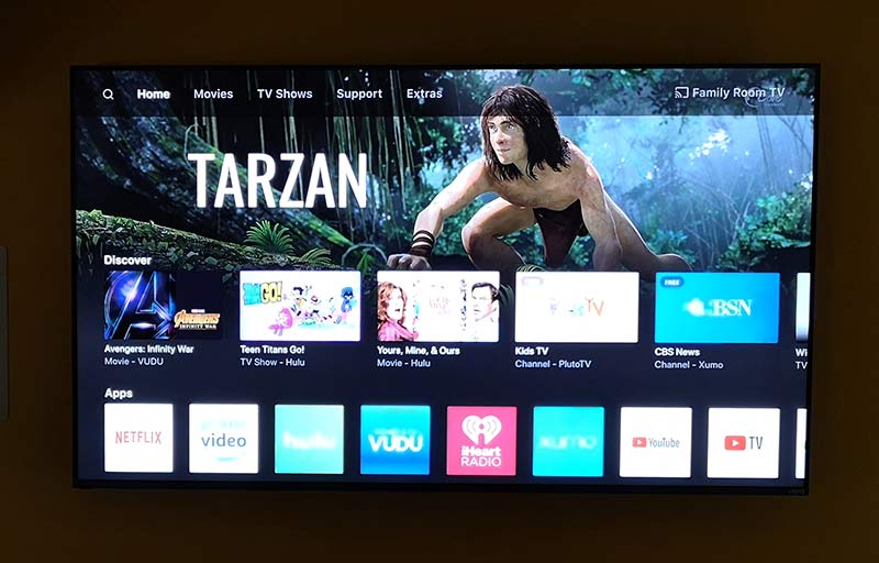
If you’re a cord cutter, you’ll love the VIZIO M65-F0’s SmartCast features. You might remember that I reviewed the Vizio M50-D1 back in 2016. That set came with a 6-inch Android tablet that could be used as the TV remote and a SmartCast app device. This 2018 VIZIO set doesn’t come with a tablet, but you don’t need one because it has the apps right on the TV or you can use your smartphone with the SmartCast app.

The SmartCast apps on the TV allow you to connect to your Hulu, Netflix, Amazon, VUDU, YouTube, and other streaming services including VIZIO’s own WatchFree free content app that makes cord cutting a breeze. But the built-in apps don’t include some big names like HBO, DirecTV Now, ESPN, etc and from what I can tell, there’s no way to add them at this time. But, firmware updates might change that at some point. But it’s not a big deal since you can use the SmartCast app on your phone or tablet with any Chromecast-enabled app like HBO Go, DirecTV Now, and many more.

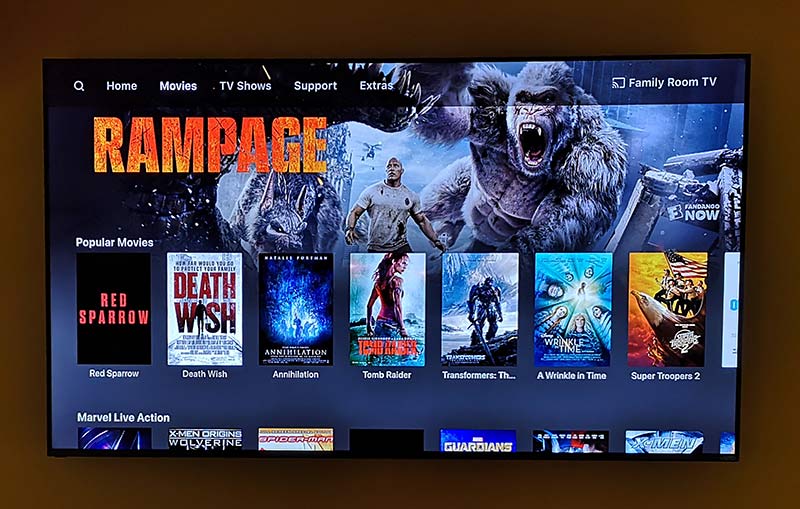
VIZIO’s SmartCast app is cool because it offers a bunch of apps all in one place, provides content recommendations and will let you search across apps so that you don’t have to search from them individually. But you can still go to other apps like Netflix, or HBO Go, or Vudu directly to find content.

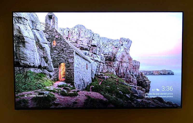
One of my favorite features of this VIZIO TV is the built-in Chromecast which allows me to unplug the 2nd generation Chromecast that has been hanging off my AV receiver for the past year.

I love Chromecast and do a lot of content casting mainly from the Netflix app from my Pixel 2 XL. Using the VIZIO’s built-in Chromecast works exactly like the regular Chromecast I was using, so there was no learning curve. It just works. Actually, it works BETTER than the Chromecast that I was using before because the VIZIO’s built-in Chromecast is like a Chromecast Ultra which can stream UHD with HDR content from apps that support it.

During my testing of this TV, I’ve used it to watch content from DirecTV, BluRay DVDs, Netflix, Hulu, and VUDU through the built-in SmartCast apps and from my phone. The UHD content looks fantastic to my eyes even though my Onkyo AV receiver is around 8 years old and doesn’t support 4K or UHD. It does have a passthrough feature which is what I used.

I do plan to upgrade my AV receiver in the next couple of weeks and will update this review if I notice any big changes to the picture quality. I am looking forward to updating the receiver because the VIZIO was unable to use HDMI CEC feature to automatically power on/off the AV receiver and switch inputs as needed for audio. So until I update, I’m back to using 2 remotes. One for the TV/DirecTV and one for the AV receiver. This is a little annoying but it’s obviously not a deal breaker because this TV is a nice improvement over the one I was using.

What I like

  • Gorgeous picture
  • Almost no bezels
  • Built-in Chromcast
  • Built-in tuner
  • Voice controllable via Alexia or Google assistant

What needs to be improved

  • Screws included in the VESA mounts are useless
  • HDMI CEC wouldn’t work with my Onkyo AV receiver

Final thoughts

If you’re shopping for a new 4K UHD TV, the VIZIO M-Series (M65-F0) 4K HDR Smart TV will not disappoint with its rich blacks, bright whites, vibrant color, and sharp picture. It’s enjoyable to watch all my favorite shows and movies on this set and it’s earned a well-deserved place on my wall.

Price: $999.99
Where to buy: Best Buy, Amazon
Source: The sample for this review was provided by VIZIO.

Filed in categories: Reviews

Tagged: ,

VIZIO M-Series (M65-F0) 4K HDR Smart TV review originally appeared on The Gadgeteer on August 8, 2018 at 9:00 am.

Note: If you are subscribed to this feed through FeedBurner, please switch to our native feed URL http://the-gadgeteer.com/feed/ in order to ensure continuous delivery.