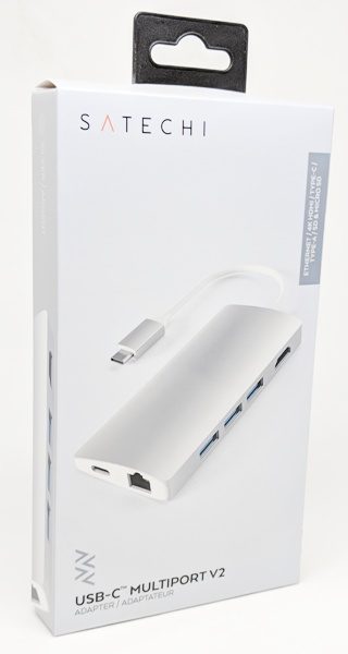
Satechi Type-C Multi-port Adapter 4K with Ethernet V2 review

REVIEW – As newer laptops become thinner and more portable, they have fewer and fewer ports available. As a result, users have to purchase USB hubs to provide the missing necessary ports. My Lenovo Yoga 730 only has two USB Type-C ports (Thunderbolt 3), one USB 3.0 Type-A port, and a 3.5 mm audio input/output jack which means that I really need more ports. I had decided that I wanted a USB hub that has at least two USB Type-A ports, an Ethernet port, microSD and SD card slots, an HDMI port, and a USB Type-C port. Thankfully Satechi makes an adapter that has all that I was looking for.

I was sent the Satechi Type-C Multi-port Adapter 4K with Ethernet V2 to review. It has three USB 3.0 Type-A ports, a 4K HDMI port, an Ethernet port, SD and microSD card slots, and a USB Type-C port which provides pass-through charging and will output up to 49W. I found that all the ports worked well but that the three USB Type-A ports were a little too close together to accommodate three different shaped USB flash drives simultaneously. In addition, it’s expensive.

What is it?

The Satechi Type-C Multi-port Adapter 4K with Ethernet V2 is a device that when plugged into your laptop’s USB Type-C port, provides you with three USB 3.0 Type-A ports, a 4K HDMI port, an Ethernet port, a USB Type-C port, and an SD and microSD card slots.

What’s in the box?

The only thing in the box was the adapter with its built-in USB Type-C cable. There was no information provided.

Design and features
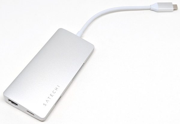
I received the silver Satechi Type-C Multi-port Adapter 4K with Ethernet V2. The outer portion of the adapter is made of a matte aluminum. The adapter also has a built-in 6″ USB Type-C cable (measurement includes connector). The Satechi brand name is also displayed on the top of the device.

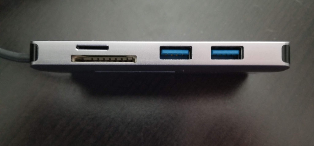
One side of the adapter has a tiny LED status light that glows blue to indicate when the adapter is plugged in. The microSD and SD card slots are also located on this side.

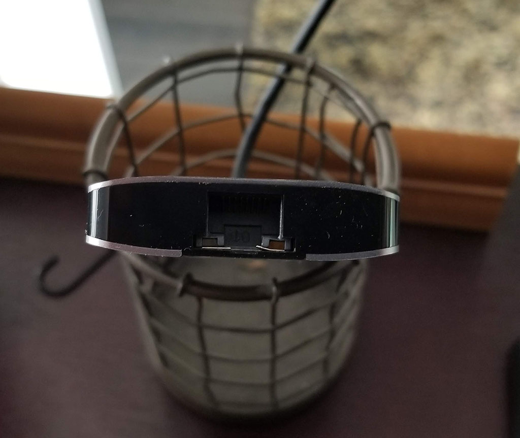
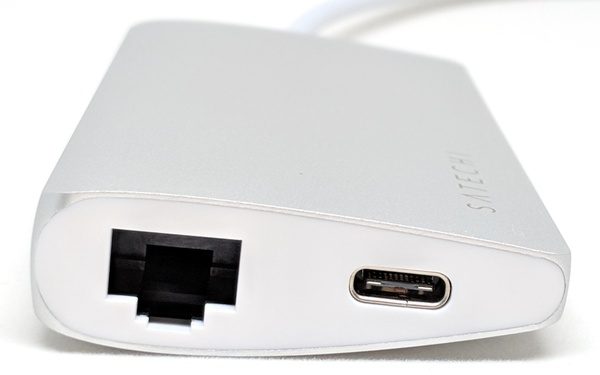
As the above photo shows, the Satechi adapter tapers from one long edge to another, thus making it a little more portable. The end of the adapter shown above has an Ethernet port and USB Type-C port, thus, the adapter replaces the USB Type-C port that it uses when plugged into your laptop. The adapter’s USB Type-C port will allow you to charge your devices (up to 49W) or allow you to charge your laptop.

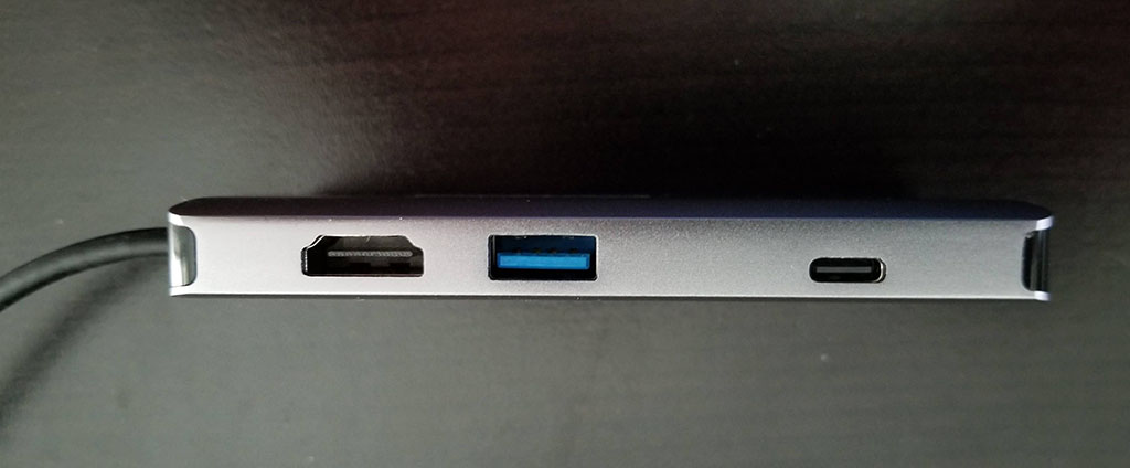
The other side of the adapter has a 4K HDMI port and three USB 3.0 Type-A ports.

The length of the entire adapter is a little over 10″ long when including the built-in cable.

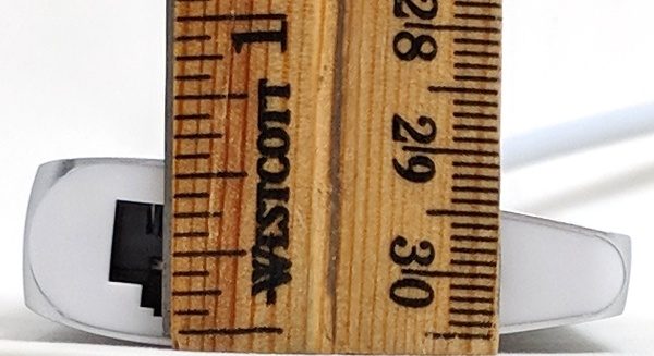
And it is only a little over 0.5″ thick and is thus very portable.

Use

I plugged the Satechi adapter into my Lenovo Yoga 730 laptop and was able to successfully use all of the ports simultaneously.

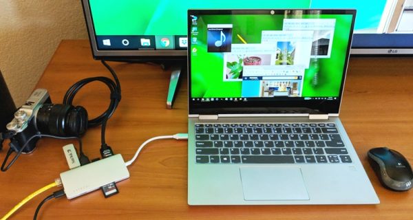
As shown in the photo above, I have plugged in the following (starting at the top right of the adapter and continuing counterclockwise): my TV using an HDMI cable, a USB mouse dongle, my camera using a micro-USB cable, a USB flash drive, an Ethernet cable, my laptop’s USB Type-C power cable, a microSD card, and an SD card. Notice how the SD card sticks out a great deal. When inserting this storage device, you only need to slide it into the adapter until it stops to seat it properly.

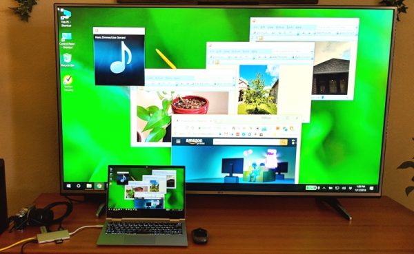
Each of the windows displayed on my laptop’s screen (and my TV) shows the photo stored on my camera, the music playing on my USB flash drive, the photos stored on my microSD and SD cards and the web page I pulled up using the Ethernet connection.

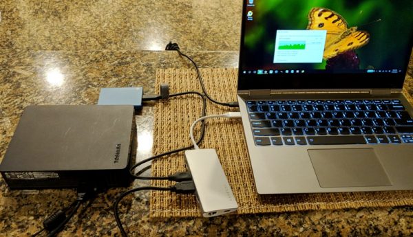
Using this adapter, I was also able to do things like easily transfer data from our larger external hard drive to our smaller portable hard drive as shown above. I had no problems doing this, nor did I have any problems transferring data between any of my portable storage devices or from my laptop to any of the storage devices using the USB Type-A ports and microSD and SD card slots. I also didn’t have any difficulties charging devices (or my laptop) using the USB ports, connecting to external monitors using the HDMI port, or using the Ethernet connection.

There was one thing that I noticed while using the adapter. Actively using some or all of the ports causes it to run a little warm. Satechi states that the operating temperature of the device is 86-122 degrees Fahrenheit, so apparently, this is normal.

My only complaints about the adapter are that it is expensive ($79.99), the USB 3.0 Type-A ports are too close together to accommodate anything other than physically small squared-off USB flash drives or cables, and in order to properly insert the microSD card, I needed to use my fingernail to push it far enough into the slot to get it to click into place. When inserted, the card sits flush with the adapter. And last, in the process of inserting or extracting the microSD card, sometimes the card would unexpectedly shoot out of the adapter if my fingernail slipped off of the card. *PEW* Whoa, look out! Where’d it go?!? This tiny projectile proved to be difficult to find a couple of times!

What I like

  • My laptop now has lots of ports available (3 USB 3.0 Type-A ports, a 4K HDMI port, an Ethernet port, a USB Type-C port, microSD and SD card slots) to accommodate my needs

What needs to be improved

  • Satechi should increase the spacing between the USB 3.0 Type-A ports
  • Inserting the microSD card is a bit of a challenge unless you have long enough fingernails
  • It’s expensive!

Final thoughts

I really love having the Satechi Type-C Multi-port Adapter 4K with Ethernet V2. It drastically increases the number of ports on my laptop and allows me to transfer and access data on my USB flash drives and microSD and SD cards. It also allows me to connect my laptop to a monitor or TV, my camera, or accessories that require a USB dongle.

The adapter’s drawbacks are that the USB 3.0 Type-A ports are too close together to accommodate physically large non-square USB flash drives, inserting the microSD card requires you to use a fingernail, and the adapter is quite expensive.

Price: $79.99 – $89.99
Where to buySatechi and Amazon
Source: The sample used in this review was provided by Satechi.

Filed in categories: Reviews

Tagged: , ,

Satechi Type-C Multi-port Adapter 4K with Ethernet V2 review originally appeared on The Gadgeteer on August 25, 2018 at 9:00 am.

Note: If you are subscribed to this feed through FeedBurner, please switch to our native feed URL http://the-gadgeteer.com/feed/ in order to ensure continuous delivery.

eMeet OfficeCore M2 conference speakerphone review

REVIEW – Conference calls may be problematic if the local telephone system ineffectively captures voices or is not loud enough for everyone to hear the remote party. The eMeet OfficeCore M2 is a portable Bluetooth adapter for a mobile or telephony app that ensures great conference calls can be conducted anywhere. Read on to see what I think!

What is it?

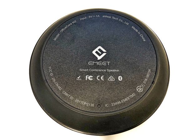
The eMeet OfficeCore M2 is the second generation of a portable Bluetooth speakerphone adapter made by Chinese manufacturer eMeet. The previous version of this device, the OfficeCore M1, has received many celebrated reviews. This new version is very similar to the previous one. They are both small round battery powered units that feature speakers and microphones and are connected by Bluetooth, USB, or 1/8-inch jack cables. The M2 version has optimized VoiceIA signal processing (a custom eMeet solution), Bluetooth 4.2, enhanced Bluetooth range, and a touch sensitive interface. A specialized version of the M2 unit permits the user to record a conversation. In addition, a separately sold cable enables the user to daisy chain multiple M2 units together to increase range. The OfficeCore M2 weighs about half of the M1 but as a tradeoff, it cannot be used as a power bank like the M1 can.

What’s in the box?

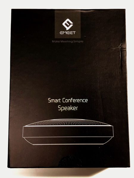
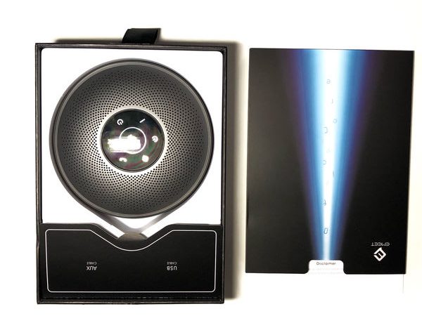
The Box is a black, stiff cardboard design that has a nylon pull tab on one end. The pull tab opens the inside of the box in a sliding fashion to reveal the OfficeCore M2, a compartment for cables and adapter (the BT adapter only ships with the M2+ SKUs), and a sleeve that contains the manual.

  • OfficeCore M2
  • 1/8-inch jack cable
  • USB 2.0 Type-A to Micro-B Cable
  • User Manual

Design and features

Specifications

Size: 125 x 125 x 35 mm
Weight: 290 gr
Loudspeaker: 3W x 1 / 84dB
Touch Buttons: Yes
Bluetooth Distance: 20 meters
Bluetooth Version: V4.2, BLE
Connection Type: Bluetooth or USB cable, AUX cable
Output: 3.5mm audio output to connect loudspeaker or earphone
Sound Pickup Angle: 360° omnidirectional
Sound Pickup Radius: 8-10 meters
Microphone Array: 4 Microphone Array with AI algorithm
Algorithm: VoiceIA™ algorithm, AI algorithm, AI adaptive noise suppression
Voice Localization: AI Positioning

eMeet OfficeCore M2 Design

The M2 is available in black, grey, or silver/white design. The grey and black design both have a black base. The silver/white design has a white base but uses the same black rubber port cover as the black and grey model. This results in a black rubber bar across the back which looks out of place. The speaker grill on each unit is black, grey or white.

The look and feel of the unit are well suited to the modern office environment. It is sleek and modern, but not flashy so as to distract from the conference at hand.

The unit is a squat cylinder that has a saucer-like base and a domed top. The circumference of the base is a rubber ring with three small feet on it to isolate it from sounds coming from the table it is resting on.

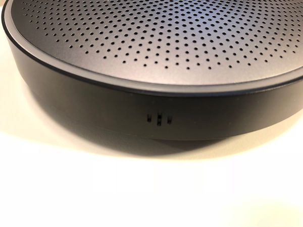
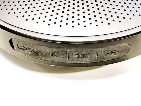
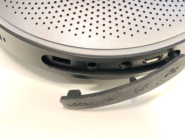
The side of the unit is a smooth anodized aluminum finish. Four speakers grills are evenly spaced around the perimeter. A rubber-covered port area is placed at the topside of the unit, between the microphone grills.

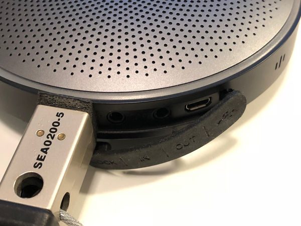
The ports include a Kensington lock slot, audio in, audio out, and a micro USB port. The labeling of the audio ports is a little confusing. The “audio in” port accepts a 4-pole 3-ring cable that supplies audio in and audio out to a PC or mobile. The “audio out” accepts a 3-pole 2-ring cable for transmitting the captured audio to a loudspeaker (although a 4-pole 3-ring cable would also work). The OfficeCore M2 comes with a three foot 4-pole 3-ring cable.

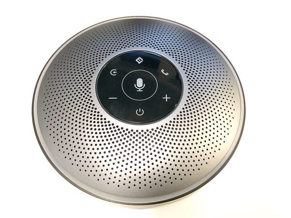
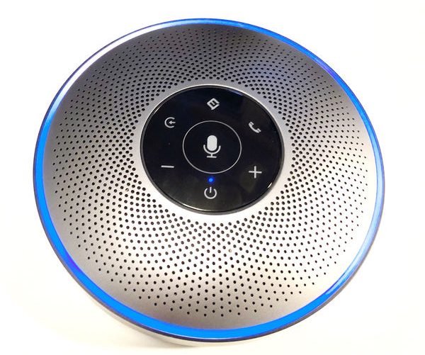
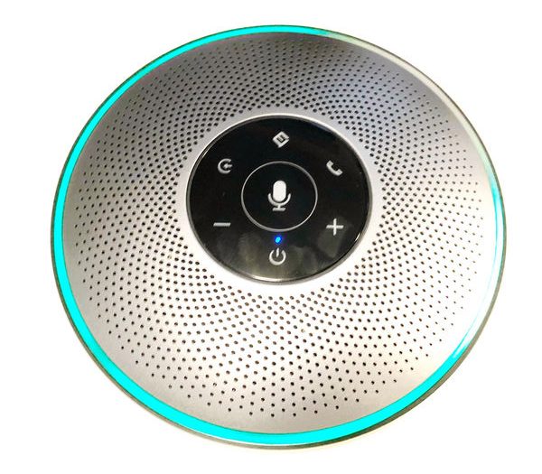
The top is a domed speaker grill. Between the sides of the unit and the top is a circular array of LEDs. The LEDs are hidden behind the grey plastic ring that blends seamlessly into the top. The LEDs are divided into 10 zones and shine in white, blue, green and red.

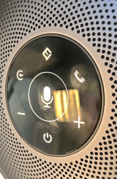
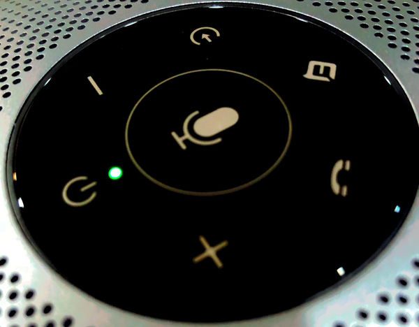
At the top center is a glossy plastic surface with a set of capacitive buttons. It’s a nice detail but the plastic can act as a bit of a fingerprint magnet

The center button is the mute button. The area for mute is larger than the other areas so that it is easy to activate by anyone on the call. There is a circle surrounding the mute button to highlight the area to be struck if a mute is required.  There is no physical separation from hitting the mute and accidentally hitting the adjacent buttons thereby changing the input source or hanging up the call.  However, the mute button is just the right size that there is little chance of missing it. The buttons around the center have the following functions. Intelligent assistant (Cortana, Google, Siri, etc.), call answer and hangup, volume up, power/battery check, volume down, and source button.

Operation

The unit is powered on by holding the power button for 3 seconds or more. The unit responds by illuminating the LEDs surrounding the top in blue and tracing the blue LEDs with a white LED in a clockwise fashion. A startup tone comes from the speaker. After the startup routine is complete, a single LED indicator glows above the power button that indicates the audio source: blue for Bluetooth, green for USB, and white for analog audio.

If there is no signal from the input cables then the unit enters pairing mode. Pairing is indicated by a blinking blue light above the power button and a sonar-like tone from the speaker. When it is paired the LED above the speaker is a solid blue. If multiple sources are connected then pressing the source button cycles through the connection options. The Bluetooth radio only supports pairing with one device at a time.

If the unit is paired to a phone and a call is received the phone rings but the OfficeCore ring blinks blue. Pressing the phone button will answer the call and holding the button for 3 seconds will reject the call. If the unit is paired with a phone then the eMeet logo button can be used to dial an outgoing call using the intelligent assistant. When the unit is plugged in but turned off the power light glows yellow while charging.

Using the eMeet with a mobile is a lot more straightforward than with a computer if only for the fact that the computer generally has a more difficult process connecting to a Bluetooth device and/or selecting the correct audio input and output. On a non-mac computer is also important to pick the correct mode of output. A windows computer will list both eMeet M2 stereo and eMeet M2 hands-free. The stereo is used for audio streaming of music and the hands-free is for calls.

The Bluetooth will only connect to one device at a time but will pair with multiple devices. Pressing and holding the audio select will cause the eMeet to search for another input source. The eMeet does not support NFC pairing.

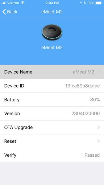
The eMeet also has a mobile app. It runs just fine on iOS; on Android, it only seems to work if you grant all the permissions. The ap doesn’t do much. It interrogates the eMeet through Bluetooth and provides the battery strength. It is able to change the name of the device and can provide OTA updates if they are available.


Performance

I made a couple of sample recordings with the eMeet. The first is a standard recording made with the eMeet to a voicemail system in a 10 x 12 office on a desk.

The voicemail announcement is loud and clear. The recording has hints of audio processing but is overall a good recording. In comparison, I made a recording using a JBL Flip 2. The recording is much lower quality – there are encoding artifacts, phasing, and generally low quality.

When used in a larger conference setting the eMeet still picked up my voice over 15 ft away quite clearly. The white LED lamp is a good feedback indicator of what the eMeet audio isolation system is capturing so that if a bunch of people are talking the other end will be able to at least hear one person speaking.

The recording below is made using a USB connection to a MacBook Pro. No recording enhancements are made to the recording below.

I performed the Andy Chen Vacuum challenge. This is an audio test that our Gadgeteer Andy Chen performed on a Plantronics headset. The eMeet seemed to isolate the noise, but only slightly better than the iPhone.

To test the battery I fully charged the unit and streamed Bluetooth audio to it at full volume continuously for as long as possible. It lasted a total of 11:30 hours. Which is right around the advertised 12-hour battery life.

The eMeet M2 is first and foremost a conference speakerphone, but it is also able to work as a Bluetooth speaker. The audio from these speaker sounds tinny and lacks bass depth, but the audio doesn’t cut out, even at max volume. The JBL Flip 2 is much louder; it sounds about as loud as the eMeet when it’s only about 20% of its full volume. Also, the bass out of the JBL is much fuller and the overall sound is a lot warmer.  So while the eMeet is a great conference speakerphone, it does poorly as a portable Bluetooth speaker.

What I like

  • Noise isolation
  • the indication of which direction noise reduction is isolating

What needs to be improved

  • Audio volume

Final thoughts

The eMeet OfficeCore M2 conference speakerphone is a great choice when you need a portable speakerphone with noise isolation and extended range. Although it isn’t very loud as a Bluetooth speaker, it has just the right volume for a conference phone for up to a 20-foot radius.

Price: $209.99
Where to buyAmazon
Source: The sample for this review was provided by eMeet.

Filed in categories: Reviews

Tagged:

eMeet OfficeCore M2 conference speakerphone review originally appeared on The Gadgeteer on August 24, 2018 at 11:00 am.

Note: If you are subscribed to this feed through FeedBurner, please switch to our native feed URL http://the-gadgeteer.com/feed/ in order to ensure continuous delivery.
Brooks England Pitfield Backpack review

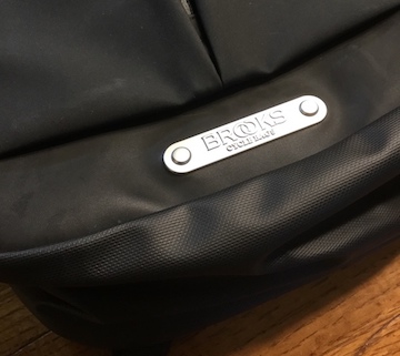
REVIEW – What’s defines heritage? How about a company that’s been making cycling and equestrian gear since 1886! Today I’m reviewing the Pitfield Backpack from Brooks England, and it’s a beauty. Let’s take a ride!

What is it?

It’s an all-weather backpack designed for biking that has the capacity for all of your daily essentials… including your bike helmet.

Hardware specs

  • 12.6” wide by 21.6” tall by 6.7” deep
  • 2.9 pounds
  • 24-28 liter capacity
  • Waterproof PU Coated Nylon 66 & Cordura
  • YKK Aquaguard Zips
  • Padded Compartments
  • High Grade Aluminim Hardware
  • 100% Recycled Lining

Design and features

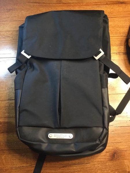
The Brooks Pitfield Backpack is a sneaky operator. It’s a working bag designed with the cyclist in mind, but the clean & understated profile looks good enough to rock in the office. At a 24-28 liter capacity, it’s a bigger bag but feels smaller due to its streamlined profile and some very clever pocketing design. It’s kind of like a stealth bomber.

The Brooks Pitfield Backpack is built to handle the elements. Water resistance comes from a combination of waterproof PU coated nylon, Cordura, and YKK Aquaguard zips. An interesting combination of textures combined with Aluminum hardware add subtle style. It will take a downpour, and look good doing it.

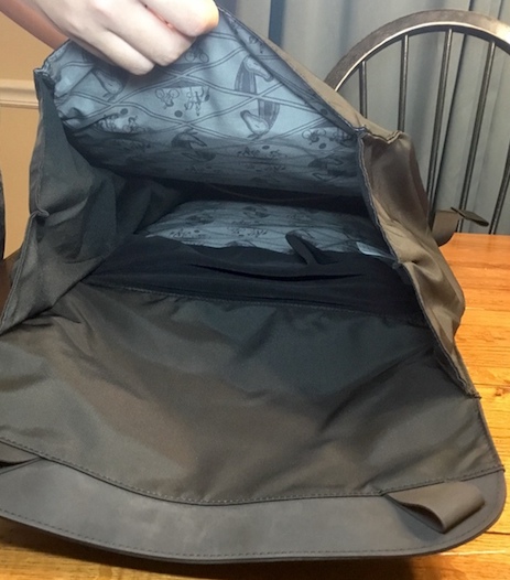
The interior lining boasts a cheeky pattern that pays homage to Brooks England’s heritage. I love little details like this!

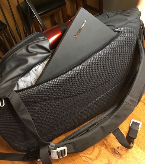
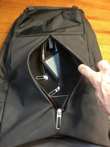
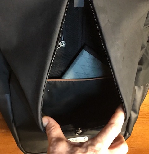
Your laptop rides in its own padded 18” by 12” compartment that sits on your back, and has a separate side zip for access. A 15” laptop fits easily in there along with a tablet.

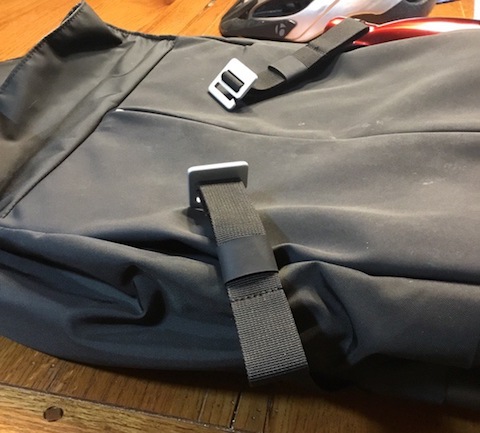
The main compartment is positioned in the center of the bag, accessed from a flap-over lid that is closed with two sturdy aluminum hooks that connect to loops on the flap. Adjustable straps allow you to cinch-down or expand the compartment based on what you’re carrying. There’s also an 8” deep divider at the bottom of the compartment to help organize your stuff.

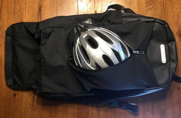
Those locking straps are actually set at 45-degree angles to the front face of the bag, to accommodate the Pitfield’s most unique feature: an 11” by 15” front panel compartment that stretches to accommodate larger items like a bike helmet!

A vertical zip opens this compartment, which also includes two small stash pockets (3-1/2” by 6” and 4-1/2” by 8-1/2” respectively) with zips built along the centerline for easy access when the main pocket is opened. A 7” deep open pocket at the bottom of the space wrangles loose items, while a hanging loop at the top of the compartment gives you a place to dangle your keys on a strap or carabiner.

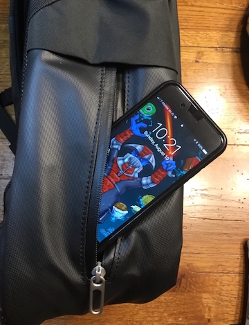
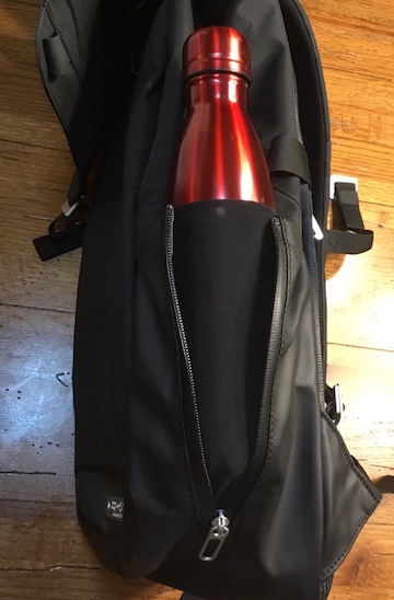
There’s an additional pocket on either side of the bag, accessed by vertical zippers. The left pocket is 9” by 6”, perfect for your smartphone or wallet. The right pocket features a pop-out elastic water bottle net that fits oversized bottles. I’m seeing this on a lot of packs these days, and it’s a great feature that tucks away neatly when not needed.

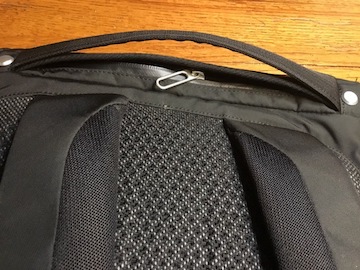
Finally, there’s also a 10” by 4” horizontal pocket accessed from a zip under the top carry handle, made from a stretchy mesh material.

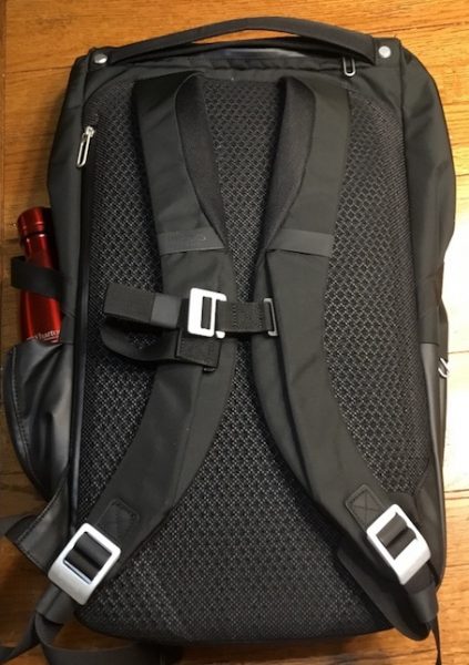
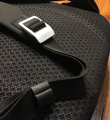
The carry system features moderately-padded straps that are curved for comfort & fit. Custom aluminum buckles on the adjustment straps use a double-loop strap insertion method and curved profiles to prevent unwanted slippage, and a built-in sternum strap adds some stability to your ride. The back panel padding is marvelous, with deep perforations to promote air circulation. It won’t slip and slide around on you, either.

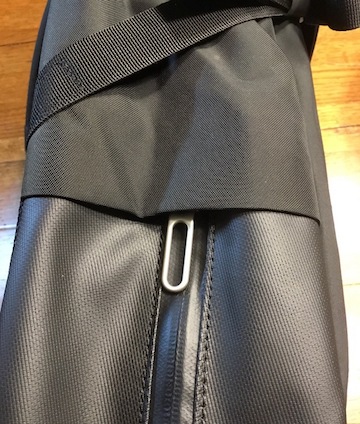
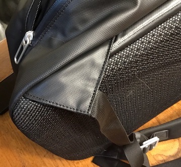
The build is full of little quality details. External zips are hooded to prevent leakage in the bag. Every strap has a sliding collar to lock down extra flappy bits when adjusted. The zips don’t quite run the length of the pockets, creating a nesting space in each pocket so things don’t tumble out when they are opened. Every seam is reinforced. It’s a nicely detailed build, backed by a 10 year warranty that shows Brooks England’s commitment to quality.

Performance

I am not a cyclist, but I tend to favor bike-oriented packs for daily use for comfort, weather resistance, and overall usability. The Brooks Pitfield’s design is so well executed that it works just as well on or off the bike. It’s ridiculously easy to live with.

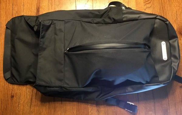
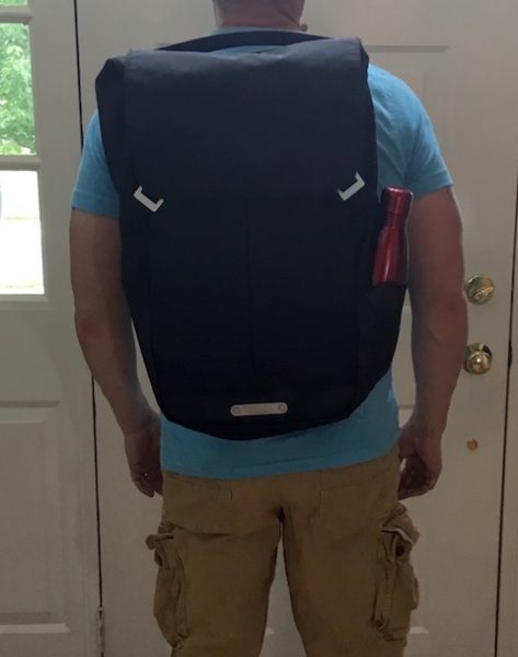
The Pitfield is on the bigger side of a daypack, but it doesn’t feel like it. The tall, wide format of the bag may be an issue if you have a smaller frame, but check out how nicely the profile compresses!

I love the streamlined harness system. While it looks fairly light, it’s actually super-comfortable to wear all day, even when you’ve maxed out capacity on the bag. It also an office-friendly: slipping the bag on and off is easy, and you’re look is not dominated by massive shoulder straps if you’re dressed up. The whole system hugs the body well and provides excellent balance. Despite the larger size, I don’t feel that a waist stabilizer is required here.

Pocket design is a delight. You have just enough of a variety of places to organize your less-used stuff (like chargers), with secure locations for important stuff (like your wallet) and dump n’ grab places for things you need on the run (like sunglasses). I really like the overall accessibility of the external pockets. The beefy zipper tabs make for easy manipulation, and all the pockets are wide enough to get in and out of without straining your fingers. And you won’t find a single piece of Velcro anywhere to fight with. I kinda love that.

With all of the external compartments for your tech and travel bits, that leaves the main compartment wide-open for a change of clothes, a packed lunch, or groceries on the way home. Those aluminum hooks & loop points are actually very effective here for smooth one-handed operation. The divider in the space is nice to tuck a notebook or tablet in there for easy removal but doesn’t get in the way if not needed.

If there is one knock on the bag that I have found, it’s that the matte fabrics seem to pick up marks in use. Most of what I’ve seen so far wipes off easily, but I’ve collected some scars. I will be curious to see if these marks start to collect over an extended period of time.

What I like

  • Great build with careful attention to details.
  • Streamlined, sophisticated profile.
  • Ready to handle the elements.
  • Excellent accessibility and pocket design.

What needs to be improved

  • Some external surfaces may show wear over extended use.
  • Tall, wide format may not work for people with a smaller frame.

Final thoughts

The Brooks Pitfield Backpack is a stealth warrior that is buttoned-up enough for the office, yet packed with features for tackling the road. The usability is dialed in on this design, making it easy to live with both on and off the bike. It is one of my favorite bags so far in 2018.

Price: $200.00
Where to buy: Brooks England
Source: The sample of this product was provided by Brooks England.

Filed in categories: Reviews

Tagged:

Brooks England Pitfield Backpack review originally appeared on The Gadgeteer on August 24, 2018 at 9:00 am.

Note: If you are subscribed to this feed through FeedBurner, please switch to our native feed URL http://the-gadgeteer.com/feed/ in order to ensure continuous delivery.

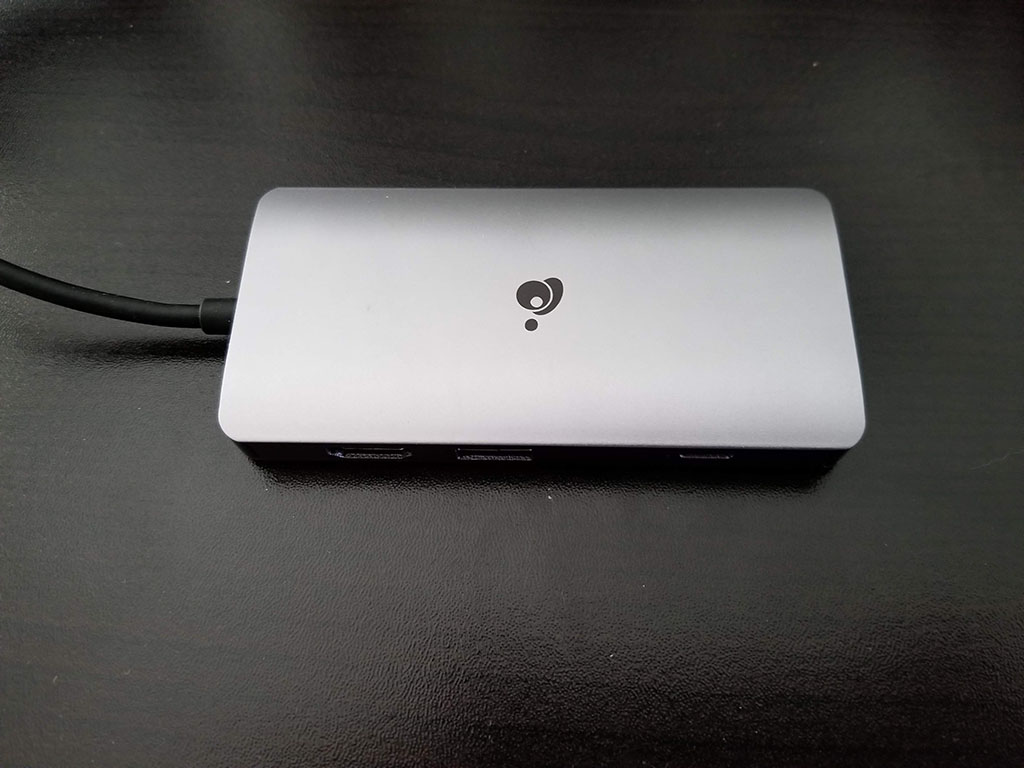
IOGEAR USB-C Travel Dock review

REVIEW – USB-C is a great specification, but in practice, it has been a slow, uphill battle to get peripherals that support it.  Many aftermarket manufacturers (such as external hard disks or network adapters) seem stuck on the old USB-A type connectors and the slower speeds that go along with that standard.  A few, though, are forward-thinking and are providing device support for the now common connector.  Case in point: the IOGEAR USB-C Travel dock.  Let’s see how well the dock lives up to the new standard.

What’s in the box?

The USB-C Travel dock with a fixed USB-C connection cable (about 6 inches long).  The hub itself has a gigabit Ethernet port, 3 USB-A ports that support USB 3.0 connection speeds, an SD slot, a micro-SD slot, a USB-C pass-through connector and an HDMI port that supports 4k video at up to 30Hz.

Design and Features

The travel dock is a very well-made device.  The body is aluminum and seamless – and, unlike a lot of other aluminum-encased devices, the dock seems impervious to fingerprints.  The cable connection to your computer is solid and rubber-coated and the USB-C connector is also aluminum-encased.  All in all, this is a device that seems like it would take a beating in your travel bag and yet always be ready when you need it.

The ports are arranged with 2 USB-A connectors sharing the same side as the card slots, the USB-C pass-through and HDMI on the opposite side with another USB-A port, and finally the gigabit Ethernet port at the opposite end from the hard-wired connection cable.

Does it work?

In a word, yes.  And well.

I used the travel dock with my MacBook Pro (mid-2017) and my Surface Book 2.  First, the MacBook: although I have a model which sports four Thunderbolt 3 ports, I dislike the feeling there are octopus tentacles coming out of my laptop.  Whenever possible, I prefer a single connection – and preferably one that does not require multiple adapters such as USB-A to USB-C.  The travel dock allows my OCD to be satisfied – with the USB-C pass-through connected with my Apple USB-C power adapter, I can keep my laptop powered on AC while reading memory cards (something lacking in the Mac lineup), reading and writing with my Samsung T3 external SSD, and driving an external 1080p monitor via the HDMI port at 60Hz.  The pass-through port is a 100-watt port but it reserves 15 watts for the devices on the port, which ends up rendering 85 watts to the laptop if your adapter can supply that.  My adapter supplies 87 watts of power, but in use, the difference did not in any way cripple my laptop with reduced power – my battery charged slower, but I did not experience excess heat or any other power-related issues.

The Surface Book 2 does not currently support USB-C charging (the new Surface Go does, but the older Book 2 does not), so my use was limited to extending the single USB-C port on the laptop.  There are also 2 USB-A version 3 ports on the Surface Book 2, but often I find that I need to have a USB-based Ethernet card and a USB -C to HDMI adapter to support an external monitor.  That leaves only a single USB-A port on my laptop to support external storage – and me having to find an adapter to bridge the gap between the SD card slot on the laptop and the micro-SD card I am holding in my hands.  The travel dock capably handles all this with room to grow.

Transfer speeds are fantastic.  To validate this, I copied files back and forth between a micro-SD card and a network share (connected via the Ethernet port) while watching an HD video from the SSD drive on an external monitor.  Some devices would choke on this scenario (admittedly, not likely a real-world one, but who does real-world stuff in reviews?), but the IOGEAR dock didn’t drop any video frames and still supported about 8mb transfer speeds from the micro SD card.

What I like

  • Solid construction
  • Good array of ports on the dock
  • Pass-through power to keep my laptop up and running

What needs to be improved

  • Nothing – this is a great device as delivered

Final thoughts

I can see the IOGEAR USB-C Travel dock being a mainstay in my backpack for many a trip to come.  From solid build quality to high-speed performance t0 the ability to hit almost any road scenario I can think of, the dock is one of those pieces of hardware that just works whenever you need it.

Price: $99.95
Where to buy: Amazon
Source: Review unit provided by IOGEAR.

Filed in categories: Reviews

Tagged:

IOGEAR USB-C Travel Dock review originally appeared on The Gadgeteer on August 23, 2018 at 11:00 am.

Note: If you are subscribed to this feed through FeedBurner, please switch to our native feed URL http://the-gadgeteer.com/feed/ in order to ensure continuous delivery.

Zagg Nomad Book tablet case review

REVIEW – There is always the worry, when you buy an expensive case for a device, that you’re going to lose that investment when you upgrade to a new device. Or, perhaps you have a device that is not exactly the market leader and need a case that can be adjusted to fit your device. Well, the fine folks at Zagg have taken these fears into account and answered with the Nomad Book tablet case. I was sent one to test, and am ready to show it to you now.

Note: Photos may be tapped or clicked for a larger image.

What is it?

The Zagg Nomad Book is a keyboard case for tablets in the 9-10-ish screen size range. There are gaskets, button mapping levers, and ways of setting this case up that will handle many different models.

Hardware specs

The top case is configured for use with an iPad 9.7” device of recent vintage, as well as 9.7” devices from Samsung (S2 or S3), as well as the 10.5” iPad. Unless you own several of these devices and want to swap back and forth between them, this is a one-time configuration.

What’s in the box?

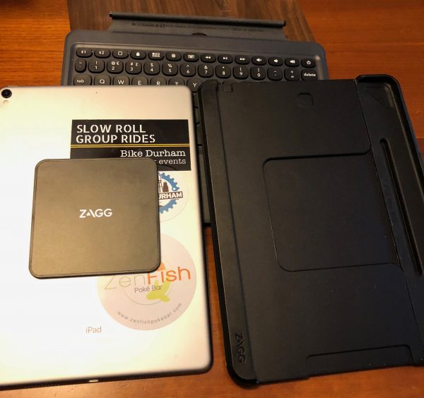
Included in the box is a rechargeable Bluetooth keyboard cover (with a charging cable) that is used for all the tablet sizes. It magnetically attaches to one side and can hinge up to cover whichever tablet is installed in the other half of the case.
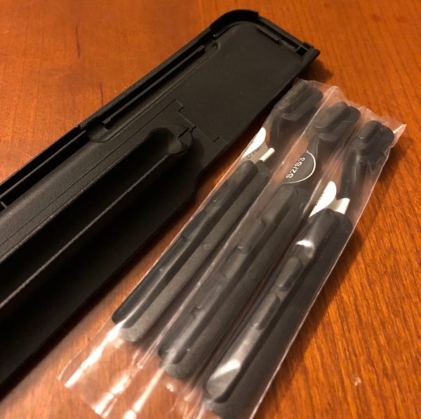
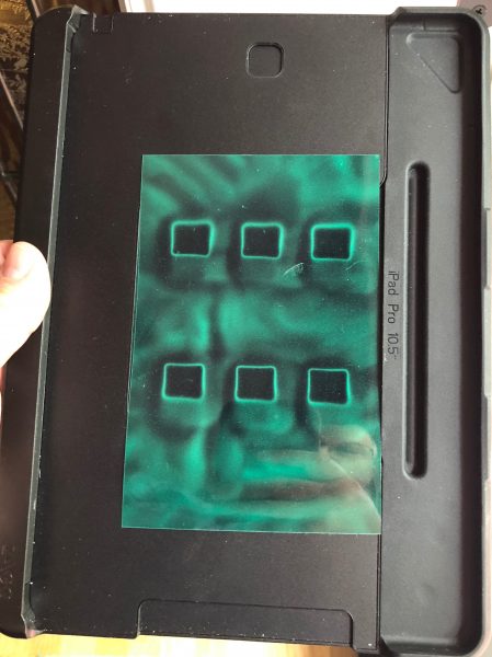
The top half consists of a basic shell, two gaskets for various sizes of tablet, four button levers to actuate various models of tablet, and a magnetic plate that attaches to the back of the tablet to keep it in the case.

Design and features

A case that adjusts to the size of the device is more desirable for makers than for users, in many ways. Users just want their stuff to fit and not look like the case is meant for another device. Manufacturers don’t want to have to make a custom device for every single form factor on the market. Early in the life of the iPad, it was said: “There is no tablet market, there is only an iPad market.” (Search that phrase to see what I mean.) Everyone wanted their tablet to resemble the size, shape, and weight of the iPad. This has held true for the most popular tablets, so this case can easily accommodate a good swath of the market, but once you’ve set it up for your device, you won’t need the other gasket or button levers. They can be stored in the event you ever want to change the tablet or give the case to another.
To set it up for your tablet, first choose the button levers that correspond to your model and insert it into the case. Next, select the proper gasket and push the stylus holder through the slot for it in the case. (The stylus holder keeps the gasket in place. To change the gasket, push the stylus holder back through the slot.)
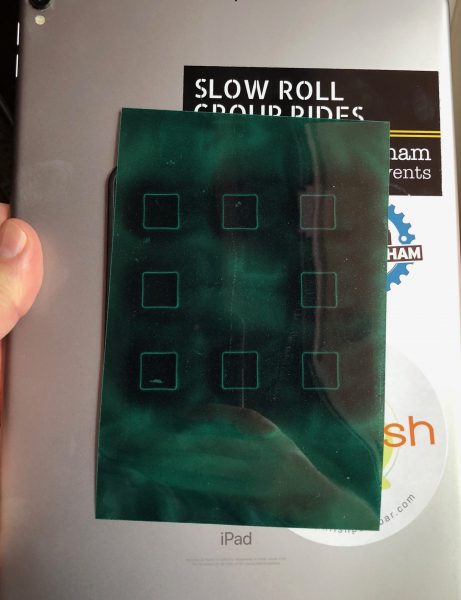
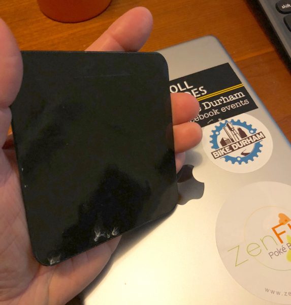
Once you have the correct gasket in place, you only have to mount the 4” x 4” magnetic plate to the back of your device with the bonding tape. This prevents the tablet from falling out of the case easily. (In testing, I found it was pretty strong, but if the keyboard was not covering the tablet, there was a decent chance the magnetic hold would release. So, not really a secure attachment method.)

Here is the layout of the magnets in both the base and the attachment plate.


The other downside of the one-eighth-inch thick bloc being stuck on the back of your iPad is that it prevents it from fitting into most all other cases. If you happen to use a folio or slipcase for your bare iPad when not using the Nomad Book, it will make your folio wear oddly, kinda giving your iPad case the equivalent of a “Skoal ring.”


To my surprise, I was able to remove the mounting block with relative ease, and it didn’t really negatively affect any of the stickers I had under it. There was no residue at all on the iPad itself. It stuck back with ease, but I’m not sure how many times that can be done before the stickiness of the magnet block is reduced to nothing.

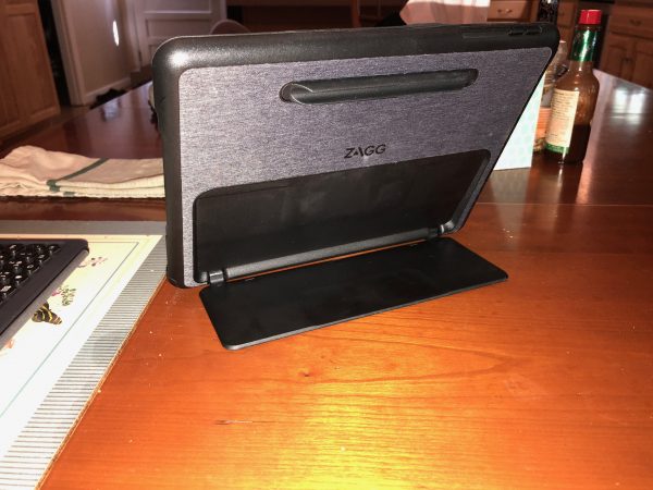
The top case itself is a nice solid housing for your tablet and has both a kickstand and a stylus sleeve. The stylus sleeve is long and flexible, so it not only holds your Pencil securely, but it’s easy enough to remove that you don’t fear you’re going to snap the stylus in half in the process.


The kickstand feature I have mentioned with other products. I am a huge fan. This one is properly stiff to open and get into place, but then it holds without wavering while you type, tap, and jiggle the table. This is possibly the best thing about this case, to me. It can hold the iPad up from almost completely flat on a surface to past 90º so that you can even use it while watching from a lower angle. With the detachable keyboard, this is not a bad thing. You can have the iPad on a higher shelf while you’re sitting back, but you can still enter information. When it’s in that nearly flat state, however, without the keyboard, tapping can cause it to fall over backward. There’s a sweet spot around 45º where it becomes very stable.

I found the responsiveness of the keyboard to be great. It’s certainly not a clickety-clack mechanical keyboard (which I loathe), but the keys have actual travel, and you can feel them, not like typing on glass or using a membrane keyboard. There are shortcuts for everything I expected, and few that I didn’t, like a way to check the battery status of the keyboard itself.
The keyboard isn’t backlit, but you can pair it with another device besides the one in the stand. (Actually, you can pair it with any 2 devices, in the case or not!) The size and layout is enough larger than the screen keyboard as to seem almost 100%. I found myself having far fewer typos with it than with some other cases I’ve used. I really missed that backlighting, though.
The combination of the magnet, the heavy-duty case, and kickstand, and the keyboard increases the weight of my 1.05 pound iPad Pro 10.5″  to 2 pounds, 10.5 ounces. That’s a huge increase, even given the protection it affords. Also, there is no view port for the iPad’s camera. Sure, you can pop the iPad out of the case to take a shot, but then, what do you do with the case while you’re framing and snapping? And not getting the benefit of the steadiness of the kickstand to help with taking pictures is criminal.

What I Like

  • Holds tablet securely
  • Removable keyboard
  • Easy to recharge both tablet and keyboard while attached
  • Integrated Kickstand

What needs to be improved

  • No camera view port
  • Must use stick-on magnet to use securely
  • Keyboard detaches easily while in a bag, exposing the screen
  • Keyboard not backlit
  • Really heavy

Final thoughts

I really wanted to love this case. When I realized I’d have to stick on a huge square of plastic to use it securely, I was really crestfallen. Having moved from an iPad Air 2 to the 10.5” iPad, I was right in the target demographic. I could move back to the older form factor, or gift this to my Mom, who has the older size. But if it means prying off this growth, and then finding the sticky-tape to reapply it to the next device, it’s really not worth the effort to me.

If the magnetic attachment and occasional in-bag uncoupling don’t bother you, and you can deal with not having a way to take pictures while in the case, you may find this solid kickstand and light, tight keyboard combination a winner.

If you’re one who doesn’t have an iPad, but instead has been trying to find a protective, solid case and keyboard combination for your not-so-mainstream tablet, this may let you get into a case/keyboard combination that you’ll really love.

Price: $99.99
Where to buy: Amazon or Zagg
Source: The sample of this product was provided by Zagg.

Filed in categories: Reviews

Tagged: ,

Zagg Nomad Book tablet case review originally appeared on The Gadgeteer on August 23, 2018 at 9:00 am.

Note: If you are subscribed to this feed through FeedBurner, please switch to our native feed URL http://the-gadgeteer.com/feed/ in order to ensure continuous delivery.