Barrington Special Edition Watch Winder review

REVIEW – I have a small but growing collection of automatic watches which I love wearing. In the era of smartphones and smartwatches, many say that old school timepieces are a thing of the past. But I would argue that watches are one of the original gadgets, their style and use still having a place in today’s modern world. But that is a debate for another time… Unlike a battery powered quartz watch, automatic watches wind themselves as you wear them. So, if they sit more than a few days they need to be hand-wound and time reset. Watch winders are engineered to keep the power reserve of your watch full and timepiece ticking while not on your wrist. In this case, Barrington has send their Special Edition single watch winder to review.

What is it?

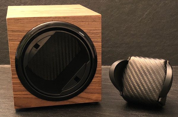
As the name states, the Barrington Special Edition Watch Winder is a device designed to wind your automatic timepiece so it is charged and good to go at all times. In addition to their quality internal components, Barrington uses fine hardwoods in the construction of their Special Edition series of watch winders. For this review, they send me their single winder in unvarnished American walnut.

Design and features

Barrington is a British company focused on fine watch accessories. They produce high quality watch winders, watch winder safes, and various other accessories to maintain and store your watches. As you can see, their Special Edition watch winder is designed to hold/wind a single watch at a time with a variable number of daily turns and multi-direction capability.

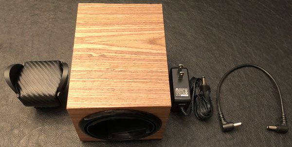
In the box:

  • Special Edition Barrington Single Watch Winder
  • Standard or Flex holder
  • US power adapter
  • Connecting power cable

Inside the watch winder is an ultra-quiet Japanese motor that you can barely hear when operating. The movement is very smooth and precise. The physical dimensions of the watch winder measures 4.5in/11.5cm (W) x 4.7in/12cm (H) x 6.3in/16cm (D). A good size for on top of an armoire or shelf of a closet.

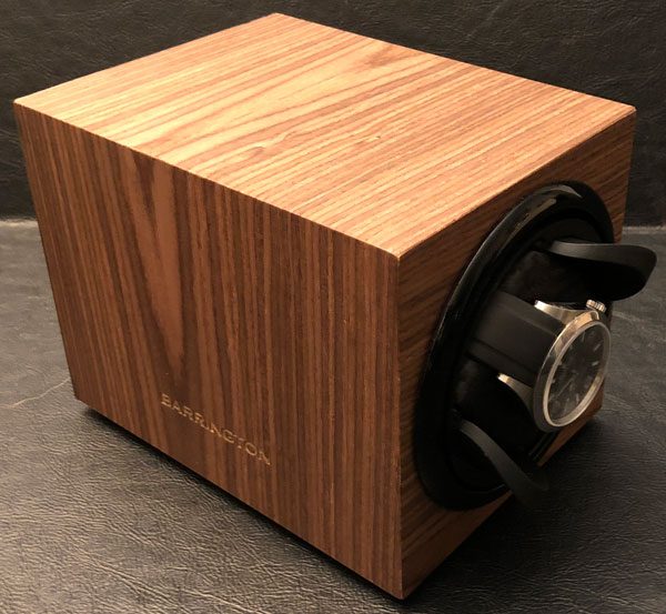
The Barrington watch winder can accommodate their Standard or Flex cushions. Here you can see my watch on their Standard holder. The Standard is designed for watches with a strap/bracelet circumference of 19cm to 24cm. The Flex is suitable for watches with a strap/bracelet circumference of 14cm to 20cm. According to Barrington, their Standard cushion fits approx 70% of customers and the Flex “is preferred if wrist size is slightly smaller”. They sent me the Standard holder and while it fits my rubber strap watch just fine cause I can adjust it. I would need their Flex cushion to accommodate my timepieces with brackets due to my scrawny wrists.

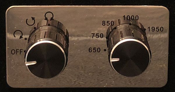
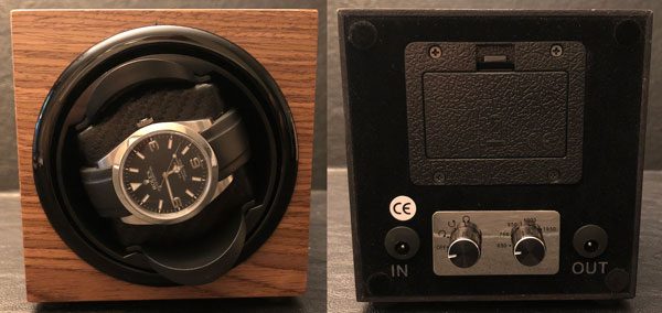
As I have mentioned, the Barrington watch winder has multiple turns per day settings (650/750/850/1000/1950) and rotation directions. The movement is smooth and nearly silent but Barrington says it best:

This single watch winder operates on a basis of gentle rotation to wind watches. Older generation Watch Winders were programmed to be always on (i.e. rotating without a pause) in an effort to wind the watch as quickly as possible. This can lead to over-winding of a watch and potential damage to the main spring. Gentle rotation ensures a consistent movement over a longer period of time that won’t over-wind your watch.

When initially turned on the rotor turns for 1 minute before pausing. The length of the pause is determined by the Turns Per Day setting (a lower TPD setting will mean a longer pause and vice versa) and once it is completed the rotor turns again for just 1 minute. This cycle continues silently until the watch winder is turned off.

If the Direction setting is set to clockwise then the rotor will always rotate in a Clockwise manner; the same principle applies if the Direction setting is set to Anti-Clockwise. However, if the Direction setting is set to the third setting, Alternately Clockwise/Anti-Clockwise, the first 1 minute rotation will be Clockwise, the next 1 minute rotation will be Anti-Clockwise and so on, ensuring your watch gets a balanced, yet gentle, rotation.

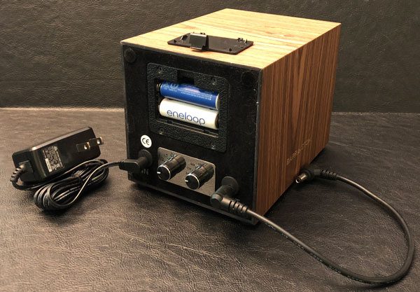
This watch winder can be powered by standard AC power or a pair of AA batteries. For this review, I powered the winder on batteries that have lasted nearly two months of on & off operation with no sign of running out of juice. Barrington’s ‘Jump’ feature allows multiple winders to be connected together via the supplied connecting cable and powered from the AC power source…aka there are two power ports, in and out, so you can daisy chain multiple single watch winders together powering them with one AC adapter cord.

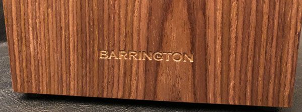
The Barrington Special Edition series is all about the hardwood enclosures. As a lifelong, part-time woodworker, the unvarnished American walnut is gorgeous. The exterior is nicely finished with excellent old world craftsmanship. The seams are perfect with ‘BARRINGTON’ routered into both sides of the wooden box.

In addition to American walnut, the Special Edition watch winders are available in: santos rosewood, gray koto, oak, zebrano, and ebony Macassar hardwoods. For those of you not tempted by their Special Edition winders, Barrington’s standard single watch winders are available in: crimson red, glacier white, midnight blue, electric yellow, shadow black, racing green, and burnt amber for a fraction of the cost.

What I like

  • Well made with quality materials
  • Old world craftsmanship
  • Keeps your watch wound and ready for use
  • Variable turn and directions suitable for nearly any watch
  • Capable of daisy chaining multiple winders

What needs to be improved

  • Expensive

Final thoughts

The Barrington Special Edition Watch Winder is the first watch winder I have ever tried and the convince is obvious. Historically when I switch watches, 99% of the time I have to wind and set it but now that all-be-it minor hassle is a thing of the past. The Special Edition’s wooden enclose is beautiful and mechanism within nearly silent. You can definitely find cheaper watch winders or you could take the time and effort whenever the need arises to do it yourself. But the Barrington SE watch winder is a luxury accessory for your old school timepieces that alleviates that task and looks great while doing it.

Price: $395.00
Where to buy: Barrington
Source: The sample of this product was provided by Barrington.

Filed in categories: Reviews

Tagged:

Barrington Special Edition Watch Winder review originally appeared on The Gadgeteer on August 30, 2018 at 9:00 am.

Note: If you are subscribed to this feed through FeedBurner, please switch to our native feed URL http://the-gadgeteer.com/feed/ in order to ensure continuous delivery.

Wondershare Fotophire Image Editing Software review

REVIEW – Photo editing can be drudgery unless you were raised as a graphic designer using Photohsop (like me). Even then, it can be tedious. Today we’re checking out the Wondershare Fotophire Image Editing Software, which combines a whole bunch of image editing features in one package. It’s simple to use, automates a bunch of the work for you, and has a ton of features that don’t require deep graphic experience to execute. Let’s learn more. To the review!

What is it?

It’s a set of tools that allow you to edit & manipulate your photos including filter effects, image enhancements, color correction, background removal, cropping, and the ability to remove unwanted objects.

Software specs

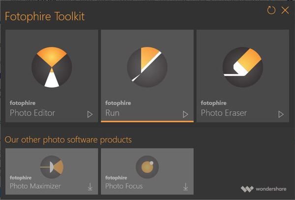
There are three tools included in the Fotophire editing toolkit:

  • The Photo Editor provides basic editing (like cropping, flipping), 200+ filter effects, focus blurs & vignettes, color correction, and more.
  • The Photo Cutter enables you to remove or replace backgrounds in pictures with a set of smart tools that automate the process.
  • The Photo Eraser automates the process of removing unwanted objects from your photos, including watermarks and date stamps.

I’m testing the Windows-based version of the package, but an Apple OS version is also available.

Design and features

The Wondershare Fotophire Image Editing Software kit provides a suite of tools that allow you to manipulate your photos for professional quality results using a series of easy to use, intuitive interfaces that don’t require extensive graphics experience to master. You’ll start by firing up the toolkit launcher, which gives one-click access to each tool:

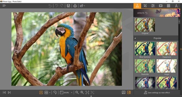
The first tool is the Photo Editor, which offers a HUGE range of filters and effects. Your photo is presented in an interface that uses a combination of intuitive icons, menus, and excellent help tools guide you through their use:

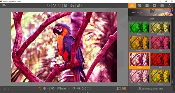
The effects menu provides over 200 canned filters you can apply for different photo treatments. I chose a random effect to give the whole photo a purple filter here:

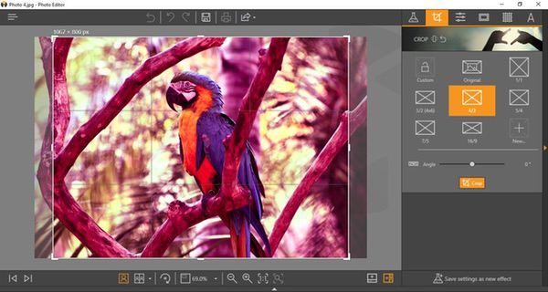
The cropping function, available from all three tools, provides a set of pre-packaged sizing/aspect ratio options, which can then be dialed in with on-screen controls:

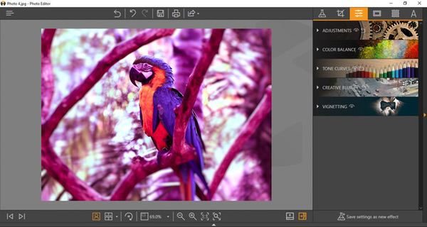
If you want to do your own color adjustments, you can forego the pre-selected filters and create your own. There’s a whole subset of tools to adjust color balance, tone, contrast, color saturation, etc. You can save these preferences for future use, and even apply them for batch processing later.

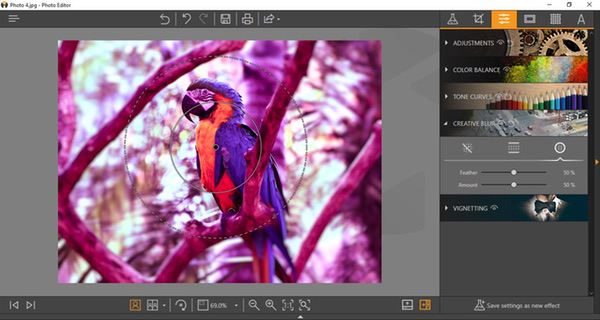
Blurs and vignettes enable you to create focus areas in your image. I added a creative blur here, setting the radius and depth of the filter with my mouse to focus on the parrot and blur the rest of the image. As with other effects tools in the package, everything works with friendly and self-explanatory sliders and onscreen tools that are quick and easy to master.

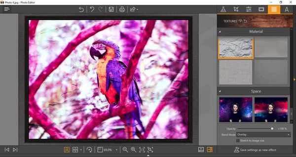
After making those adjustments, I added a frame from another preset menu of options, and then applied a texture to the whole picture.

These samples only scratch the surface of what the Image Editor can do. Color management and tone controls are really deep. You can add text, flip photos, add blends, and more. You can also set the view mode to arrange the desktop with before and after previews if you like, and save your settings for future use or batch processes. It’s an impressive set of features compared to many photo editing apps out there. And the speed is excellent. I ran my tests on an older Windows 10 machine, and saw virtually no lag from application to execution of any of the effects.

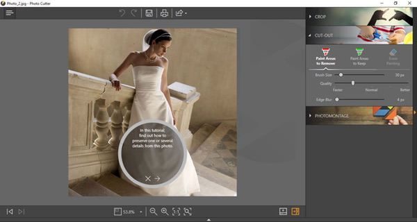
The Photo Cutter tool employs a simple, user-friendly automated feature to remove background elements from your photos for isolating the main subject matter. There’s a handy tutorial that takes you through the process the first time.

To use the tool, you’ll start by drawing lines on your image through the areas you want to remove. As you add these lines (shown in red below), the preview shows you what areas are being eliminated from the photo. If you lose too much of the key image, you can go back and highlight areas to include in the finished piece (shown in green). Adjustment sliders allow you to refine the selection process to accommodate the depth and complexity of the original image.

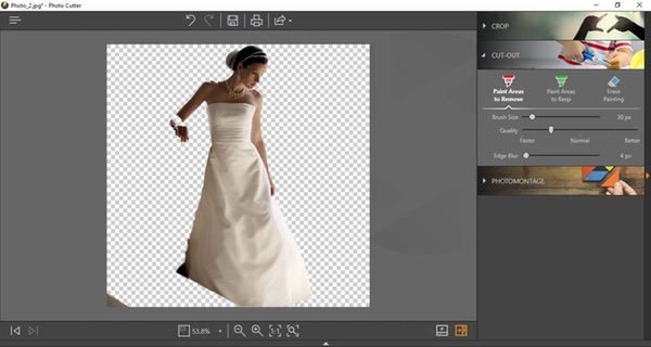
Once you are happy with the preview, press the “erase” button and the background just… disappears.

The finished art is rendered on a separate layer, and you can add in a different background if you like:

In my previous life I spent many, many late nights doing detailed image cropping and background removal in Photoshop… I can tell you that I would buy this package just for this tool. The automation is really good. You will always have challenges with images that have very similar tones, but most of my testing was spot-on in one or two attempts. And the speed is, once again, excellent for a complex task like this.

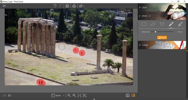
The Photo Eraser is the final tool in the package. Basically, it acts like an automated “clone” tool used in other photo editing programs to remove unwanted objects. The “Erase” tool lets you set the size of spots on the screen (in red below), and the software will basically blend the surroundings to eliminate the image in the spots. Like so:

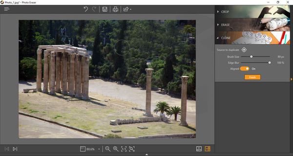
You can also do your own cloning, basically copying an area of the image to another to blend out unwanted objects. I removed the buildings behind the monument hereby extending the foliage in the picture. I exaggerated it a bit so that you can get an idea for how it works:

Of the three tool sets in the Wondershare Fotophire package, this is probably the weakest one in my opinion. The interface is great and responsive, but I found that the automated cloning feature is not always as accurate. It’s nice to have in the package, but doesn’t need to stand on its own… this tool could probably be worked into the Image Editor as opposed to standing as its own app.

While the Wondershare Fotophire package isn’t as robust as a fully-functional commercial image editing tool like Photoshop, I think it ticks off just about all the boxes if you are actively publishing photos online on a regular basis. It does each job very efficiently, and it doesn’t require a steep learning curve to produce professional-looking results.

What I like

  • Simple, well designed, intuitive interfaces
  • Snappy performance
  • Excellent help and tutorial support
  • Robust feature set for a photo editing package

What needs to be improved

  • The Photo Eraser tool could be improved, or even integrated in the Photo Editor tool for simplicity

Final thoughts

I think the Wondershare Fotophire is a good value for what you’re getting. A lot of photo editing tools are extremely limited in scope and capability, requiring you to buy a combination of tools to get what you need if you are frequently posting images. The Fotophire package gives you just about everything you need for essential image manipulation in one package, and you don’t need deep graphics experience to use it.

Price: 1 year license for $49.99, lifetime license for $79.99
Where to buy: Download the demo and purchase at the Wondershare Fotophire web page.
Source: The sample of this product was provided by Wondershare

Filed in categories: Reviews

Tagged:

Wondershare Fotophire Image Editing Software review originally appeared on The Gadgeteer on August 29, 2018 at 11:00 am.

Note: If you are subscribed to this feed through FeedBurner, please switch to our native feed URL http://the-gadgeteer.com/feed/ in order to ensure continuous delivery.
gosh! easyPlay robotic pet fitness puzzle review

REVIEW – As a dog owner I’m always concerned whether or not my 9-year-old puggle Zoey is getting enough exercise. Her activity level isn’t what it used to be, and the summer heat limits the amount of outdoor activity she gets. She’s very finicky when it comes to her toys. Usually, if she can’t eat or destroy it, she won’t play with it. I thought a toy like the gosh! easyPlay would be great for her both physically and mentally. Let’s see if I was right.

What is it?

easyPlay is a robotic remote ball designed to keep your pet active. It uses a smartphone app that lets you interact with your pet and even reward them with treats for playing with it.

What’s in the box?

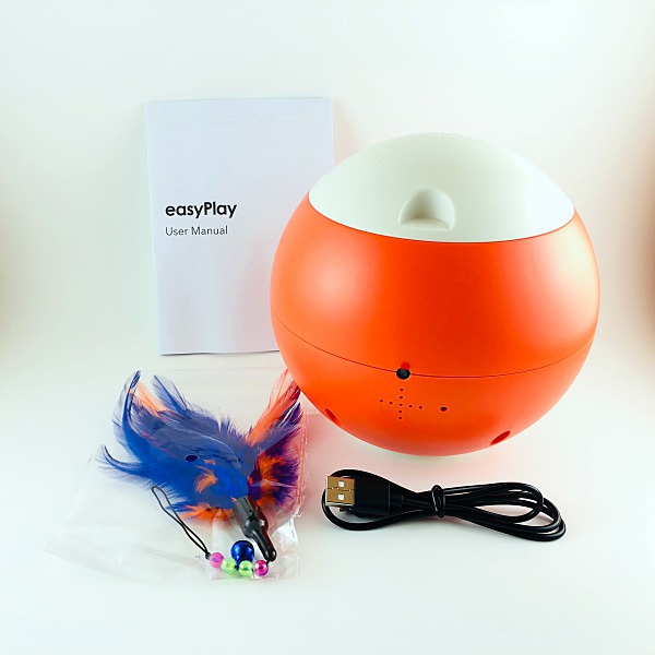
  • easyPlay robotic ball
  • Micro USB to USB charging cable
  • Feather cat toy accessory
  • User manual

Design and features

The easyPlay is made of a durable easy to clean plastic. The ball itself measures 6-inches in diameter and weighs just over 2-pounds.

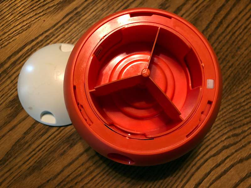
The top of the easyPlay twists off to reveal the food pods. You can fill them with your pets food or small sized treats.

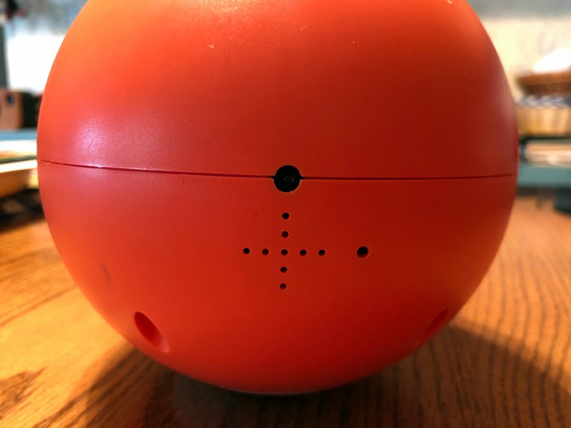
There’s a 720P HD wide-angle webcam located on the front of the ball. Just below the cam, there’s a speaker and microphone.

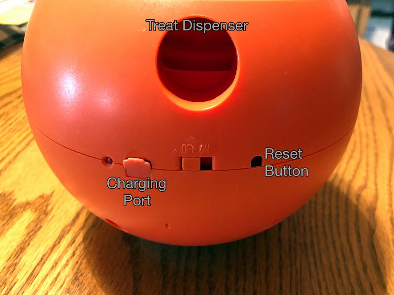
The backside of the ball is where you’ll find the treat dispenser, micro USB charging port, on/off switch, and the reset button. There’s also a battery LED indicator.

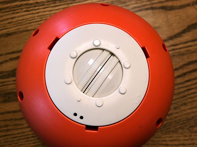
The wheel track, which is used to maneuver the ball is located on the bottom.

easyPlay app

To set up easyPlay, you first have to download the free app from the App Store or Google Play.

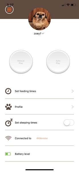
The app interface is simple and easy to use. The Homepage is where you access all of easyPlays features. You can set a profile pic, feeding times and even set and track your pets activity levels. It also allows you to see the network connection and the easyPlays battery level.

You can also select how you want to interact with your dog.

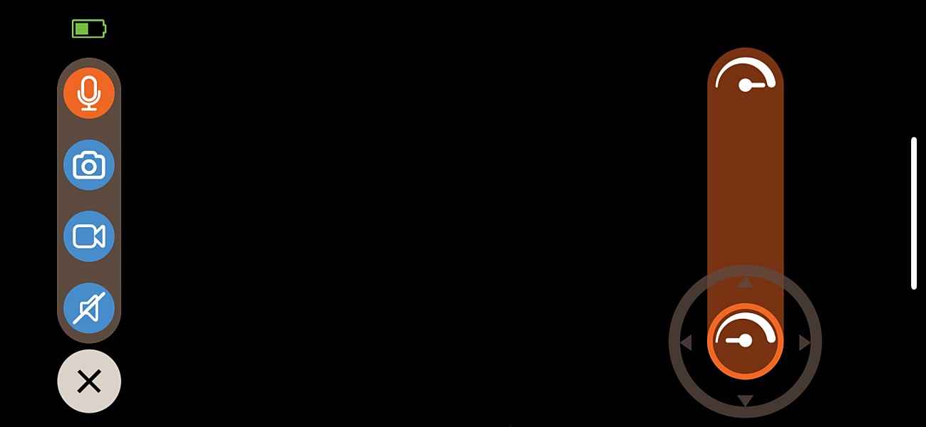
Manual play allows you to control the ball remotely and access the camera and speaker features.

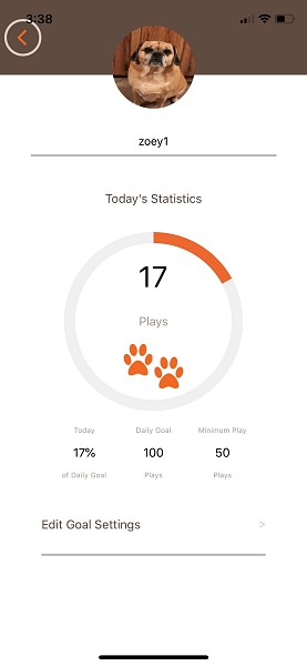
When autoplay is selected, the easyPlay will move on its own for 30 seconds. Profile allows you to track and set your dogs activity level. The app keeps track of how many plays your dog has for that day. A play is registered every time the ball is rolled, so 1 roll = 1 play. You can choose to set either a daily goal or a minimum play goal. You can even have an alert sent to your phone when your dog hits their daily goal.

Performance

I was really excited to start playing with my dog Zoey using easyPlay. Unfortunately, my excitement was short lived. The first issue came with the fact that the easyPlay can only be used on a completely flat surface. Since most of my home is carpeted, I was relegated to using it in my kitchen where I have a small tiled area. So if you don’t have tile or hardwood floors the remote control feature is unusable.

Controls

Although the app is easy to use and pretty responsive, no matter how hard I tried I couldn’t get the ball to go straight. It always wanted to travel in a semi-circle. And the ball is easily knocked off its tracks and often becomes stuck in an unmovable position.

Treat / food dispenser

I was disappointed that there was no way to dispense a treat individually using the app. Instead, you have to set a specific time of day for this to be done. When its time the pod rotates so that it lines up with the dispensing hole. I use a small bite kibble, and Zoey was able to get all of the food out within a few rolls of the ball. I really was hoping it would be a little more challenging for her to get the food out. Even larger treats came out fairly easily, not much of a puzzle.

Camera

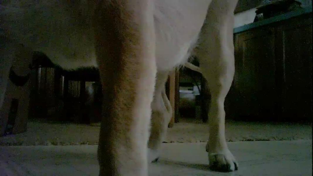
The camera works okay, but it’s positioned a little low for you to get any quality still shots. Unless your pet is standing a few feet away, all you see are legs and paws. It’s also located on the opposite side of the treat dispenser, so if your dog is like mine, that’s the part of the ball they’re most interested in. As you can see from the short video below it’s really hard to make out what is going on when your pet is actually playing with the easyPlay.

The app does allow you to save pics and videos to your camera roll or post them on your favorite social site. Although it’s hard to get any pics or vids worthy of sharing. Images below are unedited to give you an example of the camera quality.

The sound quality of the speaker isn’t very good, and the sound from the built-in microphone sounds like a garbage disposal, luckily you can mute the mic from the app.

Battery life

The easyPlay’s rechargeable battery has a continuous play time of  4.5 hours and a standby time of 12 hours. You can put the easyPlay into sleep mode to save the battery but, this disables the WiFi meaning you can’t access it with the app until the sleep mode timer expires. Another issue I ran into was the pop-up alert you get on the app when the battery is low. It pops up non-stop every few seconds, rendering the app utterly useless. Considering the app already has a battery indicator the pop-up isn’t really necessary.

What I like

  • Durable, well constructed
  • Easy to use
  • The app interface

What needs to be improved

  • Too expensive ($150)
  • Remote control feature only works on completely flat surfaces
  • Poor camera placement and quality
  • Poor sound quality from speaker and microphone
  • Can’t immediately dispense treats
  • Short battery life
  • Food and treats come out too easily, not challenging enough

Final thoughts

Conceptually the easyPlay is a great product, unfortunately, most of what it does suffers from poor execution. Sometimes MORE is LESS, and that’s the case here. easyPlay does a lot of things, but it doesn’t do any of them particularly well. I really wanted to like it, but there are just too many flaws that just can’t be overlooked. However, Zoey does like playing with it if only for the food, so that’s a positive.

Price: $149.95
Where to buy: Amazon
Source: The sample of this product was provided by gosh!.

Filed in categories: Reviews

Tagged:

gosh! easyPlay robotic pet fitness puzzle review originally appeared on The Gadgeteer on August 29, 2018 at 9:00 am.

Note: If you are subscribed to this feed through FeedBurner, please switch to our native feed URL http://the-gadgeteer.com/feed/ in order to ensure continuous delivery.
Giesswein boiled wool shoes review

REVIEW – Giesswein (pronounced geese vine) is an Austrian company who has been in the shoe business since 1954. They offered to let me try their boiled wool shoes and I thought sure, what the heck. They sent them, I’ve been wearing them, let’s find out if boiled wool shoes are as comfy as they look.

What are they?

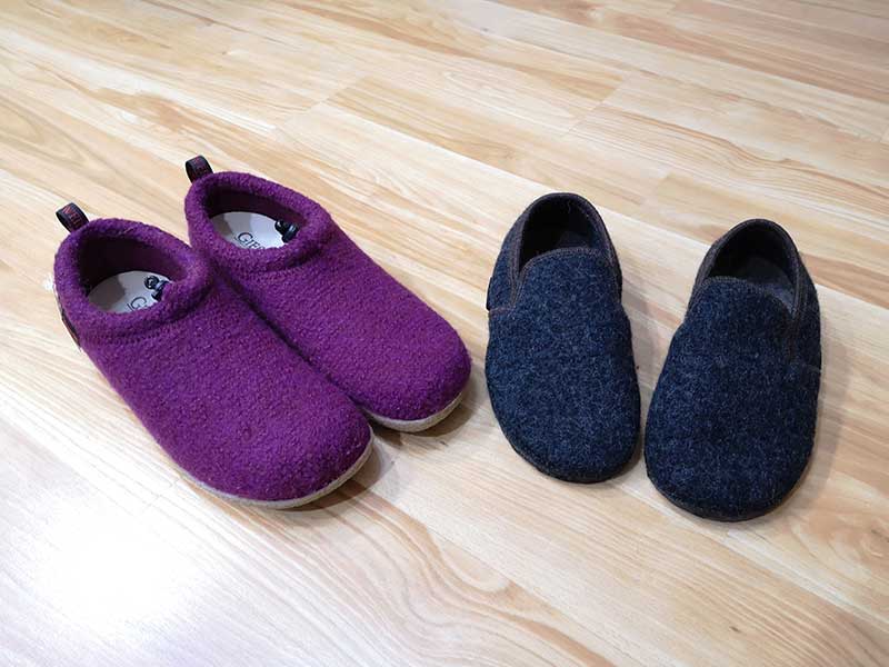
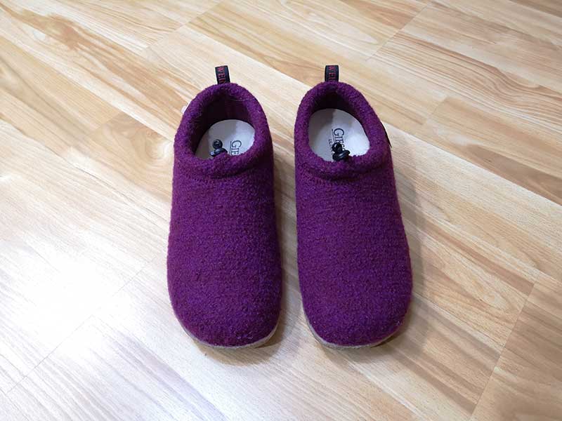
Giesswein shoes are boiled sheep’s wool shoes that have been designed for indoor use and/or outdoor use. Giesswein sent me two styles from their variety of offerings. They sent me the Vent in Plum which are indoor and outdoor shoes and the Andau in Charcoal which are indoor only shoes.

What is boiled wool and how are these shoes made? I’ll let them explain it.

To create our shoes, we begin by weaving the wool into a soft Tyrolean knit, which is then put through a unique process called “fulling” or “Walk” (pronounced vahlke) in German. The knit is washed, agitated, compressed, and subjected to high and low temperature variations in fresh mountain spring water… Giesswein wool is not your average boiled wool, and should never be mistaken for felt. It is lighter, software, and more flexible than felt, and because of the intricate fulling process, it is completely machine-washable.

Design and features

Vent style

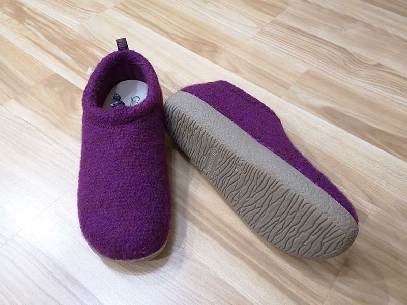
The Vent style shoe is what Giesswein calls a lodge shoe which just means that it is designed to be worn as both an indoor and outdoor shoe. The Vent style is available in several colors including the Plum version that they sent me. I’ve always wanted “purple” shoes 🙂

This style comes in Women’s size 5 – 10 US and Men’s size 7-15.

I’ve never had anything made of boiled wool and had an image in my mind of thick heavy material. Those thoughts were wrong. The Giesswein shoes are not heavy, the natural boiled wool upper makes the shoe relatively lightweight with a soft fuzzy feel.

The Vent shoe has a waterproof rubber outsole which provides a decent grip on slick surfaces and allows you to wear them both in the house and outdoors.

The sole in the image above makes the shoes look sturdy and yes, they are, but they aren’t clunky feeling when you wear them. At least I didn’t think they felt too heavy or awkward to walk in.


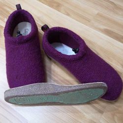
These shoes include a removable cork-latex footbed that has metatarsal and medial arch support. What does that mean? It means your foot is going to be supported and you’ll notice the difference if you’ve been accustomed to wearing shoes and slippers without any support. I sure noticed a difference. At first, I didn’t like the Vent shoes at all because I felt like I was walking around with a ball under my foot. But after just a short adjustment period, I found the shoes to be comfortable to wear all around the house, up and down stairs, out to the garage, down our gravel driveway, etc. The cork footbed is designed to mold to your unique foot shape over time.

Note that these shoes are pretty much impossible to step into and out of without assistance from your hands. This is especially true if you tighten them around your ankle with the built-in cord.

The Vent shoes can be washed in a cold gentle cycle (after removing the cork footbed) and then allowed to air dry overnight.

Andau style

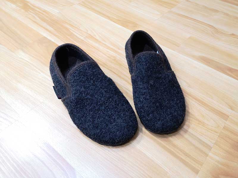
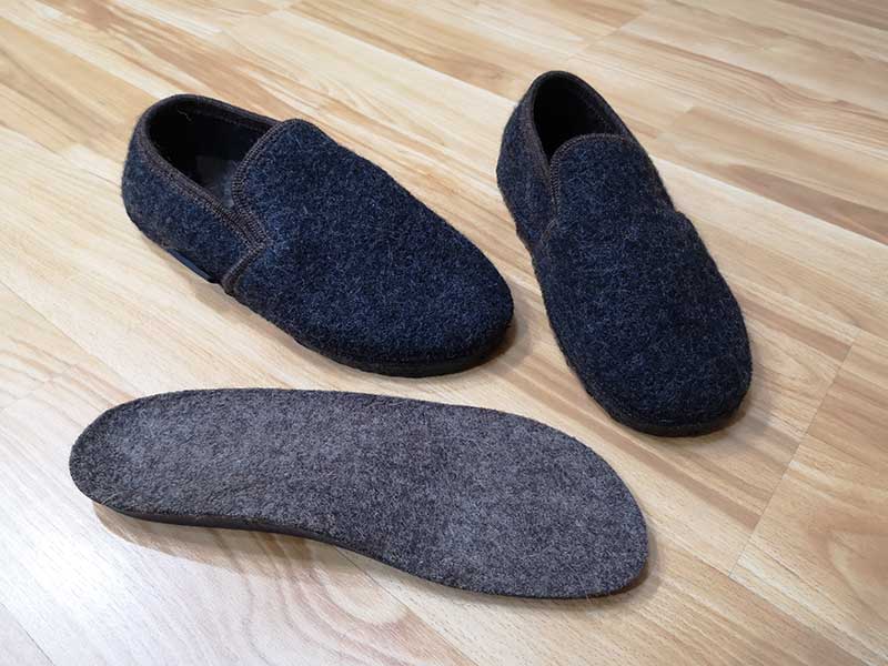
The Andau shoe is a house shoe/slipper and has been designed to be worn as an indoors-only shoe/slipper. It only comes in Charcoal and looks more masculine than the Vent shoe. Like the Vent, the Andau has a removable footbed.

This style comes in Women’s size 5 – 10 US and Men’s size 7-15.

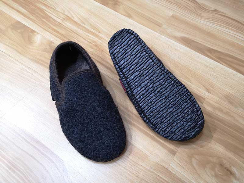
These shoes have a natural latex-dipped outsole that provides grip for hard slick surfaces while remaining thin and flexible.

The Andau footbed isn’t made of cork, but is made of wool and can be washed along with the shoe by removing it and washing in a cold gentle cycle and then allowing it to air dry overnight.

The Andau’s footbed also offers arch support, but I think the Vent’s footbed’s arch support is a lot more noticeable.

What I like

  • Cute
  • Warm if it’s cold and cool if it’s hot
  • Machine washable

What needs to be improved

  • Price, they are expensive

Final thoughts

The Giesswein shoes are well-made and comfortable (after you get used to the arch supports) to wear. The sheep’s wool construction makes them breathable and great at wicking away moisture, all without being itchy and scratchy like you might assume that wool can be. That said, I have two main issues/concerns with these shoes. 1. The fuzzy wool picks up lint and pet hair easily so I am always picking stuff out of the material. 2. These shoes are expensive and pricier than I would care to spend on one pair of house shoes.

I wore these slippers for a couple of weeks and they were comfortable enough, but I can’t say that they were more or less comfortable than other slippers I’ve worn in the past that cost much less. Am I cheapskate when it comes to paying for slippers? Probably. But for the $100+ price tag, I expected the Giesswein shoes to wow my feet. My feet didn’t complain, but they didn’t do a tap dance of joy while wearing them either. So it comes down to if you like the look of these shoes and if you don’t mind the price. If so, then by all means, buy a pair.

Price: Vent $146, Andau $98
Where to buy: Giesswein USA and Amazon
Source: The sample for this review was provided by Giesswein.

Filed in categories: Reviews

Tagged:

Giesswein boiled wool shoes review originally appeared on The Gadgeteer on August 28, 2018 at 1:32 pm.

Note: If you are subscribed to this feed through FeedBurner, please switch to our native feed URL http://the-gadgeteer.com/feed/ in order to ensure continuous delivery.
Understands Evo Walnut Live Edge Desktop Computer Stand review

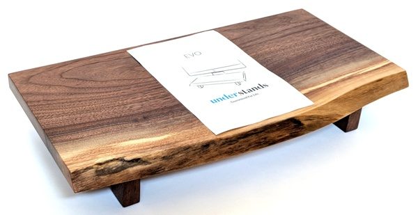
REVIEW – Monitor stands are just the kind of gadget accessory that suits me. They lift your monitor up to a level to help ease any neck discomfort and they help to free up space below the monitor. Since I love small gadgets like the Apple Wireless Keyboard (or Apple Magic Keyboard), the space below the monitor stand is a perfect storage area for a keyboard. I had the opportunity to review the Understands Evo Live Edge Desktop Computer Stand. I found that it is a beautiful high-quality monitor stand made out of walnut and birch and the legs are tall enough and just wide enough to accommodate my keyboard.

What is it?

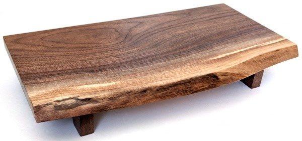
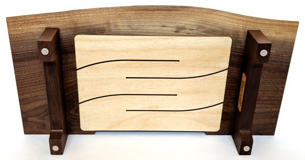
The Understands Evo Live Edge Desktop Computer Stand that I received for review is a gorgeous hand-crafted computer (monitor) stand made out of walnut (with a birch plywood iMac undermount) and is used to elevate your monitor to a level that eases neck pain, frees up space, and brings a bit of nature inside your home or office. Understands makes other styles of wood stands (some with drawers) and also uses different kinds of wood (see the Understands website). All Understands products are made in the United States.

Hardware specs

What’s in the box?

My Understands Evo Live Edge Desktop Computer Stand came with an information sheet that provided information on the care of the stand and stated that it is guaranteed for life.

Design and features

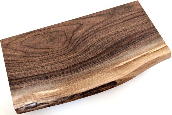
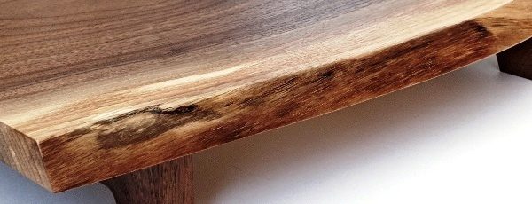
The Evo Walnut stand is hand-made and crafted from “urban walnut sustainably harvested from northern Illinois and southern Wisconsin.” The stand has been tested to hold up to 50 pounds according to Understands.

The above three photos illustrate the beauty and the high-quality materials and craftsmanship involved with making this stand. It also displays the “live edge” feature which gives each piece a distinctively unique look as shown in the last photo. “Live Edge lets you imagine the profile [of] the tree. … Lacquer coating enriches natural beauty and protects from aging and mishaps.”

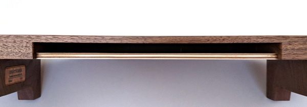
There is an iMac undermount in this stand for iMac and iMac Pro. The bottom of your iMac slides right into this space. If you don’t have an iMac, you would just place your monitor on top of the stand.

The iMac undermount is made of Baltic birch plywood (for strength).

There were supposed to be furniture slides applied to the feet of the stand, but mine was missing these. I applied my own adhesive felt furniture sliders to the stand to help avoid scratching the surface that the stand would rest on.

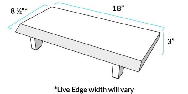
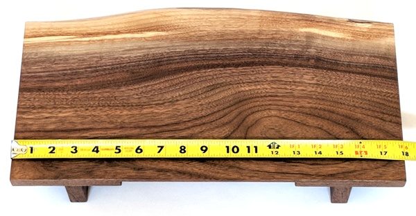
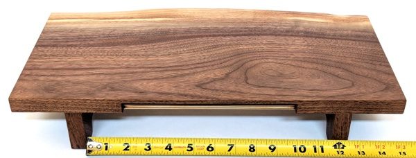
The Evo Monitor stand is 18″ long…

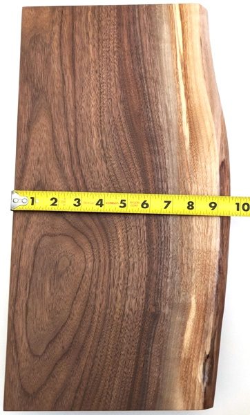
by about 9.5″ at it widest point (each stand will differ in this measurement due to the variation in the Live Edge feature)…

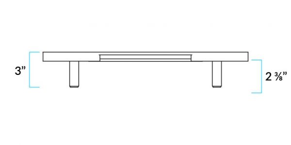
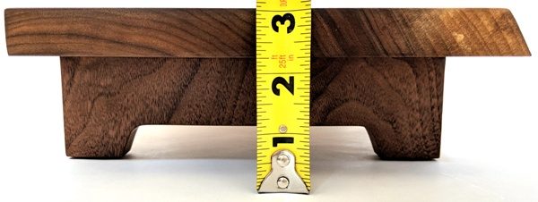
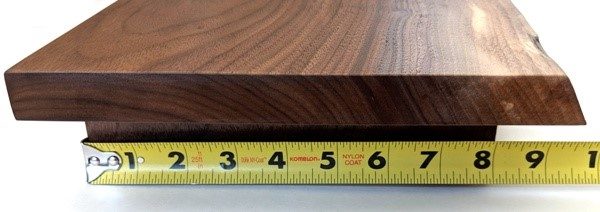
by 3″ tall.

The measurement between the legs of the stand is slightly over 11.5″.

And last, the width of the legs is 8″.

Performance

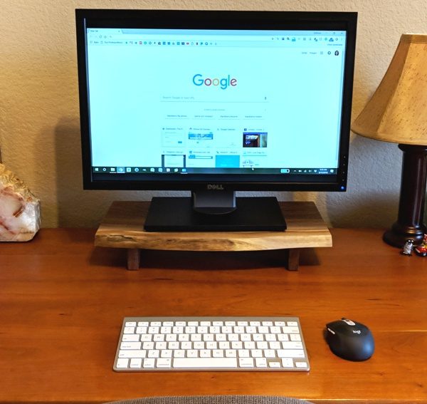
The Understands Evo Walnut Live Edge Desktop Computer Stand elevated my monitor to a comfortable viewing height for me.

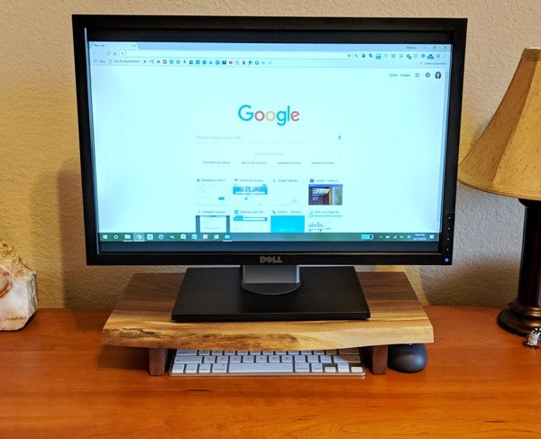
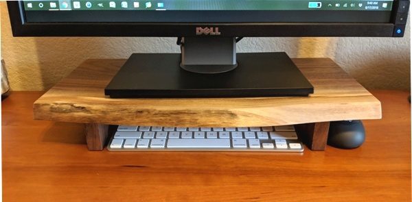
And there was enough room under the stand to store my keyboard.

Not only did it perfectly store my Apple Wireless Keyboard (it will also store the small Apple Magic Keyboard), but I found a place to store my mouse too (right next to the right leg of the stand as shown in the photo above)! Ergonomic viewing height, storage for my keyboard and mouse, and high-quality materials and craftsmanship all make this a wonderful computer accessory. It’s also durable, strong, and brings the outdoors in. I have really enjoyed using this stand. I’ve also enjoyed just looking at it because it is so attractive.
To keep the stand looking its best, Understands recommends using a damp cloth to clean it and they suggest keeping it out of direct sunlight and away from heating vents which can cause cracks and warping.

What I like

  • It stores my Apple Wireless Keyboard perfectly
  • It places my monitor at a comfortable viewing level to help alleviate neck strain
  • It is made from high-quality solid walnut and birch plywood
  • It is hand-crafted
  • It is durable and strong (will hold up to 50 pounds according to Understands)
  • Its Live Edge feature makes it unique and beautiful
  • It is guaranteed for life

What needs to be improved

  • It is a bit expensive

Final thoughts

I thoroughly enjoy using the Understands Evo Walnut Live Edge Desktop Computer Stand. It’s so difficult to find such beautiful high-quality solid hardwood furniture these days, but the Evo Walnut stand is one of those pieces. It is a fabulous, well-made, hand-crafted, durable monitor stand that keeps my monitor at a comfortable viewing height, provides me with enough room to store my Apple Wireless Keyboard beneath the stand and even tuck my mouse off to the side. It’s also just beautiful to look at. It is a bit expensive, but if funds aren’t an issue, I don’t think you’ll be disappointed with this purchase.

Price: $109.00
Where to buy: Understands
Source: The sample of this product was provided by Understands.

Filed in categories: Reviews

Tagged:

Understands Evo Walnut Live Edge Desktop Computer Stand review originally appeared on The Gadgeteer on August 28, 2018 at 9:00 am.

Note: If you are subscribed to this feed through FeedBurner, please switch to our native feed URL http://the-gadgeteer.com/feed/ in order to ensure continuous delivery.