Cascade Wallet review


REVIEW – If you like gadgets and mechanisms (and you likely do since you’re here), the Cascade Wallet might be something to take a closer look at. Being a daily-carry item, a good wallet is a necessity. Mani Wonders has a very technical take on what makes a good wallet. It definitely caught my attention. Let’s jump to the test drive.

What is it?

The Cascade Wallet is a minimalistic credit card case with a sliding mechanism for accessing the cards along with a hidden money clip for cash and other thin items like business cards. A snap-on cover (available separately) lets you expand the storage capabilities.

Hardware specs

Wallet

  • Aircraft aluminum construction
  • RFID protection
  • Credit card lifting mechanism
  • Holds 5-6 cards
  • Hidden money clip
  • Dimensions 66.9 x 10.2 x 100.9mm

Cover (Sold separately)

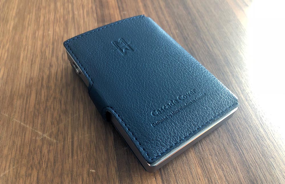
  • Leather construction
  • Metal snap pins
  • Velcro closure
  • 4 card slots
  • Cash area

What’s in the boxes?

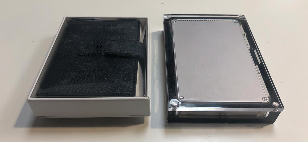
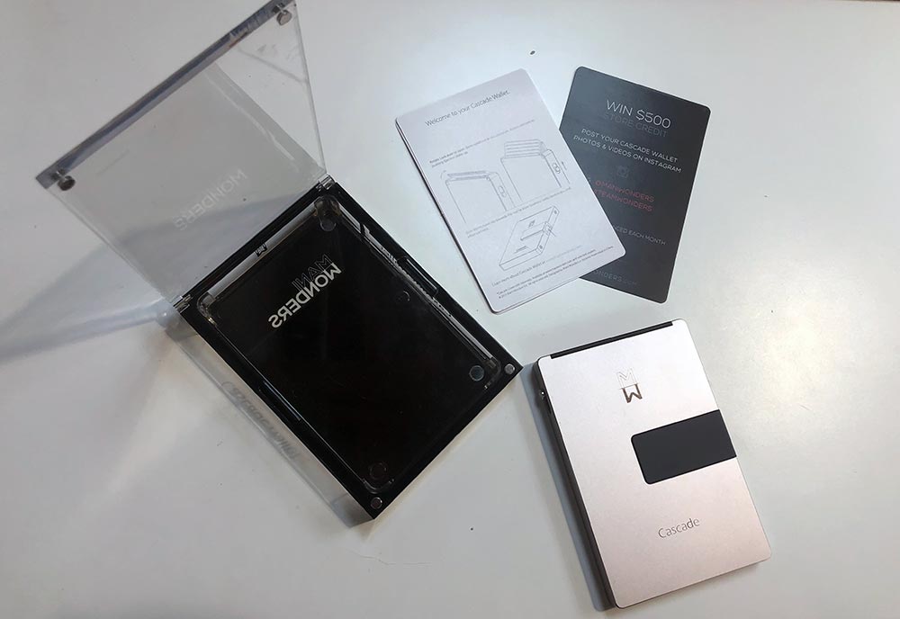
  • Cascade Wallet
  • Instruction card
  • Cascade Wallet Cover

Design and features

The Cascade Wallet is extremely well made. It’s primarily a two part, aluminum construction. The front half, sides and bottom are all a single part with mounting areas for the credit card door, slider switch and the money clip. The back plate hides the internals.
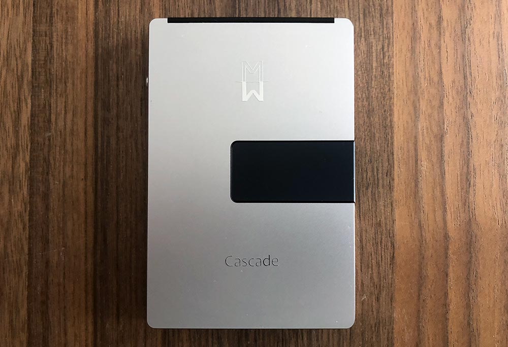
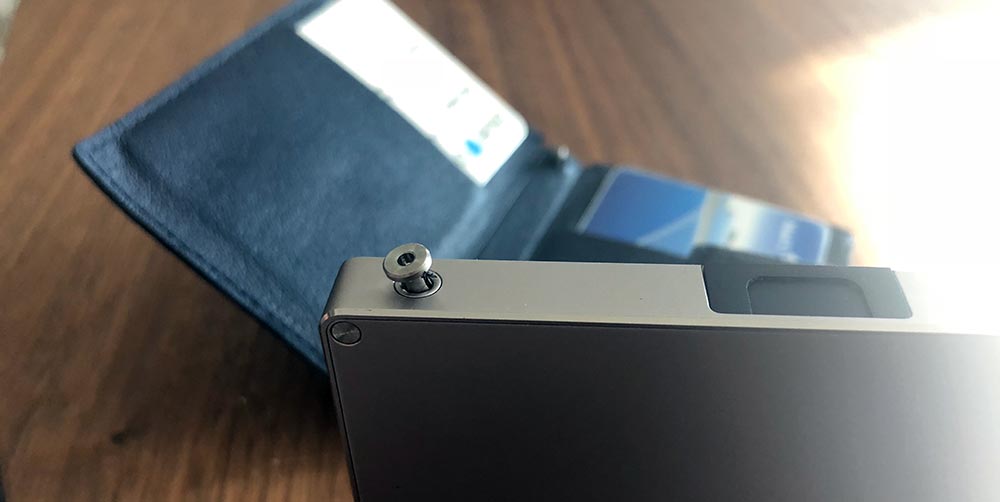
The right side of the case houses the money clip lever and has two flush receiving rivets for attaching the cover.

The slider switch lives on the left side of the case which is used to raise credit cards out of the wallet.

The credit card door is on the top and has a serrated edge used for opening the constant resistance hinge.
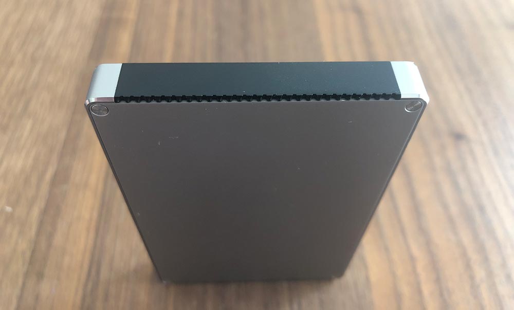
Setup

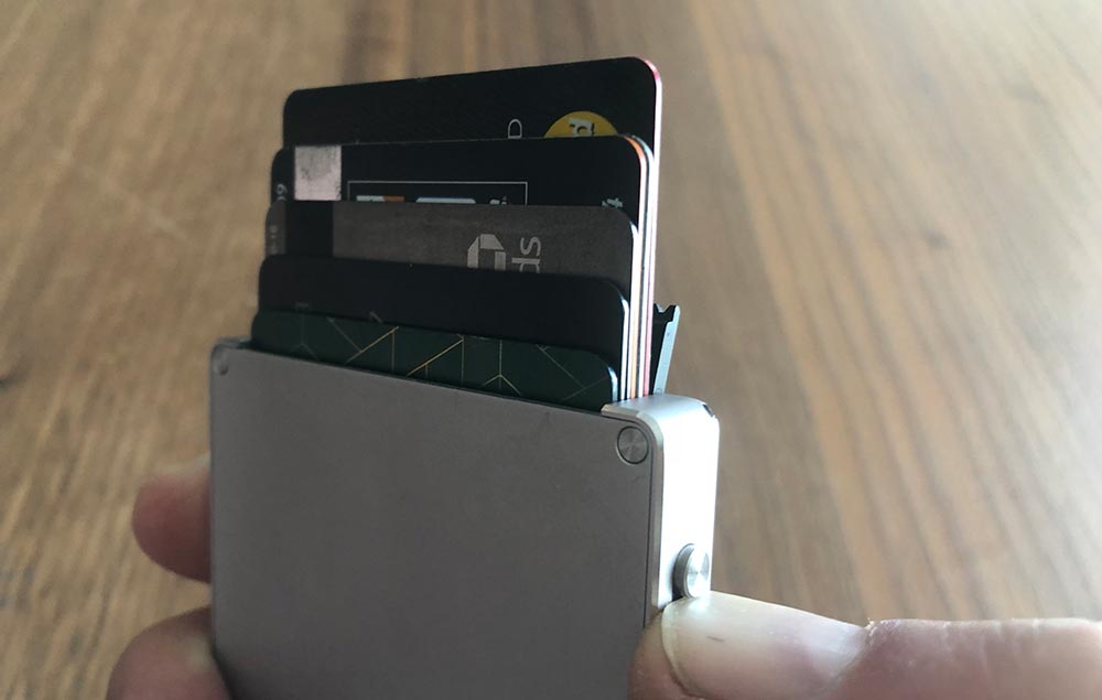
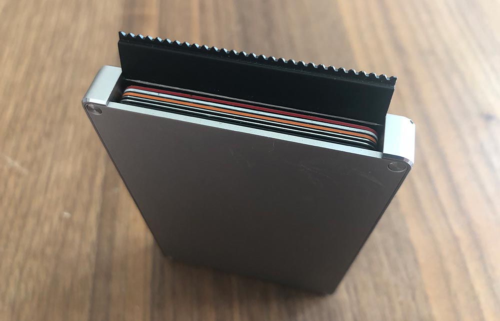
Part of starting to use any new wallet is figuring out which cards to put where. Using the Cascade Wallet (without a cover) makes this pretty simple as there is room for 5-6 cards. More and more credit cards have moved away from having raised numbers on the card’s face. If you’re running more of the flush, you should be able to get 6 in there.
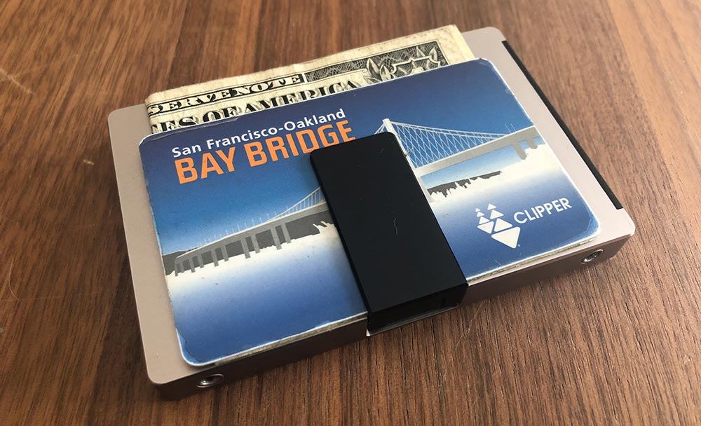
The money clip will hold a few bills and a card.
If you choose to purchase the cover, you’ll have some additional storage options. Installation isn’t hard, but it’s a bit tricky. Inside the cover on the spine are two small metal posts. You’ll want to align these with the two holes on the wallet and then press down on the wallet as shown below.
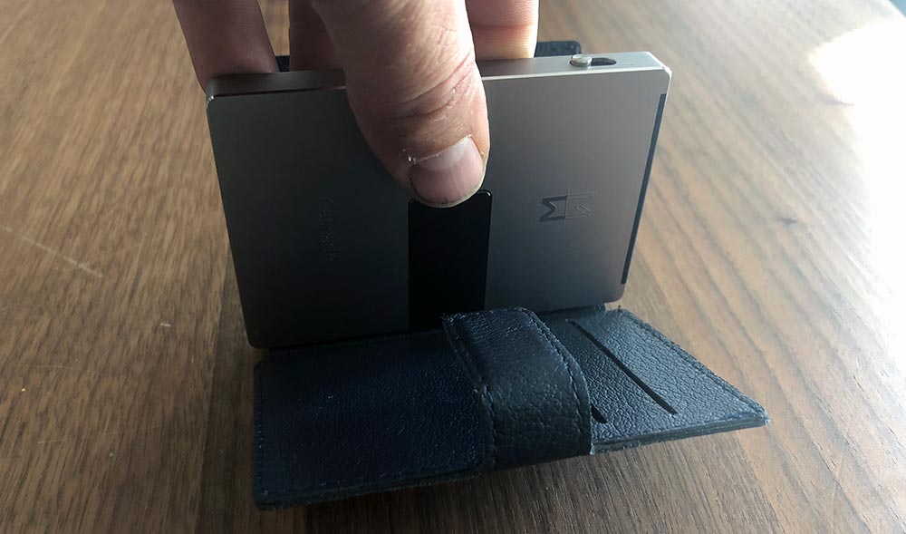
Once installed, the velcro holds the cover closed around the wallet.

Performance

It’s really a shame that the wallet is as beautiful as it is as I really wanted to like it, and there are plenty of things to like. They’re just overshadowed by functional issues that for me, resulted in returning to my previous wallet.

The key feature is the switch that slides the cards up. When it works, it’s magical. It fans the cards semi-evenly depending on the thickness and stack order of your cards.

So first things first. You can’t use the switch unless you have already pivoted open the door. This door is tight enough that initially, you think you are doing something wrong. On the plus side, this is never going to accidentally swing open.

The switch itself protrudes slightly and if you try and slide it single-handed with your thumb, the inward pressure of your thumb jams the mechanism. If I use the top of my thumbnail, it works much better, but it’s less of a natural motion. Using my other thumb (which is already close by from opening the door) doesn’t offer any advantages.

In this photo, you can see the stepped lifter at the bottom of the inside. As that rotates it lifts each of the cards to different heights.
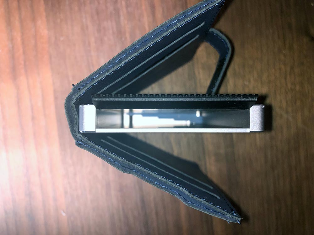
Next up. You may have noticed I didn’t say 1-6 cards. If you have a single card in the wallet, it rattles around, but depending on which way you’re holding the wallet it will rest on a different lifter when you use the switch. It might be barely up, fully up or somewhere in the middle. The same thing happens with 3-4 cards, or even with 6 if you happen to have closed your wallet while you’re using the one you took out, making it a bit tricky to figure out where to put the one back.
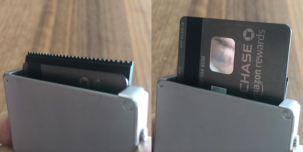
Even if you do have the full 6 cards in there, extracting the one you want is more challenging than you would think. The front and back cards are pretty easy, but ones in the middle are tricky, especially if they’re paired up like the two in the photo above. If you tip the wallet to help out, there’s zero retention and all six go sliding out (usually at speed).

Let’s move onto the money clip. It’s really cool that they were able to design a mechanism that sits this flush when not in use. To open the money clip, you need to slide the clip towards the front of the wallet with your thumb. This motion, while opening the clip, tilts the front edge of the clip enough where it’s hiding again.
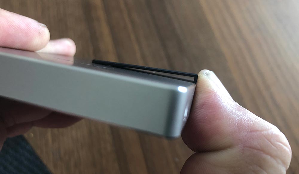
As a result, you end up trying to wedge your bill or card underneath the edge closest to your thumb and then navigating your cash into place. After numerous tries, I figured out that you can push it up and then rock your thumb backward to kinda level out the clip. Not ideal. It also opens just far enough to tackle a bill or two. If you paid with a 20 and got back 8 in bills, you’ll be fighting it a bit.

At this point, I opted to try out the cover. The RFID function of the main wallet is a great safety feature, but also means that my transit card won’t work at readers, so I already knew I’d end up using the cover for regular use. With the cover on, I was able to put 6 cards inside the wallet, health/insurance cards in the left side of the cover and my Clipper and driver’s license on the right side.

The cover’s length is about 15mm short of being able to put bills in without folding, so you’ll have to decide your preferred folding, lump stack up. All closed up the wallet doubles in thickness to about 20mm loaded this way. Still pretty thin, but just an FYI.
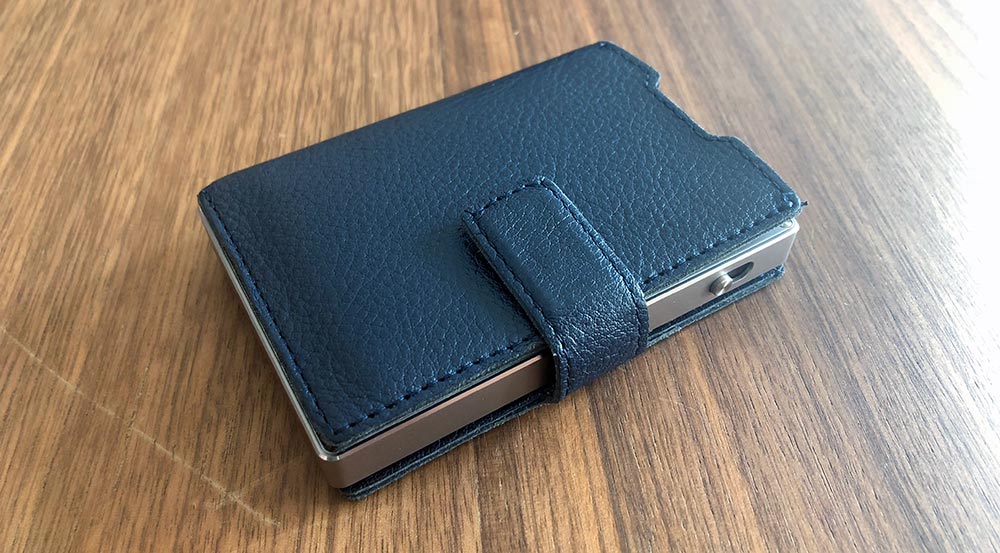
It’s also worth noting that once you have the cover on, it further renders the money clip useless as the lever is now trapped inside the spine of the cover.
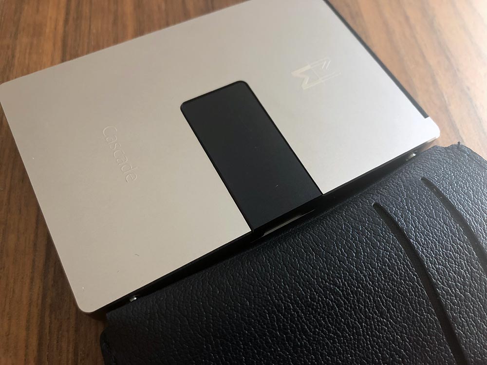
When it came time to take some photos for this review I needed to take the cover back off. There are no instructions on how to do this in the card that came with the wallet and none on their site. I would imagine that the pins relax a bit over time, and maybe Mani Wonders didn’t think someone would take the cover back off this quickly, but it was not trivial. In fact, both of the pins pulled through the cover and sat proudly from the side of the wallet. At that point, they were much easier to remove.
What I like

  • The slim aesthetic and overall size
  • The intent of the design
  • The materials

What needs to be improved

  • Functionality
  • Cost

Final thoughts

There’s so much potential here, but so many misses when it comes to the core functionality of a wallet. I need to be able to quickly get to the card I need, use it and return it without challenge. With the Cascade Wallet, it felt like I had passed some kind of a test if it all went as it should. The materials and attention to detail are amazing, but it’s really hard to ignore functionality problems this big, especially at this price. Here’s hoping they can figure out how to make V2 better.

Price: $159 ($39 extra for cover)
Where to buy: Mani Wonders
Source: The sample of this product was provided by Mani Wonders.

Filed in categories: Reviews

Tagged:

Cascade Wallet review originally appeared on The Gadgeteer on September 26, 2018 at 11:00 am.

Note: If you are subscribed to this feed through FeedBurner, please switch to our native feed URL http://the-gadgeteer.com/feed/ in order to ensure continuous delivery.

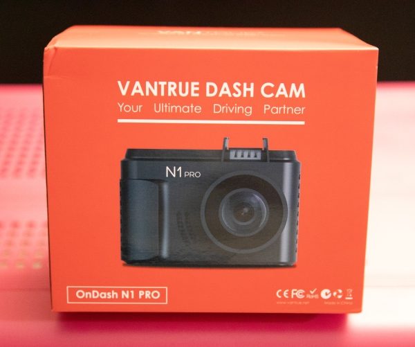
Vantrue N1 Pro Mini Dash Cam review


REVIEW – For many years, I really disliked dash cameras. I felt like they were in the way of my vision, and always had some sort of shortcoming, whether it was the quality of the footage or connectivity that made me say away from them. Most recently I have been able to test and review a few of them, and I have begun to like them more as the overall quality has increased. This dashcam really caught my interest because of its really tiny size and yet indications of nice built-in features.

What is it?

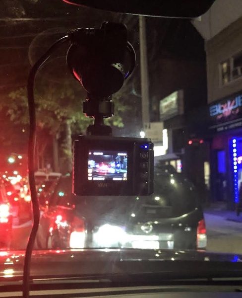
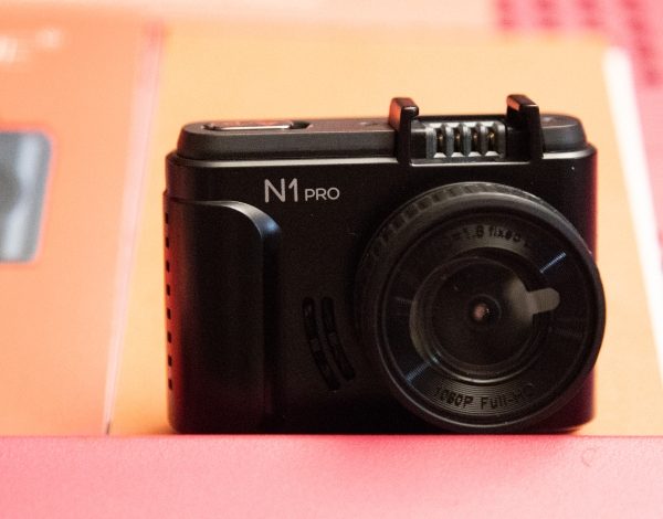
The Vantrue Dash Cam is a “tiny” dash cam with a 1.5″ LCD and a 160-degree wide angle lens that produces full 1080P HD footage and includes features like Parking Mode and collision detection.

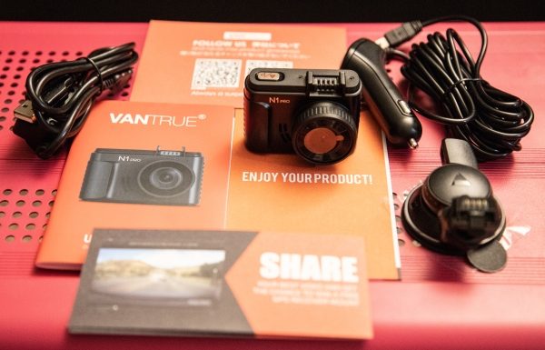
What’s in the box


1 x Vantrue N1 Pro Dash Cam
1 x Suction cup mount
1 x 3’ Micro USB data cable
1 x Car charger/power adapter with connected 10’ mini USB cable
1 x User Guide
1 x Quick Start Guide
1 x Warranty card

Design and features

This dash cam has a tiny and compact design and measures 1″ x  2 1/2″ x 1 1/2″.

Specifications:

Display: 1.5 inch TFT LCD (4:3)
Lens: 160-degree wide viewing angle and a full 6 layer glass lens with a wide aperture of F/2.0
Languages: English/Japanese/Germany/简体中文
Video Format: .MOV; H.264 compressed format
Video Resolution: 1920x1080P30, 1280x720P30
Image Resolution: 12M Pixels
Image Format: JPEG
Motion Detection: ON/OFF
Parking Monitor: ON/OFF
Audio Recording: ON/OFF
Memory Card: Micro SD Card up to 64GB (Class 10; in FAT32 format)
MIC/Speaker: Built-In
Backlight: Off ON/OFF
USB Port: USB 2.0, mini
Battery Capacity: 130mAh
PC Operation System: Windows XP/Vista/Windows 7/Windows 8/Window 10/Mac

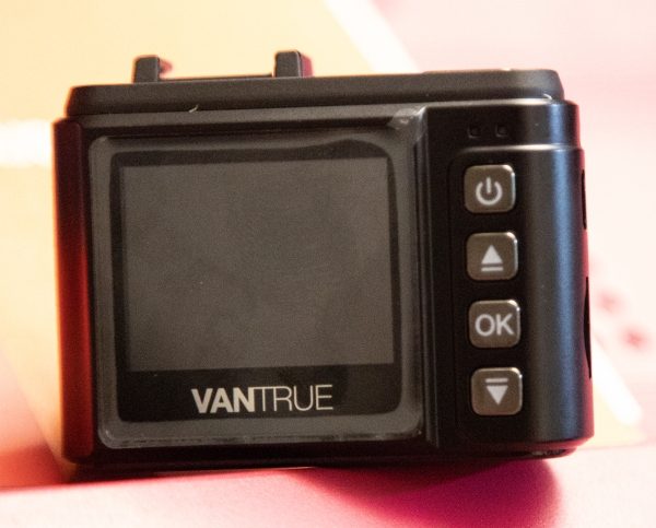
On the front of the camera, there is the logo and to the right of it the camera lens. On the back on the top right-hand corner, there are 2 LED indicators that show when the camera is charging and when it is recording. In the column of the 4 buttons, the top button is on/off power button, the second is the upward selection button that also serves as the fast forward playback button and as the microphone on/off switch. Next, there is the OK button that starts and stops video recording and performs the “confirmed” function, and last, there is the downward selection button that also serves as the slow forward playback button and to turn the screen on or off.

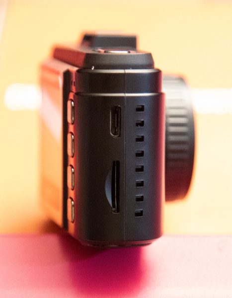
On one side of the camera, there is a micro USB port on top for charging or data transfers, and a micro SD card slot below.


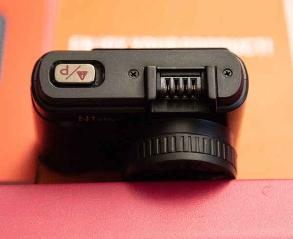
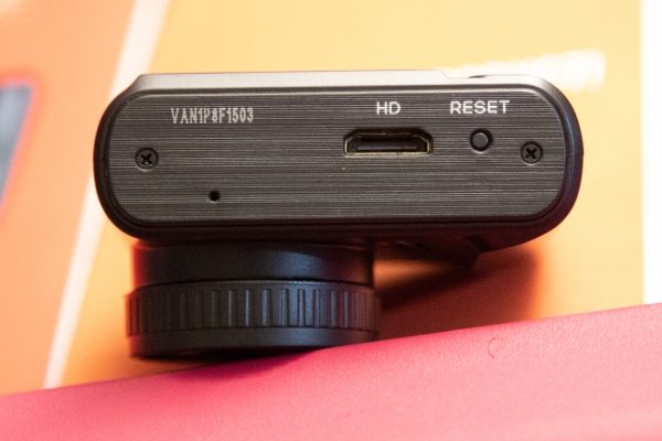
At the top of the dash cam to the left, there is the emergency mode button that you press to capture a photo while the camera is recording, and a long press, while the camera is recording, will put it in Parking Mode. To the right of the emergency mode button, is the connection that receives power for the camera once it is connected to the mount and the mount is plugged in. At the bottom of the camera as shown below is the HDMI port and the factory reset button.


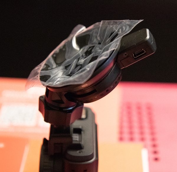
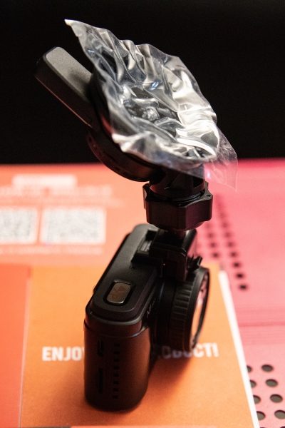
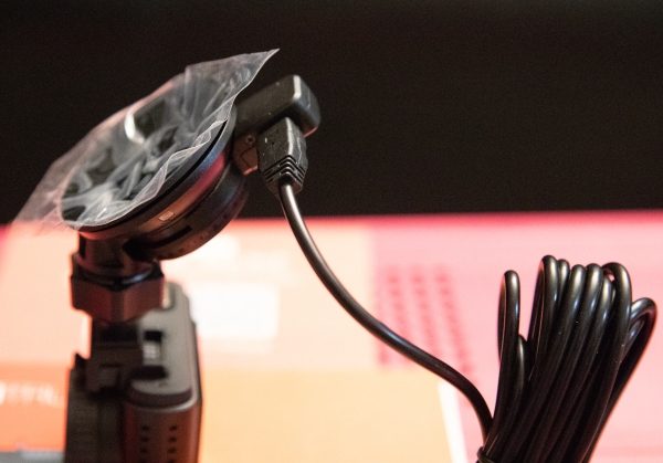
The 3 pictures below are of the windshield mount and they show how it is positioned when connected to the dash cam, the mini USB power jack and how the power adapter is connected to the mount.


Performance

This dashcam really performs well. The settings are easy to navigate and the choices are very straightforward. The image stabilization works well and the video and images are clear even in overcast and/or rainy conditions. Its “tiny” size, it has no noticeable effect on your view when driving.


It includes features like 1080P/30 fps HD video with Supper Night Vision, seamless loop recording on micro SD cards up to 256GB, and a G-sensor that automatically detects a sudden shake/collision and locks the footage to prevent the video from being overwritten even in loop recording. The 24-hour Parking Monitor motion activated parking mode allows the camera to automatically record when it detects motion in front of your car. To take advantage of this feature, the power adapter should be plugged into an “always on” outlet or hard-wired to the battery. This way, if the dash cam is off and it detects a crash to the front of the vehicle, it will turn on and end recording after 20 seconds, and the recorded videos are saved and locked.

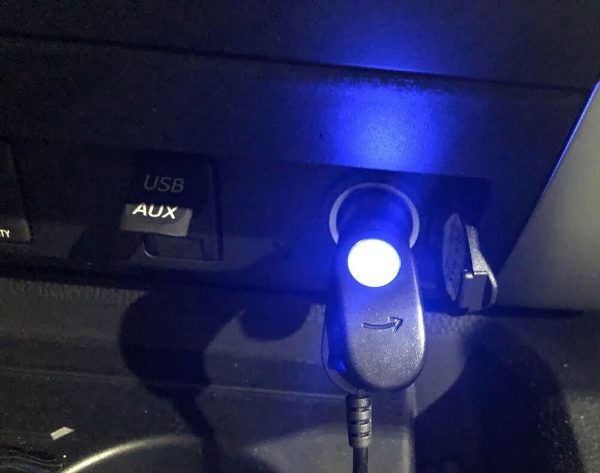
If you enable the time-lapse feature, the Vantrue N1 will keep taking photos at the set time interval and then auto edit them together to a video clip. This reduces the size of the video file. The dash cam also provides excellent audio quality. I also like that the power adapter has a nice blue LED on the end that plugs into your vehicle. Not only does it indicate power on/off, but it is a nice interior light.

Videos


What I like

  • I love the size
  • The video quality
  • The features and ease of use

What can be improved

  • The connector to the dash/windshield mount

Final thoughts

Out of all of the dash cams that I have owned and/or tested, I like this one the best. It is so small that it does not present any type of bothersome obstruction of your view and yet it functions much like the bigger and more expensive dash cams. While it is not 4K, its footage is perfect for its function and quite “crisp and clean”. It is simple and effective, and gets an exuberant thumbs up from me!!

Price: $79.99
Where to buy: Amazon
Source: The sample for this review was provided by Vantrue.

Filed in categories: Reviews

Tagged: ,

Vantrue N1 Pro Mini Dash Cam review originally appeared on The Gadgeteer on September 26, 2018 at 9:00 am.

Note: If you are subscribed to this feed through FeedBurner, please switch to our native feed URL http://the-gadgeteer.com/feed/ in order to ensure continuous delivery.
Neato Botvac D7 robot vacuum review

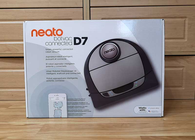
REVIEW – I haven’t vacuumed the floors in my home for almost 3 years. Before you think I live in squalor, I said that I haven’t vacuumed. That doesn’t mean that my floors haven’t been cleaned. They have, just not by me. I have a robot that does that for me. Since my review of the Neato Botvac 80 back in 2015, I’ve been completely spoiled by the fact that I don’t have to push a vacuum cleaner around my 2 story home. A few years after reviewing the Botvac 80, I was sent the Neato Botvac Connected WiFi and have been using both units. One on the first floor and one on the 2nd floor of my home. And now I have been given the opportunity to review Neato’s latest robot vac, the D7. Let’s see if it sucks but in a good way.

What is it?

The Neato Botvac Connected D7 is a robot vacuum that maps out your home and cleans the floors while you do something more fun and productive.

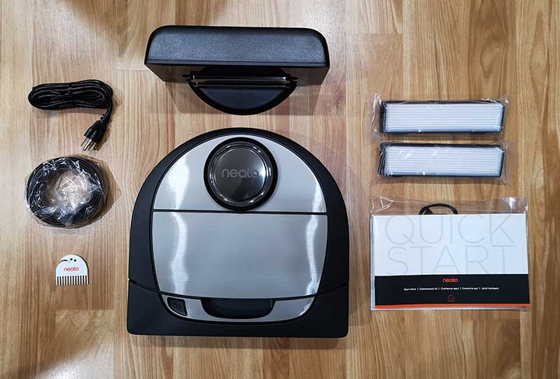
What’s in the box?

Neato Botvac D7 Connected robot vacuum
Charge Base
Power Cord
Spiral Combo Brush
Ultra Performance Filter
Brush and Filter Cleaning Tool
Boundary Markers (2M)
Manual

Hardware specs

Connectivity – Wifi 2.4Ghz + 5Ghz
Dimension – 13.21 inch x 12.56 inch x 3.92 inch
Weight – 7.5lbs
Dustbin Capacity – 0.7 liters
Cleaning Path – 12 inch
Battery – Lithium Ion
Run Time – Up to 120 minutes
Charge Time – Up to 150 minutes

Design and features

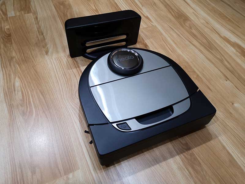
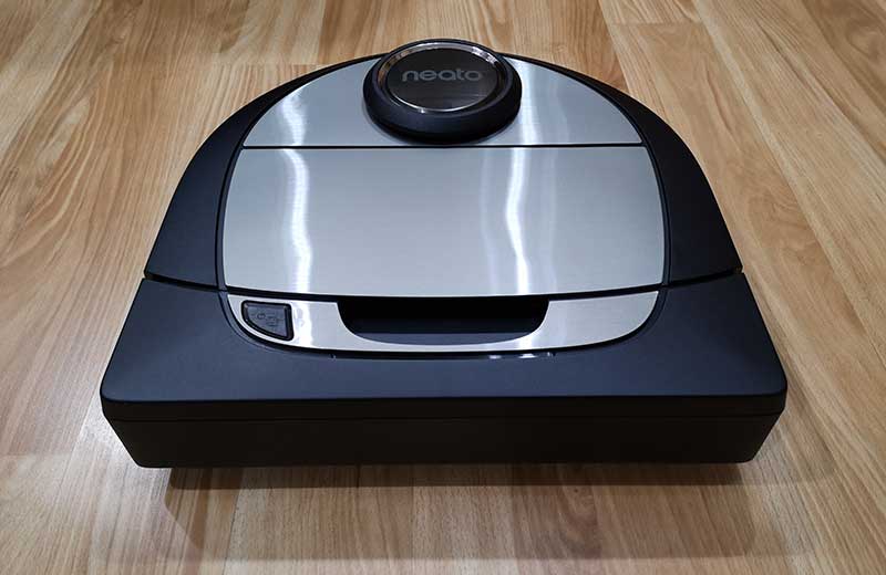
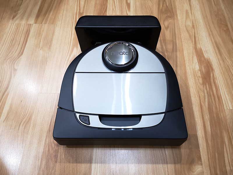
Like the other two Neato Botvacs that I have reviewed, the D7 has the same D shape body that helps it clean close to walls and corners, unlike other brands of circular robot vacuums that can’t get into tight corners.

The D7 has a dark gray/black body with brushed silver accents. The front bumper has a handle cutout so you can carry the vacuum with one hand.

The other Neato Botvacs had a small display and touch buttons for navigating the menus that were used for setting the time and configuring the cleaning schedule. The newer D7 doesn’t have a display because the settings are all done using the Neato app.

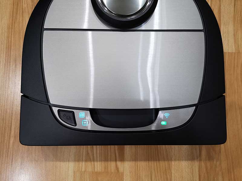
There is one button and four status LEDs on the top of the D7. The start button turns the vacuum on and can be used to manually initiate a whole house cleaning session when pressed once or a 7ft x 7ft spot cleaning session when pressed twice. Pressing the button while the vacuum is in a cleaning session will pause cleaning and pressing and holding the start button will cancel the cleaning session.

The two icons next to the start button show the whole house clean status and the spot clean status. On the other side of the handle cutout are two more LED status icons for the WiFi connection and the battery charge status. The battery status icon glows green when the battery is full, yellow when low, and red when empty.

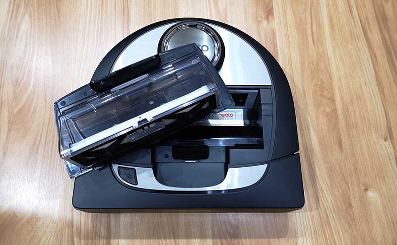
The lid on the top of the vacuum lifts off to reveal the dirt bin and filter holder which is built into the lid.


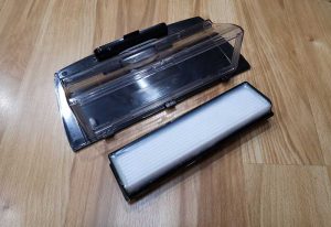
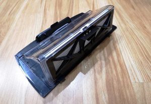
The D7 ships with one filter already installed and two extras in the box. The filter is easy to remove from the dirt bin by just pinching the clip between two fingers and lifting it off the bin. The bin’s contents can then be dumped in a trash can.

The Neato Botvac has a built-in laser which helps the vacuum navigate around the room to build a map and not run into things. The disc-shaped protrusion on top of the vacuum covers the laser and helps protect it from dirt and dust.

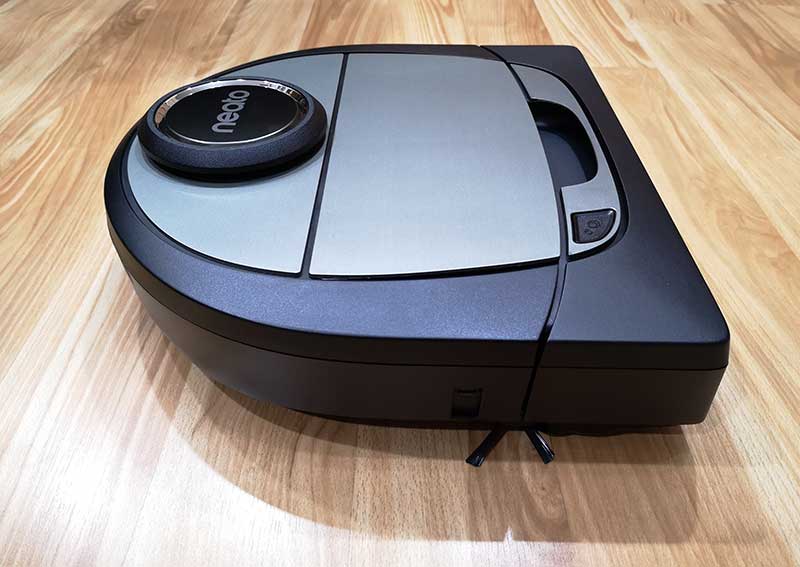
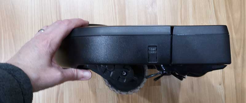
Here’s a side view of the Botvac D7. It shows the large wheels in the back and the side brush along with the front bumper.

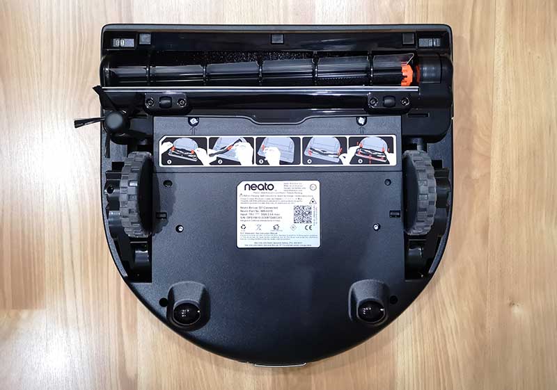
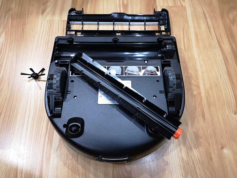
A view of the bottom of the vacuum lets you see the main wheels and smaller back wheels. You can also see the brush and in the upper corners of the front bumper, you can see two rectangular windows that cover the drop sensors so the vacuum doesn’t take a tumble down stairs.

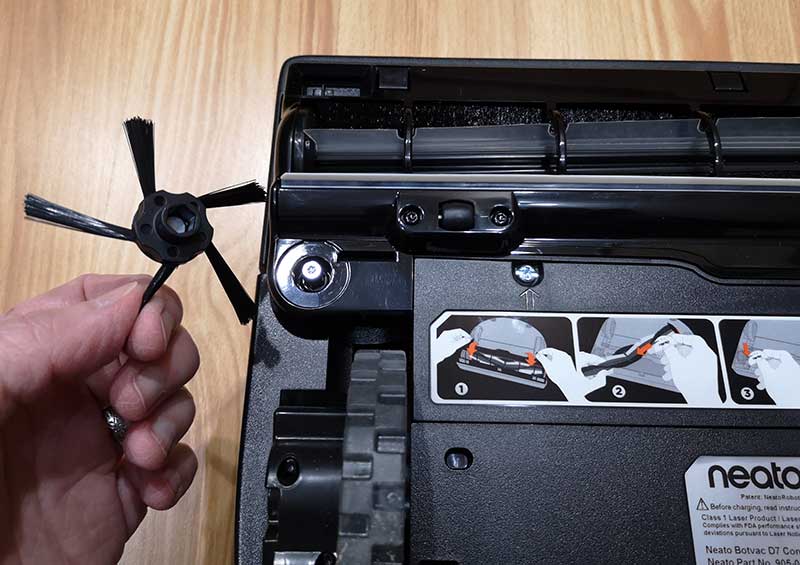
The side brush is held in place with a magnet. This small brush is used to clean dirt and dust from edges as the vacuum travels around the room.

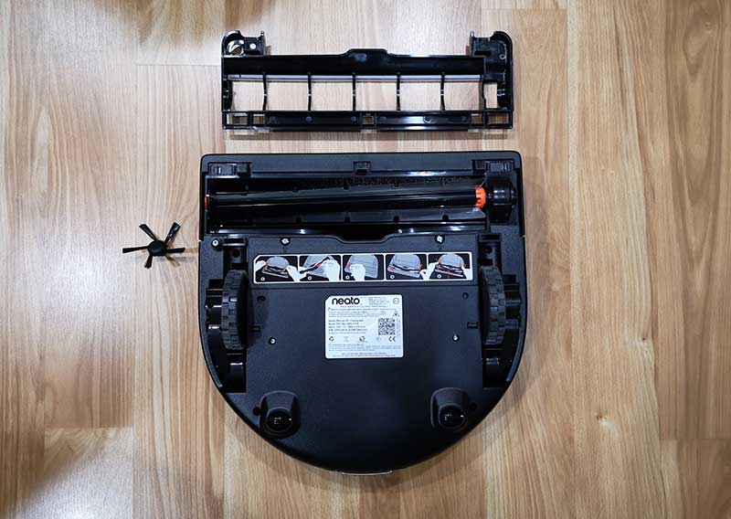
The plastic brush guard lifts off to provide access to the brush.

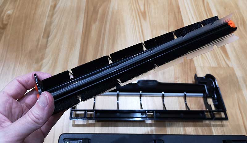
The brush lifts out so that you can easily clean it when needed.

The D7’s brush has bristles for cleaning carpet and flat flexible plastic flaps that clean up dirt from surfaces like wood, vinyl, and tile.

Like the other Botvacs that I’ve reviewed, the D7 ships with a charging dock. This dock has a cord that plugs into a wall outlet and is where your Botvac “lives” when it’s not cleaning your floors. The vacuum automatically goes back to the dock after each cleaning session to recharge and get ready to clean the next time you need it.

The Neato App


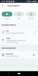
Although you can use the Neato Botvac D7 without using the mobile app, you’ll want to use the app in order to take advantage of the extra features that it provides, like scheduling cleanings and setting up no-go lines.


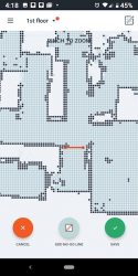
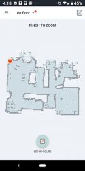
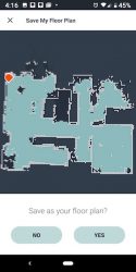
When the D7 cleans a floor, it will create a map which you can then add no-go lines to keep the vacuum from going into certain areas or rooms. I used the no-go lines to prevent the vac from going into our bathroom when it cleans because we have a fuzzy rug in there that we sometimes forget to roll up on cleaning days. If we forget and the vac cleans that room, it will usually suck up the corner of the rug and get stuck there until someone comes home and rescues it.


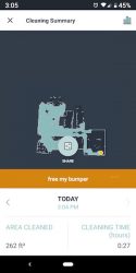
The app will let you scheduled days and cleaning times and will show you when the vac is cleaning and the status of the session.


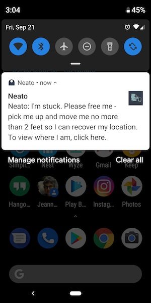
The app will also send notifications to your device if there are problems.

I wasn’t sure that I was going to like the fact that Neato removed the display on the vacs, but in all honesty, using the app is a lot easier than stooping over the vac trying to see the small display and navigate using the touch buttons.

See it in action

NOTE: The video has been sped up, but you can see the time in the right corner.

As far as how the Neato Botvac D7 performs compared to my other two Botvacs, I would say that it seems to be similar to the Neato Botvac Connected WiFi model as far as how well it does navigating around obstacles.

I even set up a complicated “web” of objects in my office and the D7 was able to sweep around the stool and table legs and was able to keep from getting stuck under the low bar on the rolling desk. I was impressed.

As far as how well it does at vacuuming, it does an awesome job of picking up all the dirt and dust on our carpeted floors and hard surface floors. We have a cat who has a litter box, and the D7 is able to pick up the little litter granules that end up getting scattered on the bathroom floor where we keep his litter box. It also picks up his long cat hair. It just does an all-around excellent job of keeping our floors clean without us having to do any of the work.

What I like

  • Easy to set up using the app or manually
  • Very good suction
  • Long run time per charge
  • Only consumable is the filter, but they can be cleaned and reused over and over again

What needs to be improved

  • Expensive

Final thoughts

I’ve been impressed with Neato Botvacs from the first day I started using them back in 2015. I know that statement sort of sounds like something a shill might say, but I can’t say enough good things about this particular brand of robot vacuum. I’ve tried several other robot vacs that are nowhere near as good as far as cleaning up dirt and navigating obstacles.

Price: $799.99
Where to buy: Amazon
Source: The sample for this review was provided by Neato.

Filed in categories: Reviews

Tagged:

Neato Botvac D7 robot vacuum review originally appeared on The Gadgeteer on September 25, 2018 at 11:00 am.

Note: If you are subscribed to this feed through FeedBurner, please switch to our native feed URL http://the-gadgeteer.com/feed/ in order to ensure continuous delivery.
Jabra Engage 75 stereo headset review

REVIEW – I’ve had office headsets before, but that was over 20 years ago. Today we’ve got desk phones, smartphones, desktop computers… the list goes on. The Jabra Engage 75 is a professional wireless headset system designed to work with all of these devices in a unified package.

What is it?

The Jabra Engage 75 is a wireless headset that provides simultaneous connections to up to five devices. It can connect to desk phone, softphone, analog phone, and two Bluetooth devices.

Hardware specs

Battery Timer: 13 hours
Wireless Range: 150 meters / 490 feet
Connect up to: 5 devices

What’s in the box?

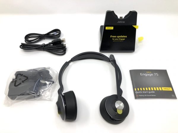
The kit comes with the headset, base, phone cord, USB cable, power supply and quick start guide.

Design and features

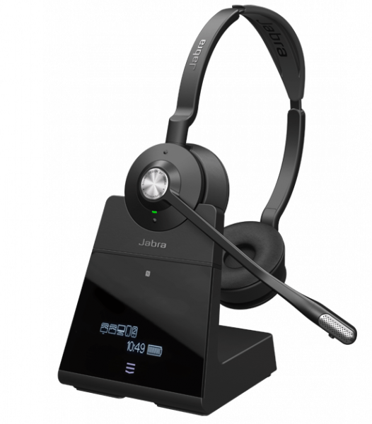
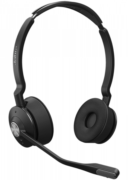
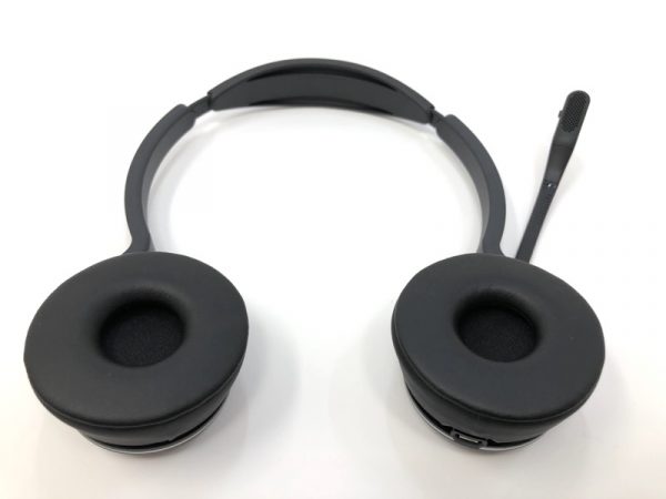
This particular model has two ear cups. It will produce stereo audio if you’re connected to such a source such as playing music back from your phone.


The cups do fold back as part of the swiveling design.

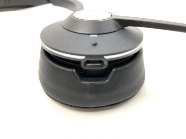
On the bottom of one of the cups is the dock connector.

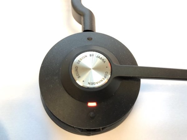
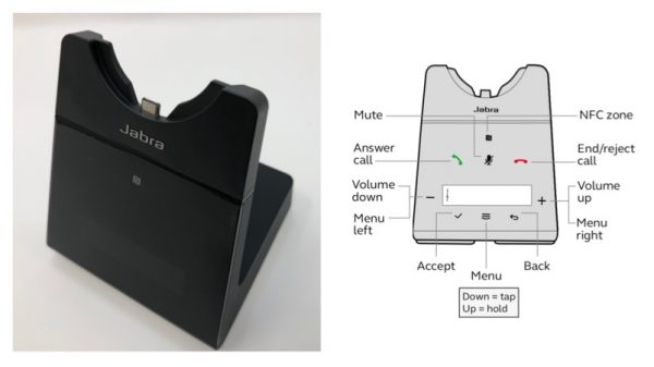
The silver disk in the center is the pick up/hang up button. Two tiny bumps control volume.

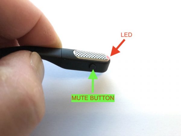
The tip of the microphone hides a tiny “busy” LED to let others know you’re in on a call. There’s a hidden mute button as well. This mutes your outgoing audio.

Setup

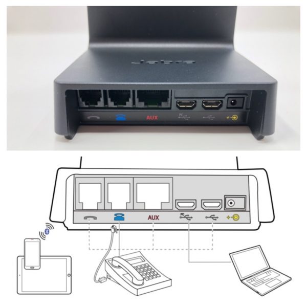
The back of the base is pretty well labeled. I was able to connect my desktop phone, my Mac Mini, and my iPhone (bluetooth).

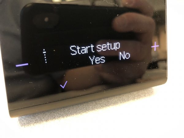
This particular model has a touch-sensitive screen with a display which made setup a snap.

A setup wizard walks you through the setup. You can always re-do the setup if you want.

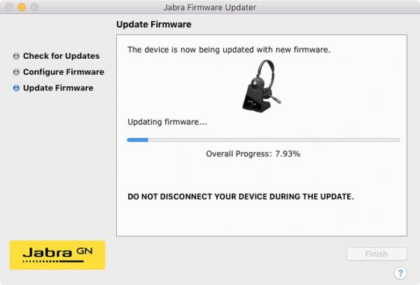
Install the Jabra Firmware Updater (Mac version shown here) to check for firmware updates. In this screenshot, the firmware is being updated.

Performance

I made a few test recordings to see what the headset sounded like in my office (not a recording booth) compared to the Apple AirPods (wireless ear buds) and the basic wired headphones you get with every iPhone.


To me, the wired earbud that comes with the phone sounds the clearest, but this is a wired device. The Apple AirPods are wireless but sound less clear. The Jabra sounds perfectly serviceable and is wireless, in addition to being quite comfortable.

What I like

I was able to connect my desktop computer (USB), iPhone (Bluetooth) and desk phone. Super comfortable to wear!

What needs to be improved

Expensive, but this is really for a professional office environment where cordless security is paramount. Don’t forget, you still need to lift the handset off the desk phone unless you have a dedicated handset jack, or an electronic lifter.

Final thoughts

The Jabra Engage 75 has really solved my headset clutter. I now have just one device to take calls as well as listening to my desktop or iPhone audio.

Price: $420
Where to buy: Jabra and Amazon.
Source: The sample of this product was provided by Jabra.

Filed in categories: Reviews

Tagged: ,

Jabra Engage 75 stereo headset review originally appeared on The Gadgeteer on September 25, 2018 at 9:00 am.

Note: If you are subscribed to this feed through FeedBurner, please switch to our native feed URL http://the-gadgeteer.com/feed/ in order to ensure continuous delivery.
BenQ PD3200U 4K Monitor review


REVIEW – As a photographer and videographer, editing videos including 4K videos and editing photographs are integral parts of my work. Also, viewing both in “true” color makes my editing process easier and more accurate. As a huge BenQ monitor fan, I have been looking forward to the opportunity to test and review a 4K BenQ monitor. Here is a summary of my experience.

What is it:

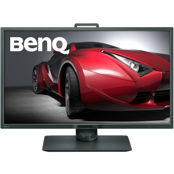
The BenQ PD3200U is a 32″ 16:9 4K IPS Monitor with enhanced color accuracy. It is 100% Rec 709 and the sRGB color space supports Darkroom, CAD/CAM, and Animation display modes. It has a built-in KVM switch that allows you to control two different computers from this single display with a single mouse and keyboard. It also features DualView mode to display content in different viewing modes side by side and BenQ has included a Hotkey Puck that simplifies switching between modes. The HotKey Puck is also programmable so that it can be used to quickly adjust the displays settings.
What’s in the box


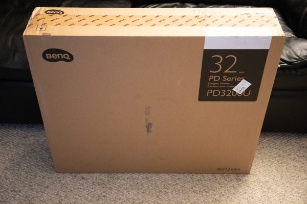
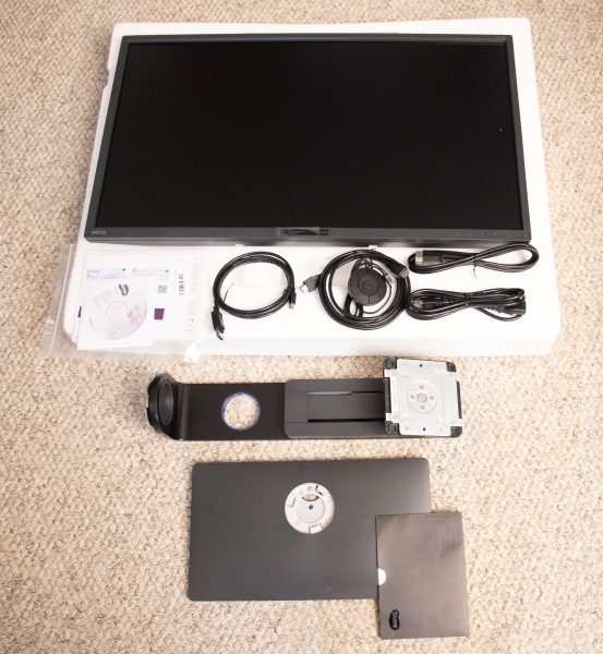
The monitor comes in a large brown shipping carton that is well padded inside to perfectly protect the contents.

1 x BenQ PD3200U Monitor
1 x Monitor Stand
1 x Monitor Base
1 x AC Power Cord
1 x Video Cable: DVI-D Dual Link
1 x Video Cable: DisplayPort cable
1 x USB Cable
1 x Hotkey Puck
1 x CD Rom Driver/Manual CD
1 x Quick Start Guide

Design and features

Specifications:
Size: 32″
Screen Area: 27.9 x 15.7″ / 70.8 x 39.9 cm
Native Resolution: 3840 x 2160
Aspect Ratio: 16:9
Maximum Brightness: 350 cd/m2
Contrast Ratio: 1000:1
Dynamic Contrast Ratio: 20,000,000:1
Refresh Rate: 60 Hz
Bit Depth / Color Support: 8-Bit+FRC (1.07 Billion Colors)
Look-Up Table: 10-Bit
Color Gamut: 100% sRGB
Response Time: 4 ms
Viewing Angle Horizontal: 178°, Vertical: 178°
Connectivity: 1 x 3.5 mm Input/Output ,1 x 3.5 mm Output, 4 x USB Type-A (USB 3.0) Output, 2 x DisplayPort 1.2 Input, 1 x HDMI 2.0
HDCP Support: Version 2.2
Built-In Speakers: 2 x 5 W
Height Adjustment: 5.9″ / 15 cm
Rotation Adjustment: 90°
Swivel Adjustment: 90° (-45 to 45°)
Tilt Adjustment: -5 to 20°
Mounting-Hole Pattern: 100 x 100 mm
Dimensions: (W x H x D) 29.1 x 19.4 x 9.2″ / 74.0 x 49.2 x 23.4 mm (With Stand), 29.1 x 17.2 x 2.6″ / 74.0 x 43.6 x 6.6 mm (Without Stand)
Weight: 18.7 lb / 8.5 kg

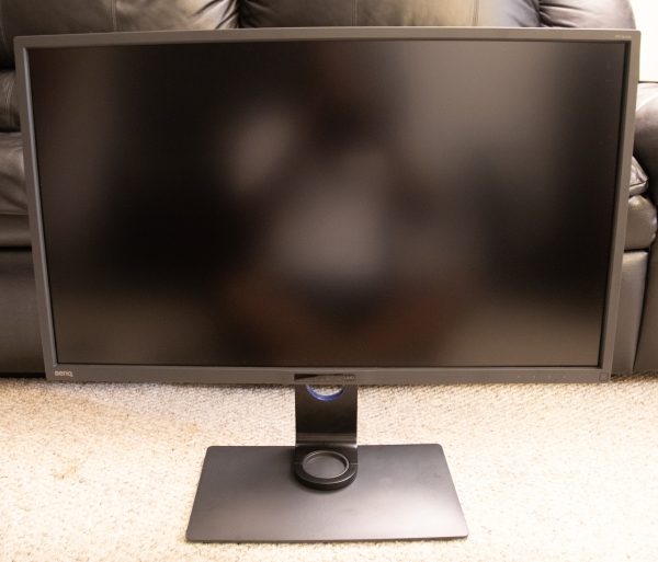
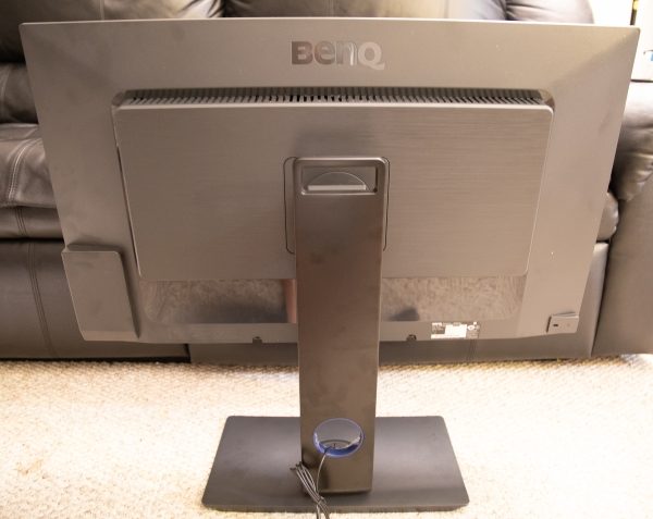
When you look at the front of this 32″ monitor, it looks sleek and impressive even with the small bezel around the edges. The back is vented and the stand “clicks in” to the back for a nice, clean look.

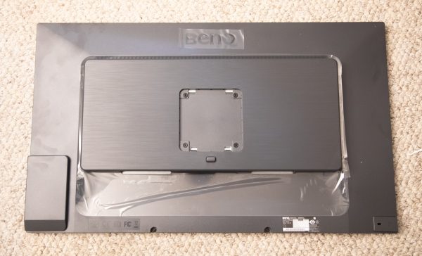
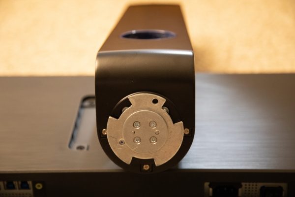
When you first remove the monitor from the box and lay it flat to assemble it, there is a Vesa square mount that allows you to simply “click in” the stand for a perfect and secure fit. The button that you see below the Vesa square is used to release the stand from the monitor.

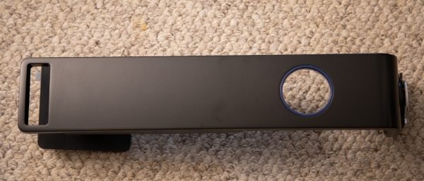
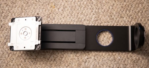
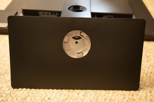
The included stand has a pass-through hole for the cables, a sliding mechanism for you to adjust the height of the monitor, and a metal interface for the base.


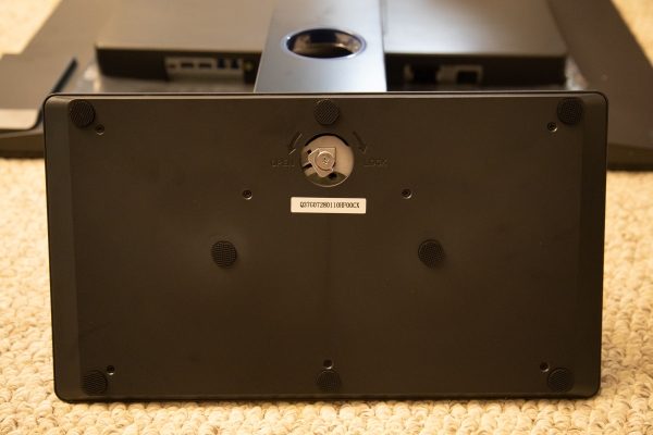
The base of the monitor has a receiver that connects with the stand’s metal interface as indicated above, and there is a wingnut type screw that is used to connect the two.

Connectivity

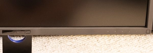
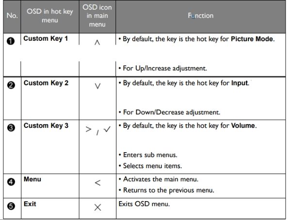
This monitor has many available connections. Starting with the controls, on the front of the monitor as shown below and starting from left to right on the bottom bezel, there is the light sensor/Eco sensor that is in the middle, the five control buttons and the power button.


The following table shows the functions for the five control buttons from left to right.

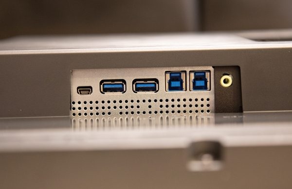
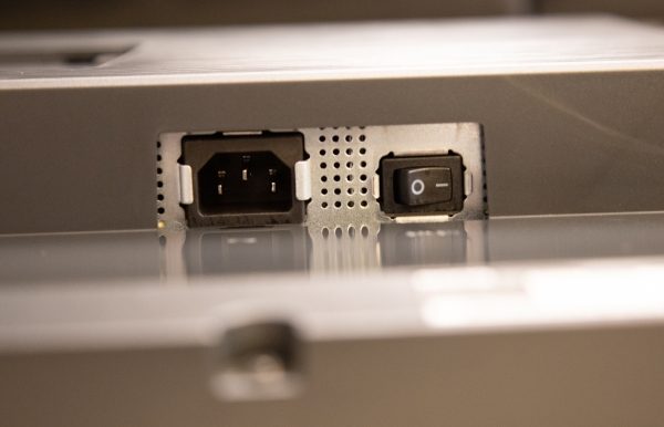
If you are facing the back of the monitor, the following are the controls from left to right at the bottom of the back of the monitor.

In the first picture:  Hotkey Puck socket, USB 3.0 ports (downstream; connecting to USB devices), USB 3.0 port (upstream 2; connecting to the PC), USB 3.0 port (upstream 1; connecting to the PC) and the Audio Line In.

In the second picture: The AC power input jack and the AC power switch.


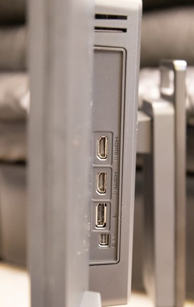
Again facing the back of the monitor, there are ports on the left side of the back section of the monitor that has the vents and that connects to the stand.

From top to bottom as shown below: DVI-D socket, HDMI socket, DisplayPort socket, and Mini DisplayPort socket.


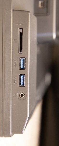
When facing the back of the monitor, on the left edge of the front section of the display housing, there are the following ports:

From top to bottom: SD card slot, 2 x USB 3.0 ports (downstream; connecting to USB devices), and the Headphone jack.


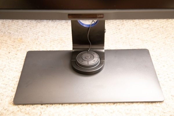
The picture below shows the included Hotkey Puck that simplifies switching between modes. It is also programmable so that it can be used to quickly adjust the displays settings.

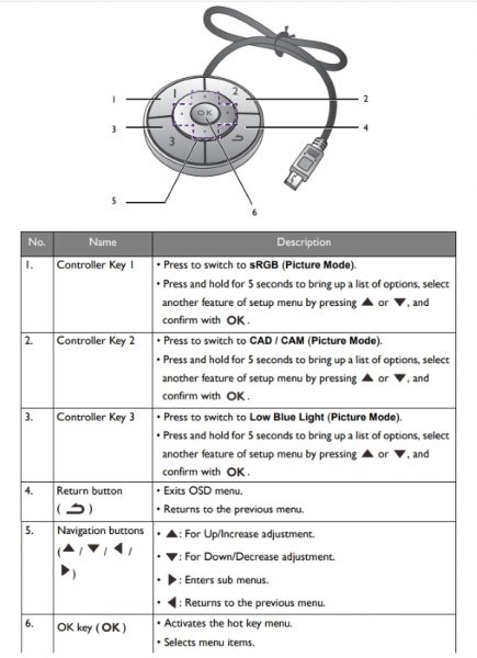
The following is BenQ’s control chart for the HotKey Puck.

Performance

First and foremost, this is a well-built monitor with a hefty base and stand for maximum stability. Assembly was relatively easy with a bit of patience needed when aligning the screw hole and wingnut screw to connect the base to the stand. When I turned on this monitor I was immediately blown away by the color accuracy and brightness and vividness levels that for me were perfect right out of the box. I did have my calibration tools at the ready, but I did not need to calibrate the monitor to use any of my editing software or otherwise. I connected my monitor using a DisplayPort cable to my Workstation, and I was able to free up a couple of ports on one of the 3 USB hubs that I use by connecting the keyboard and mouse to the monitor. This is a great convenience for me since when they were connected to my powered hubs, it would sometimes be a “pain” when I would lose power and forget to power up the hubs when I regained power. While I tested the SD card slot which works like my other card slots, I still use the SD card module on my Lexar Workflow Hub for daily use because it is easier than reaching to the side of the monitor to use the built-in card slot. However, it is a nice convenience when I just want to pop in a client’s SD card for a moment to grab some files. The functionality of the USB ports is also great. If you connect a USB cable between the computer and the monitor using the upstream USB port, you can transmit data between the computer and any USB devices connected to the downstream ports on the monitor. This works for USB flash drives and other USB drives that are USB or externally powered. The HotKey Puck is really very convenient for using the On Screen Display menus. It takes a bit of getting used to, and I am still playing around with it and trying to get used to it. It is very responsive with very little lag between pressing the button and the on-screen response.

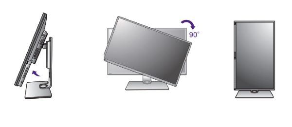
In terms of manipulating the monitor itself, BenQ offers Display Pilot Software on their website that you can download and add functionality to the monitor including switching it into portrait mode. This allows you to extend the monitor to its maximum height, tilt it the full 20 degrees that it can tilt, and then rotate it 90 degrees clockwise.  To be honest, I never use any monitor in portrait mode, and my cabling setup does not work properly when the monitor is in portrait mode. However, to demonstrate this function here is an illustration photo that I put together:
The built-in speakers are decent on this monitor with enough volume to work with ambient room noise. they are also clear sounding.

As a photographer/videographer/filmmaker, I regularly use the following programs:

  • Adobe Premiere
  • Adobe LightRoom
  • Adobe Photoshop
  • DaVinci Resolve
  • Izotope Rx
  • PortraitPro Studio

Every day when I sit in front of my workstation to use one or several of these applications, it is really an enjoyable experience with this monitor. Here are some pictures of the screens that use in my various projects:


In addition, when I use this monitor for daily tasks like reading emails or internet browsing, the text is clear and the colors on the websites just seem more brilliant than my other monitors.

What I like

  • The color accuracy right out of the box
  • The number of connectivity options
  • The size of the monitor
  • The KVM capability
  • The stability and adjustability fo the monitor
  • The build quality

What can be improved

  • An easier connection of the base to the stand

Final thoughts

The BenQ PD3200U is now by far my most favorite monitor. Rarely do I say that a monitor is perfect, and I demand a lot from a monitor. The controls are responsive and the color right out of the box is simply amazing. I spend an enormous amount of time editing photos and video footage and this monitor is simply gorgeous to look at and use. Whenever I need a break, I open a YouTube 4K video of some nature footage, just so I can be completely immersed and totally block out the world around me. The underwater 4K videos look phenomenal. While we all have our own preferences, and some of us can be more critical than others, for me, this is a win!! Win!! Win!! I absolutely believe that anyone in the photography/videography industry would find this monitor to be a very good fit in their workflow and for their productivity. I can’t wait to see what BenQ comes up with next to beat this one.

Price: $899.99
Where to buy: Amazon
Source: The sample for this review was provided by BenQ.

Filed in categories: Reviews

Tagged: ,

BenQ PD3200U 4K Monitor review originally appeared on The Gadgeteer on September 24, 2018 at 11:00 am.

Note: If you are subscribed to this feed through FeedBurner, please switch to our native feed URL http://the-gadgeteer.com/feed/ in order to ensure continuous delivery.