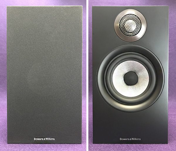
BenQ EL2870U 28″ 4K eye-care monitor review

REVIEW – Back in May I reviewed BenQ’s PD2710QC DesignView 27-inch Designer Monitor and have been using it ever since because I like the built-in USB-C dock and the excellent picture quality. But, it’s not 4K so I kept wondering what a 4K monitor would be like to use. I don’t have to wonder any longer because BenQ asked if I would like to review their EL2870U 28″ 4K eye-care monitor and I said yes. Let’s check it out.

What is it?

The BenQ EL2870U 28″ 4K eye-care monitor is marketed as a gaming monitor that offers special eye care features like low blue light, flicker-free, and auto brightness features. I explained to BenQ that I’m not a gamer and that they might not want me to review this particular monitor, but they said that it was fine and that there would be no problem reviewing this monitor for my normal everyday tasks. Well, alrighty then…

Hardware specs

Screen Size: 27.9
Resolution (max.): 3840×2160
Panel Type: TN
Backlight Technology: LED backlight
Brightness: 300
Native Contrast(typ.): 1000:1
Viewing Angle (L/R;U/D) (CR>=10): 170/160
Response Time: 1ms (GtG)
Refresh Rate: 60Hz
Aspect Ratio: 16:9
Display Colors: 1.07 billion colors
Audio: Built-in Speaker
VESA Wall Mount: Yes
Gaming: FreeSync
Connectivity: HDMI (v2.0)x2, DisplayPort (v1.4)x1
Dimensions (HxWxD mm): 657.9×476.27×194.6
Net Weight (kg): 5.7
Tilt (down/up): -5˚ – 15˚

What’s in the box?
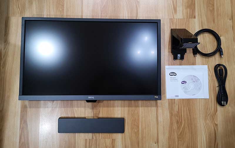
Monitor
Monitor stand
HDMI cable
Power cable
Quick start guide
CD of video drivers

Design and features
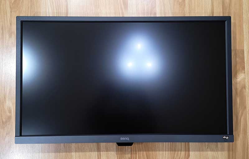
This monitor has a 28-inch glare-free matte display with a black plastic housing that has wider bezels compared to a lot of other monitors on the market and much wider bezels than the BenQ PD2710QC DesignView 27-inch monitor that I’ve been using.

There’s a Benq logo in the center of the bottom bezel and below the logo is a light sensor which is used for the eye care feature. On the right lower corner, there’s a button that you can use to toggle the HDR and Brightness Intelligence+ features. More about those features later.
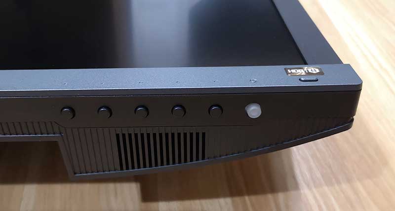
Along the bottom right side of the monitor are five small buttons that are used to navigate through the on-screen menus and another larger button that toggles power. You can also see the grill for the built-in 2-watt speakers.
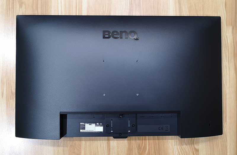
On the back of the monitor is a standard Vesa pattern so that you can mount the monitor to a wall mount or a dedicated monitor stand.
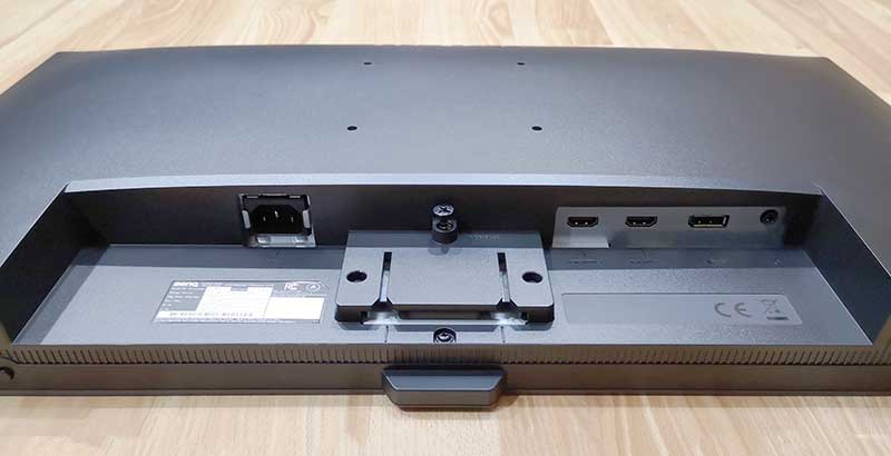
There is a mount point for the included table stand and a connection panel which has the power port, 2 HDMI 2.0 ports, a DVI 1.4 port, and a headphone jack. Unfortunately, there aren’t any built-in USB ports.
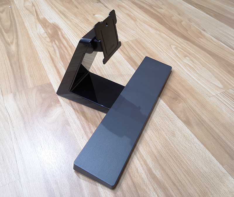
The table stand is two pieces that slide together to form a wide T shaped stand.
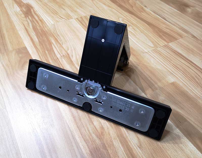
A tool-free screw tightens down to secure the two parts of the stand.
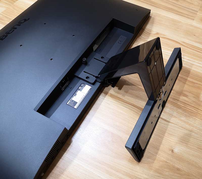
Then the top part of the stand slides into the bottom of the monitor where there’s another screw that secures the stand to the monitor. This screw requires a Philips screwdriver to tighten it down.
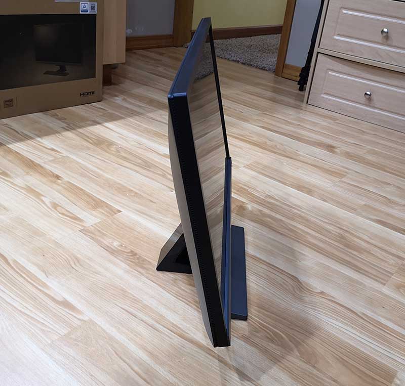
Here’s the BenQ EL2870U 28″ 4K eye-care monitor ready for service. Big thumbs up for the fact that the monitor has a built-in power supply, so it doesn’t come with a giant power brick.

One thing I noticed right away is a lack of a height adjustment feature with this monitor. The monitor pivots forwards and backward to adjust the viewing angle, but you can’t raise or lower the screen which I think is an unfortunate oversight.

I performed my testing of this monitor with my 12-inch MacBook using a USB-C to HDMI adapter and the included HDMI cable that is included with the monitor. I was immediately struck by the additional screen real estate, crisp text, and vibrant colors.

I used the monitor while doing all of my normal everyday activities working in the Chrome browser and Adobe Photoshop. I also used it to watch full-screen 4K video streamed from YouTube and other video streamed from Netflix and Hulu. The picture on this monitor is very nice but I noticed what I thought was sluggish performance with my 12-inch MacBook while connected to this monitor. It’s something I don’t notice when I’m using the other BenQ monitor and I later figured out that it was just that the display has more resolution, so it takes longer to move the mouse cursor around the screen. 😉 At least that’s what I think was the issue and after increasing the mouse cursor movement speed, I’ve not noticed any more issues with my MacBook feeling sluggish.

Text on this monitor is noticeably sharper than with non-4K monitors. Even when the text is white on black, it still looks great and it feels like I take a big step backward when I switch to back to another monitor.

This monitor looks best when viewed straight on, but if you view it at an off angle, the screen takes on a yellowish tint, at least to my eyes.

The BenQ EL2870U offers some features that minimize eye strain and irritation during long sessions of use. The Brightness Intelligence Plus (B.I.+) feature automatically adjusts the brightness and color temperature according to on-screen content, ambient light conditions, and color temperature in your surroundings. When you toggle this feature on by pressing the button in the lower right corner, it will adjust the display settings, with soothing warm white for comfort and cool white for productivity.

The HDR/B.I.+ button switches between 4 levels of HDR and B.I.+ modes to balance maximum contrast and vibrancy of the display. I tested all 4 settings and did notice a boost in color vibrancy contrast with the HDR emulation turned on.

But what does a gamer think about this monitor?

Even though BenQ said they didn’t care that I wasn’t a gamer, I decided to find out what a gamer thought about this monitor since that’s the segment of buyers that it’s being marketed for. I let Vincent, a friend from work borrow the monitor for a few days so he could share his thoughts with how the BenQ performed with some of his favorite games.

Here are some of his thoughts after testing the monitor with Assassin’s Creed Odyessy and Prey connected to his custom built i7 8700k (6 core)(12 core hyper-threading) PC with an NVidia GTX 1080 video card.

BenQ says that this monitor works best games that have dark scenes like Resident Evil, Tomb Raider, Anthem and so on. Vincent commented that he didn’t like the way the BenQ handled shadows (dark scenes) because it actually made them too bright. For example, the image above is from Assassin’s Creed Odyessy and the character’s shoulder on the left side of the screen looks grey when it should be much darker or almost black. Vinnie said that he could see how the brighter image feature would be good for multiplayer games so you could see bad guys creeping up on you from the shadows, but he wasn’t a fan of the feature.


He also mentioned that the Freesync feature of this monitor is only useful if you have an AMD video card. He uses an NVidia card, so he wasn’t able to test this feature which claims to fix choppy gameplay and broken frames. That said, he thought the refresh rate of the monitor was good.

The BenQ monitor uses a TN panel which doesn’t have burn-in issues like monitors that use IPS panels and he didn’t notice any light bleed as he has noticed with multiple ASUS monitors that he’s owned.

Like me, he wasn’t a fan of the monitor’s thick bezels but said he would definitely consider this monitor as a budget monitor for gamers who also have an AMD video card.

What I like

  • Crisp, vibrant image
  • Blue light blocking features
  • HDR features (if your video card supports them)
  • Power supply is internal, so there’s no ugly power brick
  • 3-year warranty

What needs to be improved

  • No vertical adjustment, can’t move the monitor up or down
  • Off angle viewing not the best
  • No built-in USB ports

Final thoughts

The BenQ EL2870U 28″ 4K eye-care monitor is a good option for a 4K monitor for everyday computer work and for gamers who have an AMD video card and want to take advantage of the FreeSync features. I loved the sharp text and vibrant colors of this monitor and also liked the crazy amount of customization that is possible if you want to tweak the settings in the onboard menus. But even if you aren’t a settings tweaker, right out of the box, this monitor looks good with everything I threw at it and for gamers, it provides a fast response for fast motion games. I’ll be switching to this monitor full time but I’m going to miss the built-in USB-C hub of the PD2710QC, at least until they offer a 4K version of it.

Price: $499.00
Where to buy: Amazon
Source: The sample for this review was provided by BenQ.

Filed in categories: Reviews

Tagged: ,

BenQ EL2870U 28″ 4K eye-care monitor review originally appeared on The Gadgeteer on October 9, 2018 at 10:02 am.

Note: If you are subscribed to this feed through FeedBurner, please switch to our native feed URL http://the-gadgeteer.com/feed/ in order to ensure continuous delivery.

Pitbull Gold Shaver review


REVIEW – Many years ago, I experienced frequent issues with my scalp that were caused by the stiff texture of my hair and the direction of growth, which resulted in severe in-grown hairs. After many attempts to resolve the issue, including via professional medical personnel, it was obvious that the only trouble-free solution was to “rock” a bald head. Over the years, I have tried several electronic multi-blade shavers but have always returned to my trusty Gillette Fusion battery-powered razor, including the previous iterations of the current model, to obtain the smoothest shave. The Pitbull Gold shaver seeks to change my opinion about electronic multi-blade shavers. Let’s see!!

What is it?

The Pitbull Gold Shaver is a powered wet/dry skull shaver, that utilizes 5 articulating rotary blades that allow for an effective contouring of your scalp to produce the best possible shaving experience. The body of the shaver is designed to fit easily in your hand and to allow you the option of multiple ways to hold it for the best comfort.

What’s in the box


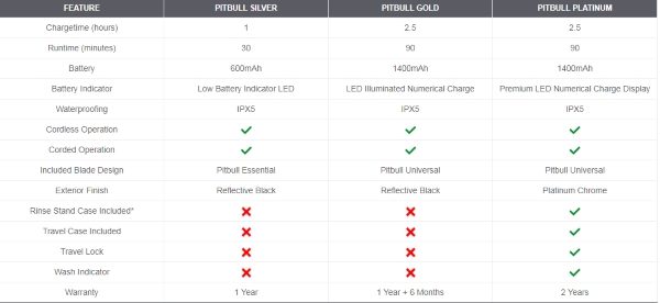
It is important to note that Pitbull included the accessories that made this the Pitbull Platinum package.
1 x Pitbull Gold Shaver (Platinum Package)
1 x Blade Cover
1 x Blade Brush
1 x Rinse Stand
1 x Instruction Manual
1 x Power Cable and Adapter
1 x Felt Accessory Pouch
1 x Carrying/Storage Case

Design and features

Pitbull has 3 shaver packages of this type of Skull Shaver. They are the Silver, the Gold, and the Platinum packages. The following is the comparison chart:

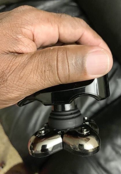
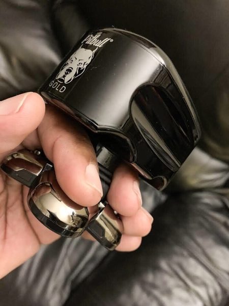
The shaver has a nice weight and feel to it, and does not feel fragile or cheaply built. It also feels like the right size that allows you to balance it well when using. The top handle is designed to fit the contour of your fingers should you choose to hold it in that position (See pictures later in the review). On the front short side of the shaver, there is the Pitbull logo.


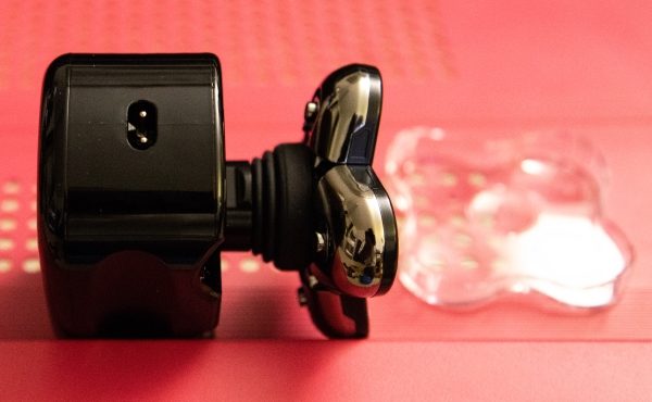
On the opposite short side of the shaver, there is the power jack.


On the top of the shaver, there is the power button and the battery charge LED indicator.


There are 5 rotary blades on the bottom of the shaver that is on a contoured base and with the built-in flexibility it helps to match the shape of your scalp.


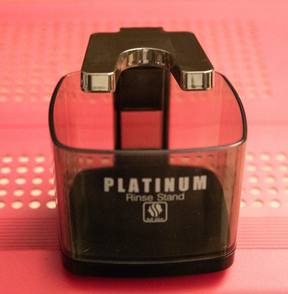
Also included with the shaver is a rinse cup that you fill with water and place the shaver in periodically to rinse the blades during the shaving session.


Performance

Once fully charged, the Pitbull shaver is primed and ready to go. A simple press of the power button turns it on, and the blue LED battery charge indicator shines brightly and displays the remaining battery capacity. The battery charge is quite long-standing and from my experience, I should be able to complete at least 6 complete shaving sessions without needing to recharge. Keep in mind that from my experience, I consider a session to be at least 15 minutes. I followed the instruction and on the first try, I chose to dry shave. In small circular movements, I began to shave and I continuously checked the progress of the shaving. It is important to note that I shave my head every day, especially because my hair grows back overnight. In the end, I managed to get a reasonably close shave albeit not silky smooth, and it took me about 15 minutes to get to that point. I still had to use the razor to properly shave the areas behind my ears and some other parts of my head. The picture below shows the end result of the Pitbull Shaver test. My complexion makes it difficult to see, but there was still stubble on my head that needed to be removed with my Gillette.


On my next attempt with the Pitbull Shaver, I used shaving foam, and while I found the experience quite pleasing in terms of the scalp massage that it provided, the shaving result was the same, with the need for me to go over my head with a razor to take the experience from a close shave to a silky smooth shave. With both tests, I had to press the shaver quite hard against my skull, but remarkably, this action contributed to the really nice massage benefit as opposed to causing any abrasions or irritation. I did try two gripping methods, but the one shown in the second picture below proved to be most comfortable and effective for me.


The rinse stand worked well to rinse the blades during shaving and as a stand.

What I like

  • The build quality
  • The great scalp massage it provides while shaving
  • The longevity of the battery

What can be improved

  • There is still room to improve to provide as close a shave as a razor.

Final thoughts

In my opinion, the Pitbull Gold Shaver is possibly the best attempt at a Skull Shaver that I have ever tested. While I have to honestly say that the Gillette Fusion Power razor is still the King and on the throne, the Pitbull does provide for a nice shaving experience with the benefit of an enjoyable scalp massage, and with patience and effort it is capable of a relatively close shave. While not as close as the Gillette, the benefit of having a less abrasive shaving experience is subject to individual preference and tolerance. The Pitbull Gold Shaver gets an “A” for effort, but will not overthrow my Gillette Fusion Proglide that still provides the smoothest shave.

Price: $99.99
Where to buy: Skull Shaver Website and Amazon
Source: The sample for this review was provided by Pitbull.

Filed in categories: Reviews

Tagged:

Pitbull Gold Shaver review originally appeared on The Gadgeteer on October 9, 2018 at 9:00 am.

Note: If you are subscribed to this feed through FeedBurner, please switch to our native feed URL http://the-gadgeteer.com/feed/ in order to ensure continuous delivery.

Blackloud Soundot AF1 FM radio earbuds for iOS review

REVIEW – Do you still enjoy listening to FM radio? I listen to it every day on my drive to and from work. But have you ever wanted to listen to FM radio with your smartphone but not using a streaming service like iHeart Radio which uses your data? Then you will be interested in learning more about Blackloud’s Soundot AF1 earbuds for the iPhone or iPad.

What is it?

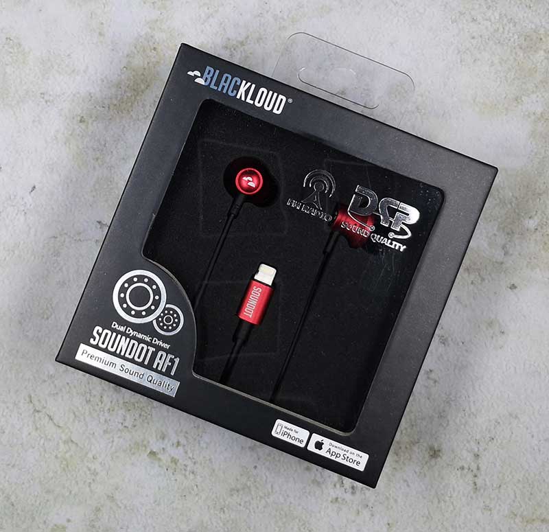
The Soundot AF1 earbuds from Blackloud look like any other pair of wired earbuds, but there are two notable exceptions. First of all, they have a lightning connector instead of a 3.5mm headphone jack. So right away, you know that these headphones are for iPhones and iPads (USB-C version coming in 2019). The other difference is that you can listen to FM stations using these earbuds and your iOS device, without using any of your data. Kinda…

What’s in the box?

Blackloud Soundot AF1 earbuds
2 extra sets of eartips
Drawstring storage pouch
Quick start guide

Design and features

From all outward appearances, the Soundot earbuds look unremarkable unless you count the snazzy red color of the aluminum housings. The earbuds have an in-line 3-button control for volume adjustments and play/pause operations. The earbuds also have an in-line microphone so you can use them to make and receive calls as well as listening to audio.

The app


To use the Soundot earbuds to listen to FM radio, you have to install the Soundot app and you’ll have to log in to the app using your existing Google, Twitter, or Facebook account, or by creating a Soundot account. Then you can plug in the earbuds and you’ll be greeted with a simple interface for tuning FM radio stations.

There’s a tuning dial in the center of the screen that you can use to zero in on a known station, or you can also use the scanning buttons to find stations. At the bottom of the screen, there are 6 presets that you can use for your favorite stations.

The app also features an EQ for fine tuning the sound and a lock screen widget for quick control.

What the app doesn’t feature is RDS (Radio Data System) to display the song title and artist info. That is a feature that is coming soon. Another thing to be aware of is that you have to have a network connection (cellular or WiFi) in order to first set up the app which requires that you sign in either with your existing Google, Facebook, or Twitter account, or you can create an account with an email address.

Then when you do want to use the Soundot when you have no cellular or WiFi connection, you will have to click past the No Network error message, which is a little confusing as it leads you to believe that the product is not going to work without being on the network.

If you can get past these caveats, the FM radio sound quality is decent, but that all depends on how strong the FM stations are in your area. I was able to pull in the biggest stations without any issues.

I can see how an accessory like this one would come in handy during a natural disaster when cellular, and internet connectivity isn’t available, but a mobile device like an iPhone only has so much battery life and in a disaster, electricity is probably the first thing to go. I think a regular battery-powered radio or one with a crank that you can use to generate a few minutes of use without needing batteries would be a better option.

What I like

  • Good sound quality
  • Dongle-less lightning connector earbuds

What needs to be improved

  • Don’t require a login or account
  • Add RDS capability
  • Price is too high

Final thoughts

Some phones (maybe all of them?) have a built-in FM chip, but the carriers don’t allow you to use that chip to listen to FM radio. Why? I’m sure it has to do with money like everything else. The Blackloud Soundot AF1 earbuds give you back the freedom of listening to FM radio on your iOS device as long as it has a lightning connector and you can log in to the internet for the initial setup which for me seems to defeat the point… but if you don’t mind these restrictions, or the price, head over to Blackloud.com and check them out on your own.

Price: $79.89
Where to buy: Blackloud
Source: The sample for this review was provided by Blackloud.

Filed in categories: Reviews

Tagged: , ,

Blackloud Soundot AF1 FM radio earbuds for iOS review originally appeared on The Gadgeteer on October 8, 2018 at 9:00 am.

Note: If you are subscribed to this feed through FeedBurner, please switch to our native feed URL http://the-gadgeteer.com/feed/ in order to ensure continuous delivery.

eBlocker Family anonymous surfing gadget review


REVIEW – Whenever I surf the internet or go”window shopping” or even look up something specific online, I notice that shortly thereafter, the items that I viewed pop up as ads on other websites that I visit. I soon realized that the ads “follow me” as a marketing tool that companies customize based on my online viewing habits. Seeing this got me to start thinking about how much of my privacy and the privacy of my family is being compromised and wondering about what else “the eyes” on the internet are seeing and doing. This device promises to protect me and my family when online and to be effective enough to prevent any snooping. Let’s see!!

What is it?


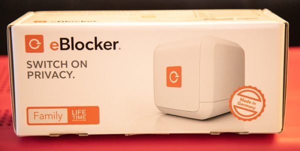
The eBlocker is a small computer, running the proprietary eBlocker Operating System. The eBlocker only needs to be connected to your router and it automatically protects all devices in your network. There is no software to install other than SSL certificates as needed for HTTPS. Even your mobile devices are comprehensively protected.

What’s in the box


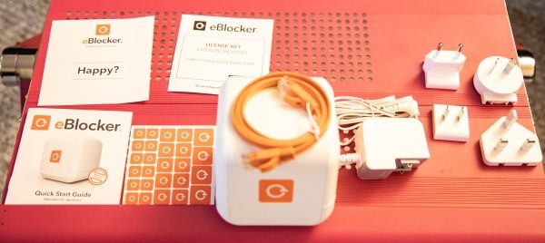
1 x eBlocker
1 x Power Adapter
1 x Ethernet Cable
4 x AC Plug Adapters
1 x Quick Start Guide
1 x License Card
1 x Feedback Card

Design and features

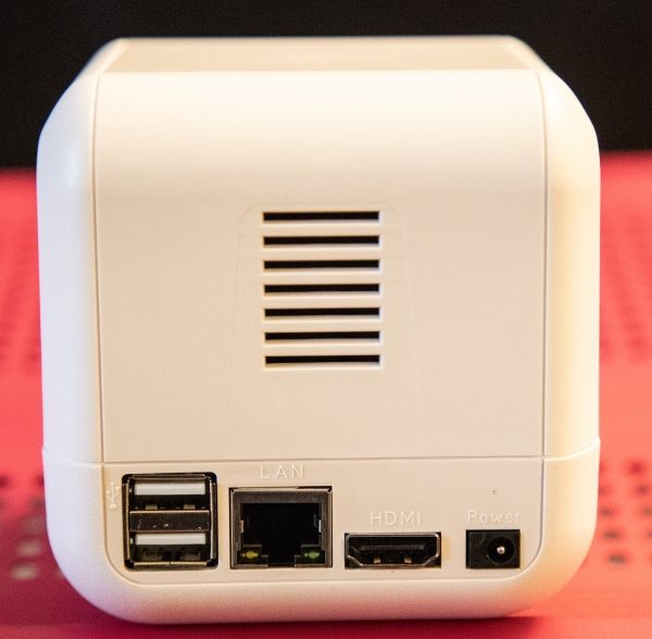
The eBlocker device is a small cube-like box that contains everything to perform its functions. Apart from the logo on the front side, there is an air vent and 2 USB ports, 1 ethernet port, one HDMI port (currently the manufacturer has not enabled this port for use), and the power port on the back.
Specifications

  • Processor: 1.2 GHz quad-core
  • Memory: 1 GB DDR3
  • Operating system: eBlockerOS 2
  • Usage: type 2 Watt, max. 10 Watt
  • Ethernet: 1 x Ethernet
  • 2 x USB 2.0
  • Weight: 153 g
  • Dimensions: 9 x 9 x 9 cm

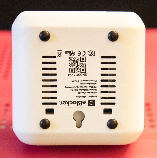
    On the bottom of the eBlocker, there is the basic spec sticker that includes the serial number that you need to set up the device. There is also a mounting hole to mount the device to a wall.

Installation and performance

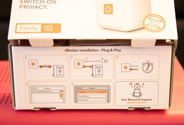
Connecting the eBlocker to your network is beyond simple. It just involves connecting power and the ethernet cable to a network port on your router or switch. My network includes several switches in different areas, and I just chose an available port on one.

After the hardware connections are done, you open a browser on any computer on the same network and go to http://setup.eblocker.com.

This link eventually takes you to a browser screen that provides you with a dashboard with all of the metrics for the computer that you are using and provides a conduit to another browser screen that provides the metrics for all of the devices connected to your network.

When I loaded the setup page, I was initially lost because the page is not in English, and there is no initial option for you to choose a language or to translate. The issue is resolved by right-clicking on the page and selecting translate. However, I would prefer a clear and present selection option.

Once translated into the language of choice, you follow the prompts which take you to a dashboard for the computer you are using. There are several configuration options to customize the dashboard and once set up, it presents the metrics associated with the network traffic and what is being blocked. It is difficult in a review to provide details of what information is available because of the amount of information available and the type of information available

In addition to the dashboard for the computer you are using, you can open another browser tab that shows metrics related to every device on the network.

When I connected the eBlocker, most of my devices continued to work as normal. However, some practical web pages were blocked and I had to pause the device and create exceptions for those web addresses. Some of the blocked pages are within an online University Portal and have the .edu domain. Also, initially when I wanted to pause the eBlocker effect on the laptop that was trying to get to the .edu page, I had a bit of a hard time because I did not see its IP address in the device list. Eventually, I used the search option on that eBlocker page and searched using the IP address and I found the laptop under a different IP address. I am assuming that the IP was being masked via the IP Anonymous function. I will confirm this as I spend more time with the device. I can see this becoming a more tedious process if many web pages are being blocked. In addition, I have close to a dozen different types of streaming devices on my network, and out of 4 Roku devices, the one connected wirelessly one seems to freeze and stop working once the eBlocker is connected. I have not yet been able to figure out why this happens. The other Roku devices are wired, and so far there has not been a problem with their connection. There is a large number of options and features available for the eBlocker. If you would like to get a better understanding and learn more about the features and possible customization, you can find the instruction manual here.

Here is a list of some of the main features/options/categories, and below the list is a small screenshot sample of some of the screens:
eBlocker Icon – this shows the eBlocker activity on each site and provides access to the control bar by clicking on the icon
Whitelist – This option allows you to disable eBlocker process on websites that you deem safe
Trackers – With this option you can see which trackers are being blocked on the web page
Ads – This is an Ad blocker option to see which ads are being blocked
Anon (IP Anonymous) – this hides your real IP-address
Device Cloaking – makes it seem like you are using a different device to provide you with even more privacy
Pause – Pauses the eBlocker on the device you are using for 5 minutes
Messages – Appears when there are system notifications or messages for you
Settings – Includes advanced setting like SSL support and network configuration settings


What I like

  • The size
  • The functionality
  • The lifetime license included with the Family device

What can be improved

  • Better software design so that additional information is available on the main screen for network devices
  • A language selection option on the first screen

Final thoughts

The concept of the eBlocker is great, and these days, we need to do all that we can to protect ourselves from the vulnerabilities we face when interacting electronically whether voluntarily or not. On a simple network with a couple of PCs and tablets, I can see the setup being very easy. My experience with it has been more complex, due to the number of and different types of network devices that are a part of my network. I feel very assured that this device does a great job at making your network presence mostly anonymous. It will take me some additional time to really get a sense of how to fully customize and take full advantage of the flexibility of the eBlocker, while still evaluating its ability to accommodate the unique challenges that some network devices and web pages can present. For now, I am giving it a conditional thumbs up, and I will follow up with an update if necessary and when I have spent quite a bit more time with it.

Price: $299
Where to buy: eBlocker.com and Amazon
Source: The sample for this review was provided by eBlocker.

Filed in categories: Reviews

Tagged: ,

eBlocker Family anonymous surfing gadget review originally appeared on The Gadgeteer on October 7, 2018 at 9:30 am.

Note: If you are subscribed to this feed through FeedBurner, please switch to our native feed URL http://the-gadgeteer.com/feed/ in order to ensure continuous delivery.

Bowers & Wilkins 607 speaker review

REVIEW – When I’m sticking to a budget and needing to buy something, I sometimes look at the least expensive model from a high-end company rather than the top model from a more middle-range company. That way, I figure I’m getting a better made product at a similar price. That’s the theory I would apply to the new 600 Series speakers from Bowers & Wilkins. While the B&W 607 speakers are the least expensive speakers in Bowers & Wilkins’ line, they are still B&Ws. But does the 607 speaker live up to B&Ws reputation?

What is it?

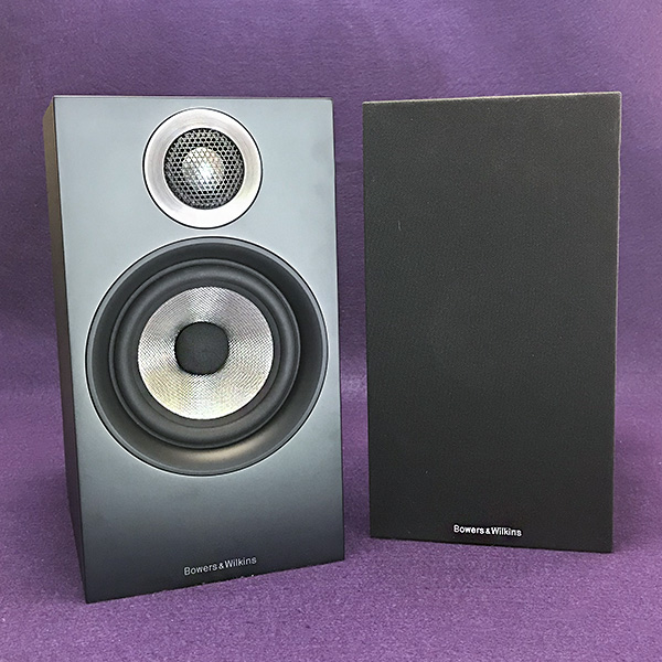
The Bowers & Wilkins 607 is a 2-way vented, passive bookshelf speaker. It is sold and priced in pairs.

Specs

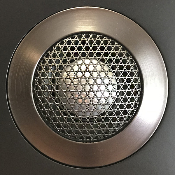
  • 1 in. aluminum dome high-frequency tweeter
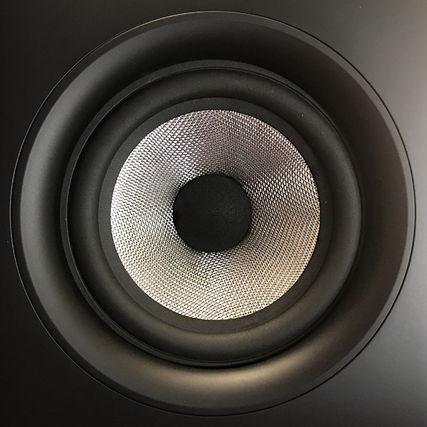
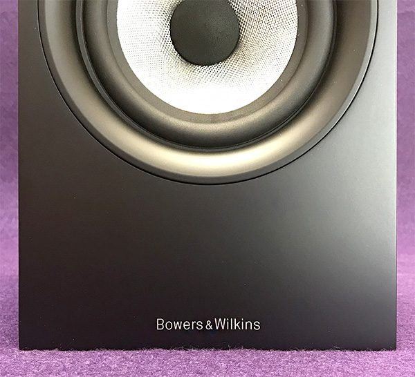
  • 5 in. Continuum cone bass/midrange
  • Nominal impedance: 8 ohms 
  • Recommended amplifier power: 30-100 W
  • Dimensions 11.8 in. (H); 6.5 in. (W); 9.1 in. (D)
  • Net Weight: 10.25 lb.
  • Finishes: Black/black; White/gray

Design and features

Let me start with an admission: I am unfamiliar with Bowers & Wilkins’ speaker line. However, I am familiar with B&W’s headphones and Bluetooth speakers, from the P5 wireless and P7 headphones to the iconic Zeppelin wireless speaker. It’s from these reviews that I came to recognize what some call the “B&W sound.”

My first introduction to the 600 series was at B&W’s east coast headquarters in Boston last June. I reported on the visit here. The 600 series speakers consist of the 607, as well as the more expensive (and larger) 606, 603 speakers as well as the HTM6 center channel speaker and a choice of 3 subwoofers. The 600 series are passive speakers, so a power source (receiver or amplifier) is necessary. The 607 is both small and light in weight—a true bookshelf design. 

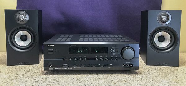
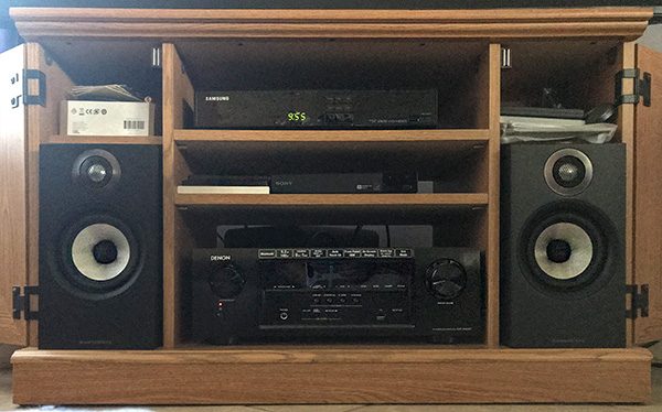
I chose to review the least expensive 607 speaker for a couple of reasons. They are the most affordable home speakers that B&W makes and I could easily connect them to existing equipment without any issues (there were none). Let other audiophiles write about how the 607 speakers sound with top-rated amps, receivers and turntables. There are plenty of detailed reviews that say it better and in more detail than I can. I wanted to see if the 607 speakers can live in an “everyday” environment with equipment that any normal person might already own—like me.

The 600 series benefits from a “trickle down” approach. Speakers  that were made of Kevlar have been replaced with a Continuum Cone base driver—a more rigid and accurate driver borrowed from the more expensive B&W speakers. They also upgraded the delicate dome tweeter as well as its protective metal mesh cover. While in Boston, I was able to hear a direct comparison between the older and new 600 speakers. As I said in my report, the improvement was subtle at best. If you already own an older 600 series speaker, there is no need to upgrade.

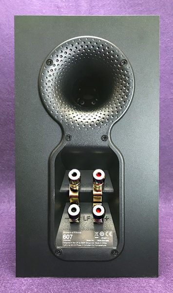
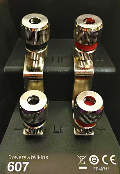
Connecting the speakers can be achieved in two ways, conventional or bi-amplification (or bi-wiring). Bi-amplification is more complicated, but can result in more resolution in low-level detail. But since this is an “everyday” review, connecting to single L and R posts will be fine. B&W includes small, self-sticking rubber pads for the bottom of the speakers. These help the speakers stay in place and can help eliminate unwanted vibrations.

The 600 series is exactly that—a series. Even though I’m reviewing the 607 speakers by themselves, they can be seamlessly paired with a matching center channel, subwoofer and two additional 607 rear channel speakers for a complete home theater experience. It’s something you can build as budget allows.

The 607 speaker cabinet comes in either black or white. There are included removable grills for those who want a cleaner design. I prefer the “naked” speaker look and left the grills in the box.

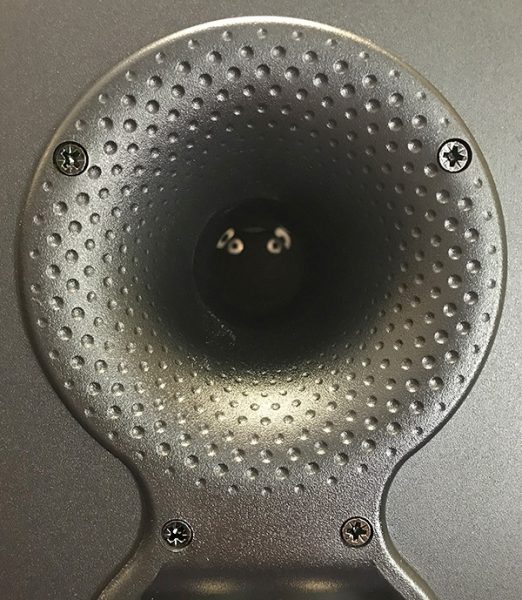
The 607 dimpled bass port has been redesigned and moved to the rear of the speaker. It’s larger then the previous front port which helps deepen the sound, especially if the speakers are moved closer to a wall. The port design is similar to the rear ports on the Zeppelin speaker. 

Bass can also be controlled by some included foam plugs that fit into the ports—an interesting low-tech solution to lessen bass. I’m not sure why anyone would want to lower the bass impact coming from the 607 speakers. Sure, bass is present and perfectly tuned for these speakers but I wouldn’t call it powerful. These are small speakers and physics is physics—you’re going to get much more bass from larger speakers or a subwoofer. If the room is small, the 607’s bass output is plenty. But if your room is larger and budget allows it, I would recommend getting a subwoofer, even if it does almost cost as much as a pair of 607 speakers.

There’s also plenty of treble from the 607 speakers. A few songs bordered on harsh, but I blame the recording and not the speakers. Generally, I leave any EQ settings on flat, but slightly toning down the treble EQ smoothed things out on problematic songs. 

One thing I appreciate about the 607 speakers is how intimate sounding they can be. For instance, Van Morrison’s “Into the Mystic” sounds incredible. There’s a lot going on in this song, such as subtle percussive things and strings coming in and then disappearing. But it’s Morrison’s voice that’s magical. You can hear every intonation he makes and his emotions come through with a fine clarity. It’s close to a live sound on these speakers. There’s an airiness to the song that’s missing on headphones or lesser speakers. And I’m not even a fan of Van Morrison!

That intimate sound also comes through on Brian Eno’s “Some Words” from his “My Squelchy Life” album. Eno’s singing sounds almost reluctant as if he would rather someone else do the vocals. But then heart-wrenching strings and beautiful synth keyboards come in and add an emotional context to the song’s second half. The 607 speakers exhibit the necessary detail within the song by allowing each instrument its space, yet letting them blend beautifully. 

It’s this sense of space that make the 607 speakers fun to listen to.

What I like

 The 607 speakers are great as stand-alone stereo speakers, but can also be part of a more complete home theater system later on as budget allows.

Expressive detail and sheer musical enjoyment are built into this speaker. It’s a cliche, but the 607’s sound quality matches or beats many other speakers in this price range and above.

What needs to be improved

Nothing of note.

Final Thoughts

Sure, the more expensive B&W speakers will sound better and also have more of this or that, but the Bowers & Wilkins 607 speakers do an admirable job of living up to the B&W name. At $600/pair, they are not cheap, but they are not expensive either when you consider how long people normally keep speakers. The one caveat to owning the 607 speakers is that you may find that you will eventually want something better and that something will probably be better and more expensive B&W speakers. 

Price: $599/pair US
Where to buy:
Source: The sample for this product was provided by Bowers & Wilkins.

Filed in categories: Reviews

Tagged:

Bowers & Wilkins 607 speaker review originally appeared on The Gadgeteer on October 6, 2018 at 9:00 am.

Note: If you are subscribed to this feed through FeedBurner, please switch to our native feed URL http://the-gadgeteer.com/feed/ in order to ensure continuous delivery.