REVIEW – When I first heard the news that Palm was coming out with a new phone, I was super excited because I’ve been a big fan of Palm devices since they started the PDA revolution with the PalmPilot eleventy million years ago. But then I read that the small credit card-sized Palm Companion was not designed to be a stand-alone smartphone, but a type of sidekick to your existing main smartphone.
The Palm Companion is meant to be a lightweight small phone that you can take with you that won’t demand your attention all the time like your primary phone. It’s supposed to help you stay present and not keep your eyes on your phone when you’re with your friends and family.
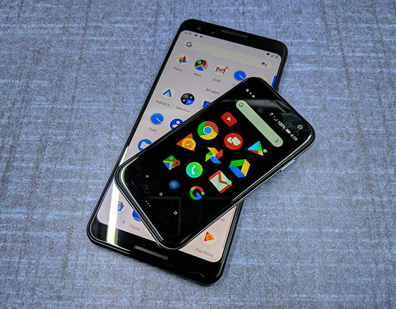
As displays get larger and more cameras are added to our smartphones, it means the overall dimensions of the phone expand until you need cargo pockets to carry it. If you’ve ever wanted to leave your bulky phone at home and carry a much smaller phone but don’t want to hassle with switching out SIM cards, the Palm Companion phone is a possible option… maybe. Let’s take a look.
What is it?
The Palm Companion is a small smartphone that uses Verizon’s Numbershare service to share the same phone number as your primary iPhone or Android smartphone. The idea is that you can take this smaller pocket-friendly phone with you when you don’t want to carry your bulkier larger smartphone. You’ll still receive texts, alerts and phone calls on the smaller device which will sync between the two phones even if the primary phone is turned off.
What’s in the box?
Palm Companion
Pre-installed SIM Card (4FF)
Wall Adapter/USB Cable/USB Connector
Quick Start Guide
Hardware Specs
Processor MSM8940, Octa-core 4 x 1.4GHz + 4 x 1.1GHz
Display 720 x 1280 pixels
Memory 3 GB RAM
LTE Advanced With 50% faster peak speeds in more than 450 cities from coast to coast
World Device Works in over 200 countries depending on your plan
Camera 12 MP
Usage Time – Up to 7.5 hrs
Height 3.8 in Width 1.99 in
Battery 800mAh
Design and features

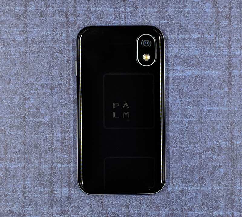
To me, the Palm Companion looks like a miniature version of the iPhone X. It has two pieces of black glass with curved corners and a brushed metal filling sandwiched between them. The only difference is that it’s itty bitty, and runs the Android operating system instead of iOS. That said, you can use the Palm with an iOS device. But there is a caveat. You won’t be able to use iMessage for your text messages. You’ll have to use Verizon’s Messages+ app on the Palm companion if you want to receive a copy of the messages sent to the primary phone too. Google Messages works for sending messages through the Palm, but incoming messages only seem to come through the Verizon Messages+ app. For most die-hard iOS lovers, that will be a big problem. Because iPhone users shun the green bubble.

Look at that camera lens with the LED flash. Even that looks like the iPhone X.

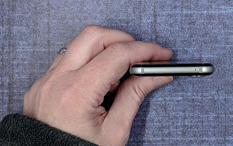
The top edge of the device has a microphone.

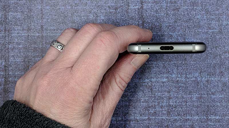
The opposite end has another microphone and a USB-C charging port.

Then on the right side, you’ll find the SIM card slot. The Palm Companion has it’s own SIM card, but it uses the same phone number as your primary phone.
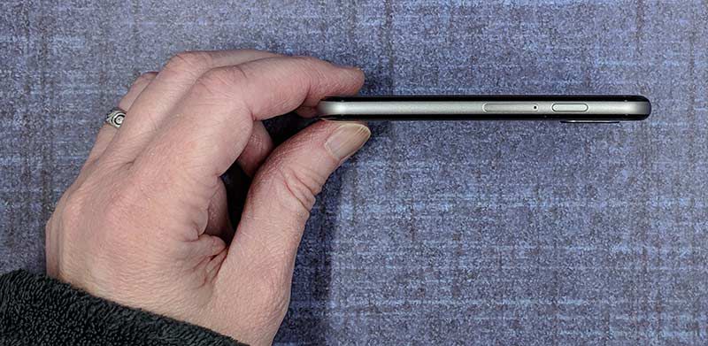
On this side of the phone is the power/wake button which also lets you summon the Google assistant if you double press it.
Yes, there are a couple of things missing. There isn’t a physical volume button or a headphone jack. There’s also no fingerprint reader and no home button. The Palm Companion actually uses facial recognition, PIN, or a pattern to unlock the phone.
Display

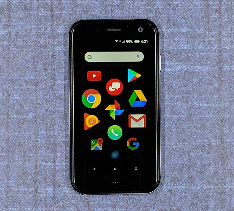
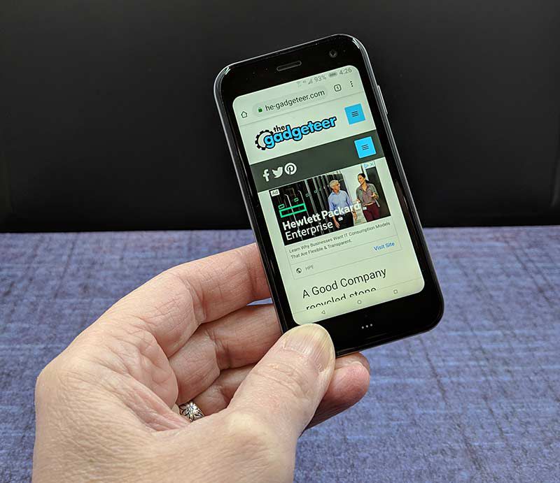
The display is bright, vivid, and crisp. But it’s only 3.3 inches, which means it’s tiny and might be too small for older eyes to read text and larger fingers to press icons and send text messages.
Camera


What can I say here? It has a camera on the front and on the back. You can take pictures with it but the pictures will not impress anyone. They are soft, blurry, and yeah.
Software and user interface

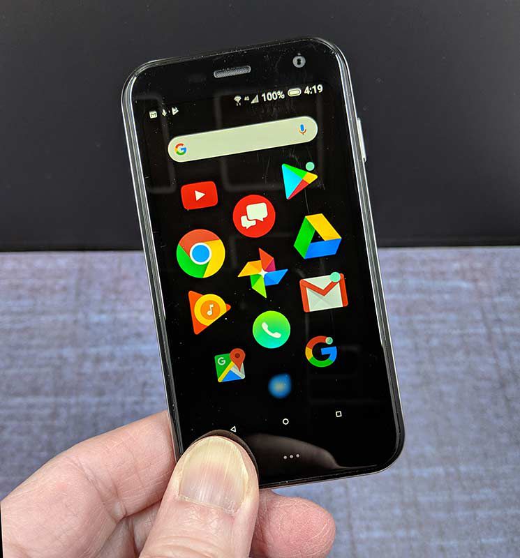
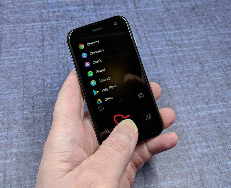
The Palm Companion runs Android version 8.1.0 but the interface is different than other Android smartphones. The Palm has a scrolling list of icons that are full sized and shink as you scroll through them. The interface reminds me of the Apple watch. But other than that difference, you have access to the Play store and can install other Android apps that you like.
Special features
Life Mode is a special Palm feature that lets you decide what will get your attention. Think of it as a more powerful do not disturb feature. It turns on Airplane Mode every time the screen is off, unless you’re on a call, streaming music or using GPS. When you wake your screen, your Palm becomes fully connected again and you can control which apps notify you when you wake up the device.

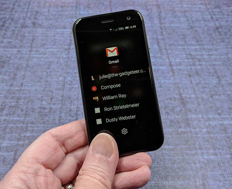
Quick Action menus provide easy access to popular actions by holding down on an icon from the home screen. In the image above, you see the quick action menu when pressing and holding the Gmail icon. Not all apps have a useful quick action menu, but most of the popular apps like Gmail, Twitter, Spotify, and others do.

Gesture pad is sort of a throwback to Palm’s Graffiti feature from days gone by. With this option, you can search and launch apps by drawing the first letter of the app. To use it, you have to swipe up on the left side of the screen from the lock screen.
Missing features
Although the Palm Companion is meant to be a mini-me to your primary phone, it is missing an important feature – mobile hotspot. That’s right, you can’t use this little phone as a hotspot.
Audio quality
If you’re in a quiet room, the audio quality is fine. But I find it really inconvenient not to have physical volume buttons. This is especially true while in a phone call because to change volume you have to take the phone from your ear to adjust the volume slider on the phone’s screen. Bah!
Using the Palm Companion for phone calls
What can I say, it looks like a phone and it works like a phone. Just be aware that if you have both the primary phone and the Palm Companion with you and you don’t have the Palm set to not respond to calls or texts when the screen is off if you get calls or text, both devices will ring and or ping.
Overall performance and battery life using the Palm Companion for day to day tasks
I found that the Palm Companion felt slow and sluggish performing most tasks from launching apps, to updating apps, and even unlocking with Face ID.
Battery life wasn’t impressive either. It’s actually worse than that, it’s awful You’ll definitely need a charge cord handy for this little phone because the battery capacity matches the phone’s size. The loaner I had barely lasted a 4 hrs before the battery was depleted. I guess if you don’t actually use the phone for anything then the battery will last longer… Ummm… yeah.
What I like
- Pocket friendly
- Shares primary phone number
- Cute
What needs to be improved
- The screen is too small for texting
- Cameras aren’t stellar
- Mobile hotspot feature is missing
- iPhone users can’t use iMessage
- The phone feels sluggish and battery life is short if you actually use the phone
Final thoughts
I understand the idea behind the Palm Companion, which is to offer a smaller sidekick to your primary phone that you can take with you when you don’t want to carry your heavier phone and you don’t want to be as bothered by notifications and calls. The problem is that the Palm Companion runs Android and it has all (most) of the same features as your main smartphone. You can take calls, send text, watch YouTube, read news, etc. So where is the advantage as far as not having a device that will demand your attention? Sure, you can turn on the Lifemode feature, but I’m still not convinced that this little phone is all that useful. The battery life is horrible and it’s just too small if you actually do want to read and/or text people. In my opinion, a better option would be a totally dumb phone that only receives calls and texts.
Price: $349.99 + $10/month for the Verizon NumberShare service
Where to buy: Verizon Wireless
Source: The sample for this review was provided by Verizon Wireless.
Filed in categories: Featured Items, Reviews
Tagged: Android, Palm
Palm Companion review originally appeared on The Gadgeteer on April 17, 2019 at 11:00 am.
Note: If you are subscribed to this feed through FeedBurner, please switch to our native feed URL http://the-gadgeteer.com/feed/ in order to ensure continuous delivery.


