Dodocool DA189 True Wireless Earbuds review

REVIEW – Truly wireless Earbuds have been out in the world for a while now, but I have yet to pick up a pair for myself. They seemed nifty, but I always felt they’d just fall out. After testing out my friend’s EarPods, I decided the next time I had an opportunity, I’d try some out. The Dodocool DA189 Earbuds were in my price range, so I thought I’d give them a try.

What is it?

Dodocool DA189’s are truly wireless earbuds that also boast being sweat and water resistant.

Hardware specs

  • 42 mAh battery (headphones)
  • 450 mAh battery (charging case)
  • Working time: Up to 5 hours
  • Standby time: 500 hours
  • 10 m Wireless range

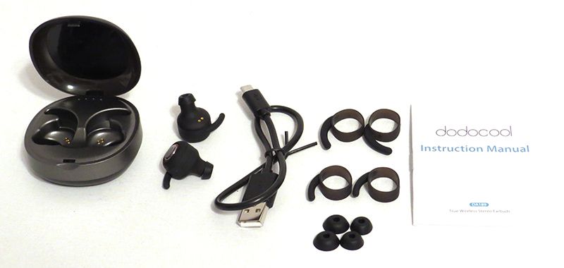
What’s in the box?

  • Dodocool Earbuds
  • Charging case
  • Micro-USB cable
  • 3 Eartips
  • 3 Wings
  • Instruction Manual

Design and features

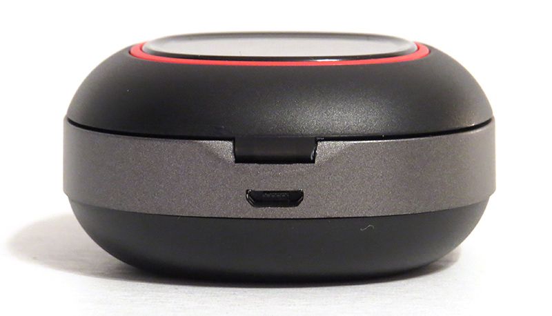
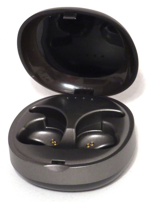
The case/earbuds took a little over a few hours to charge up, but the case charges the earbuds in less than an hour. I really liked how compact the case was, and that it was solid and could easily be tossed around.. Or batted to the floor in the case of my cats. It was also really easy to remove and replace the earbuds in the case. There was a magnetic pull that locked them into place. I did notice, however, that a bump would loosen the connections enough to turn on the earbuds. Enough of these bumps drained the battery down. It seemed random though, as major bumps like floor drops didn’t seem to bump the connection.

Each time I used the earbuds, I would drop them into the case to charge, with the longest use time at around 2.5 hours. They would also turn themselves off when they were not in use. This allowed me to use them for a good amount of time before needing a recharge.
Setup

When I initially paired these to my phone, I could only get one headphone to work at a time. They wouldn’t talk to each-other! Despite the instructions, they would continue to work in mono mode. I am not sure what I did, but eventually, after several tries, I got them to work together. Since then, they’ve worked flawlessly together without going back to mono mode.
Performance

I used these headphones for a solid week thinking they had terrible sound quality. They would fit fine in my ears, but there was no bass at all. I took them for a run, and when stopping to adjust them on my way back, I managed to push one into a better fitting position. The sound quality was night and day! After that, I made sure to push inward more than standard Earbuds, and if I got it ‘suctioned’ in, the sound quality was good. The mids and highs on these were just average, but the bass/lows were above average for the price range once they were suctioned into my ear.

During my run, they stayed in place for the most part. I had to adjust them once before heading back, but since my ears are terrible for earbuds, I was impressed. The wings help a lot, and I am really glad those come in three different sizes so that I could find the one that fit just right. Not only did they fit correctly, but they were comfortable to wear for a few hours as well.

What I like

  • Automatically connects to the phone when taken out of the case.
  • Compact
  • Customization for different ear sizes

What needs to be improved

  • Earbuds are loose in the case causing them to turn on by bumping the case
  • Pairing was a challenge

Final thoughts

Overall, the Dodocool DA189 Earbuds were ok for the price. They did stay in my ears during a run, and once I got the fit figured out, they had decent sound quality. I was disappointed when I went to use them when washing my car and they had no battery life due to being bumped every morning and evening on my nightstand. For less than $40 though, they weren’t too bad.

Price: $49.99
Where to buy: Amazon
Source: The sample of this product was provided by Dodocool.

Filed in categories: Reviews

Tagged:

Dodocool DA189 True Wireless Earbuds review originally appeared on The Gadgeteer on April 29, 2019 at 10:00 am.

Note: If you are subscribed to this feed through FeedBurner, please switch to our native feed URL http://the-gadgeteer.com/feed/ in order to ensure continuous delivery.

Upgrade your first gen Apple Pencil with this grip from Kaweco

NEWS – If you haven’t upgraded to the newest version of the Apple Pencil, you can put some new “clothes” on the first generation Apple Pencil with one of these cool looking grips from Kaweco.

Kaweco is known for their awesome pens, lead holders, and fountain pens, but this Apple Pencil grip is a new direction for them.

The Grip is made of aluminum and is available in 5 colors. It is basically an exterior shell for the existing Apple Pencil and features an octagonal barrel design and a knurled section that gives the Grip its name.

The Kaweco Grip for Apple Pencil is priced at $45 and is available from JetPens.com

Filed in categories: News

Tagged:

Upgrade your first gen Apple Pencil with this grip from Kaweco originally appeared on The Gadgeteer on April 29, 2019 at 9:00 am.

Note: If you are subscribed to this feed through FeedBurner, please switch to our native feed URL http://the-gadgeteer.com/feed/ in order to ensure continuous delivery.
Declutter Gmail’s web interface by using the Simplify Gmail Chrome extension

ARTICLE – In the past, my Gmail web interface looked a bit cluttered (shown in the above screenshot). I was curious about streamlining this look and stumbled upon several tech news articles that pointed me toward the Simplify Gmail Chrome extension. This extension was written by a former lead designer of Gmail, Michael Leggett, with the help of some of his friends.

Ta-da! This is what my Gmail looks like after using the Simplify Gmail extension. You can see that the Gmail logo located in the upper left-hand corner of the screen has been removed completely and the Compose “+” button has been moved from the upper left to the lower right corner of the screen.

The “Search mail” box has also been moved from the top center of the screen to the upper right side of the screen. Google’s Calendar, Keep, and Tasks has also been moved from the right sidebar to the Overflow menu (the ellipsis) located just above the Compose “+” button in the lower right corner of the screen.

To see your “Inbox”, “Snoozed”, “Sent”, “Drafts”, “Labels”, etc. menu items in the right sidebar, you just click on the Menu icon located in the upper left corner of the screen. I left these hidden to obtain an even cleaner look.

When I opened my emails before using the Simplify Gmail extension, this is what my screen looked like (above screenshot).

And here is what my opened-email screen looks like after using the extension. Again, the Gmail logo is gone and has been replaced with several icon buttons all located on a single line (the “Main Menu”, “Back to Inbox”, “Archive”,  “Report Spam”, “Delete”, “Mark as Unread”, “Snooze”, “Moved to”, “Labels”, and the “Overflow menu” buttons). The “Search email” box has also been moved off to the upper right corner of the screen.

NOTE: Depending on your Gmail settings, this extension may not work for you. For example, it didn’t work well for me when using the “Multiple Inbox” setting in Gmail as shown in the screenshot above. Using Multiple Inboxes with this extension, I could no longer see the distinct inboxes that I set up. And because the list of emails expanded side-to-side to fit the screen, the Compose “+” button overlayed the email list. In addition, the number of emails being displayed (e.g. 1-60 of 60 located at the top center of the screen) was overwritten by that of another inbox. But, once I got rid of Multiple Inboxes, the extension worked well for me.

Just in case you are curious about whether or not it is safe to use his extension, Mr. Legget posted the Simplify Gmail code in GitHub for those of you who wish to examine it.

The Simplify Gmail Chrome extension is available from the Chrome Web Store for those of you who like a cleaner, less cluttered Gmail web interface.

Filed in categories: Articles

Tagged: ,

Declutter Gmail’s web interface by using the Simplify Gmail Chrome extension originally appeared on The Gadgeteer on April 29, 2019 at 8:00 am.

Note: If you are subscribed to this feed through FeedBurner, please switch to our native feed URL http://the-gadgeteer.com/feed/ in order to ensure continuous delivery.

Windows 10 Will Soon Stop Forcing Updates

One of Windows 10’s most reviled “features” since its release is its update schedule. People frequently reported that the operating system would restart itself during sensitive actions with no easy way to stop it. There are unofficial methods, but Microsoft was always adamant that automatic updates were for the best. This move was to help users keep their systems secure, offering better protection against zero-day viruses and exploits as they were found. If users were given the choice to delay updates, they may have put it off to the point their PCs got infected by the malware – such was the idea. Related: Latest Windows… Read more

35+ Stunning Examples of Websites Using Squarespace

As a follow up to a previous post, in which we took a look at the differences between Squarespace and WordPress — and in parallel to another of our previous posts, in which we had a look at 50 Notable Examples of Extremely Famous Brands Using WordPress — we figured it might be fun to… View Article

The post 35+ Stunning Examples of Websites Using Squarespace appeared first on WinningWP.