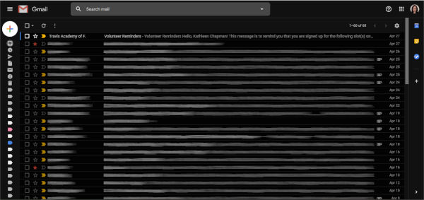
ARTICLE – In the past, my Gmail web interface looked a bit cluttered (shown in the above screenshot). I was curious about streamlining this look and stumbled upon several tech news articles that pointed me toward the Simplify Gmail Chrome extension. This extension was written by a former lead designer of Gmail, Michael Leggett, with the help of some of his friends.
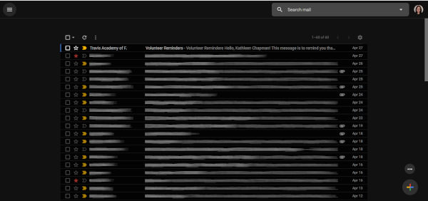 Ta-da! This is what my Gmail looks like after using the Simplify Gmail extension. You can see that the Gmail logo located in the upper left-hand corner of the screen has been removed completely and the Compose “+” button has been moved from the upper left to the lower right corner of the screen.
The “Search mail” box has also been moved from the top center of the screen to the upper right side of the screen. Google’s Calendar, Keep, and Tasks has also been moved from the right sidebar to the Overflow menu (the ellipsis) located just above the Compose “+” button in the lower right corner of the screen.
To see your “Inbox”, “Snoozed”, “Sent”, “Drafts”, “Labels”, etc. menu items in the right sidebar, you just click on the Menu icon located in the upper left corner of the screen. I left these hidden to obtain an even cleaner look.
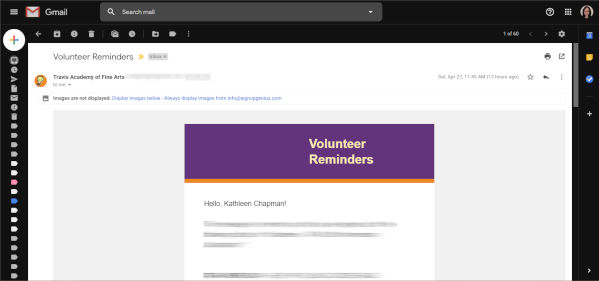 When I opened my emails before using the Simplify Gmail extension, this is what my screen looked like (above screenshot).
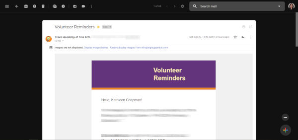 And here is what my opened-email screen looks like after using the extension. Again, the Gmail logo is gone and has been replaced with several icon buttons all located on a single line (the “Main Menu”, “Back to Inbox”, “Archive”, “Report Spam”, “Delete”, “Mark as Unread”, “Snooze”, “Moved to”, “Labels”, and the “Overflow menu” buttons). The “Search email” box has also been moved off to the upper right corner of the screen.
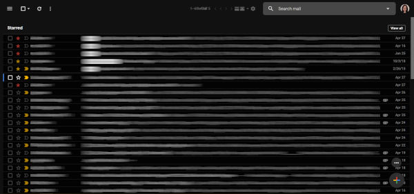 NOTE: Depending on your Gmail settings, this extension may not work for you. For example, it didn’t work well for me when using the “Multiple Inbox” setting in Gmail as shown in the screenshot above. Using Multiple Inboxes with this extension, I could no longer see the distinct inboxes that I set up. And because the list of emails expanded side-to-side to fit the screen, the Compose “+” button overlayed the email list. In addition, the number of emails being displayed (e.g. 1-60 of 60 located at the top center of the screen) was overwritten by that of another inbox. But, once I got rid of Multiple Inboxes, the extension worked well for me.
Just in case you are curious about whether or not it is safe to use his extension, Mr. Legget posted the Simplify Gmail code in GitHub for those of you who wish to examine it.
The Simplify Gmail Chrome extension is available from the Chrome Web Store for those of you who like a cleaner, less cluttered Gmail web interface.
Filed in categories: Articles
Declutter Gmail’s web interface by using the Simplify Gmail Chrome extension originally appeared on The Gadgeteer on April 29, 2019 at 8:00 am.
Note: If you are subscribed to this feed through FeedBurner, please switch to our native feed URL http://the-gadgeteer.com/feed/ in order to ensure continuous delivery.

